2023
Headquarters of the HuaYuLien Group
Entrant
Art Light Design consultants,lnc.
Category
Architectural Design - Lighting
Client's Name
HUA YU LIEN Development Co., Ltd.
Country / Region
Taiwan
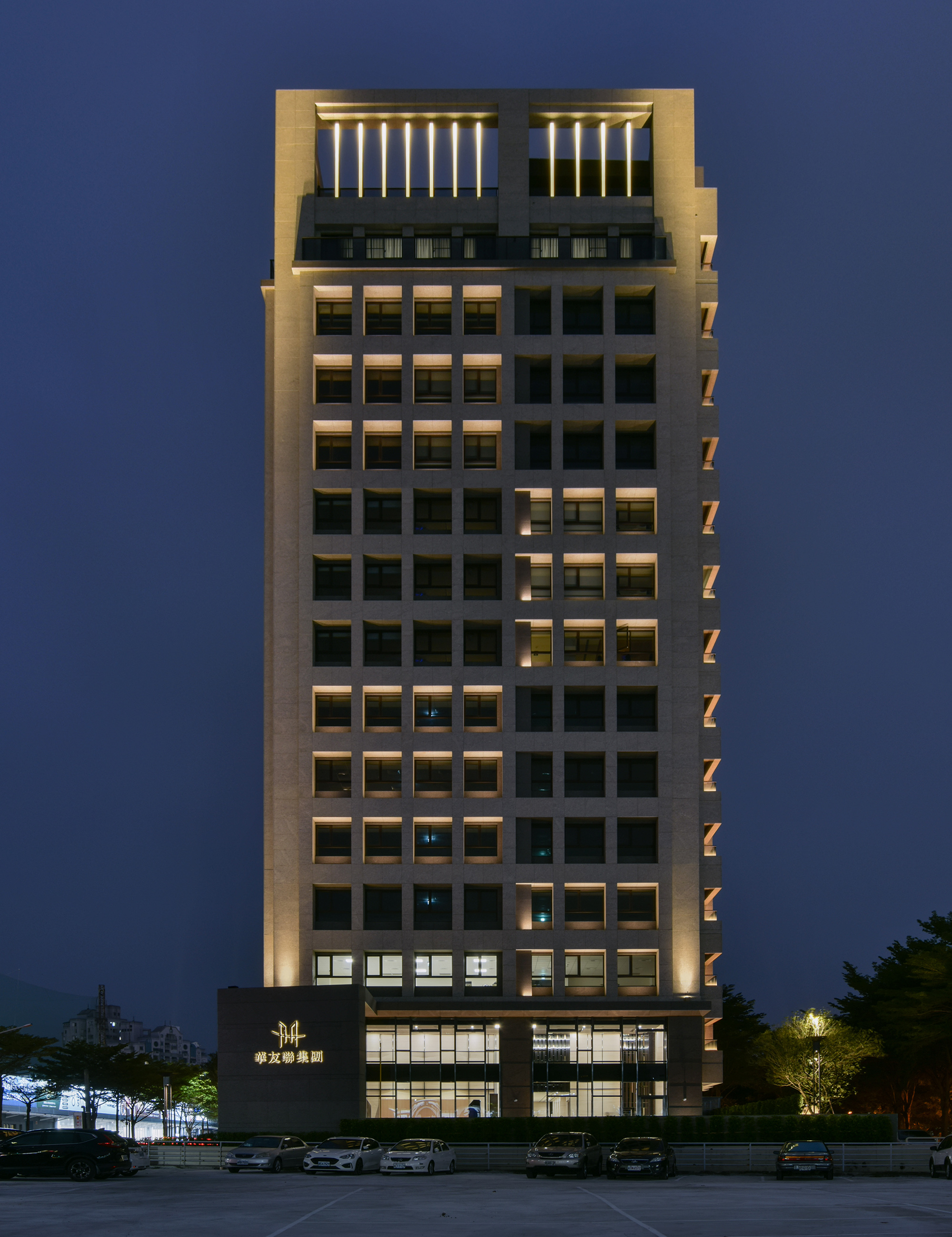
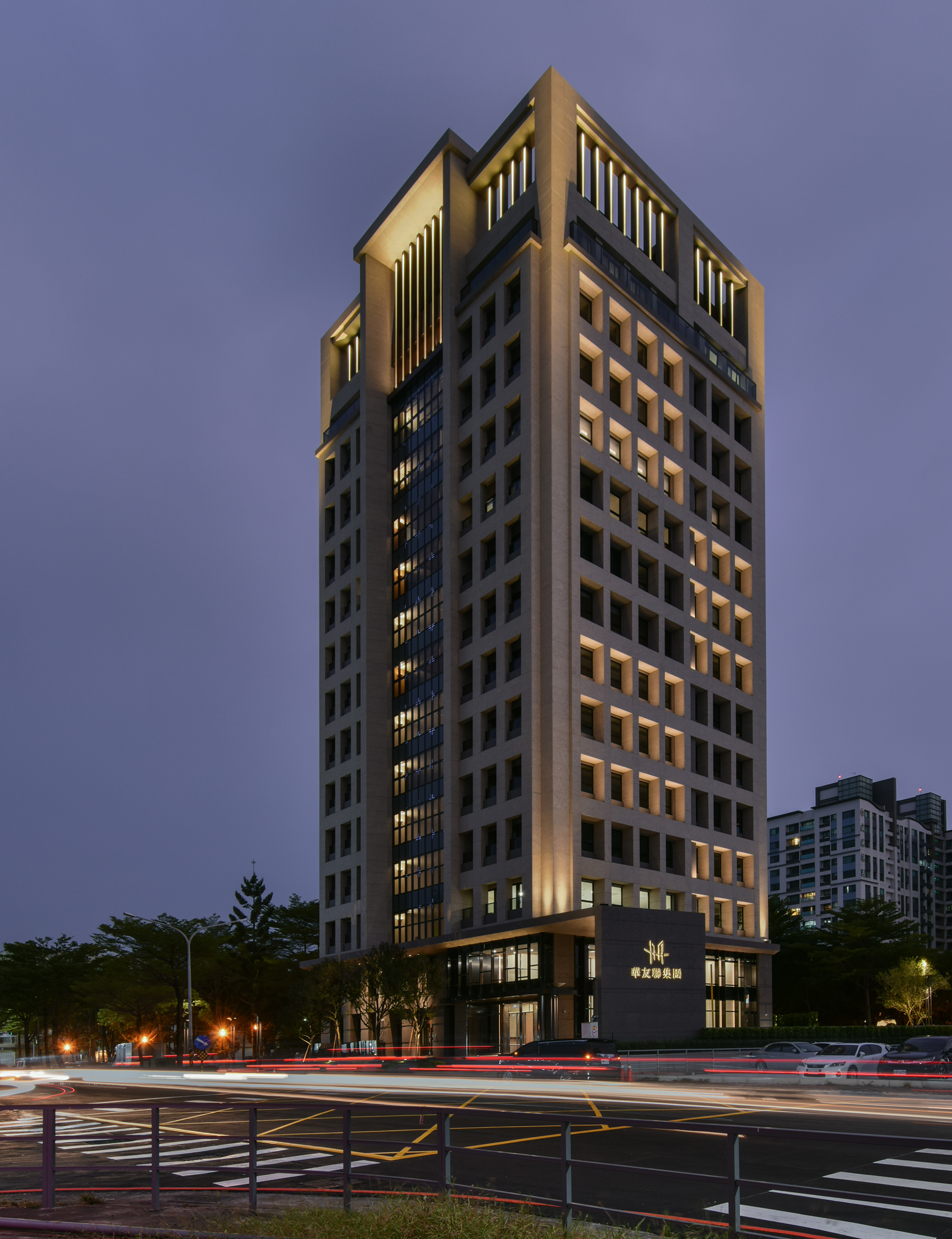
This case is located in an emerging municipal development zone where night-time traffic is frequent, and the majority of lower-level light sources are overly lit signs, compromising driving visibility and making the identification of surrounding buildings difficult. To this end, this case had a clear request; to solve this problem, we boldly introduced facades with stacked geometric designs, allowing buildings to, even at nighttime, be equipped with unique symbols that attract people’s attention from a distance.
While not disturbing normal indoor operations, the facades of the building were embellished with a large number of glass curtain walls, making the layers in the building exterior appear even more natural and imaginative.
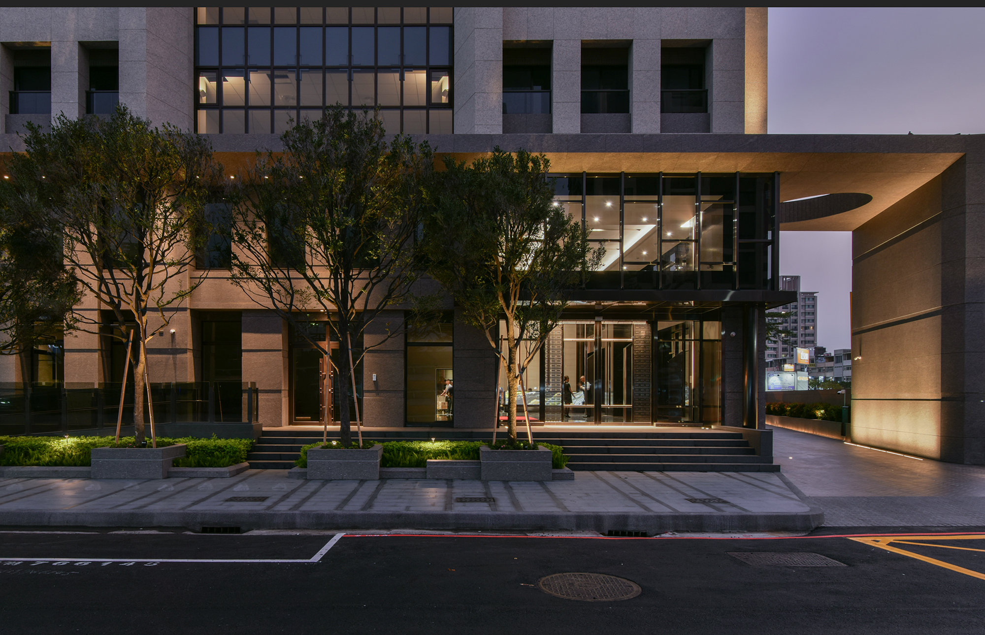
Additionally, the concealed LEDs in the metal canopies on the first floor were provoked to emit a gentle light, evoking a sense of privacy while at the same time allowing the upper and pedestrian-scale (lower) floors of the building to complement each other visually.
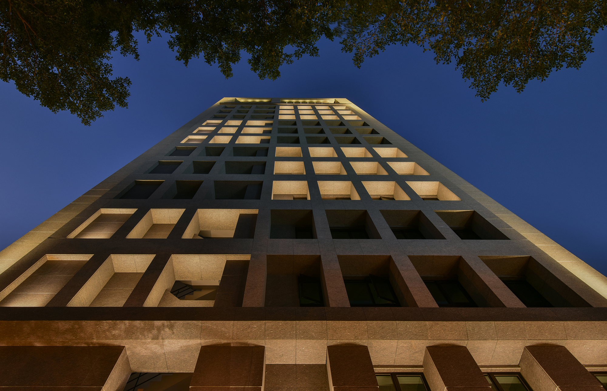
The facade structure on both sides of the building contains many grid-work girder designs. While following the primary request of not disturbing normal indoor operations, according to the designs we hid adjustable LED light sources in the facades, making the layers of the building appear even more natural and exuding geometrically stacked imaginative spaces.
The front of the building contains two separately layered cross-shaped lines which each used the combination of four different colors in the RGBW spectrum, accentuating the building design and the uniqueness of night-time views. Additionally, we used DMX to control brightness and color diffusion.
The roof protrusions feature large sections of linear metal designs. We chose to modify the traveling angle of light paths and advertently punched holes in the linear metal grooves, creating the diffusion of light from multiple points.
In terms of the design of traffic lanes visuals, we lighted our building using continuous, linear LEDs on one side and dotted light on the other, imbuing the building with a sense of space and rhythm. The color temperature was reduced to 2700K, allowing people entering the building to enjoy peace of mind.
Credits

