
2023
Comprehensive Energy Station Visual Identity Standard Design
Entrant
ZM International Corporate Planning (Beijing) Co., Ltd.
Category
User Experience Design (UX) - Services & Utilities
Client's Name
China National Petroleum Corporation
Country / Region
China
To better showcase the fresh image of China Petroleum as a key central enterprise, adapting to unprecedented changes in the past century, designers have undertaken a completely new logo design. The two long bars in red and yellow symbolize the solid foundation and boundless cohesive creative power accumulated by China Petroleum over the years. The white color represents clean energy and an international perspective. The gem flower logo is positioned above the red and yellow bars, symbolizing the sunrise and signifying that China Petroleum always takes the lead.
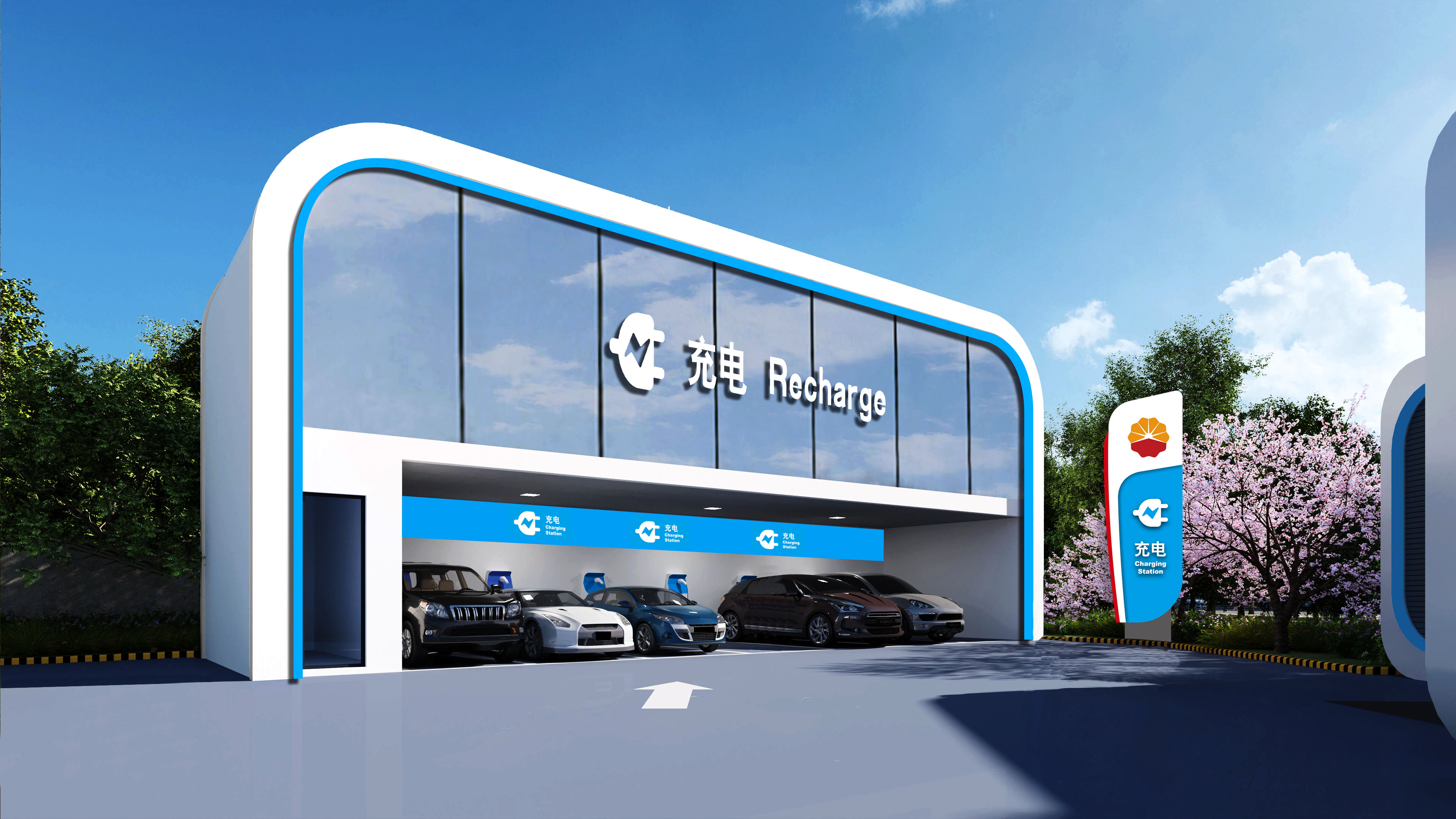
The minimalist design style aligns with development needs and showcases the fresh image of China Petroleum as a key central enterprise. The main logo signboard's visual identity creative elements echo the design elements of the canopy and refueling island, presenting in the shape of a flag to fulfill the display of service functions. The flag's design symbolizes the inheritance of the red gene, keeping in mind the original mission, allowing the banner of the spirit of petroleum to fly high in the new era. The main logo signboard also resembles a sail, symbolizing China Petroleum setting sail, with a long-lasting foundation.
The overall image of the signboard has been redesigned to combine straight lines with rounded corners; the background of the gem flower is changed to white, highlighting the image of the gem flower; the addition of advertising screens enhances promotional effectiveness. The new design of the signboard focuses on highlighting the visual identity of the main logo, with an overall clean and elegant effect, characterized by a sense of futurism and youthfulness, embodying China Petroleum's new concept of vigorously developing comprehensive energy stations.
The entirely new three-dimensional and modern design represents China Petroleum's standing at the forefront of the tidal wave of energy transformation in the new era, fully embarking on the new journey of building a world-class comprehensive international energy company with a sustainable and everlasting foundation, and striving to write a new chapter of eternal brilliance.


Entrant
Jiajia Yin
Category
User Experience Design (UX) - Games - Single Player