2025
Whisky Code Retail Department
Entrant
WEIWU Interior Design Ltd.
Category
Interior Design - Commercial
Client's Name
Country / Region
Taiwan
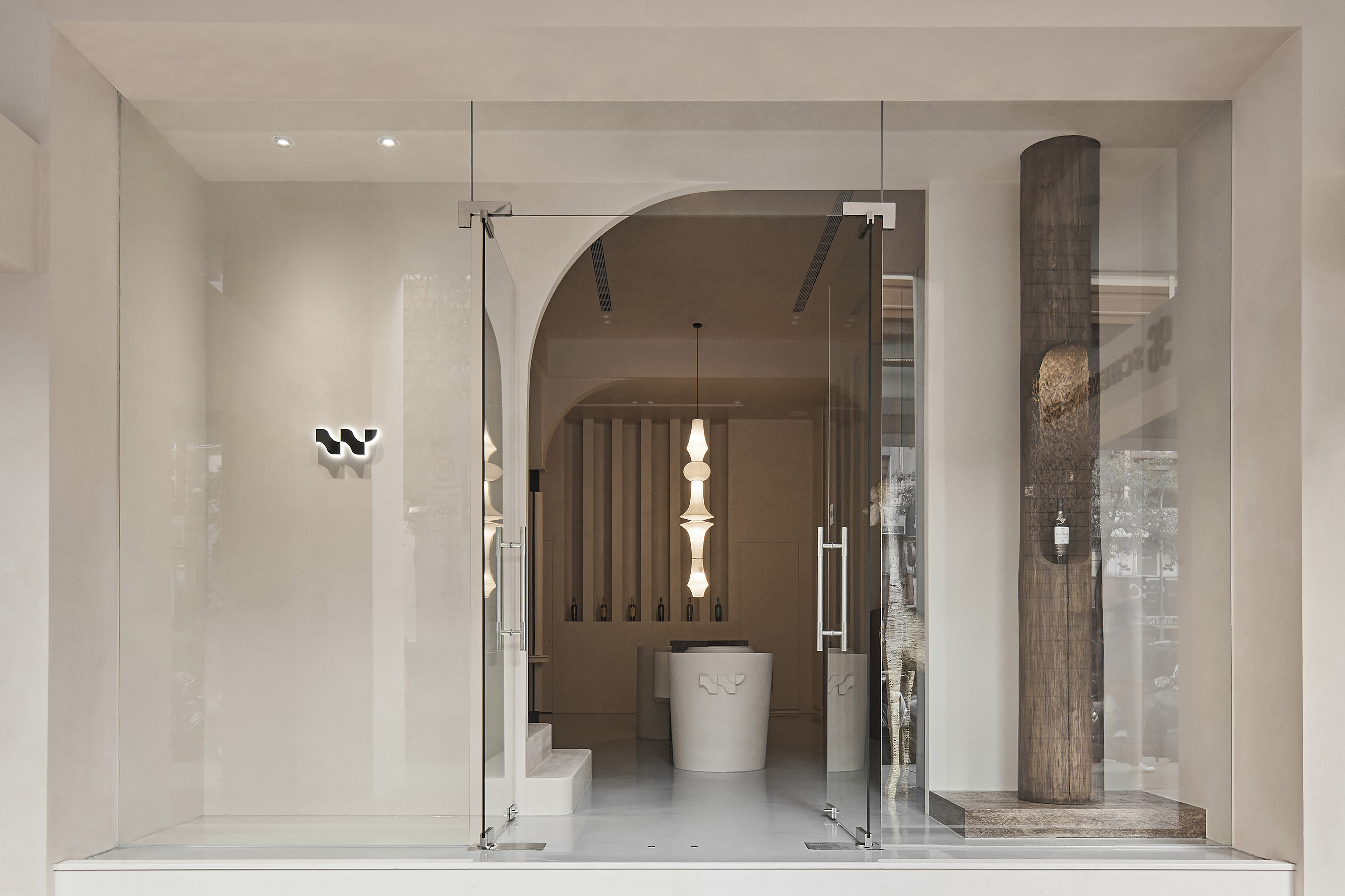
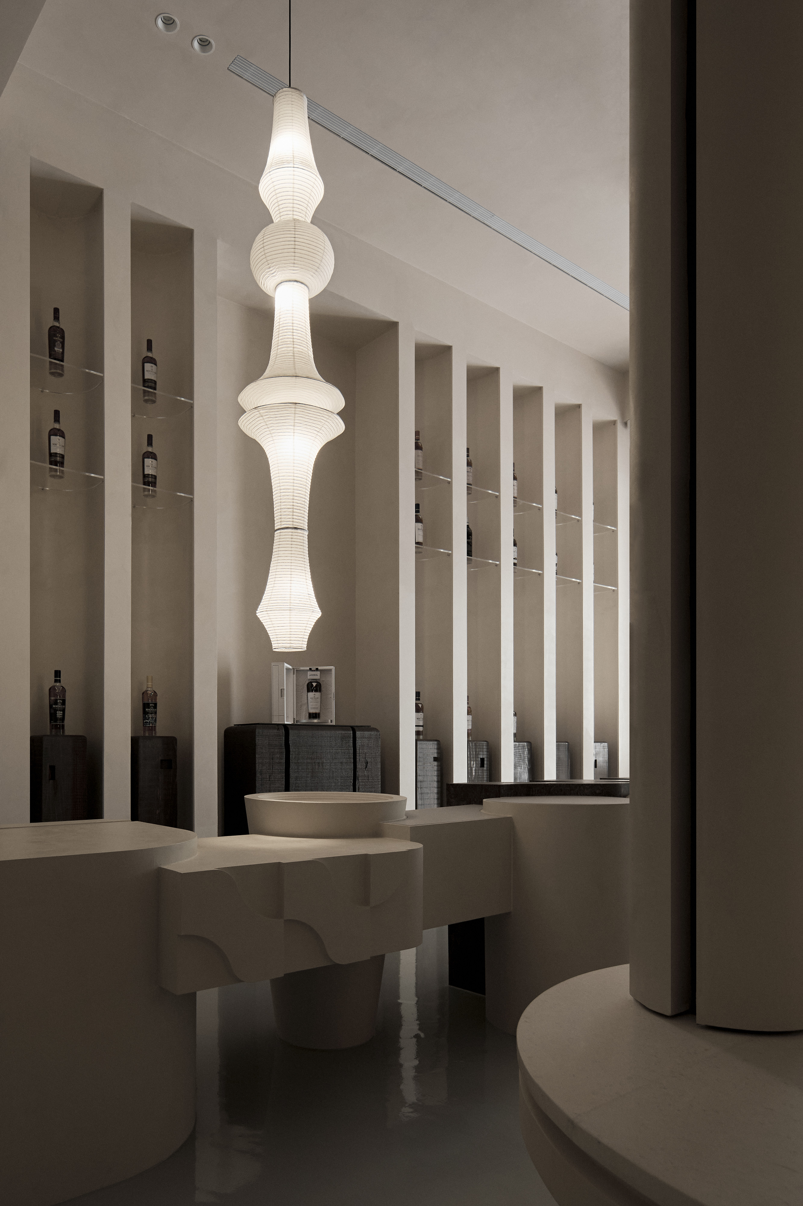
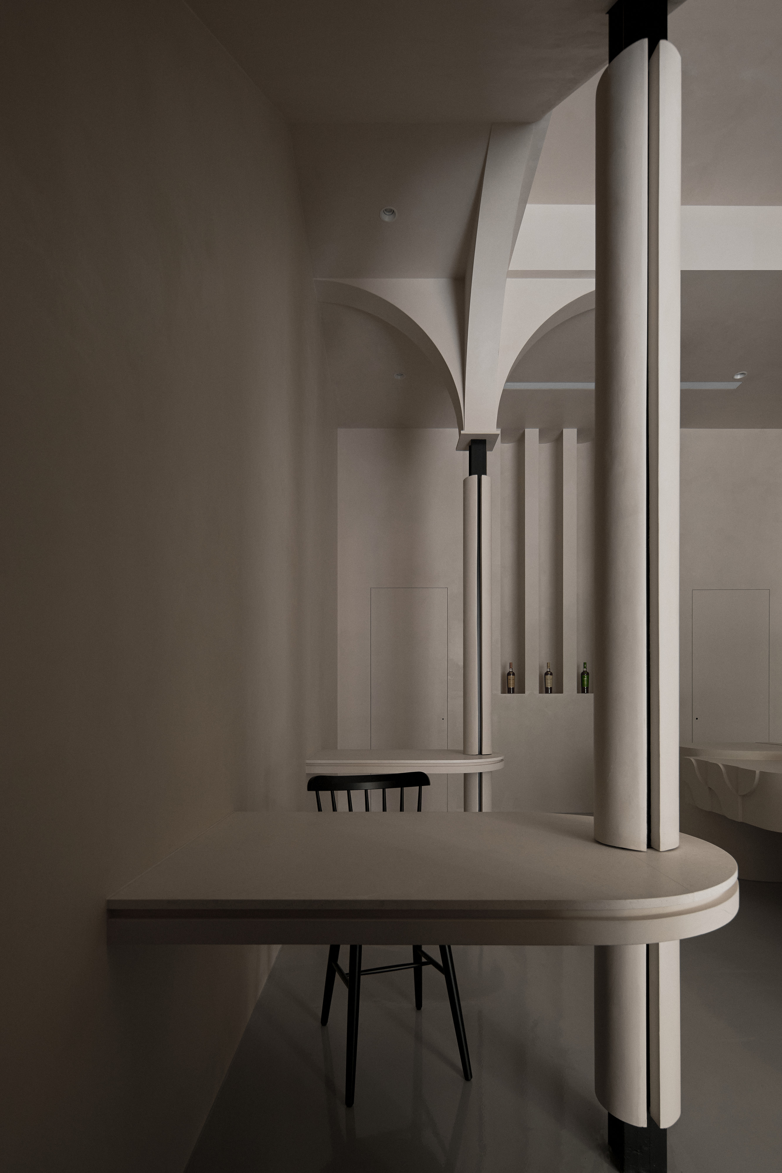
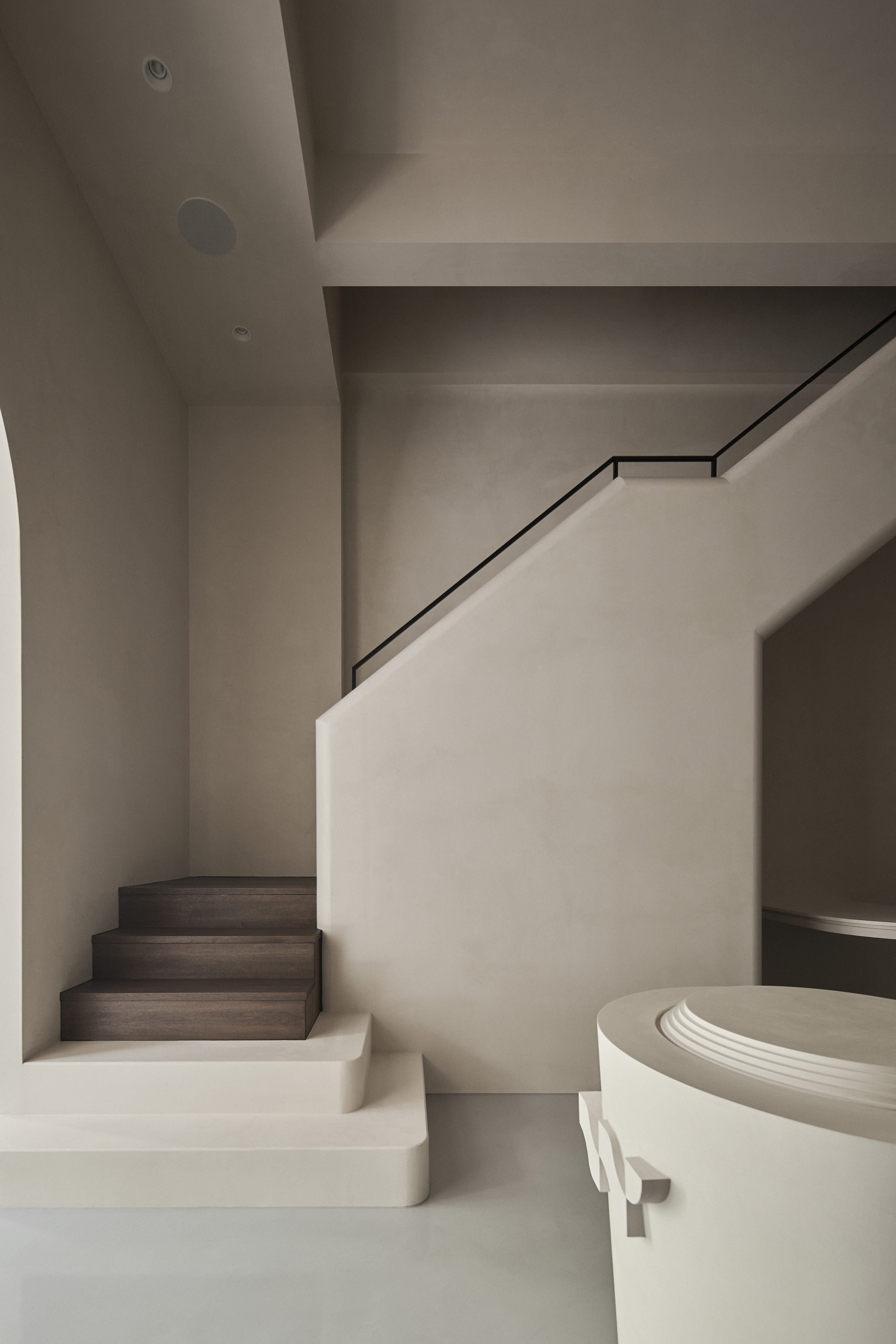
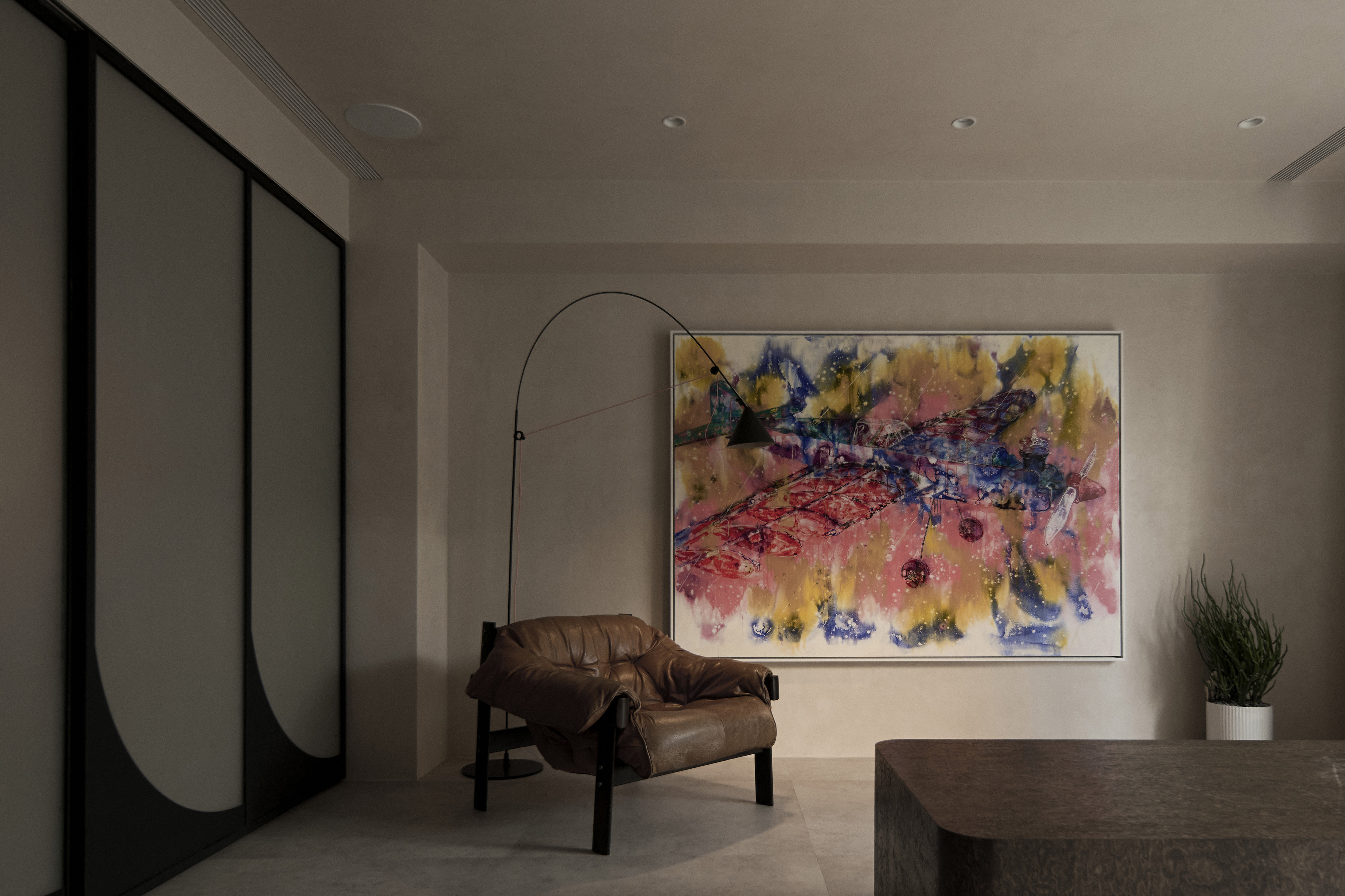
Transparent storefront glazing allows natural light to wash over the softly textured, matte wall finishes, revealing a quiet warmth reminiscent of whisky maturing in oak vats—deep, layered, and refined. A creamy palette guides the spatial narrative inward, where flowing curves and geometric forms subtly embed the brand’s logo into every corner. Wherever the eyesight lands, the brand symbols are gently woven into the space, gracefully and casually transforming the intensive image of whisky that resembles a night. With every step, the design echoes the craftsmanship of aging and the depth of time in distillation culture, leaving a delicate charm that lingers in the minds.
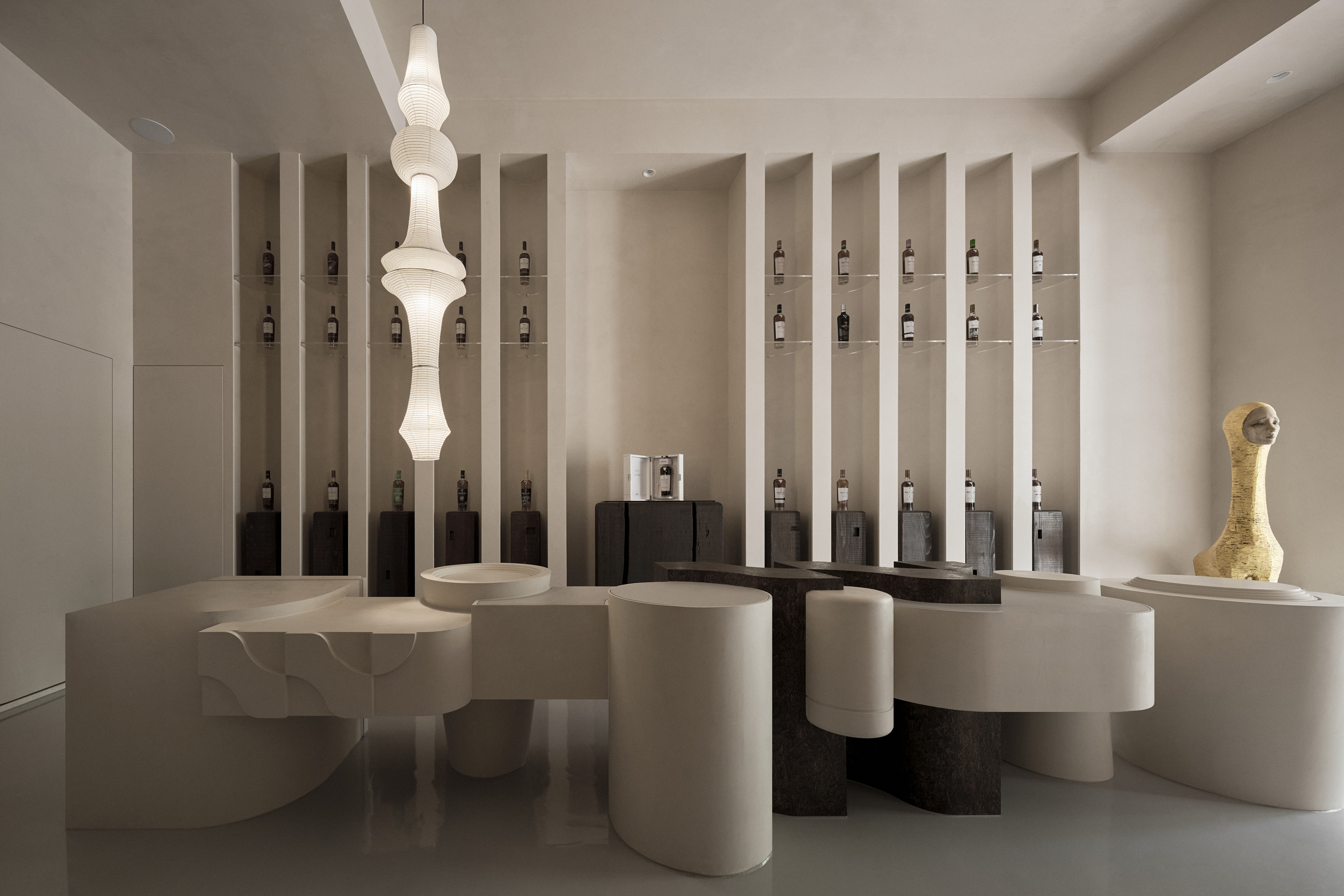
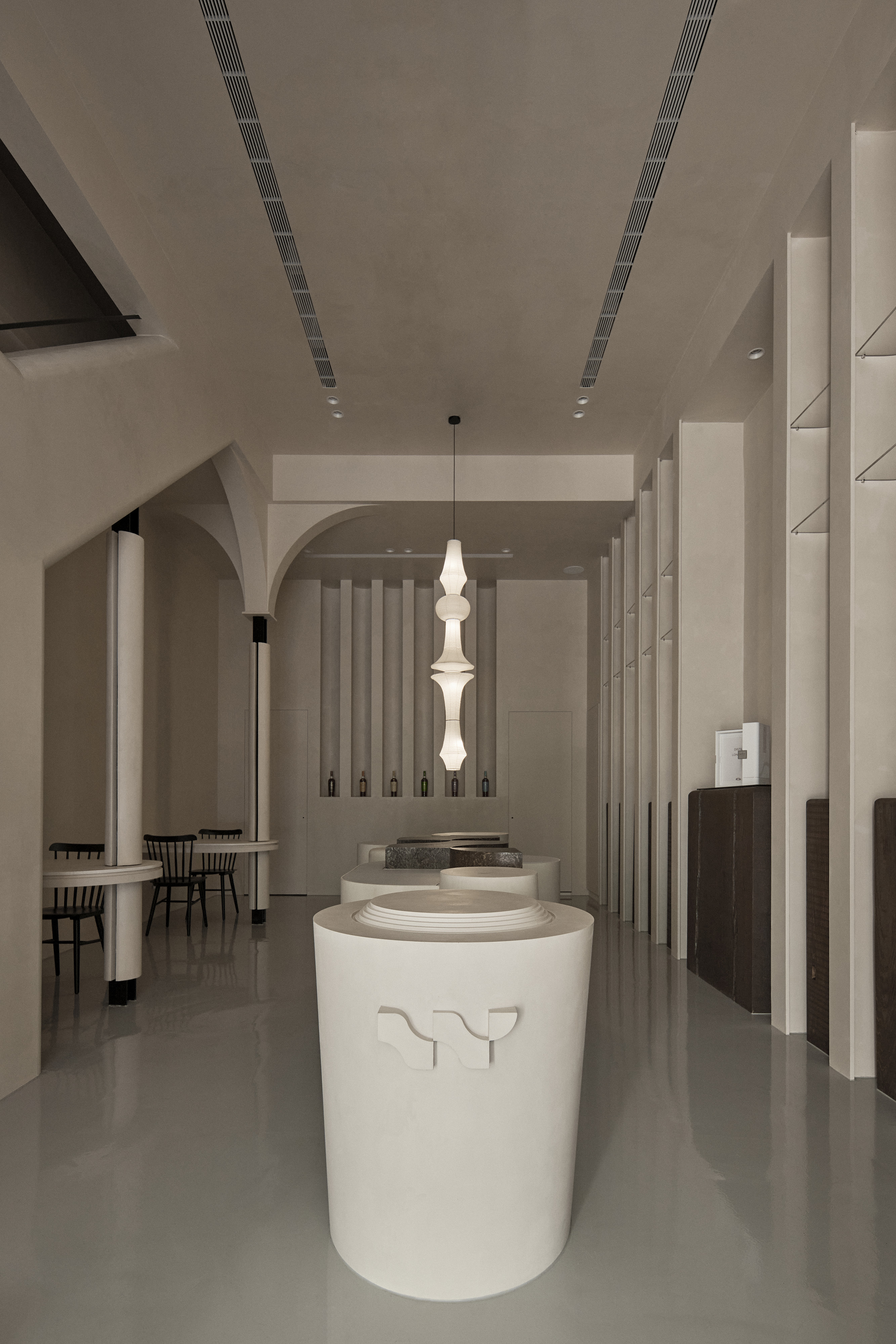
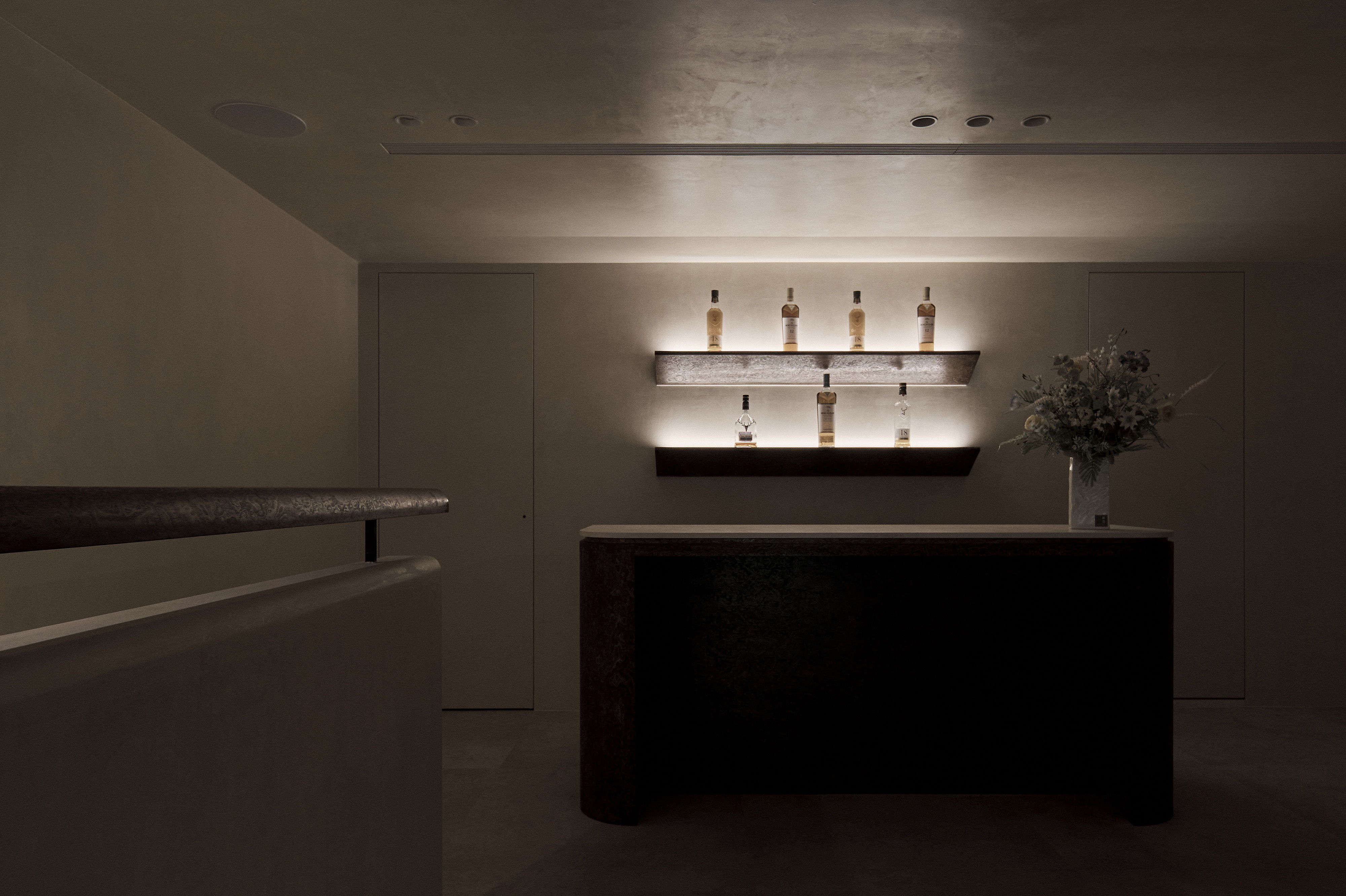
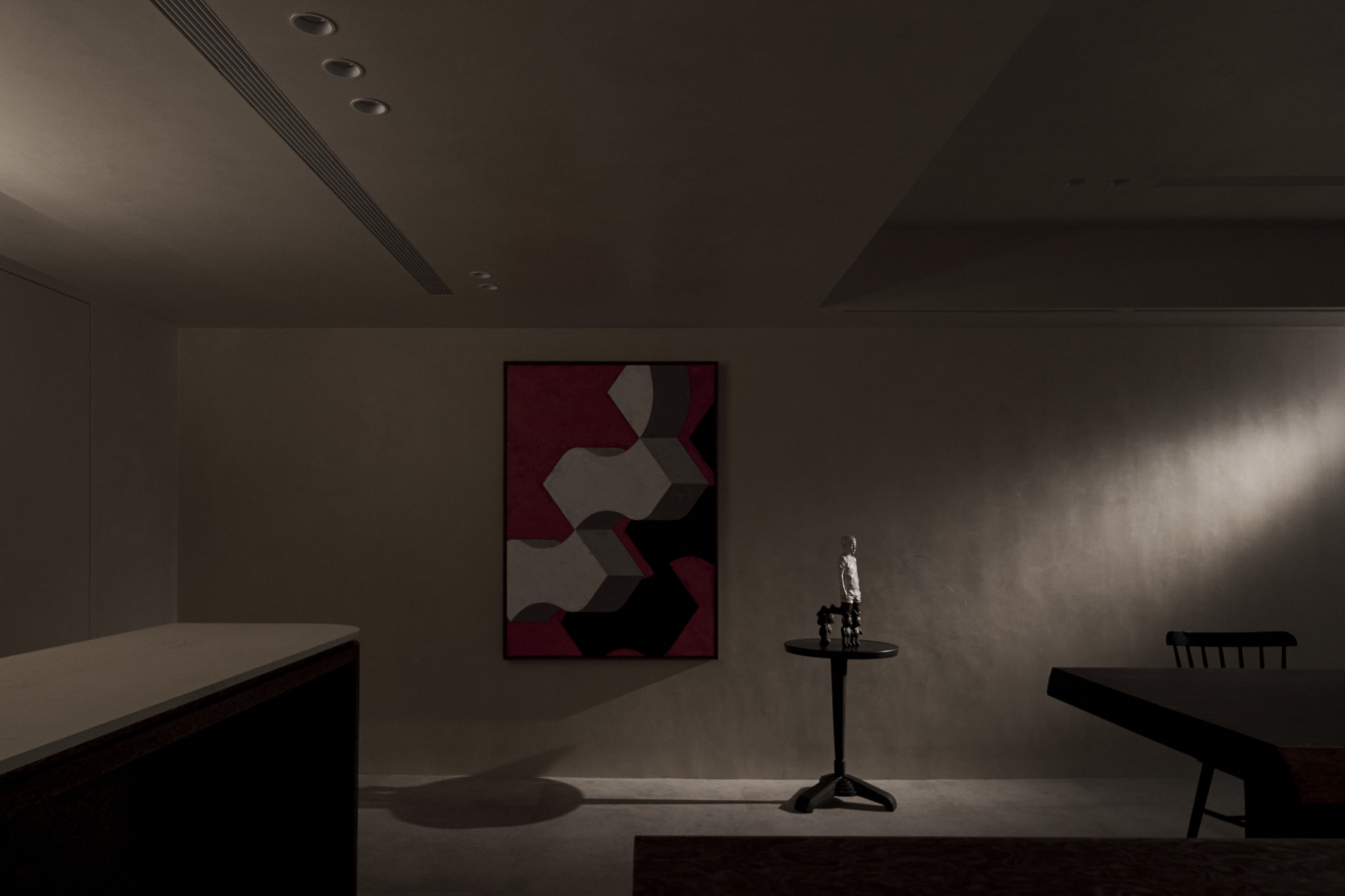
The project adopts a subtraction philosophy to focus attention on the product and enhance the brand’s value. Every approach in the space stems from a pursuit of refinement and precision that strips away superfluous ornamentation in favor of essential form and intentionality. Instead of relying on luxurious materials to convey sophistication, the design communicates a delicate spatial language through light, shadow, and geometric rhythm. Product display with the sensibility of an art exhibition renders gallery-like layering with rhythm and blanks. Through the measure, each bottle tells its own timeless story, quietly reflecting the cultural richness the brand embodies.
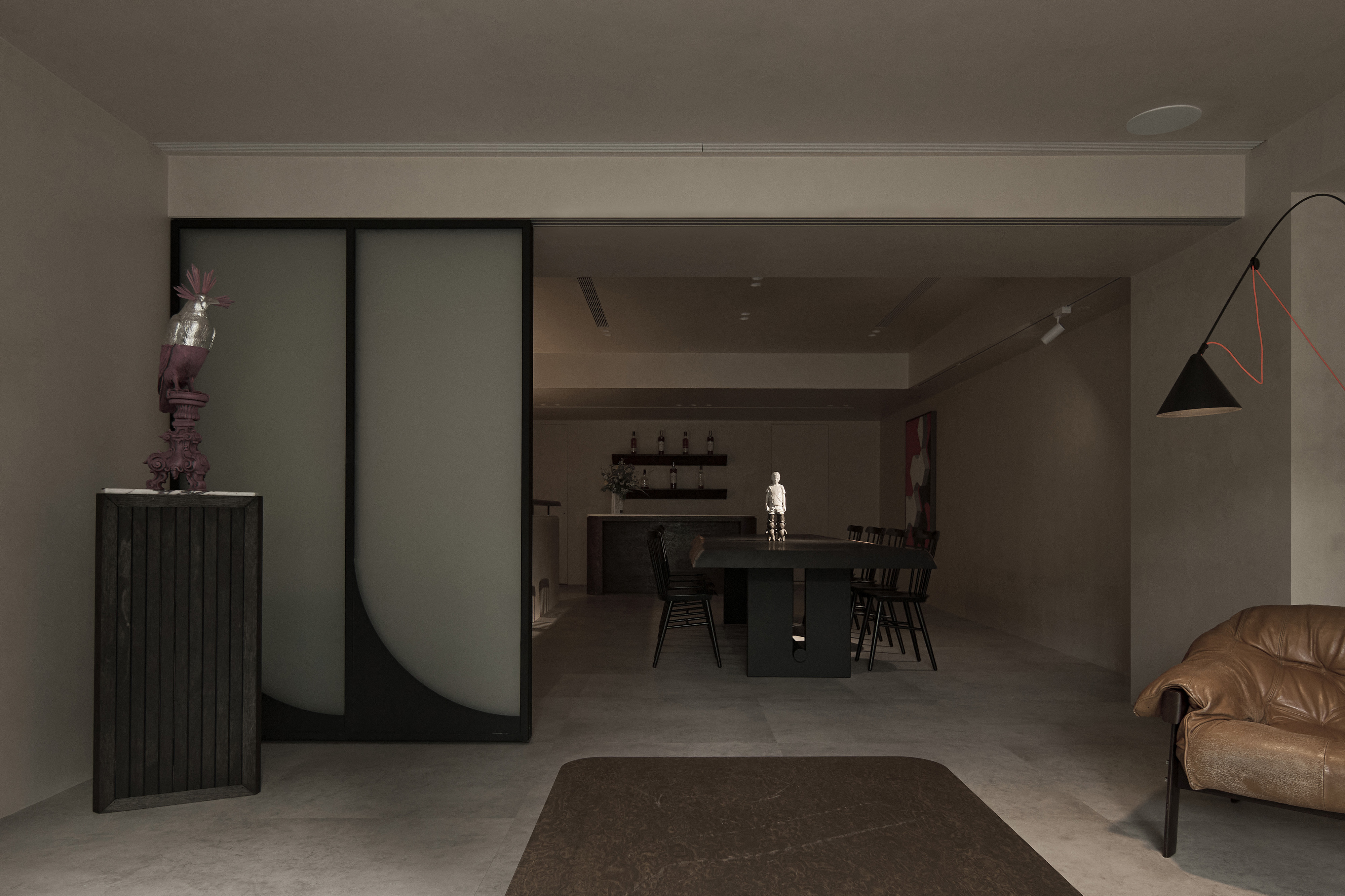
On the ground floor, a circular moving flow surrounds the central island, integrating display, experience, and interactive layout into the entire space. The clever plan establishes a sense of rhythm and narrative, enhancing visitor engagement throughout the journey. Aiming for a product-first display strategy, the design breaks away from conventional retail presentation by showcasing signature bottles within small niches, highlighting their rarity and exclusivity. A solid wood platform with a carved shape, symbolizing a canoe, serves as both a display counter and a vessel that carries the story behind each product. On the second floor, the furnishing layout regulates visual layers and maximizes minimalist staging, featuring authentic textures of building materials. This understated composition reinforces the brand’s refined identity. It also creates an immersive setting that fully engages visitors, making it ideal for tasting and meetings.
Credits

Entrant
OCEAN INTERIOR DESIGN LTD.
Category
Interior Design - Residential
Entrant
Baidu Online Network Technology (Beijing) Co., Ltd.
Category
User Experience Design (UX) - Business