
2026
GateHouse
Entrant
Yuxin Zhu
Category
Packaging Design - Retail
Client's Name
-
Country / Region
United States
Gallery





About The Entry
GateHouse is an American restaurant in South Philadelphia that brings together good food, music, and a lively atmosphere. The packaging design reflects this personality through bold colors, playful illustrations, and a consistent visual identity across the restaurant's takeout experience.
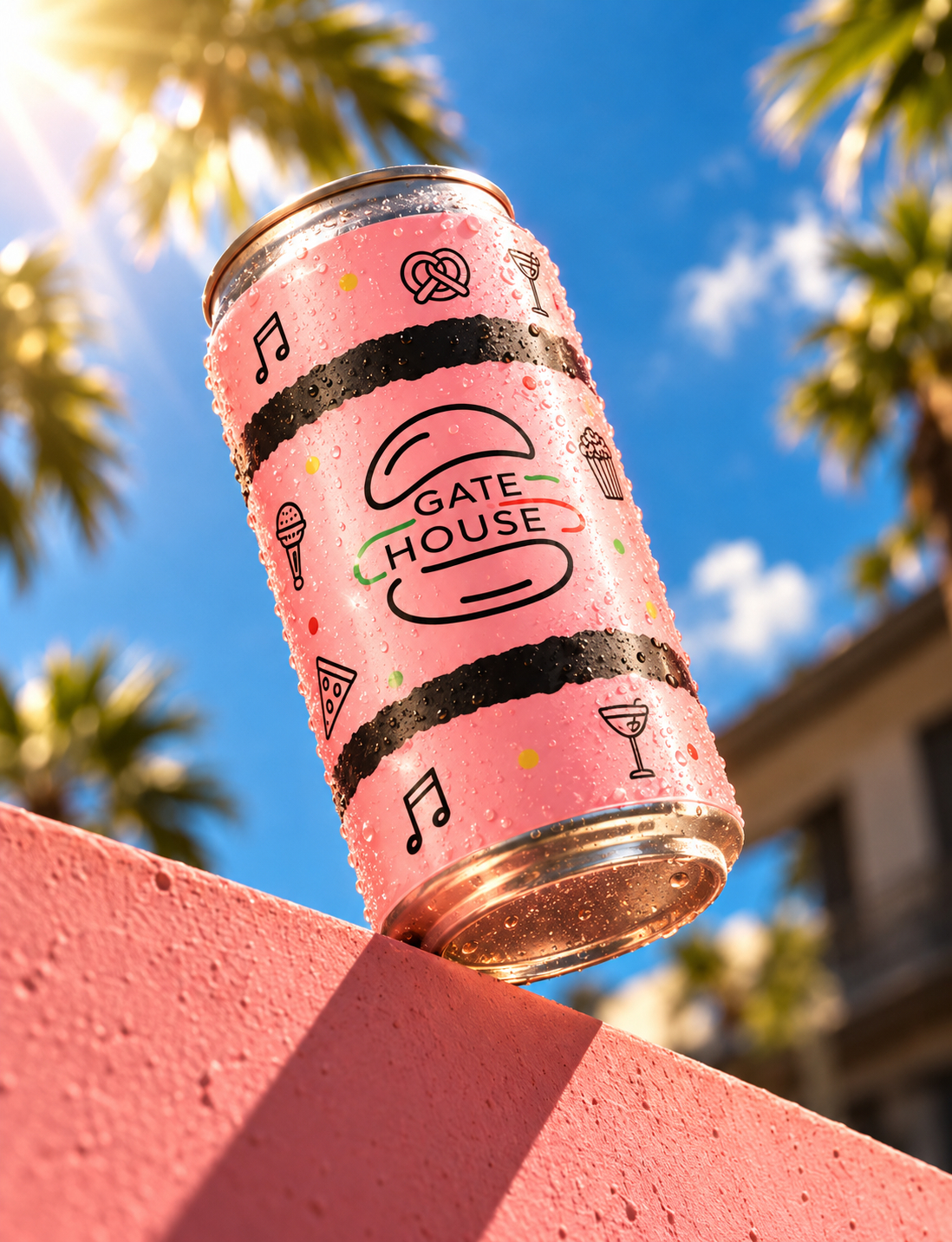
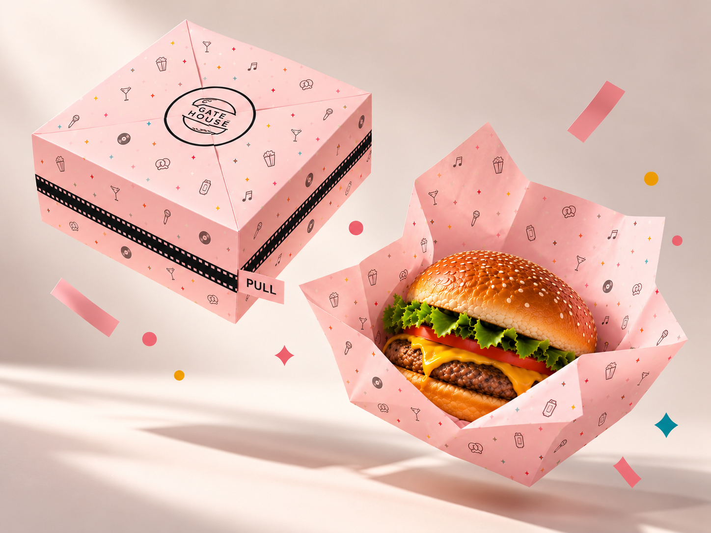
The concept centers around the GateHouse logo, which places the restaurant's name between two stylized burger buns. The logo is simple, recognizable and directly connected to the food the restaurant serves. It becomes the main visual element throughout the packaging, supported by hand-drawn illustrations inspired by the restaurant's menu and atmosphere.
Pink and black are the primary colors, paired with cream accents to create contrast. Rough, hand-painted stripes add texture, with small illustrations of burgers, pizza, cocktails, music notes, and other familiar objects that give the design a fun, casual feel. These elements are arranged differently across each package, keeping the designs interesting without making them feel disconnected.
The packaging collection includes takeout bags, burger wraps, food boxes, beverage cans, and sauce containers. Each item has its own layout based on its shape and purpose, but the same colors, logo, and illustration style carry through the entire collection. This approach creates a recognizable identity whether customers are picking up a meal, unwrapping a burger, or enjoying a drink.
The goal was to make the packaging feel like a natural extension of the restaurant rather than simply something used to carry food. The designs are meant to be fun, approachable, and visually appealing, while still being practical for everyday use.
Together, these packaging pieces create a consistent look across the restaurant's takeout offerings, bringing GateHouse's playful style into every part of the customer experience.
Credits


