2023
Museu do Porto / Porto City Museum
Entrant
R2 – Ramalho & Rebelo Design Lda
Category
Communication Design - Public Branding
Client's Name
Museu do Porto / Porto City Museum
Country / Region
Portugal
The Oporto City Museum, spread across 11 diverse locations in Porto, Portugal, showcases a range of architectural styles spanning centuries. To ensure a cohesive visitor experience and highlight the city’s rich history, a comprehensive design program was implemented. This included branding, communication, advertising, exhibition design, as well as thorough signage and wayfinding solutions.
Taking inspiration from the organic structure of a rhizome, a graphic representation was developed, influenced by visual and sound poetry. The museum’s visual identity was designed to be dynamic and fluid, departing from a static logo brand. A unique, minimalist typeface was employed, complemented by alternative glyphs for added contrast. These meticulously crafted glyphs drew inspiration from historical toponymic plates of the city.
To establish a profound connection with Porto’s essence, the new identity incorporated typographic elements from various eras’ toponymic plaques. This fusion resulted in a fresh set of letters, reflecting both the museum’s collection and the city’s heritage. The creation of multiple glyphs for each letter reinforced the rhizomatic nature of the textual compositions.
The branding system’s strength lies in the distinctive design of specific letters, ensuring easy recognition and effective signage applications. Overcoming the challenge of adapting to diverse architectural styles, from industrial spaces to historical residences, was a significant feat. The system proved remarkably adaptable, seamlessly integrating with the unique characteristics of each building. This adaptability not only highlights the brand’s resilience but also showcases its ability to harmonize with various architectural nuances.
Credits
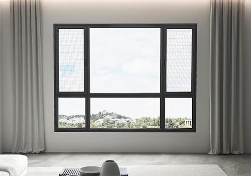
Entrant
Old carpenter Luban (Beijing) Doors and Windows Co., LTD
Category
Product Design - Windows, Doors

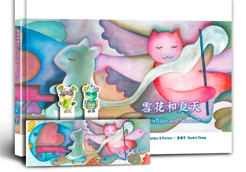
Entrant
Freelancers
Category
Communication Design - Illustration

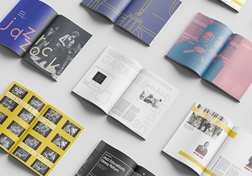
Entrant
Freelancer
Category
Communication Design - Communication Design / Other__


Entrant
KOREA/TECH UNIVERSITY OF KOREA
Category
Service Design - Sustainability & Environment
