2023
Hi!papa Children's Anti-light Damage Series
Entrant
Guangzhou good skin Technology Co., Ltd
Category
Packaging Design - Baby & Children
Client's Name
Hi!papa
Country / Region
China
Gallery


About The Entry
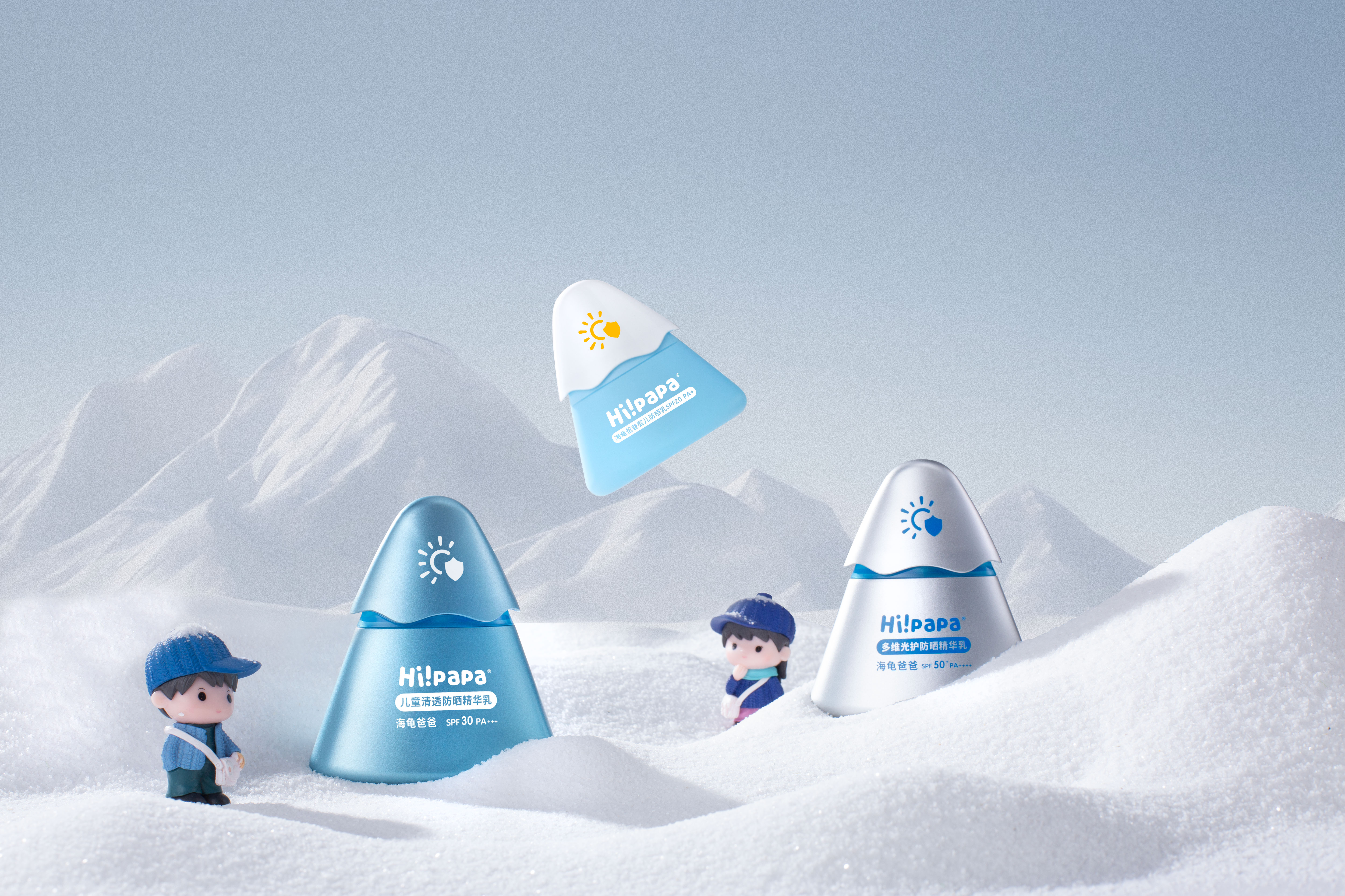
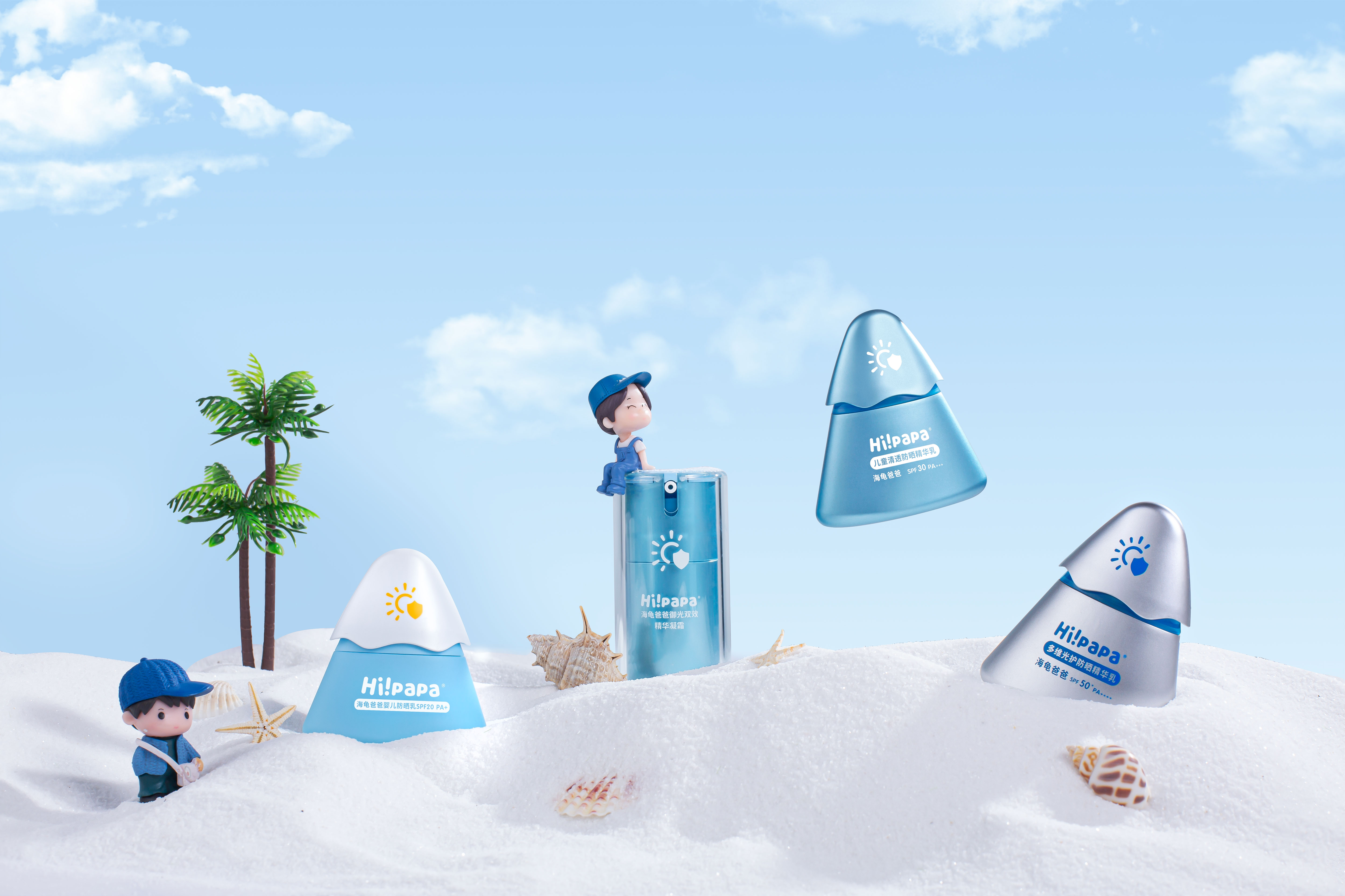
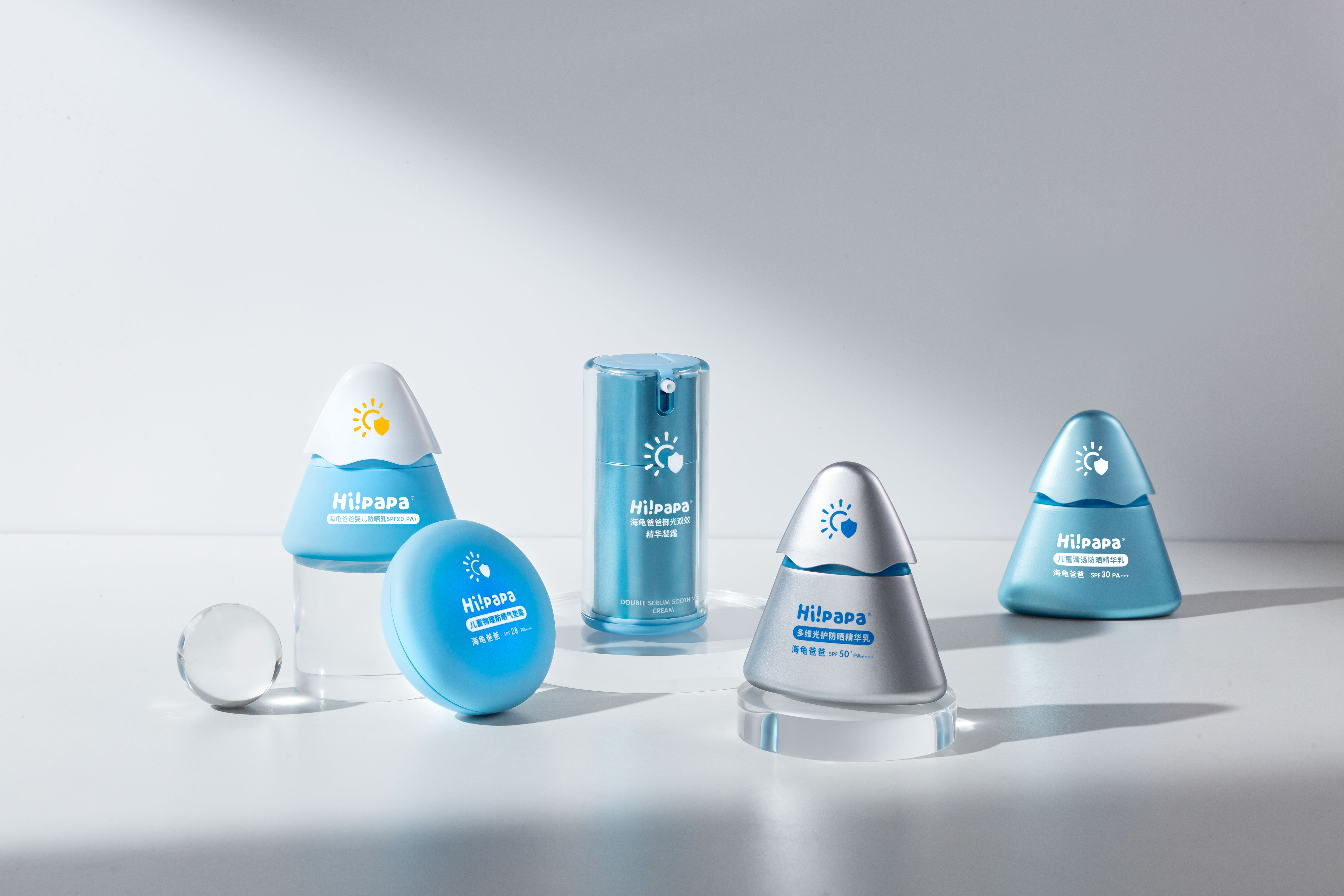
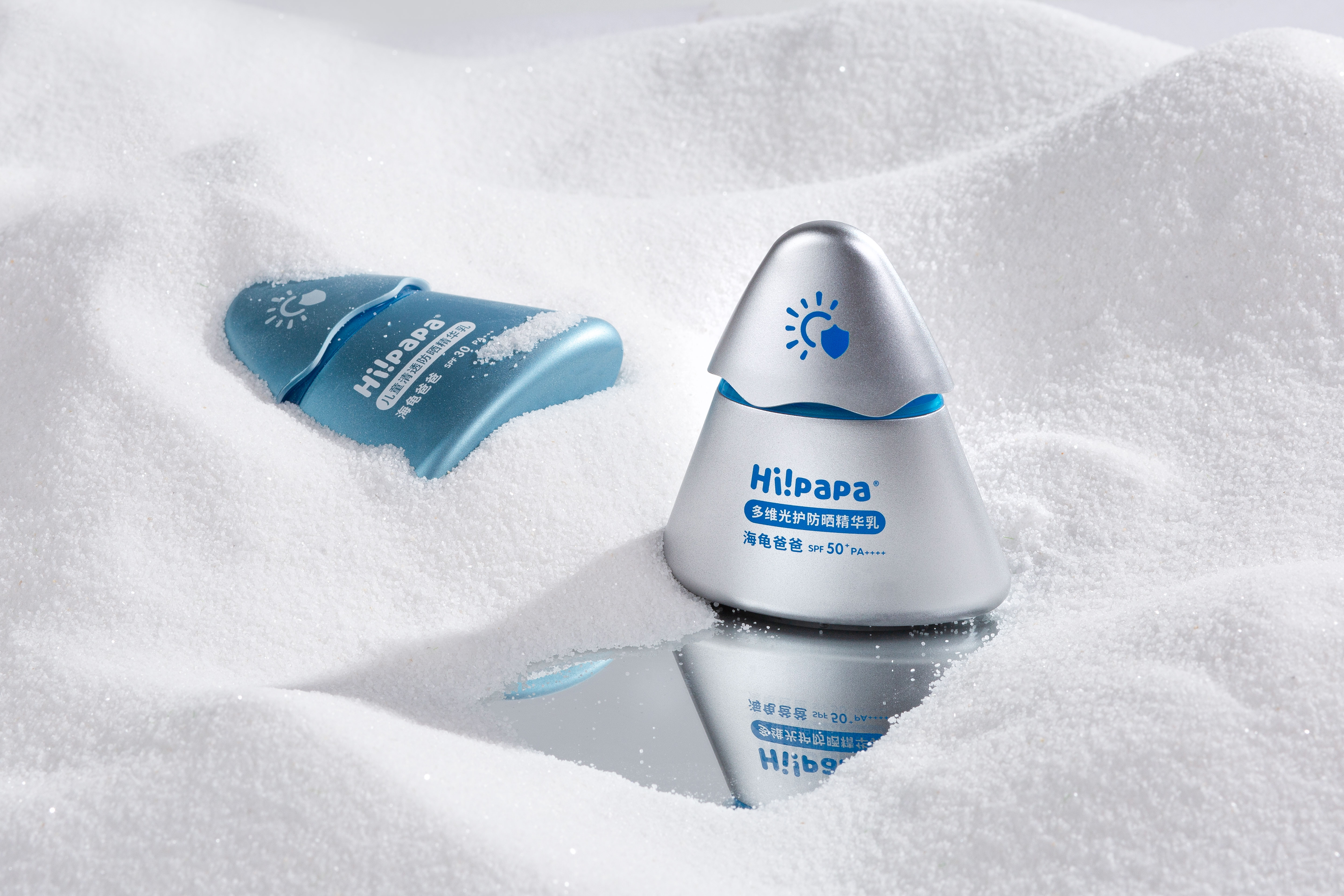
This children's protective products series provides full-spectrum sun protection for children, repairing light damage and maintaining healthy skin. It combines prevention, defence, and repair to combat skin problems brought by light damage, like darkness, sensitivity, and redness from the source.
The series consists of five products that are full of sense of design packed with the "light shield" visual hammer symbol, comprising a sun that symbolizes the challenge of UV rays and a shield that represents safety and protection. This design effectively communicates the products' main efficacy and protective properties while enhancing visual unity. Three products with different levels of protection are designed to resemble snow mountains. They are optimized in the shape of an isosceles triangle, which is aesthetically pleasing, and have a wave shape at the bottom of the cap to create a unique "rounded visual icy snow mountain" styling. The product features an intelligent light-change reminder function, which changes the colour of the snow mountain cap or "light shield" symbol according to the UV intensity. The colour becomes darker as the UV intensity increases, serving as a reminder for children to apply sun protection promptly. Additionally, Snow Mountain is infused with different metallic-coloured powders to achieve colour differentiation and help consumers quickly identify the products. By making the packaging of a sunscreen product appealing and fun for children, the effectiveness of the product can be projected to the user through a visual experience. This can help cultivate a habit of regular sunscreen use and promote independent use among children.
The product design features children's favourite geometric shapes, such as stable triangles and complete circles. The smooth and rounded lines and the ergonomic size design provide a comfortable grip for children. The colour scheme comprises a bright, low-saturated blue tone that conveys an affinity for nature and reliability. Products complemented by neutral colours such as pure white and silver grey, which enhance the credibility and feel of quality.
Credits
Entrant
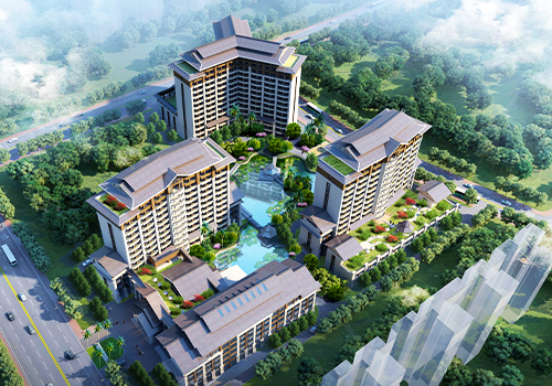
Guangdong Zhongjing International Construction Design & Research Institute (Zhu Guilin, Zhang Fukuan, Huang Run, Jia Fei, Chen Kang’en)
Category
Architectural Design - Architectural Design / Other__
Entrant
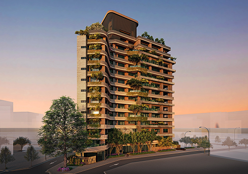
IN-LIFE REAL ESTATE DEVELOPMENT CO., LTD
Category
Architectural Design - Residential
Entrant
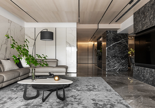
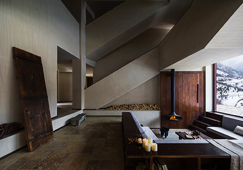
Chengdu Wan Qian Ji Environmental Art Design Company
Category
Interior Design - Hotels & Resorts