2024
Vibrant office
Entrant
the moo.co
Category
Interior Design - Office
Client's Name
Country / Region
Taiwan
Less is more. A word from Ludwig Mies van der Rohe, showing that the shape changes with the function,
The surface is the skeleton, combining needs and space atmosphere to remove redundant branches and vines. Leaving the practicality with a sense of design makes existence necessary.
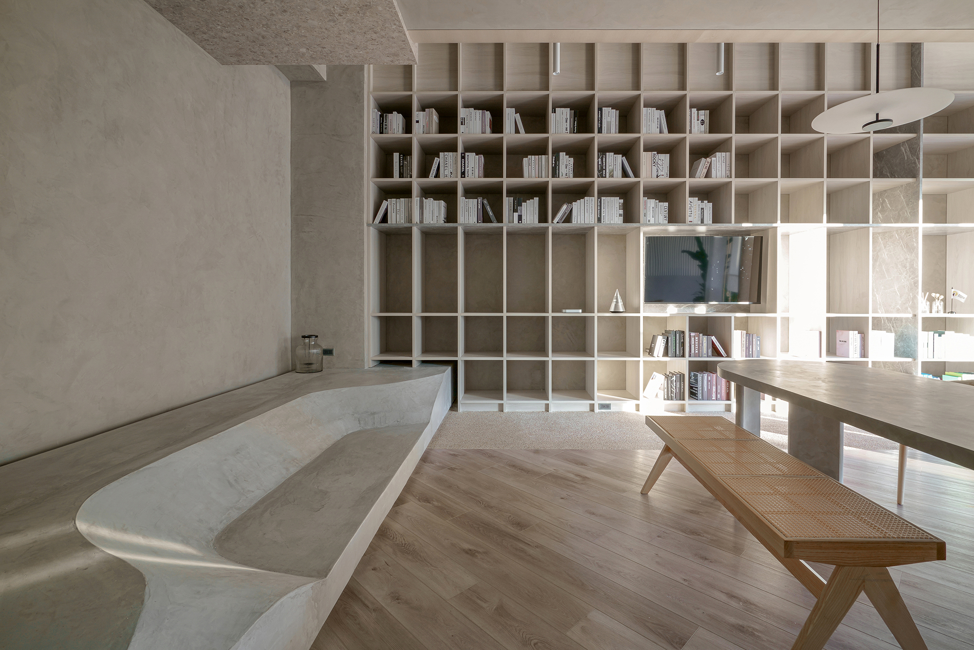
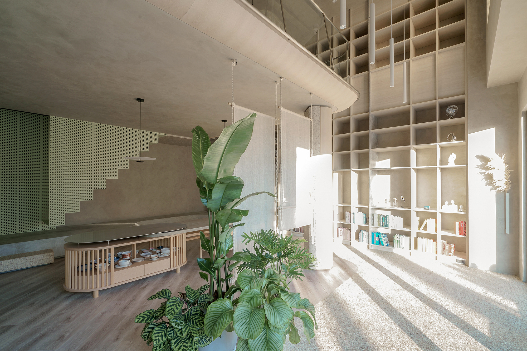
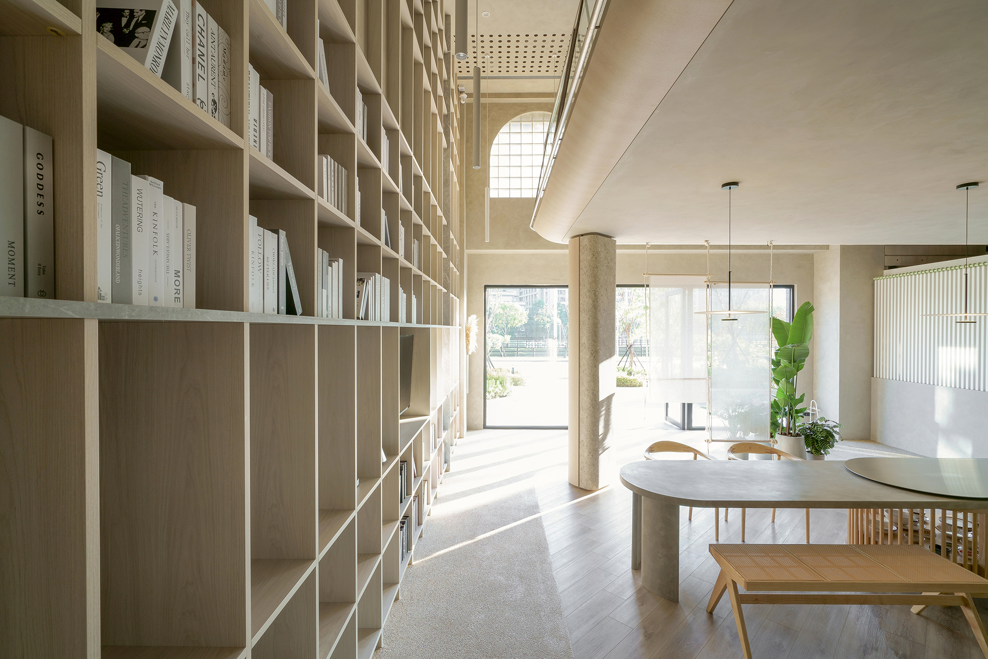
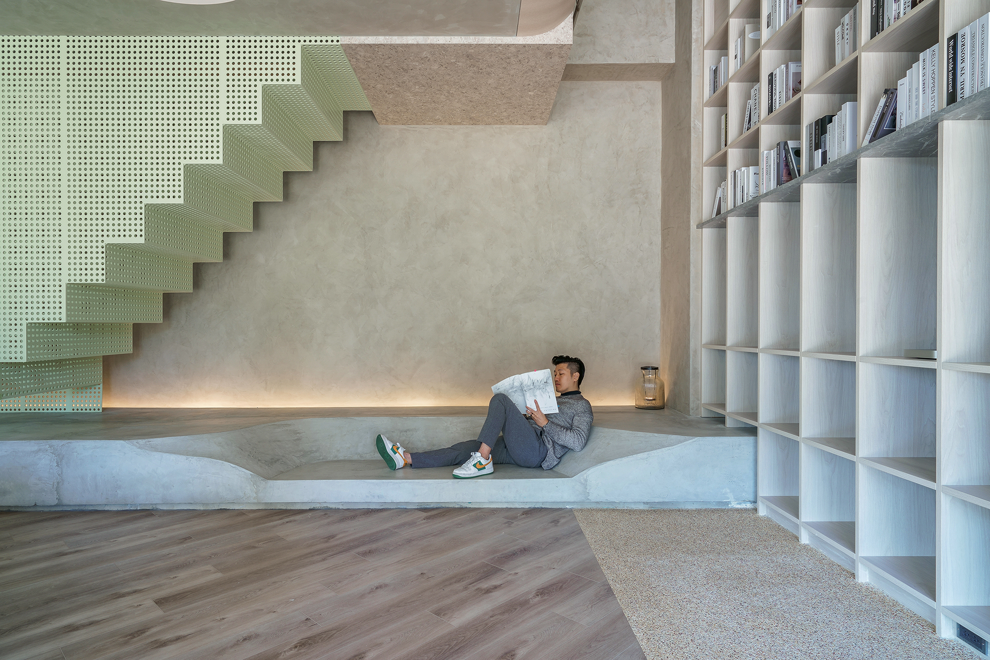
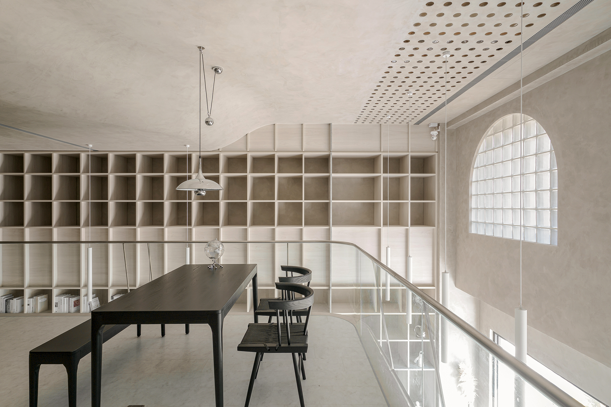
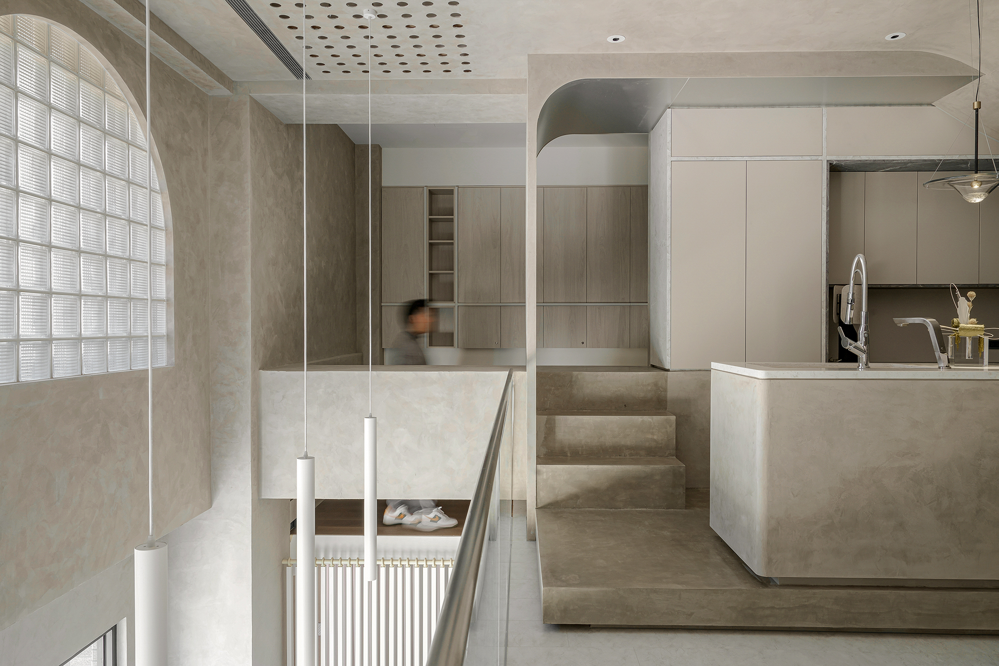
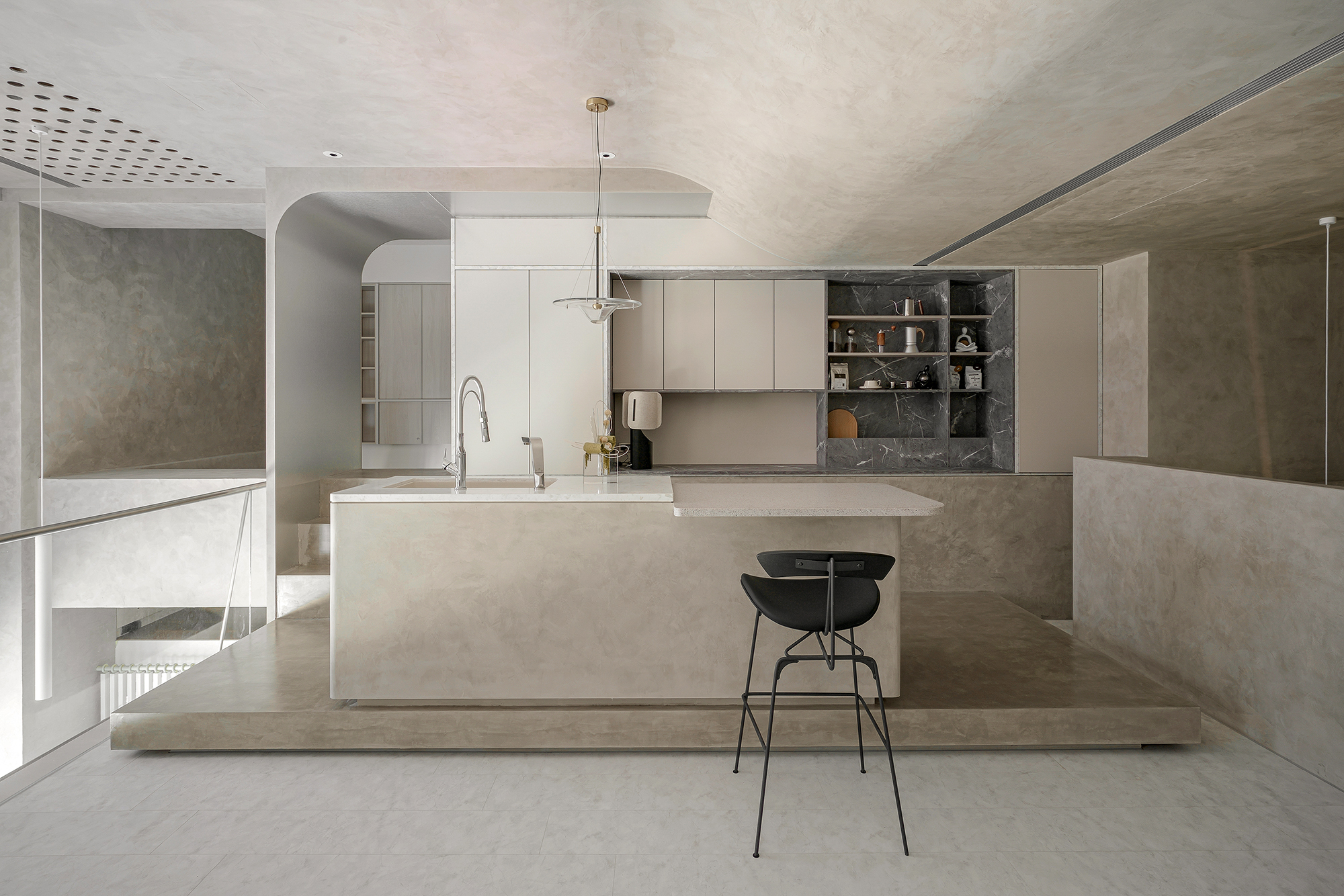
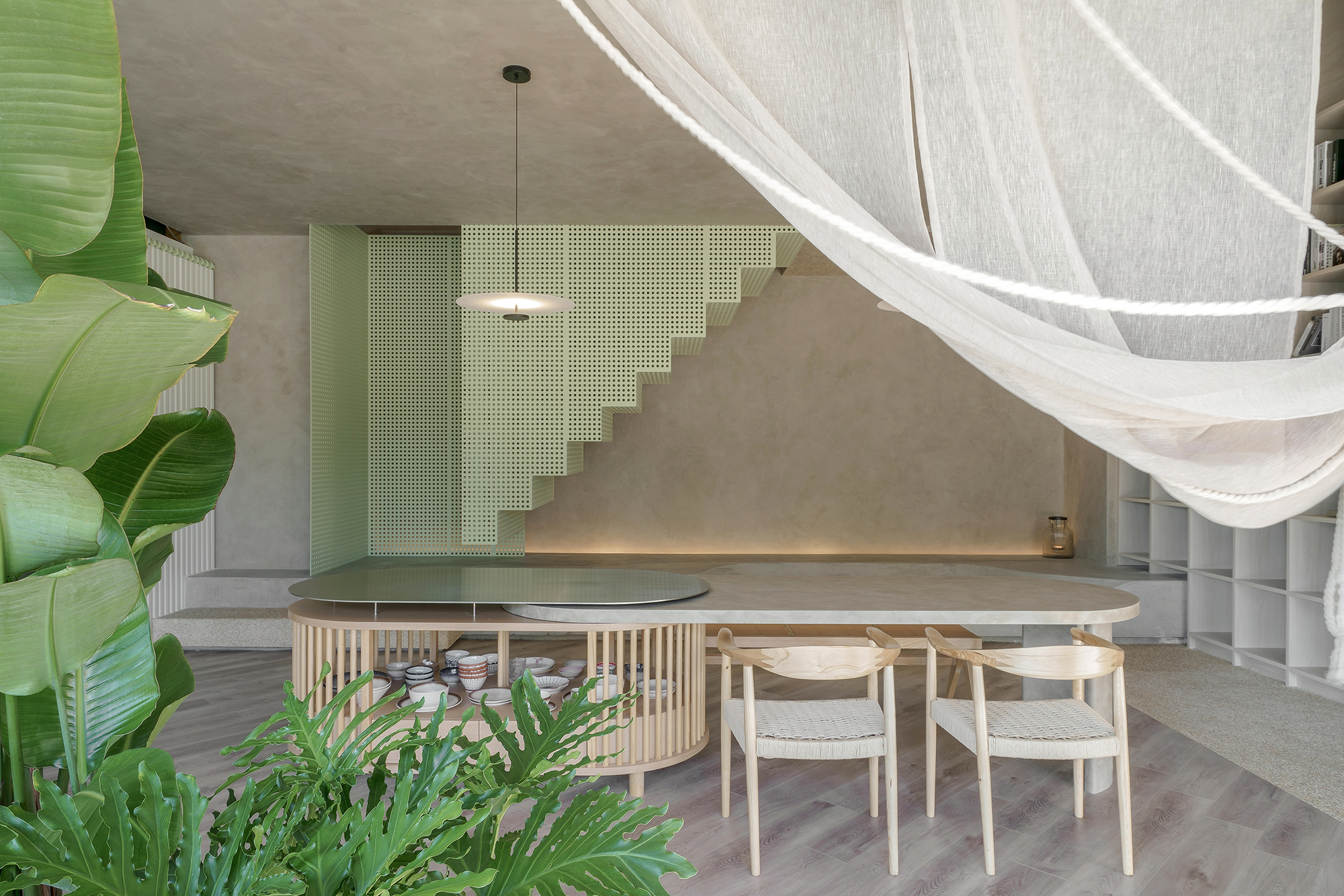
In the high-ceiling space, the upper and lower floors are separated, and cantilever beams are used to divide the inner and outer areas. A through-type design is adopted to connect the upper, lower, left and right work spaces, and bookcases are used to express the height of the interior. Four different floor heights are used indoors to overcome the problem of beams and columns being located in the middle of the space. It also makes the circulation more interesting through the setback design of the floor slabs, and obtains more daylight.
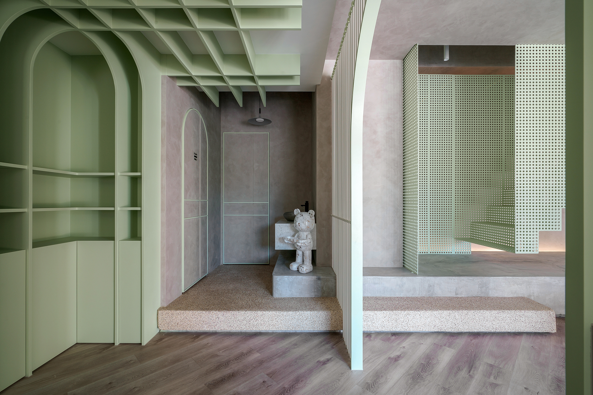
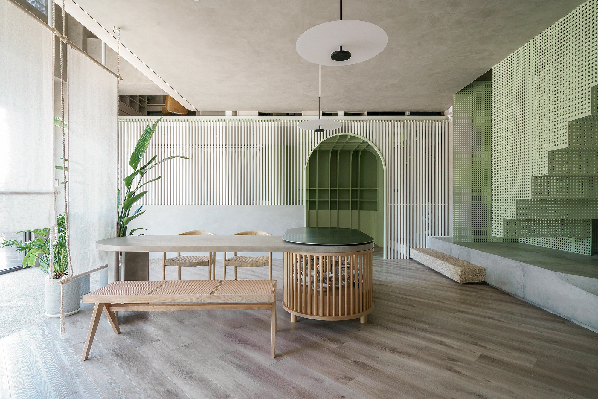
The indoor color scheme uses yellow, green and gray as the main axis of the space. The first floor space is full of green vitality with green and yellow wood grains, and the second floor space deliberately uses a large amount of gray to eliminate the boundaries of the ceiling.
In the same place, on different floors, I hope to bring visitors different feelings and at the same time feel harmony.
Under the concept of eclecticism and minimalism, we capture elements of different styles and implement simple ideas, remove branches and strengthen the performance of materials, so that the seemingly simple field has the thinking that is expected to be explored.
Credits
