2024
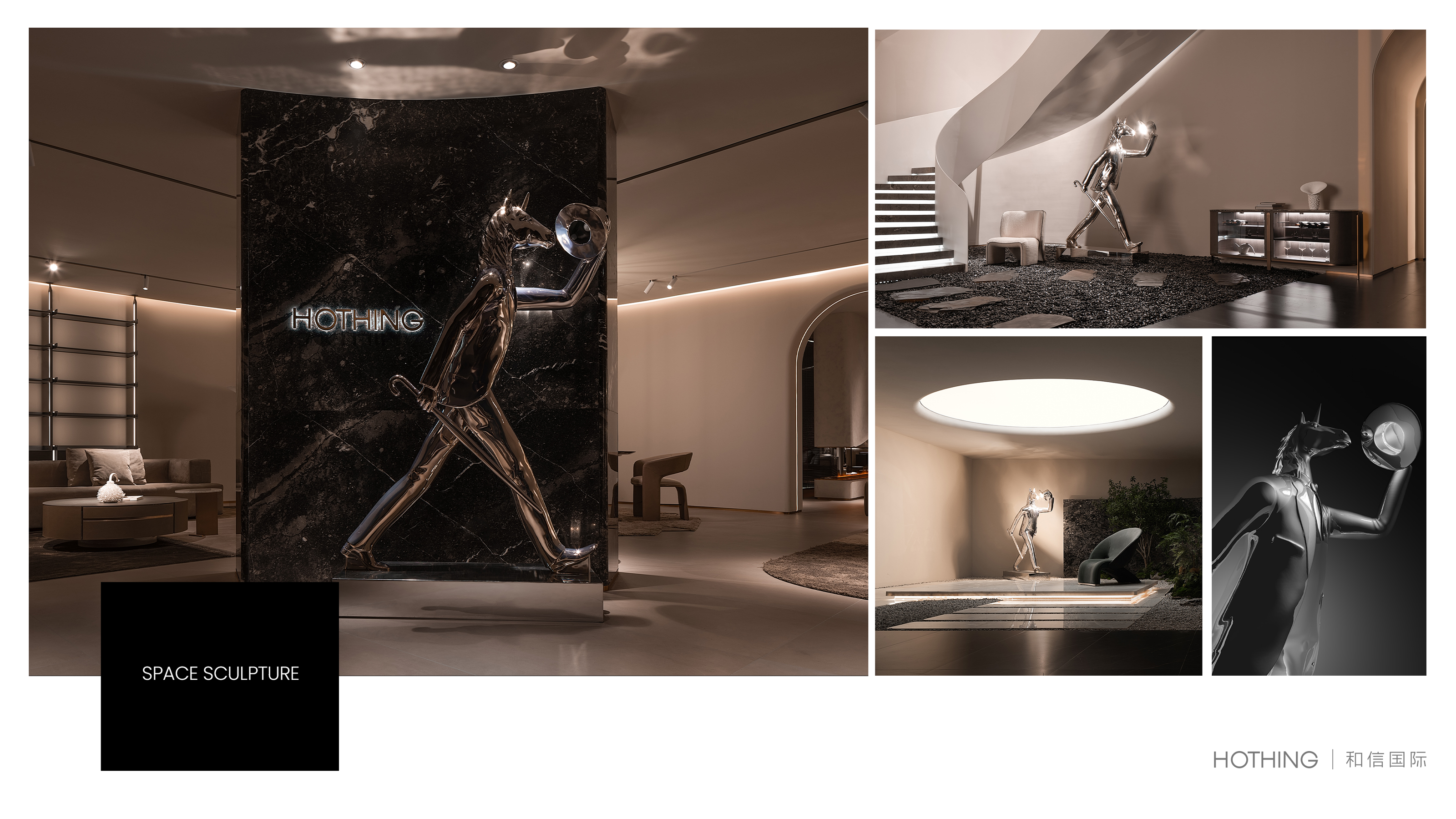
HOTHING
Entrant
Shenzhen HOTHING International Home Furnishing Co., Ltd.
Category
Communication Design - Icon
Client's Name
-
Country / Region
China
Gallery
About The Entry
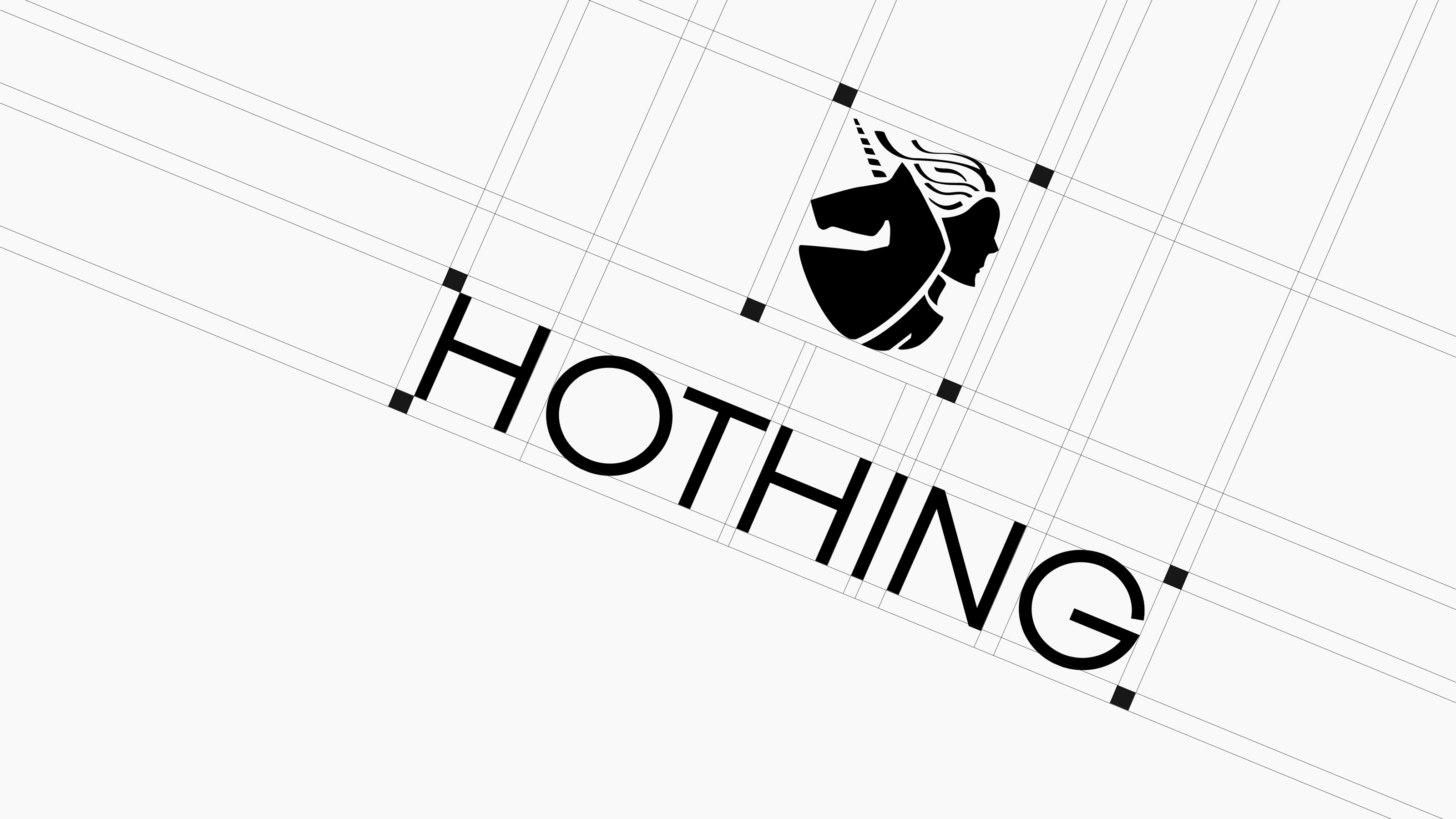
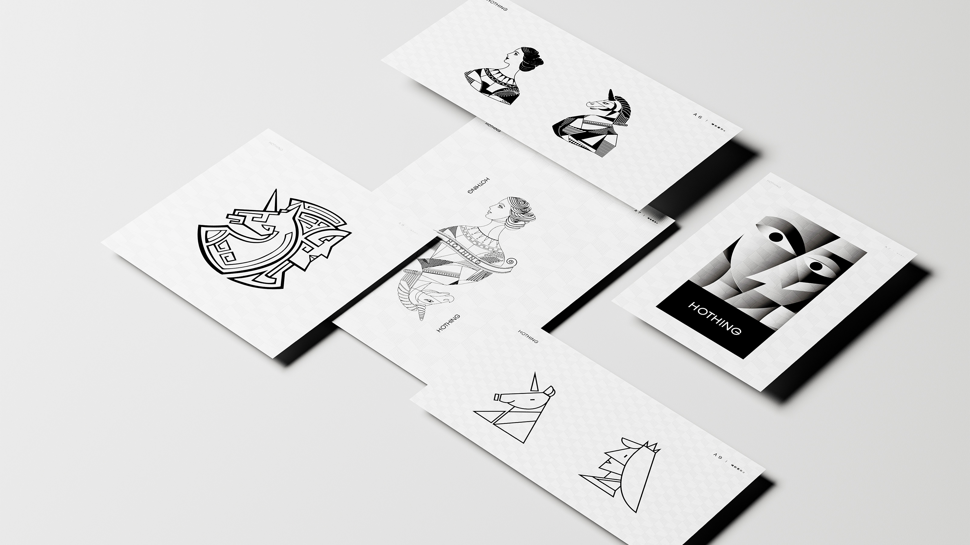
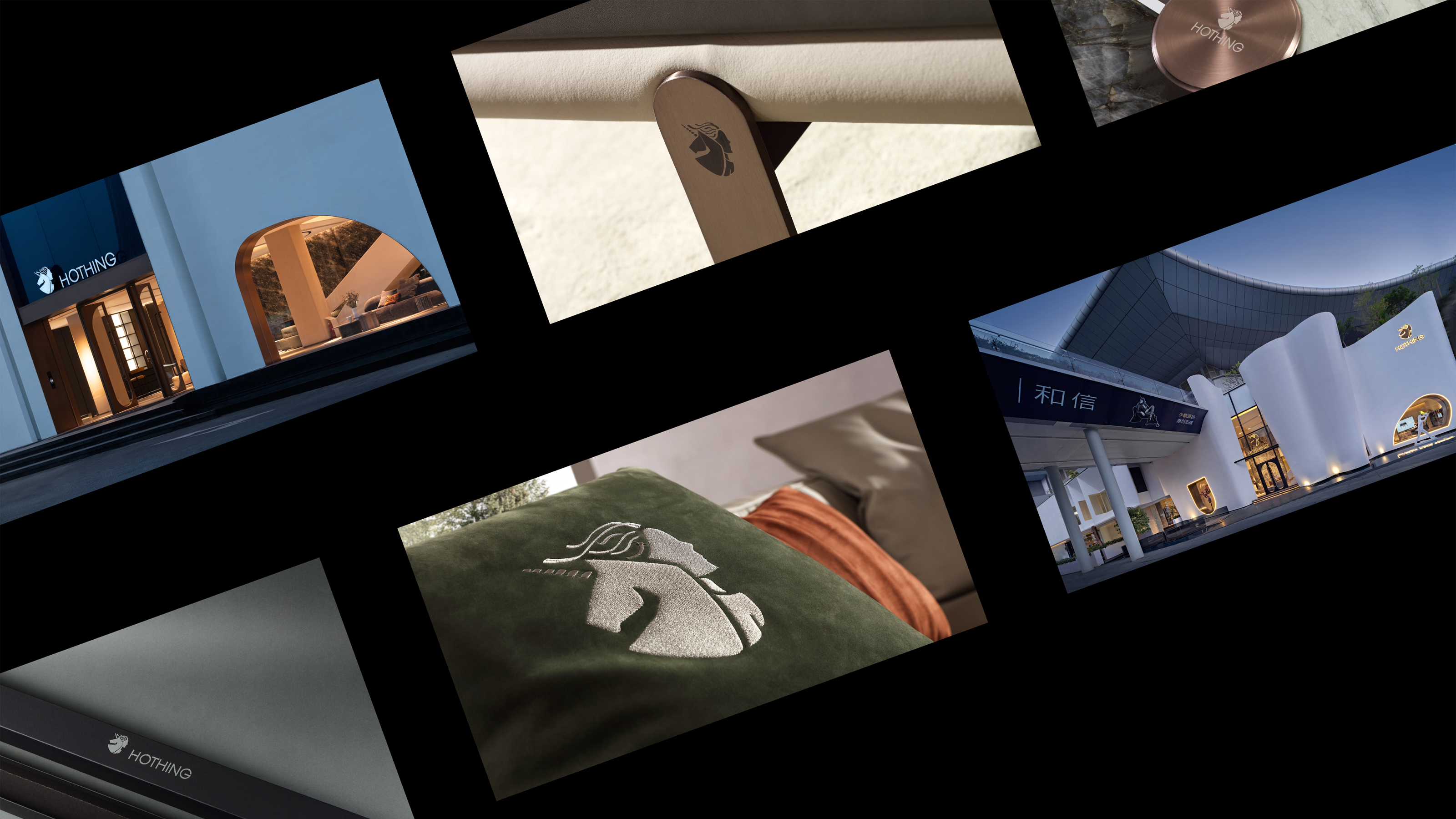
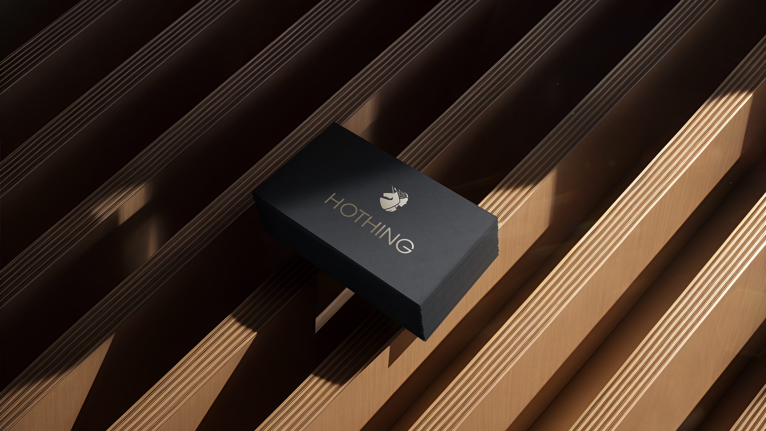
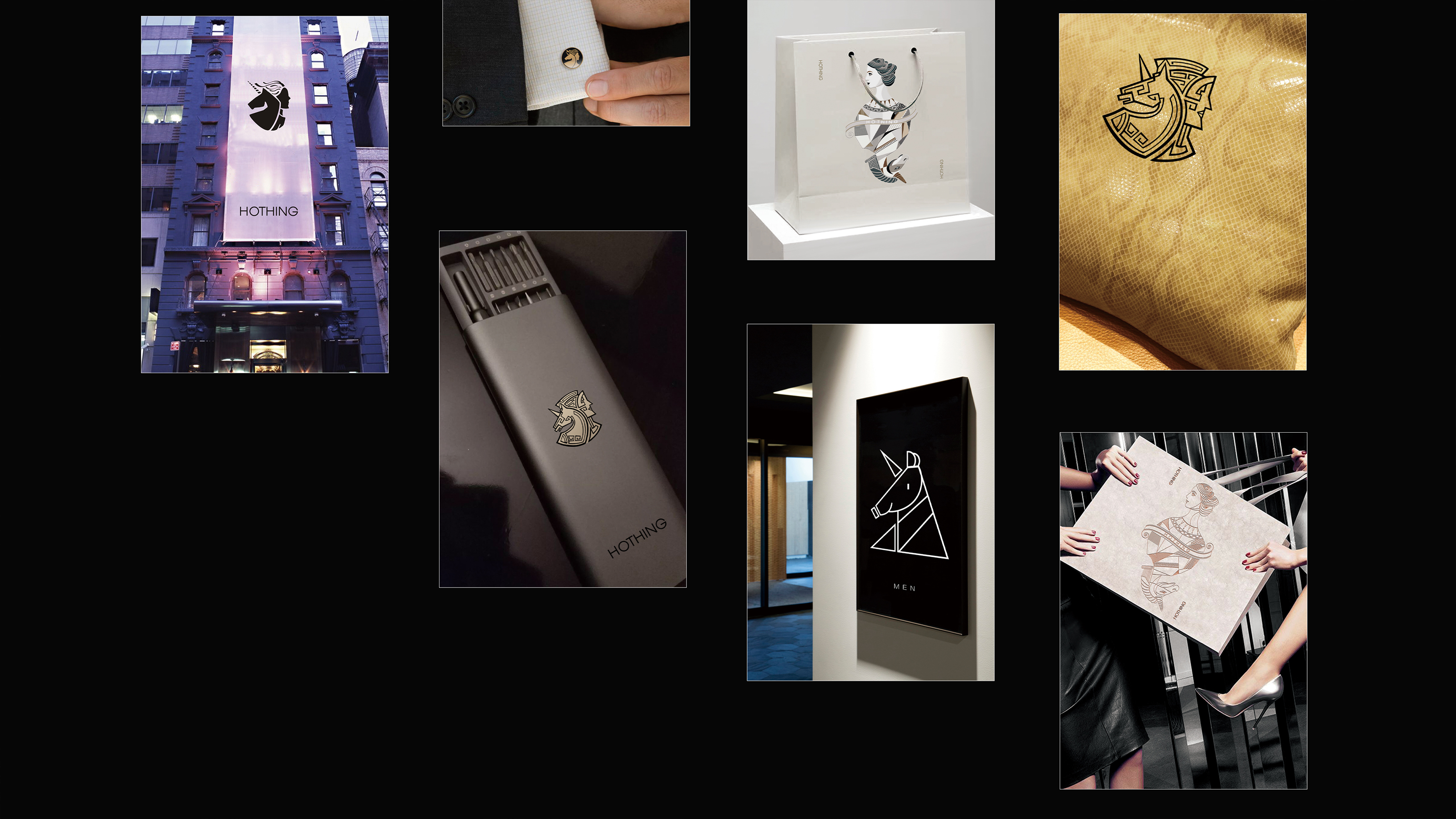
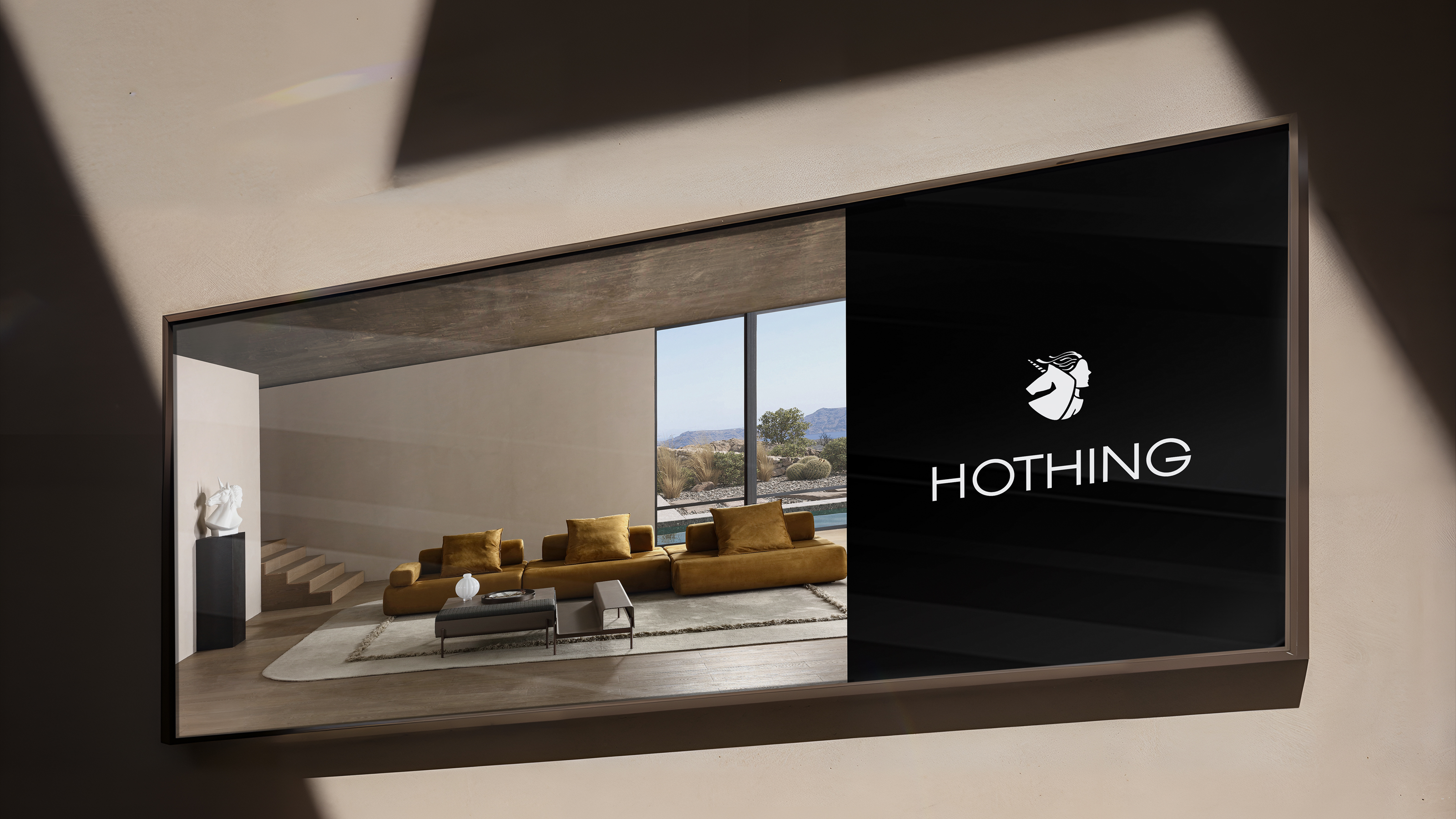
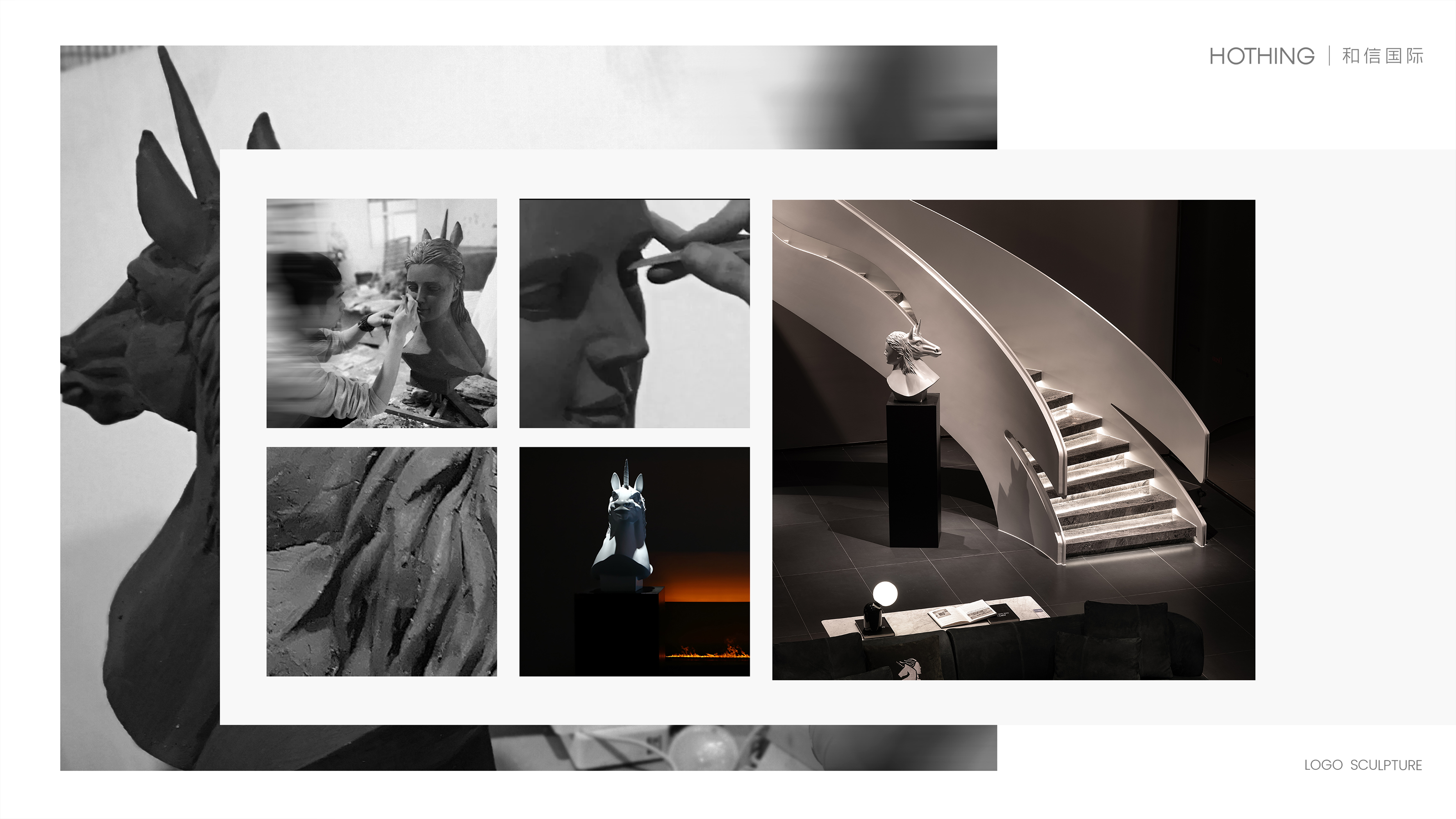
As the emblematic logo of the HOTHING brand, its design draws inspiration from the mythical unicorn and the muse, where the unicorn represents purity and creativity, and the muse symbolizes the wellspring of artistic inspiration. This fusion of elements not only embodies the brand's core spirit of inspiration and passion, rationality and obsession, independence and freedom, but also visually creates an image that is both strong and graceful. The design philosophy of "The Minority, I Am the Style" runs through the brand ethos of HOTHING, representing not just a quest for original design, but also a tribute to the mavericks of every era who dare to be different. HOTHING eschews mediocrity, committing itself to infusing unconventional life concepts into every product it creates, turning them into expressions of a lifestyle. HOTHING employs an international design language, with the black-and-white depiction of the unicorn and muse abstracted to form a distinctive graphic language. This not only exhibits an artistic aesthetic but also embodies the brand’s independent spirit. Whether on product packaging, store decor, or digital platforms, this design approach ensures the logo maintains high recognizability across all backgrounds, leaving a lasting impression on consumers.
Credits
Entrant
DNMH AGENCY | ZITE
Category
User Interface Design (UI) - Podcasts
Entrant
DBN (Shanghai) Lighter Co.,Ltd
Category
Product Design - Hobby & Leisure
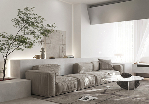
Entrant
Zhang Wu, Yang Haobo
Category
Interior Design - Living Spaces