
2025
PGRACE
Entrant
Yunnan Landee Biotechnology Co., Ltd
Category
Packaging Design - Cosmetics & Fragrance
Client's Name
Yuntao Tu
Country / Region
China
Gallery


About The Entry
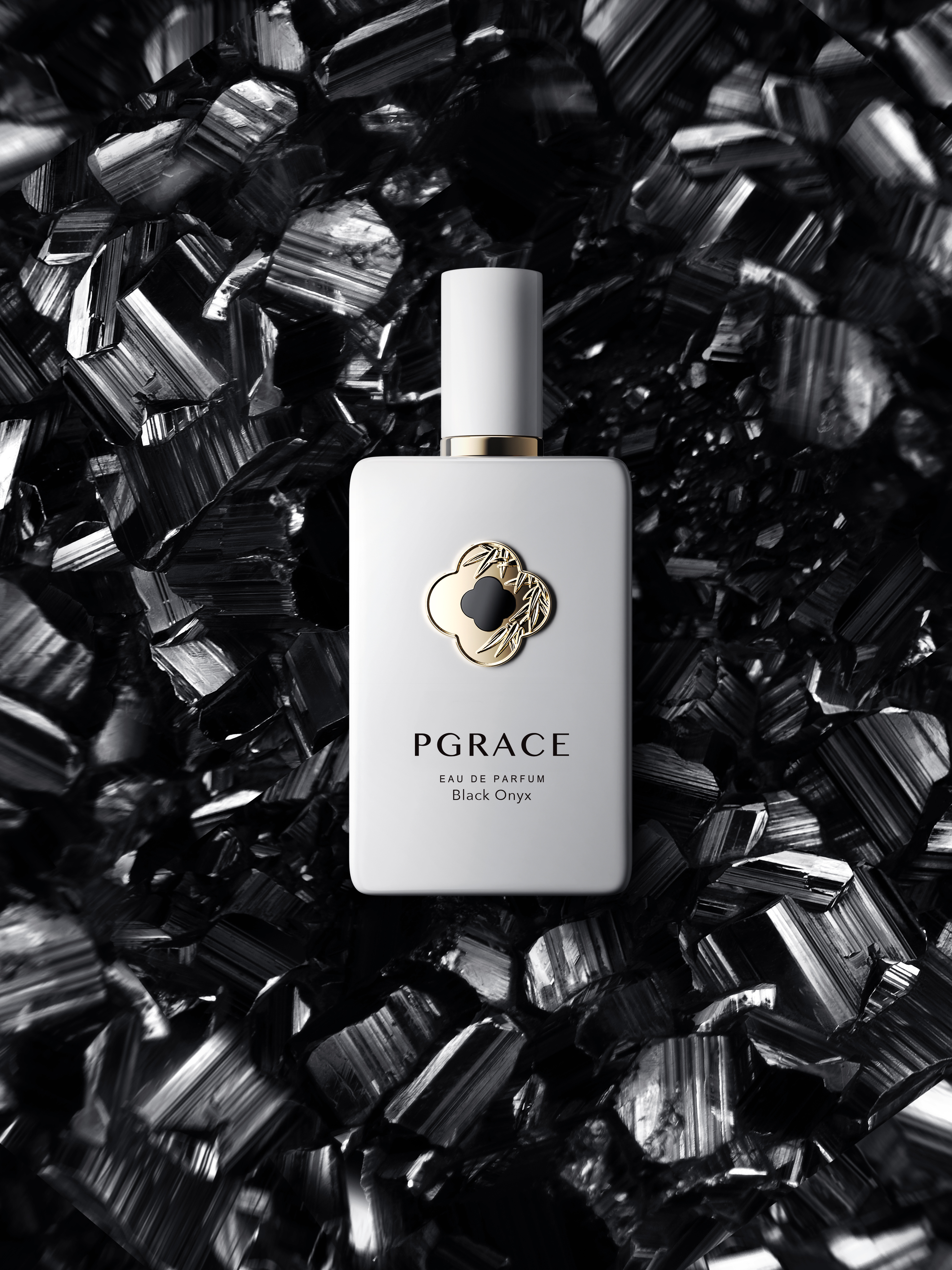
This perfume collection redefines packaging by integrating jewelry craftsmanship with industrial design. Featuring a porcelain-white bottle adorned with a bamboo-engraved clover metal plate and inlaid with genuine, ultra-thin gemstones, it creates a unique visual identity where each stone represents a distinct scent and personality.
The design transforms the perfume bottle into a piece of art. The body features a pristine, porcelain-white finish, evoking the warmth of traditional ceramics. The visual centerpiece is a clover-shaped metal nameplate, meticulously engraved with delicate bamboo leaf patterns. In a pioneering move for the industry, an ultra-thin natural gemstone is hand-inlaid at the center of the clover. This innovative application of jewelry-grade inlay techniques elevates the product from a mere container to a symbol of luxury and exclusivity.
The concept harmonizes cultural symbols to tell a story of virtue and fortune. The Clover serves as a universal symbol of luck and is also an ancient decorative motif in China. This is intertwined with Bamboo, a profound symbol of the "Junzi" (noble gentleman) in Chinese culture, representing integrity and resilience. The design creates a dialogue between the pursuit of luck and the maintenance of noble character.
The most distinctive feature is the use of gemstones to visualize scents and personalities. Instead of text labels, the natural gemstones serve as the primary identifier, endowing each fragrance with a specific spirit:
Tiger's Eye: Represents Power and Courage.
Black Onyx: Represents Unwavering Confidence.
Mother of Pearl: Represents Flawless Purity.
Malachite: Represents Health and Vitality.
Green Chalcedony: Represents Good Fortune.
This approach allows consumers to select a fragrance that resonates with their inner self or current emotional state.
Beyond aesthetics, the design prioritizes ergonomic interaction. The cap utilizes a precision magnetic closure system. This ensures the bottle is effortless to open and close, providing satisfying tactile feedback and a seamless user experience that reinforces the product's high-quality positioning.


Entrant
CayKnight.AI
Category
User Experience Design (UX) - Health / Fitness / Wellness