2025
Medicine King Jigong Capsules
Entrant
HONG KONG MEDICINE KING JIGONG CO., LIMITED
Category
Packaging Design - Medical
Client's Name
-
Country / Region
Hong Kong SAR
Gallery


About The Entry
The tin packaging for Medicine King Jigong Capsules leverages its name to convey authority and heritage. The title "Medicine King" signifies that the formula is rooted in ancient methods passed down from Sun Simiao of the Tang Dynasty. This connection evokes consumer trust in the profound legacy of traditional Chinese medicine. The figure of Jigong, widely celebrated in folklore as a compassionate "Living Buddha," is known for his merciful heart and use of ingenious remedies to rescue people from suffering. His image projects both approachability and credibility, effectively bridging the gap between the brand and its consumers. Positioned as the core IP of the packaging, his likeness strengthens brand recall and infuses the product with emotional resonance.
The entire packaging adopts a distinct Hong Kong-style visual language. Characteristic bilingual typography, clear geometric layouts, and refined textural details pay homage to the classic design vocabulary of local Hong Kong pharmaceutical and cosmetic products from the 1980s and 1990s. This stylistic choice underscores the brand's Hong Kong origins, communicating a sense of high quality and established trust.
The color scheme draws inspiration from the earth-toned monk's robe and light brown hat worn by the protagonist in the 1985 Hong Kong ATV television series "Jigong." This taps into a shared cultural memory. The Jigong portrait is framed by radiating lines emanating outward, creating a classic radial composition. All lines diverge from the central point, guiding the viewer's focus directly to the character. This results in a powerful visual focal point and immediate recognition. Here, cultural symbolism, emotional connection, and brand value achieve a high degree of unity.
Furthermore, and quite intriguingly, the entire top surface of the tin lid is designed as a seal motif, reminiscent of a traditional token of trust. It symbolizes a promise of formula authenticity, traceable efficacy, and credible quality. Simultaneously, the square structure aligns with the geometric aesthetics of Hong Kong style, lending the overall visual a sense of order and ceremony.
Entrant
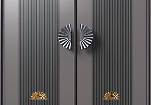
Zhejiang Huabiao Security Technology Co., Ltd.
Category
Product Design - Windows, Doors
Entrant
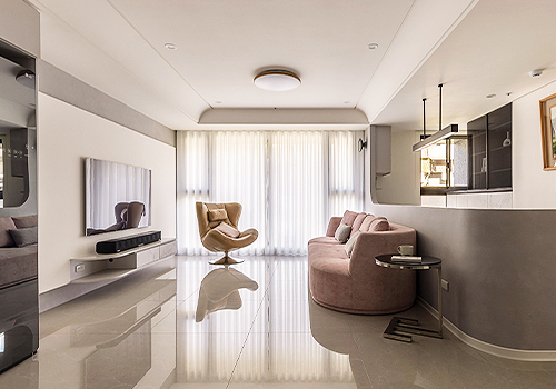
Feather Interior Design
Category
Interior Design - Residential
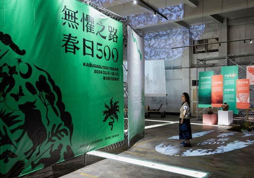
Entrant
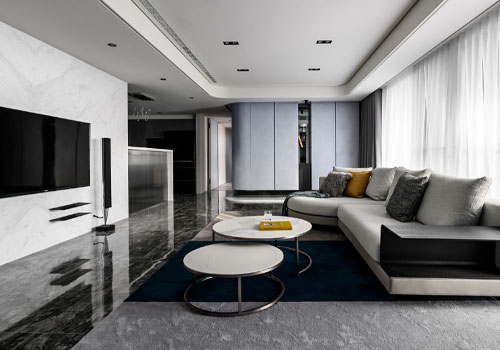
JILINYUAN Ltd.
Category
Interior Design - Exhibits, Pavilions & Exhibitions