
2026
ShineinLab Alpha Pro Product Package
Entrant
Wenyuan Gu
Category
Packaging Design - Beauty & Personal Care
Client's Name
Country / Region
China
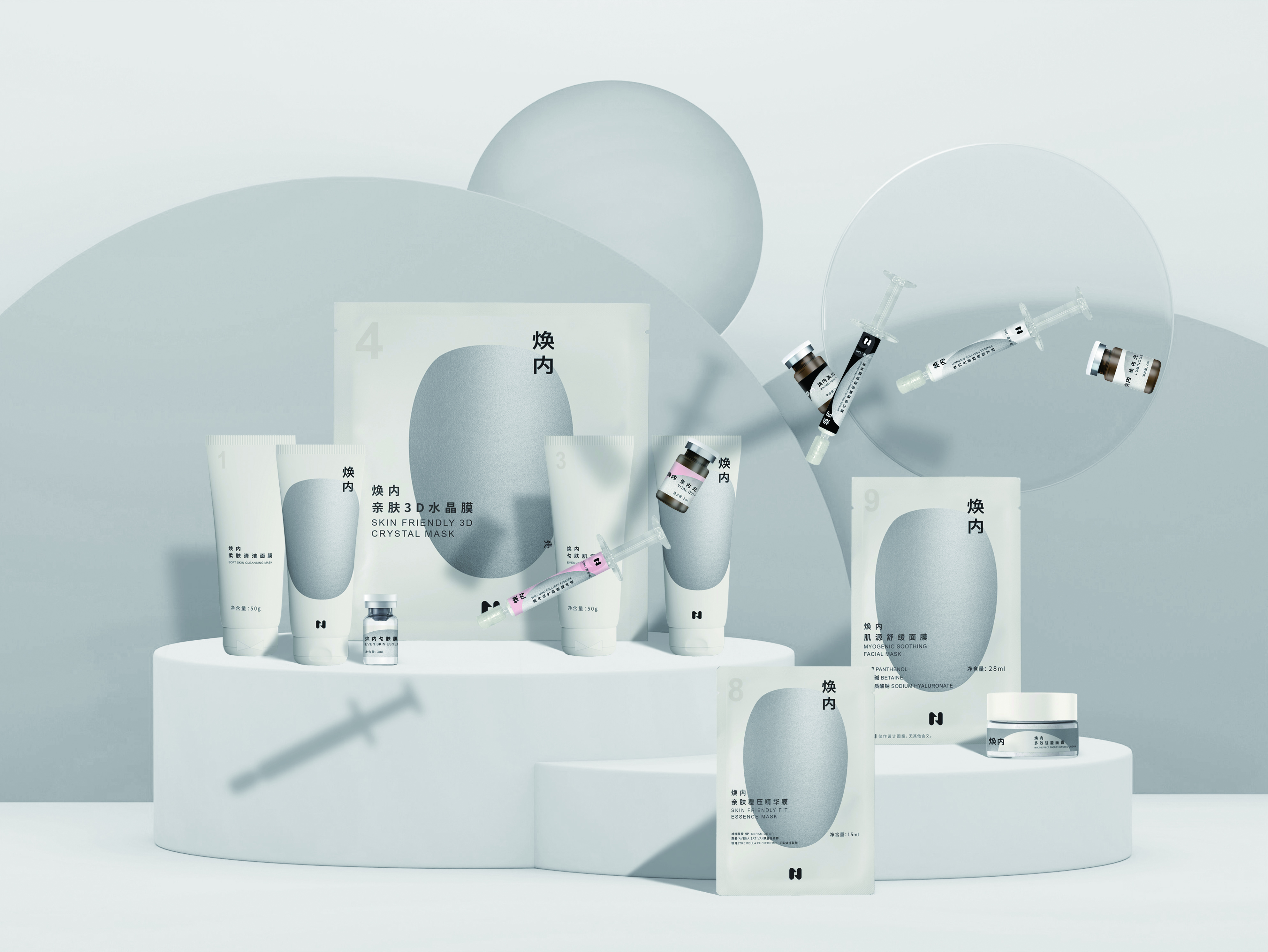
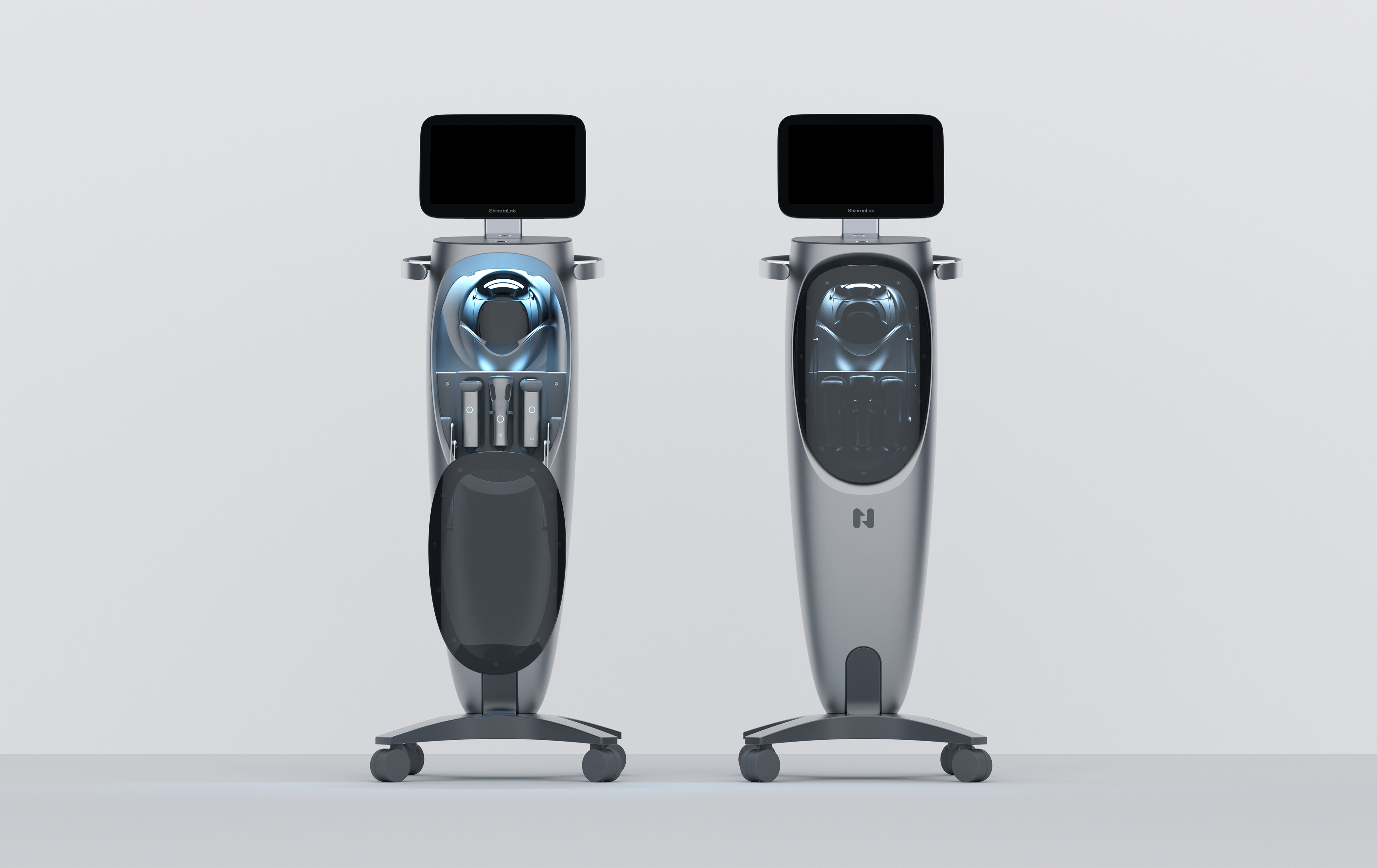
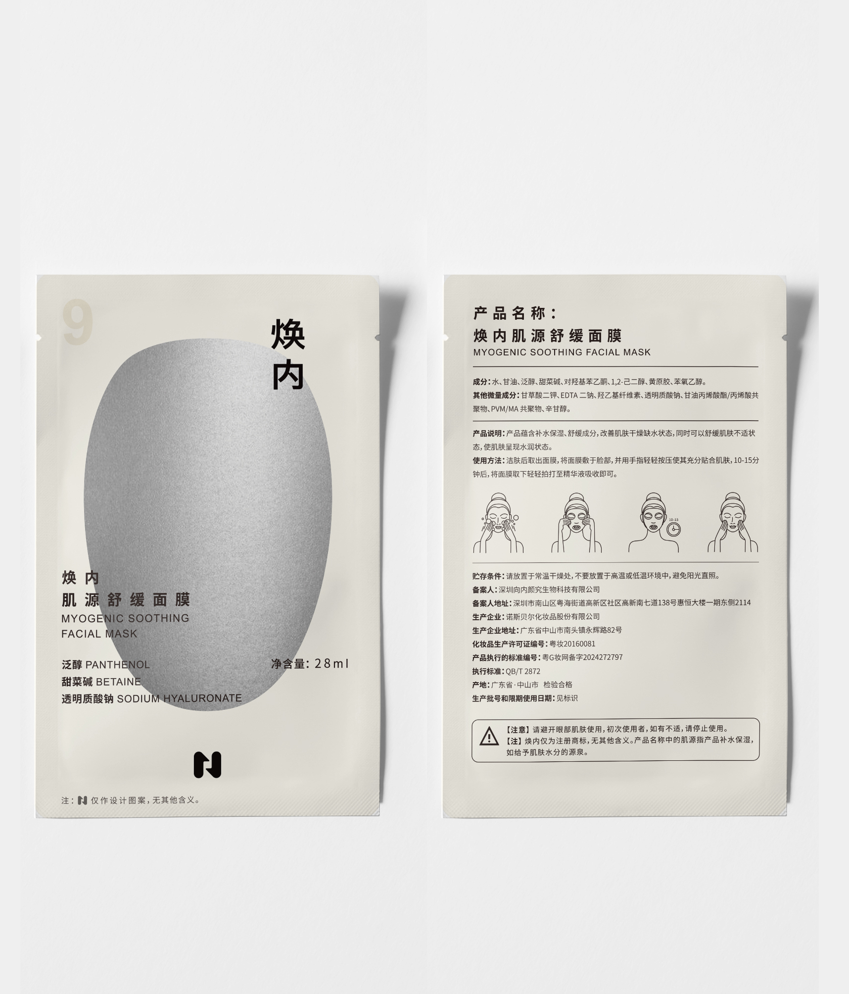
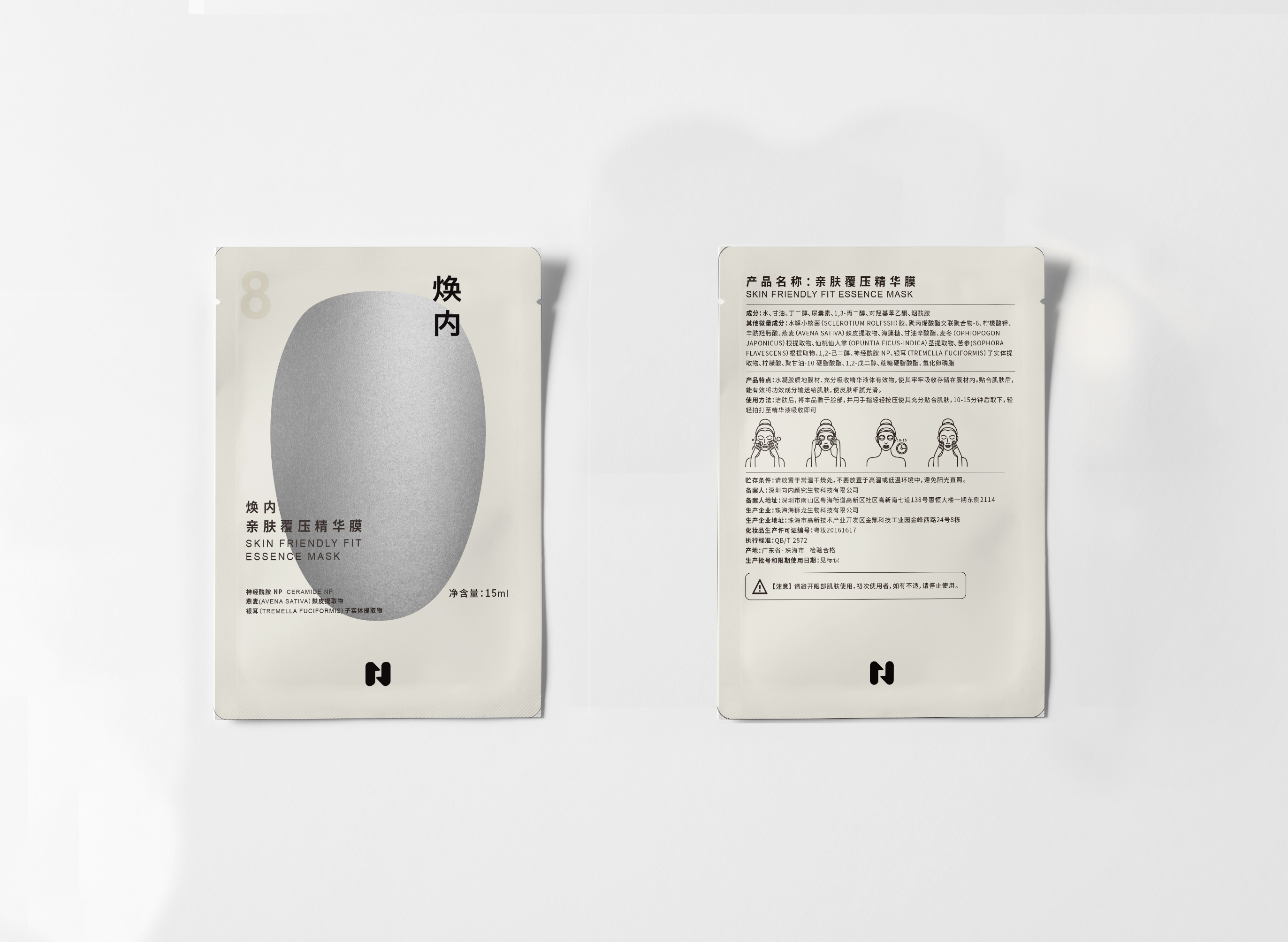
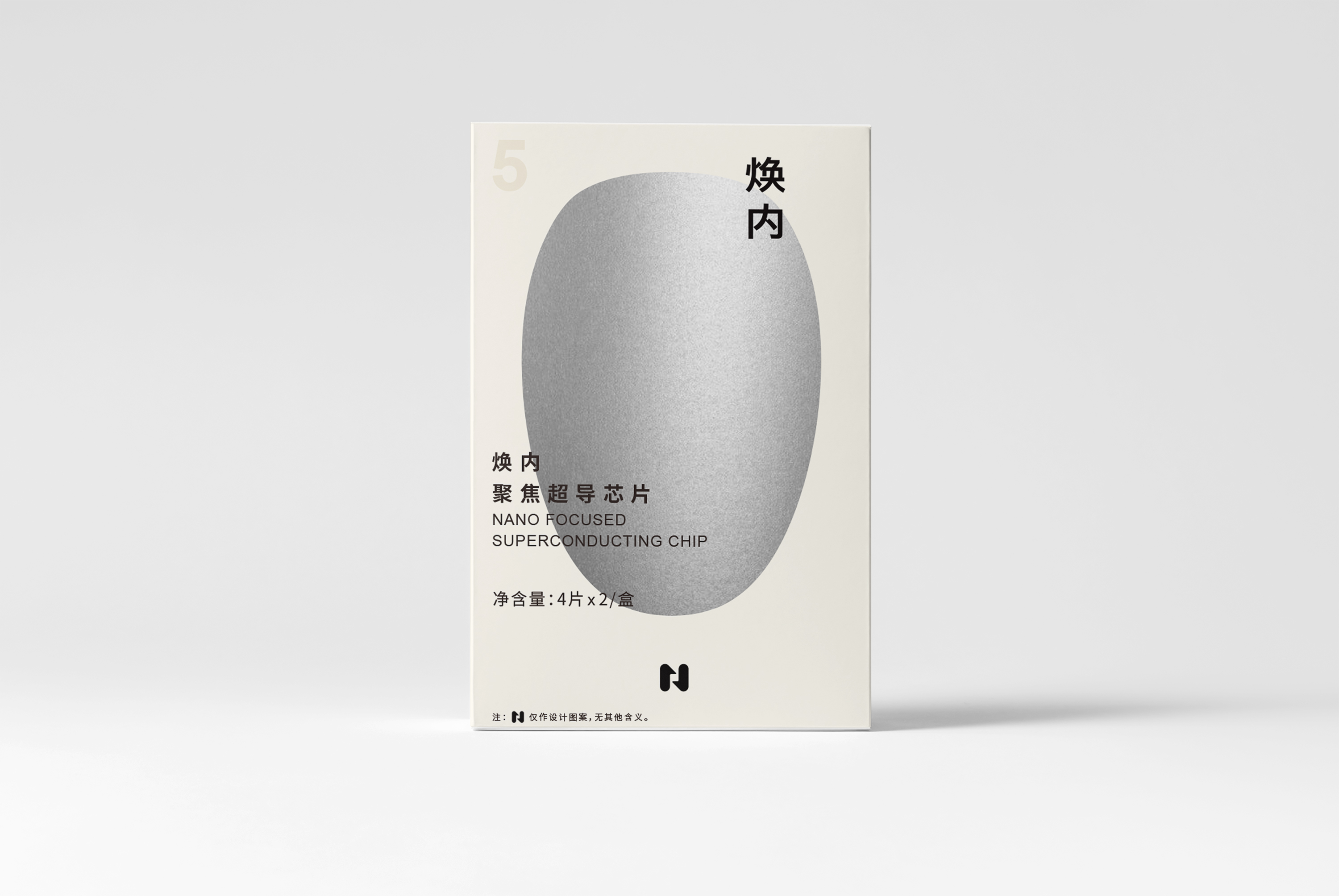
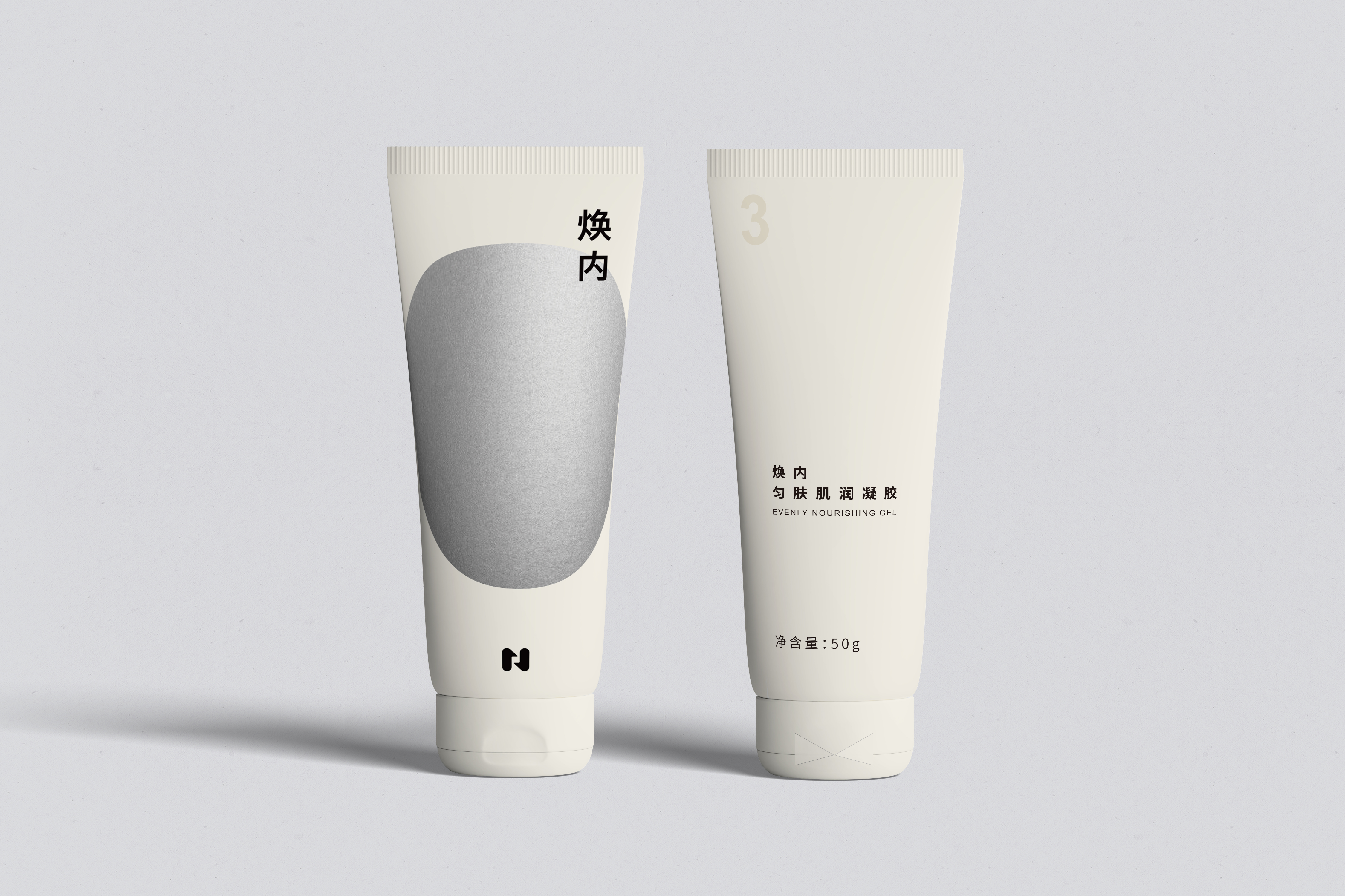
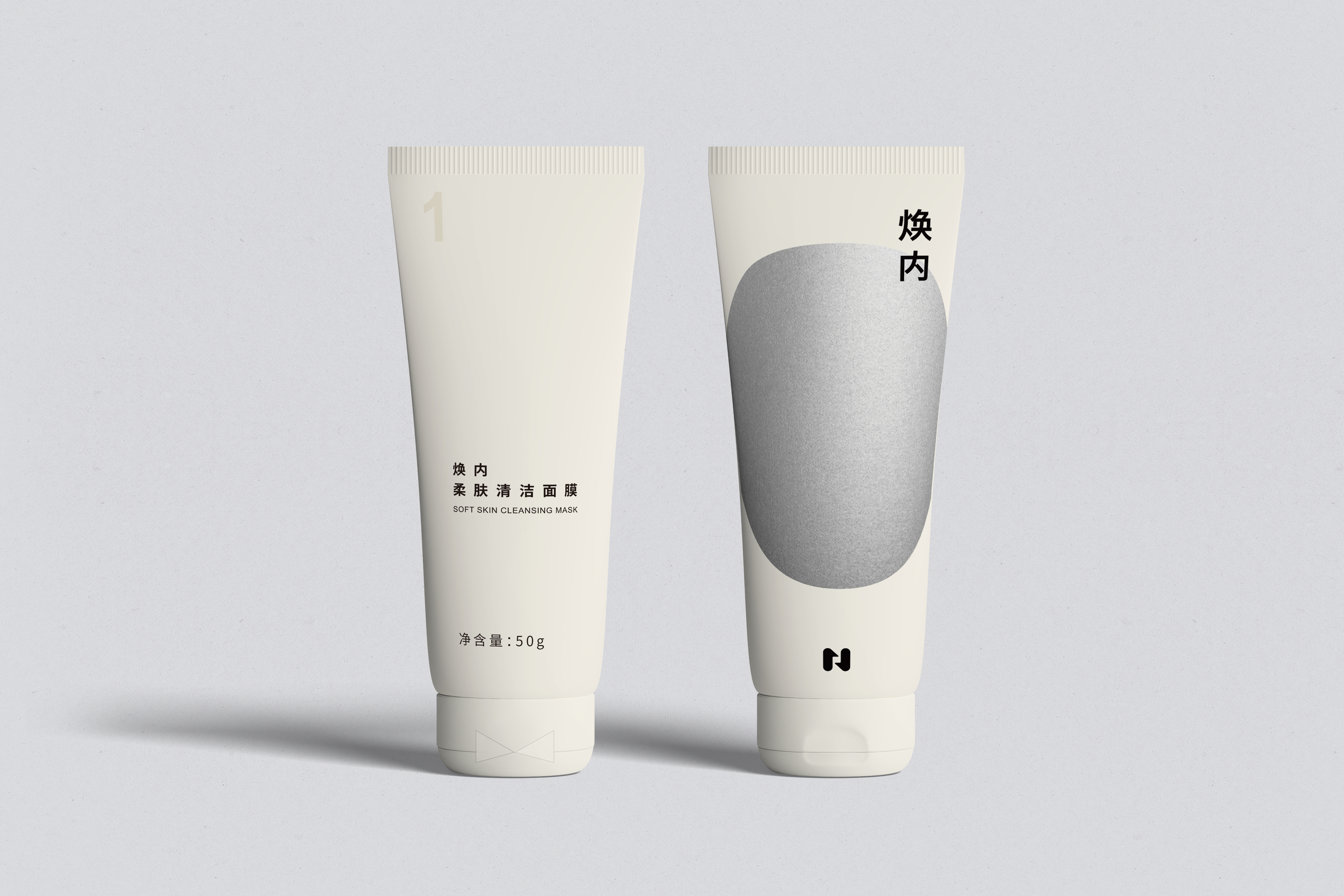
The ShineinLab Alpha Pro Product Package was designed as a supporting line for the beauty technology brand ShineinLab. As a device-centered skincare system, Alpha Pro emphasizes advanced technology and professional treatment results. The packaging therefore needed to communicate a sense of cutting-edge science while maintaining a soft, refined aesthetic that resonates with its primary audience—women. At the same time, the design had to clearly signal that these products are intended to be used together with the Alpha Pro device.
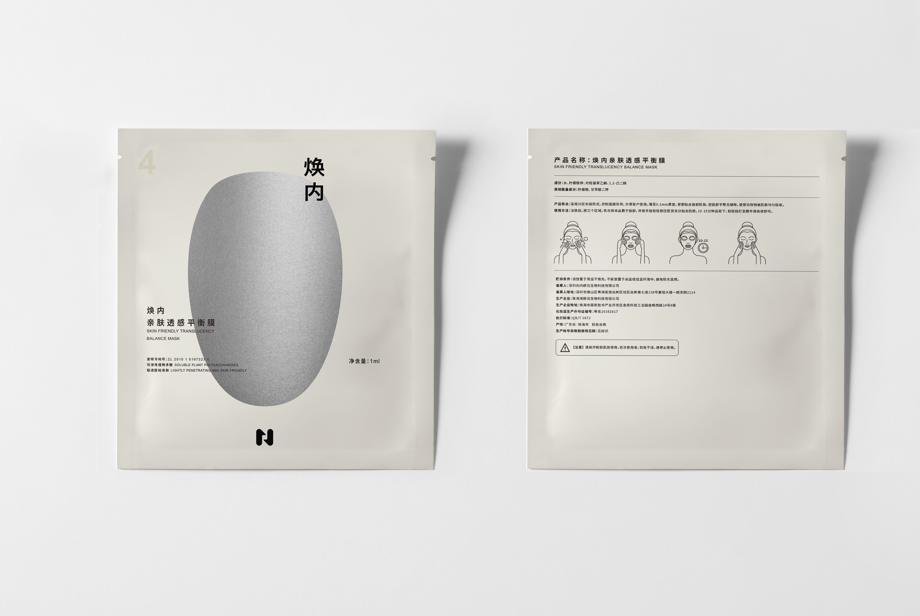
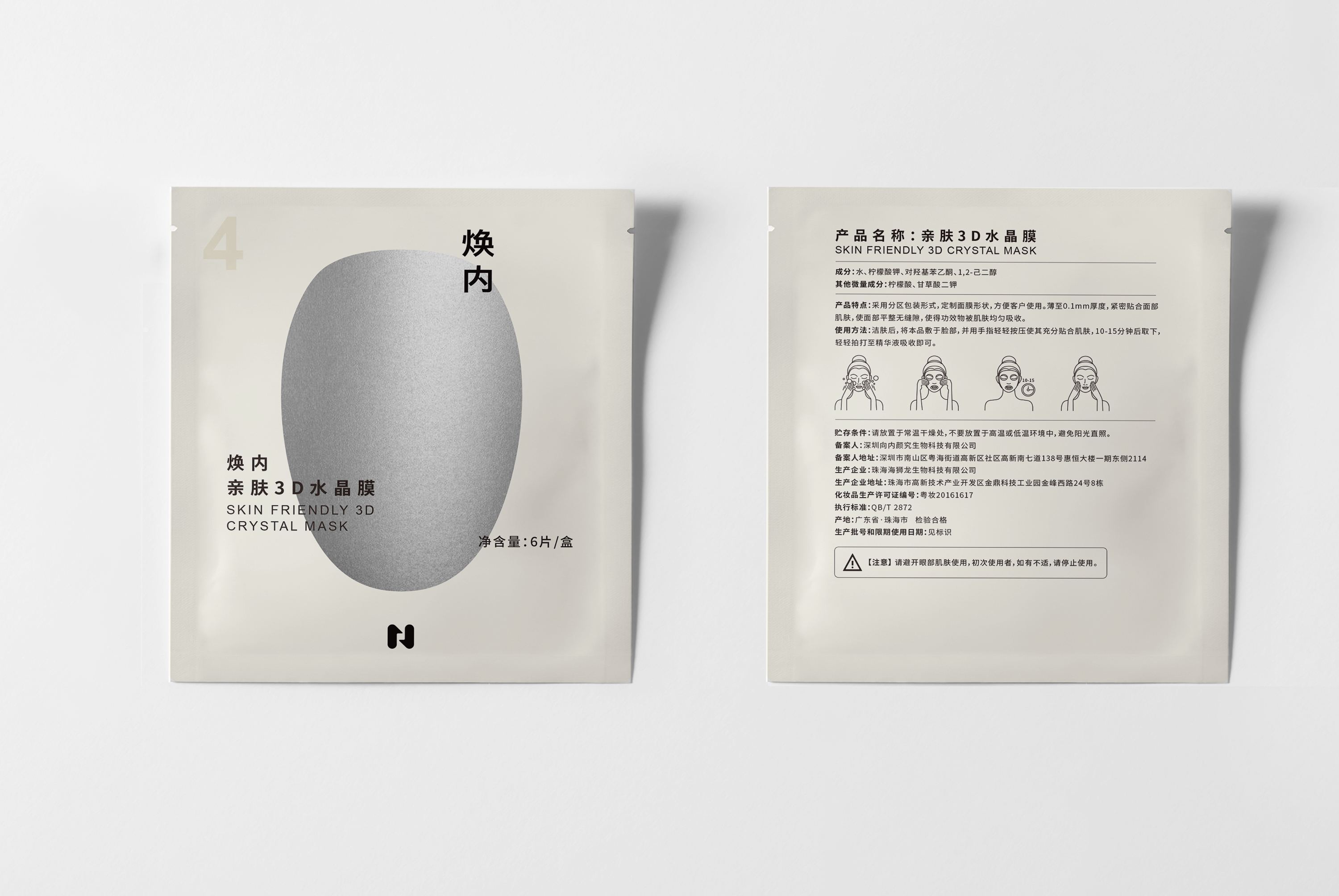
In the early stage of brand development, silver was established as the key brand color to convey a high-tech identity associated with precision and innovation. However, silver can also appear cold and distant. To balance this while maintaining a minimalist and premium aesthetic, extensive color exploration was conducted. A warm white palette was ultimately introduced to soften the metallic tone, creating a harmonious balance between technological precision and visual warmth. This combination allows the packaging to retain its futuristic quality while remaining approachable and elegant.
A crucial design element is the device’s chamber door, the most recognizable feature of the Alpha Pro machine. Inspired by the hatch of a space capsule, this form was translated into a key graphic motif across the packaging. Acting as a “visual hammer,” the shape subtly echoes the structure of the device, allowing consumers to immediately recognize the connection between the skincare products and the instrument.
The space-capsule inspiration also informs the visual presentation of the packaging. In the opening section of the project, several packages are shown floating in space, referencing the weightless environment of a spacecraft and reinforcing the futuristic narrative behind the device design.
Material and tactile experience were also carefully considered. The packaging features a matte metallic texture that visually and physically aligns with the machine’s surface finish, creating a cohesive sensory relationship between the products and the device.
By moving beyond the conventional visual language of professional beauty device packaging, the design emphasizes aesthetics, technological identity, and product-device connectivity, resulting in a cohesive product family that strengthens brand recognition across the Alpha Pro line.

Credits


Entrant
SOLVITA ICON
Category
Fashion Design - Footwear