2026
ROCKBUND VISUAL IDENTITY
Entrant
ROCKBUND
Category
Communication Design - Company Branding
Client's Name
-
Country / Region
China
Gallery


About The Entry
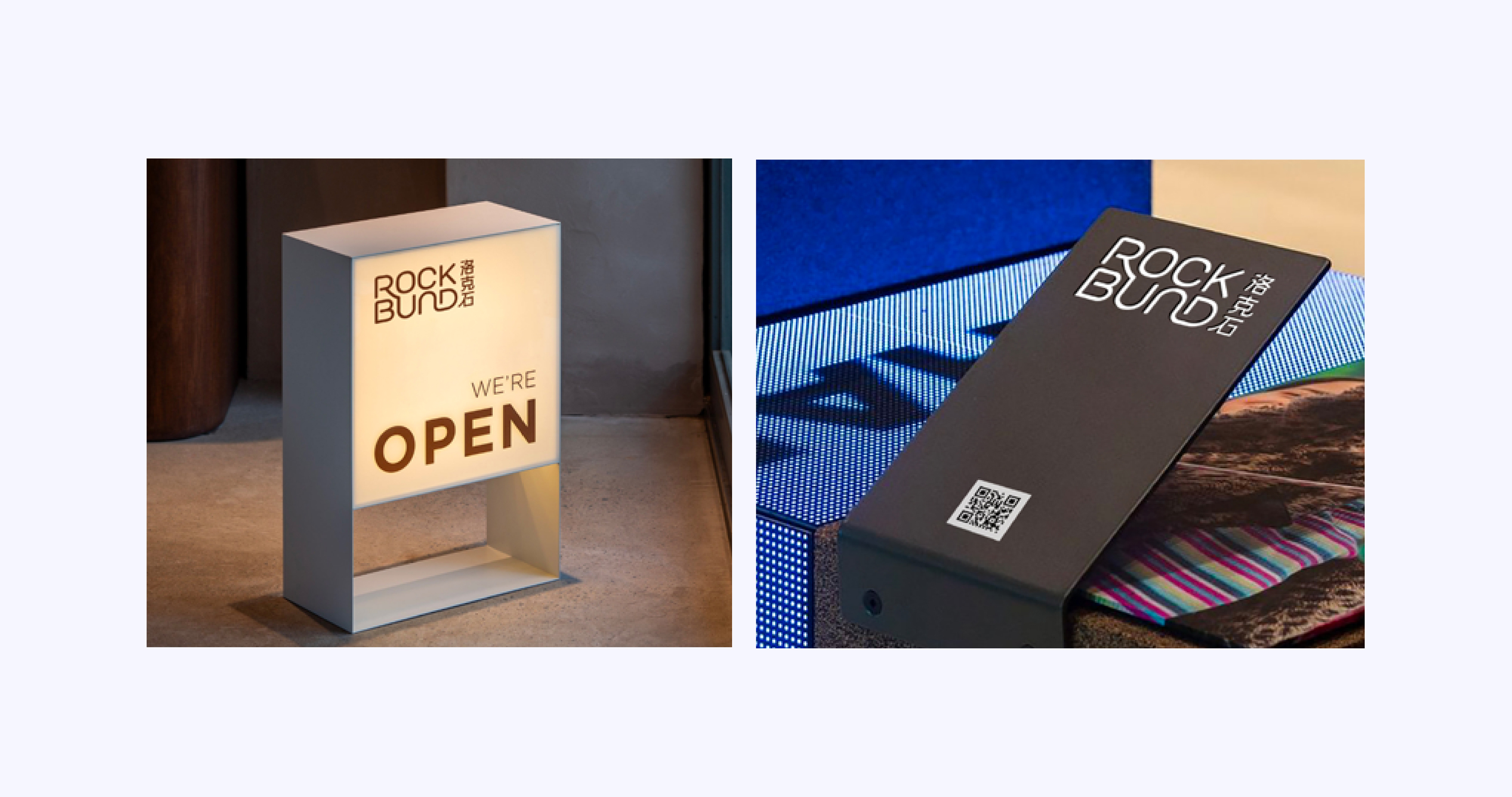
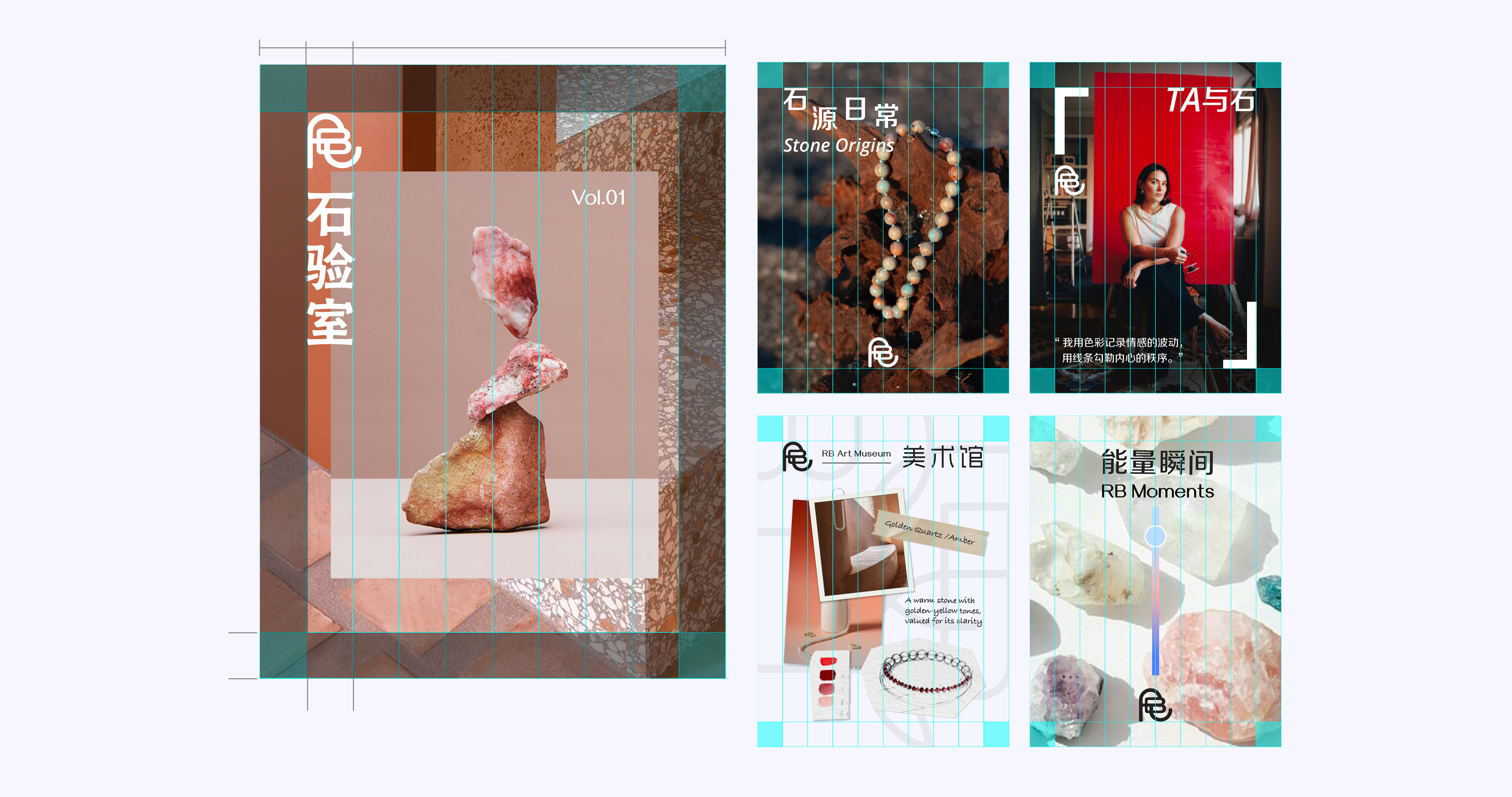
This is a brand identity system built around the core concept of ore. By integrating the stonework order of Rockbund's architecture with the organic forms of natural ore, it establishes a visual logic that balances rational structure with organic generation. This logic is ultimately distilled into a brand identity language that not only serves recognitive functions but also embodies the brand's emphasis on spatial connection and energy fluidity.
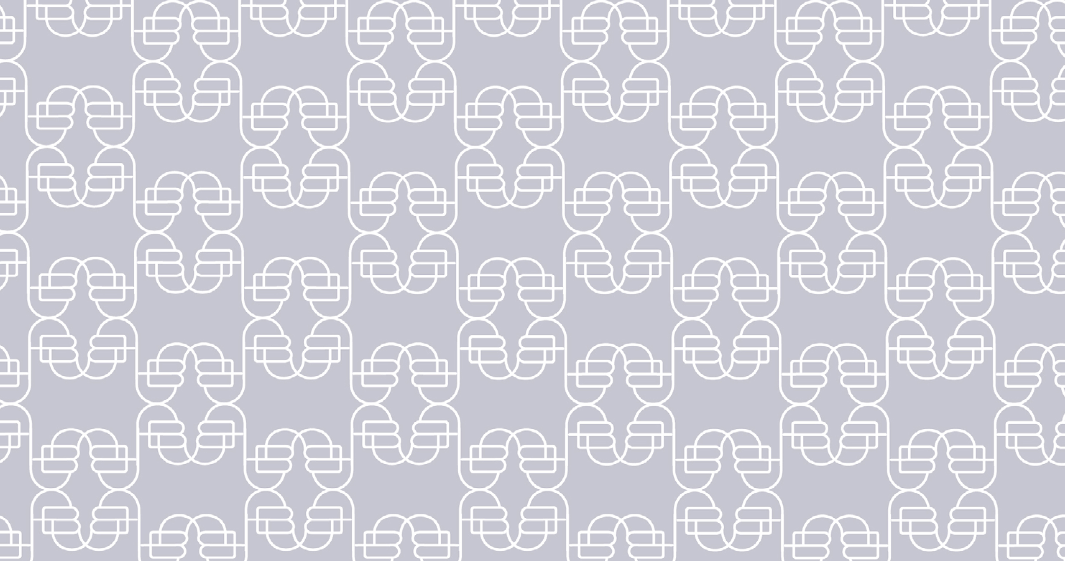
In terms of visual language, continuous, connected lines construct pathways for energy flow, while a geometric framework provides structural stability. Together, they create a tension between rational control and sensory expression. The letterforms are organized through coherent geometric lines, presenting a rhythmic, dynamic continuity that reinforces a unified brand identity. Drawing inspiration from the stonework of Rockbund's historic buildings and integrating it with letterforms, the monogram enjoys both cultural roots and high extensibility. It can be repeatedly applied across packaging, patterns, and spatial environments, further strengthening brand recognition.
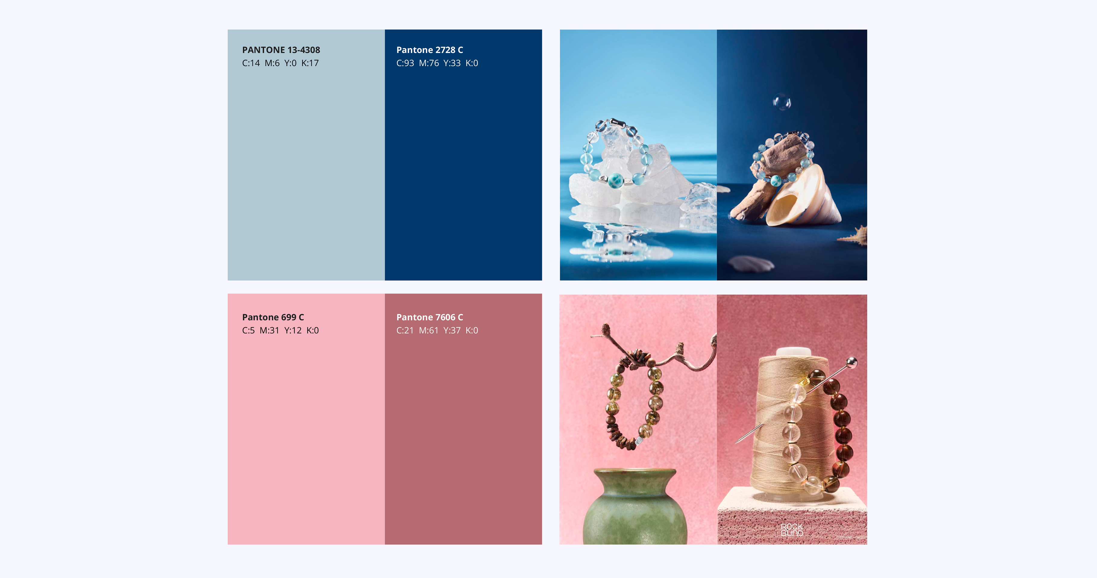
As for color, the system takes sky blue as its foundation, layered with a luminous gradient treatment to simulate the subtle variations of ore under different lighting conditions. More than an aesthetic element, color translates the brand's core qualities of energy, fluidity, and spatiality into a directly perceptible visual language, enhancing the emotional tension and atmospheric expression of the overall identity.
Credits
Entrant
Danting Li
Category
User Interface Design (UI) - Real Estate