
2026
Nardone – Never Obvious
Entrant
Poppins
Category
User Interface Design (UI) - Automotive
Client's Name
Nardone
Country / Region
United Kingdom
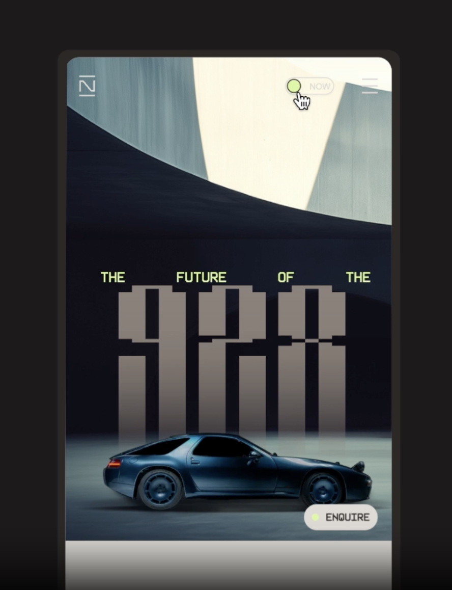
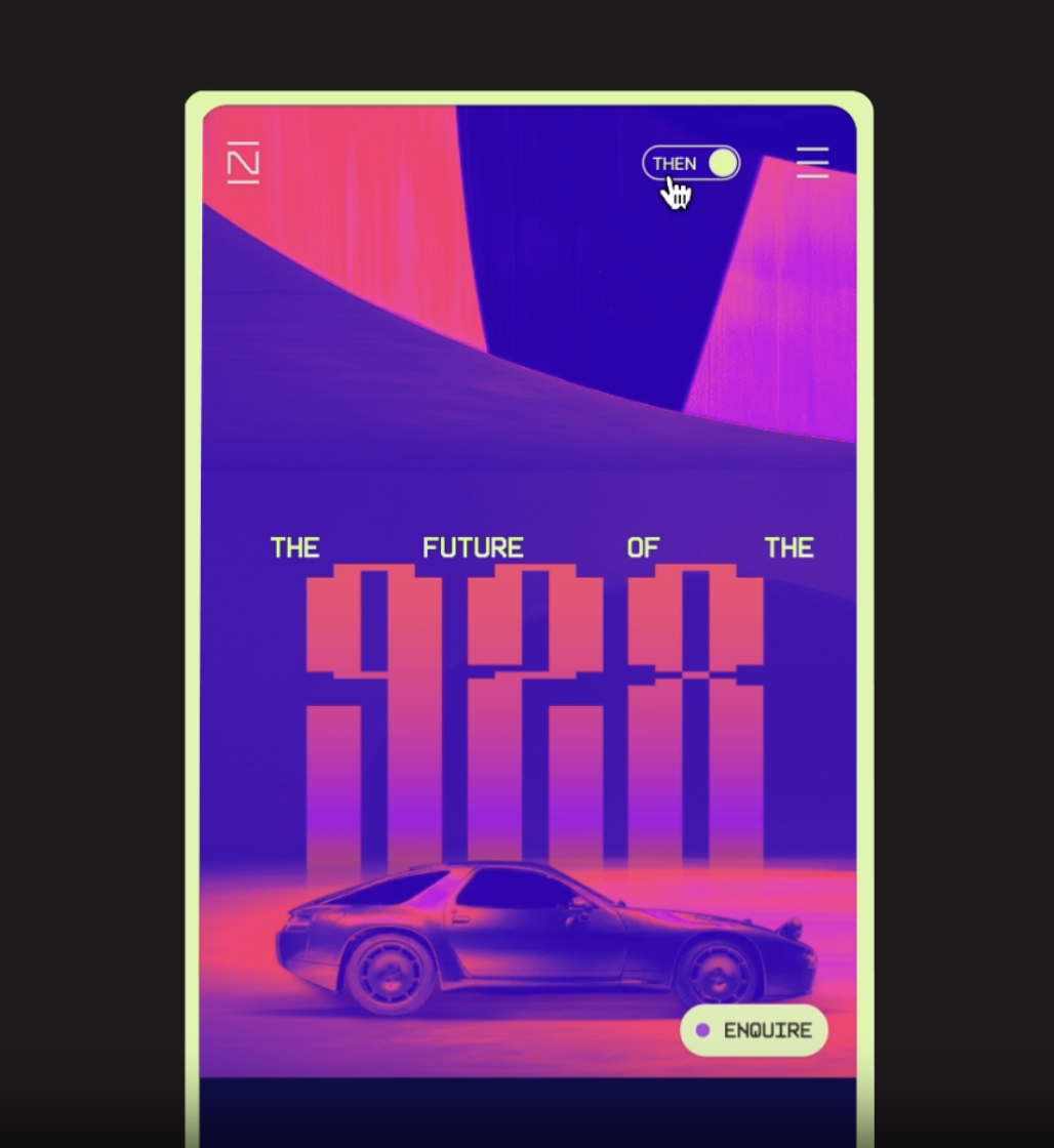
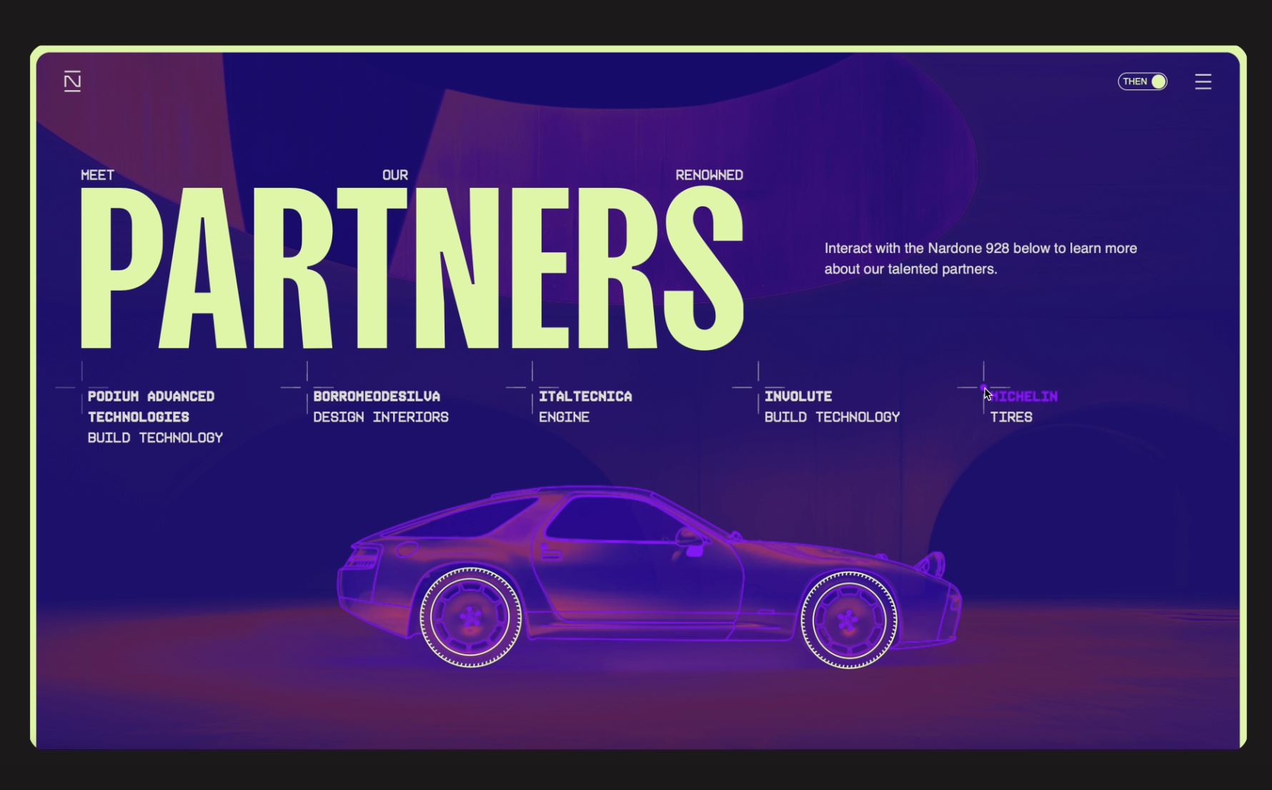
A brand full of surprises, Nardone Automotive came to Poppins with nothing but a name and a groundbreaking resto-mod in development. Together with founder Thierry Nardone, we built a brand and digital experience that embodied the spirit of a car long overlooked by other modifiers. When Porsche created the 928, they made something intentionally different, with its sights set firmly on the future. That same attitude became the foundation of Nardone. With a philosophy of ‘Never obvious’, the identity and website were designed to express a brand that sits between heritage and innovation.
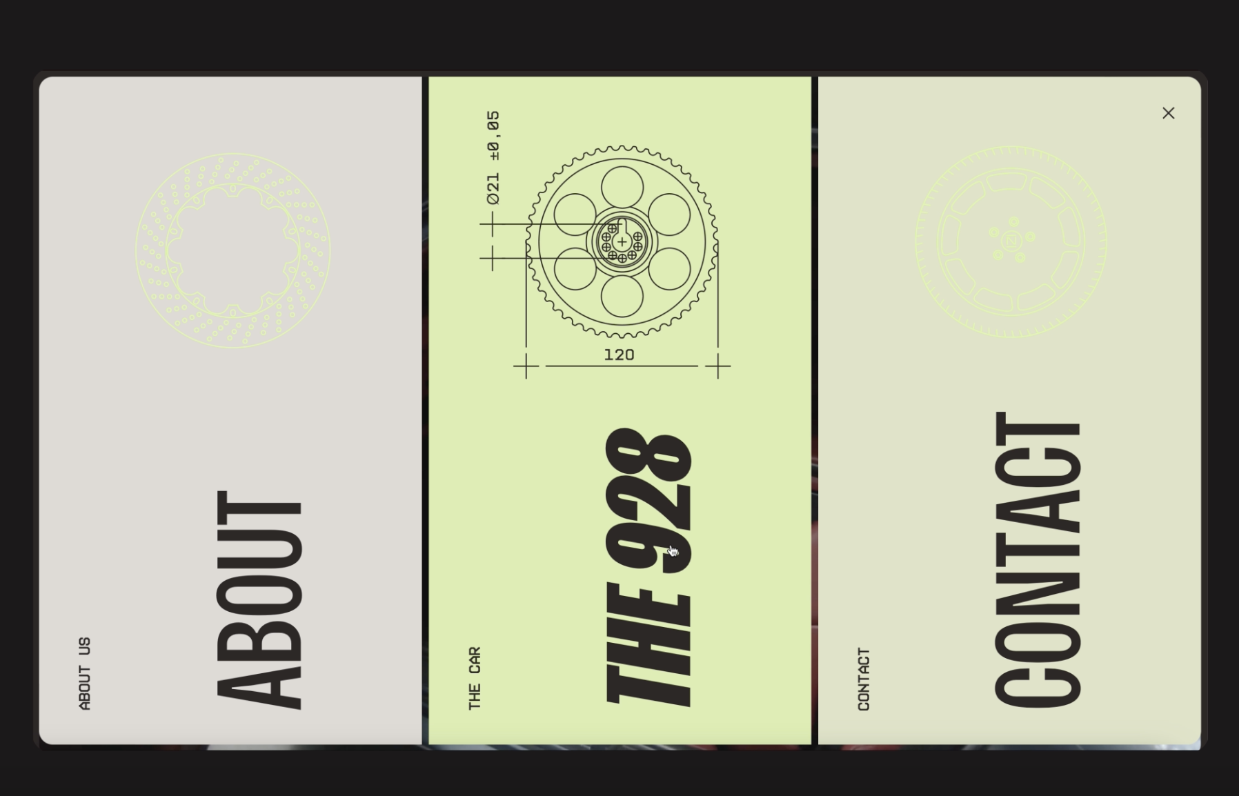
A foundational 5-point baseline grid, distilled from a section of the car’s dashboard, became the structural basis for the entire project. This sleek, Braun-esque modular system informed the visual identity, UX and UI, bringing consistency, precision and intent to every element of the website. More than a graphic device, the grid became a functional framework for how the digital experience behaves, scales and communicates.
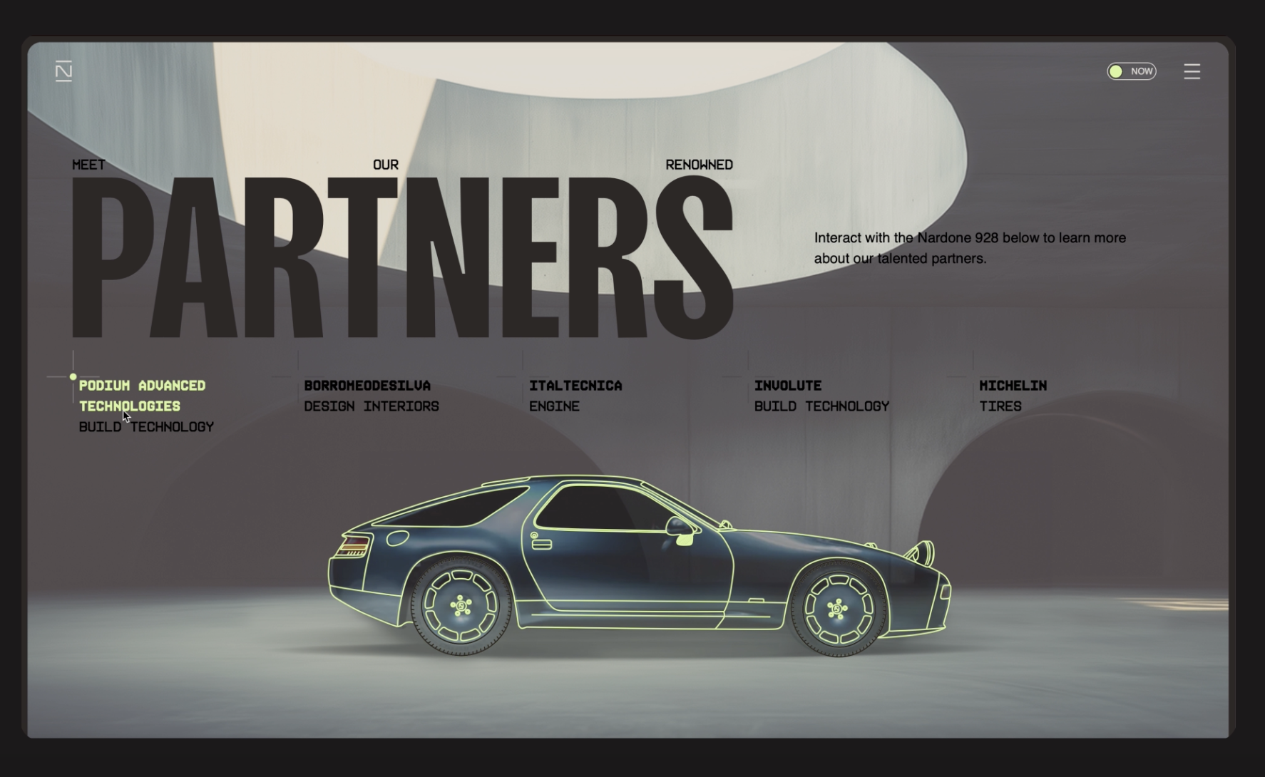
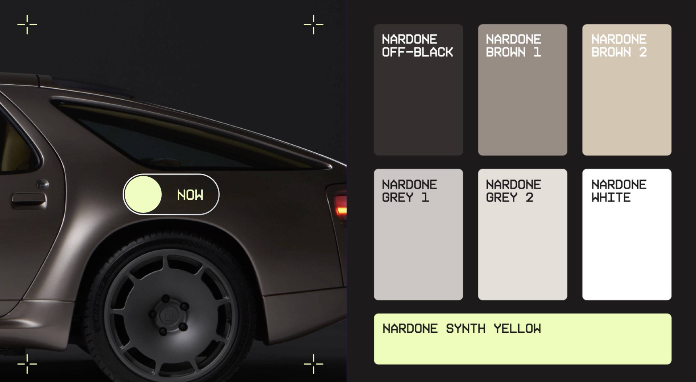
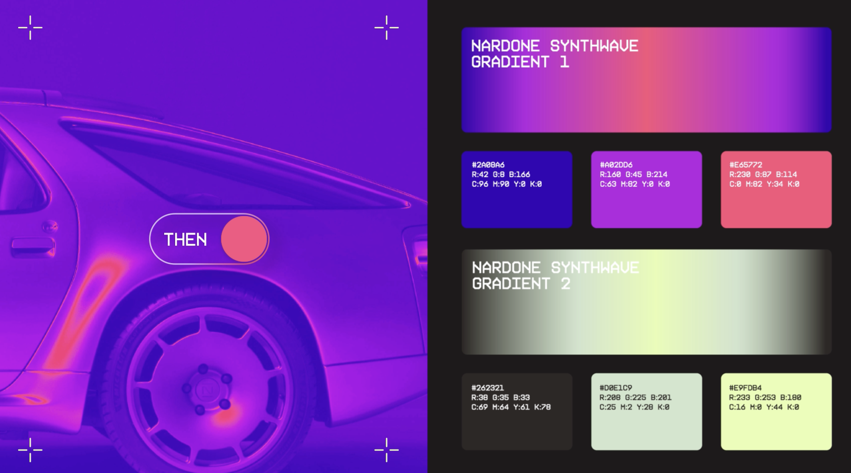
We combined colour and materiality to create a heightened sense of tactility across the interface. Every interaction encourages the audience to consider how the different elements of the car come together, reflecting Thierry Nardone’s obsession with detail. Matte and gloss interact, as do gradients, representing the eye-catching 1980s aesthetic, and true-tone, representing the sharper digital focus of today. This constant tension places the brand between present-day luxury and the wild, garish 1980s. We also built the entire website in two colourways, ready to flip at the touch of a button. In keeping with ‘Never obvious’, Nardone connects then and now, play and precision.
Hinging on the 5pt baseline grid, the site’s interaction and motion principles were designed to foreground engineered precision in both physical and digital space. Animated crosshairs reveal and celebrate the hidden mechanics of the website itself. An intentionally present lazy load reinforces the grid system, while a tickertape messaging mechanism echoes the technical prowess of the car. The result is a digital experience that does more than showcase the vehicle, it translates Nardone’s design philosophy into an interface that feels exacting, expressive and unmistakably ownable.

Entrant
Curator of FairyPle Studio
Category
Product Design - Tarot Cards and Peripheral Products
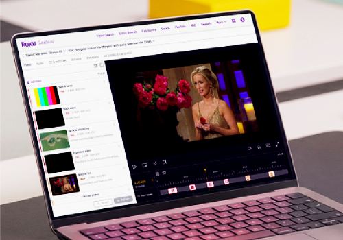
Entrant
Fang He | Roku, Inc
Category
User Experience Design (UX) - Work & Productivity
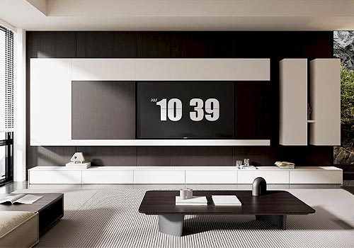
Entrant
Wangdefu Home Industry Group Co., Ltd.
Category
Product Design - Home Furniture / Decoration