2025
Vytala Seracal Product Logo Identity
Entrant
SFC Group
Category
Communication Design - Product and Service Branding
Client's Name
Vytala
Country / Region
United States
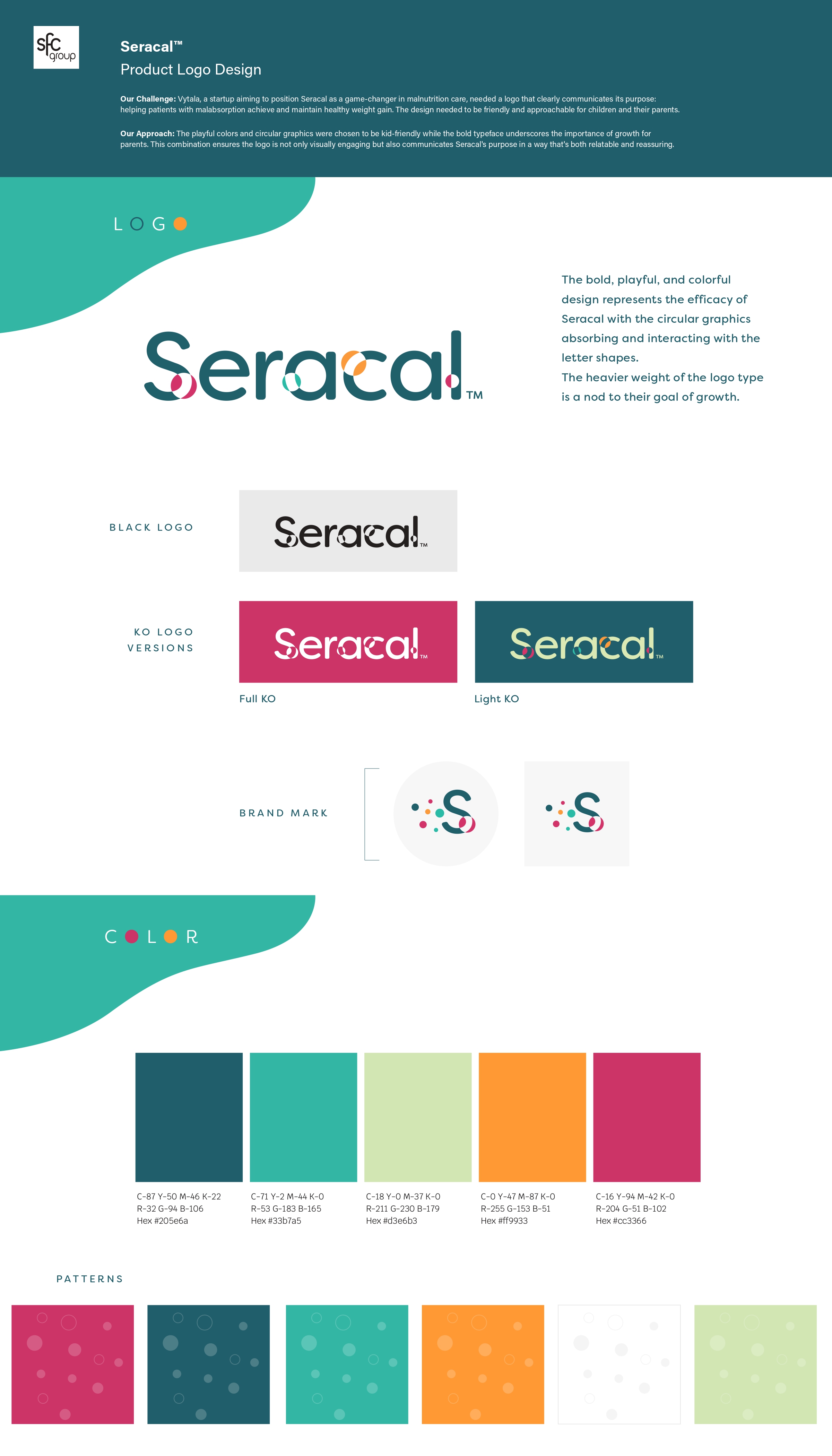
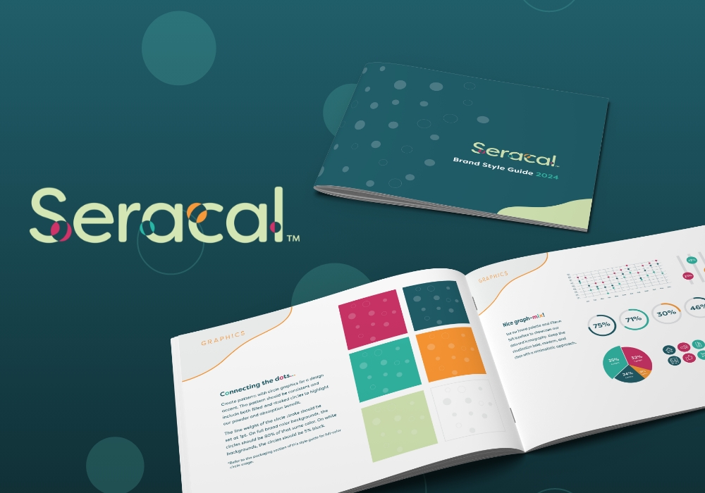
Vytala, a dynamic start-up redefining malnutrition care, needed a logo for Seracal that would encapsulate its indication: helping patients with malabsorption achieve and maintain healthy weight gain. The design needed to resonate with children and their parents, striking a balance between approachability and credibility.
The result is a bold, playful logo that communicates both purpose and positivity. Vibrant, kid-friendly colors and circular graphics create a sense of warmth and movement, making the design approachable and engaging. These circular elements also subtly reflect the micelle technology behind Seracal, symbolizing absorption and efficacy in a way that’s visually relatable.
The strong, heavy typeface anchors the logo, conveying growth, strength, and reliability — essential qualities for parents seeking solutions for their children. Together, these elements ensure the logo not only stands out but also reassures families that Seracal is an innovative yet accessible answer to malabsorption.
This carefully crafted design reflects Vytala’s mission to make advanced science approachable while embodying the life-changing impact of Seracal for patients and families alike.
Credits
Entrant
Poetic Space Design
Category
Interior Design - Commercial

Entrant
FREES DESIGN
Category
Communication Design - Brand Animation Series
Entrant
Department of Cultural Affairs, Taoyuan
Category
Conceptual Design - Exhibition & Events

Entrant
石家庄市晏钧设计有限公司YANJUN DESIGN CO.,LTD.,SHIJIAZHUANG
Category
Communication Design - Public Branding