2025
A Moment of Joy
Entrant
Guizhou Lai Shijia Brand Management Co., Ltd.
Category
Packaging Design - Wine, Beer & Liquor
Client's Name
Country / Region
China
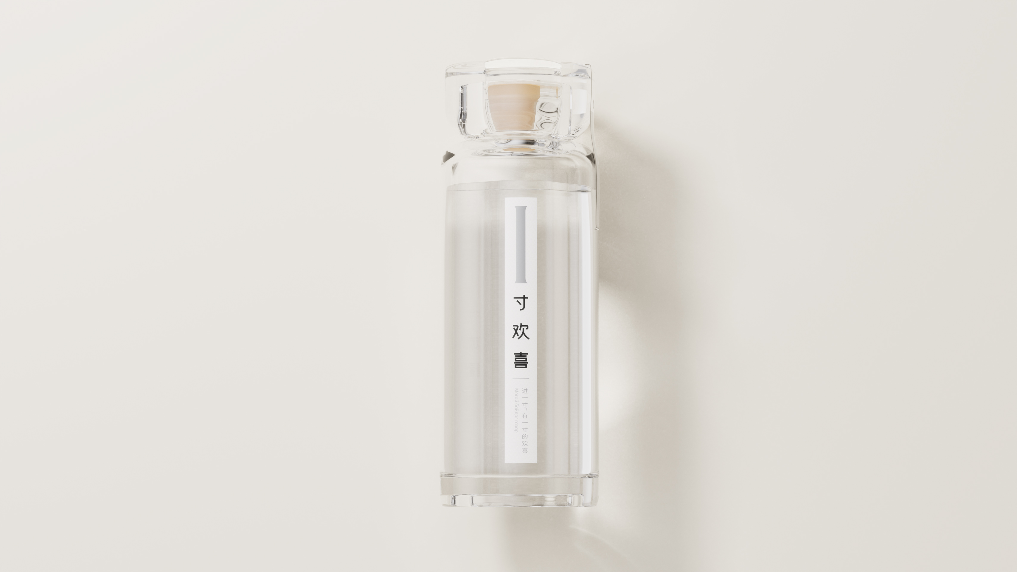
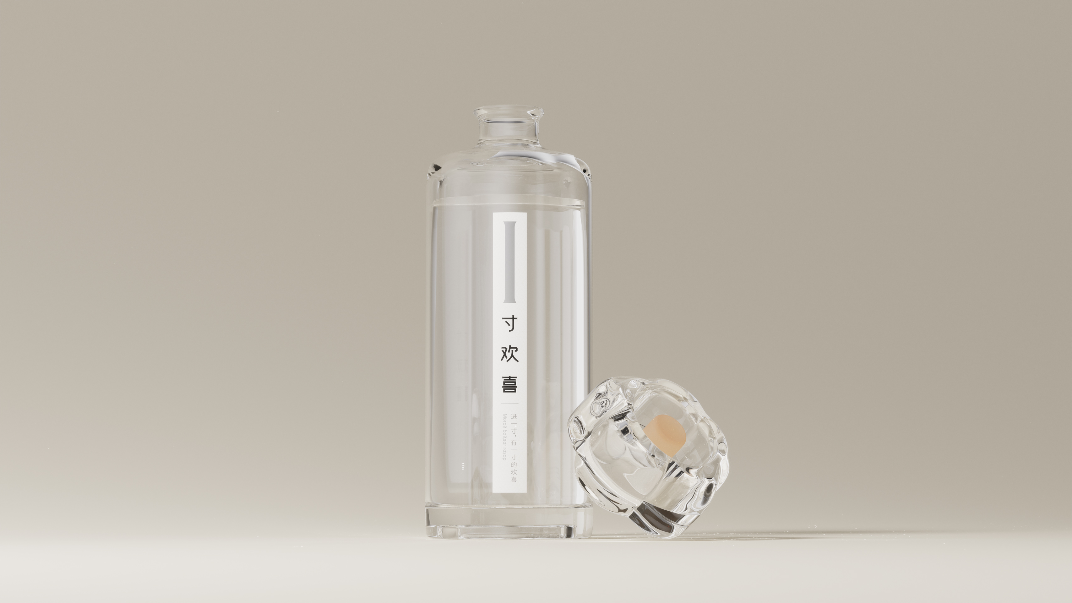
It is a liquor packaging design designed based on the core concept of "Less is More", blending Eastern imagery with modern minimalist styles to reimagine visual expressions of traditional liquor products in contemporary contexts.
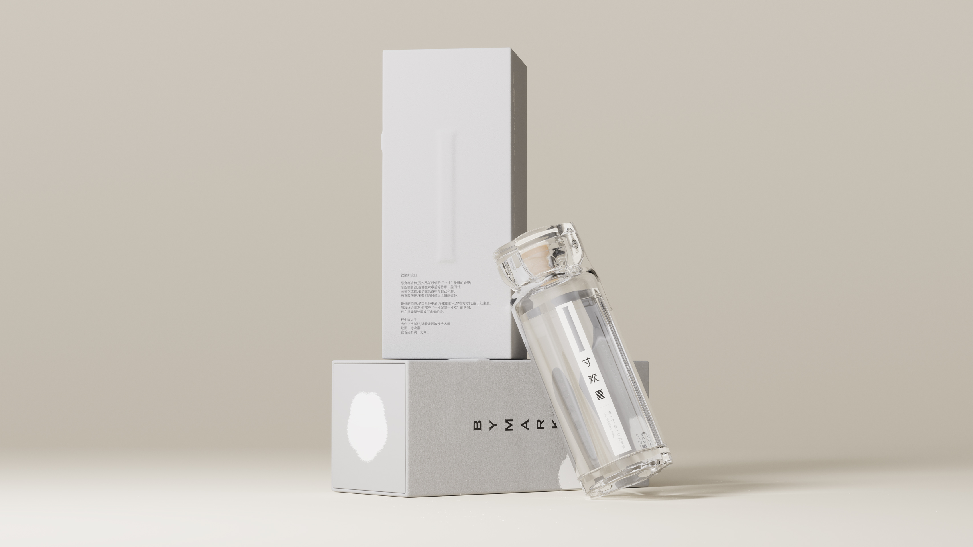
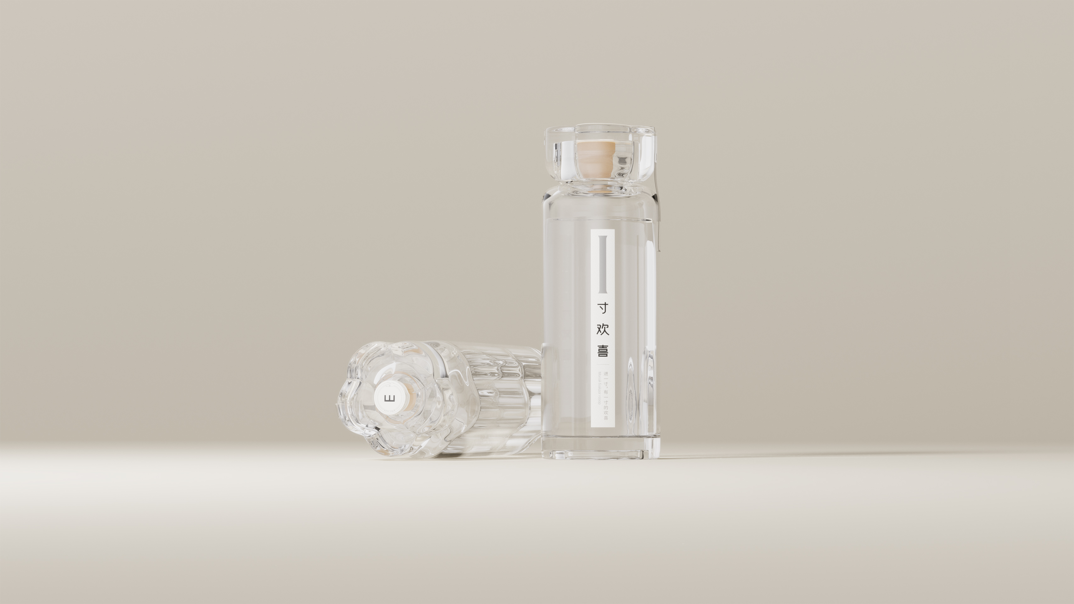
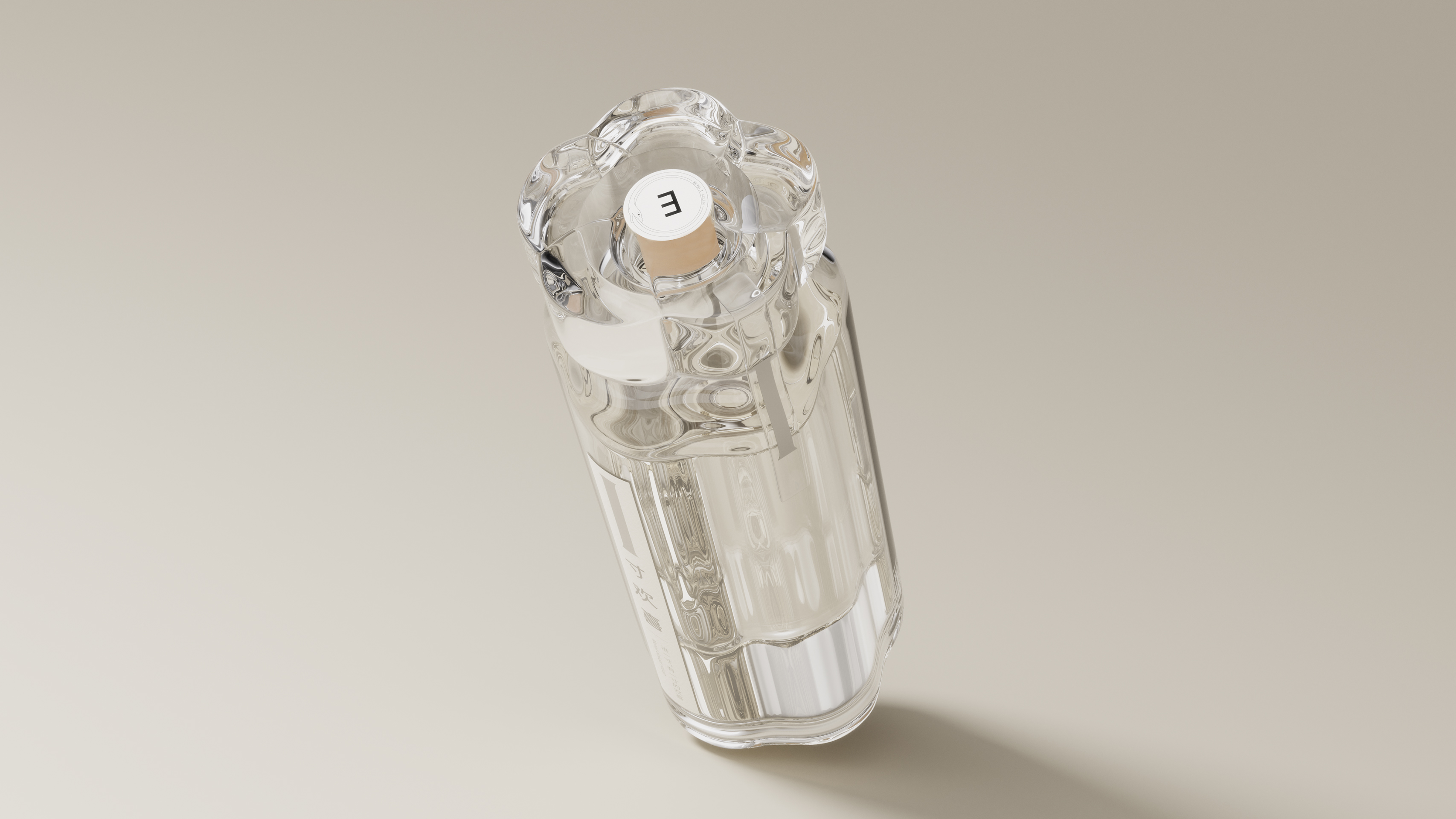
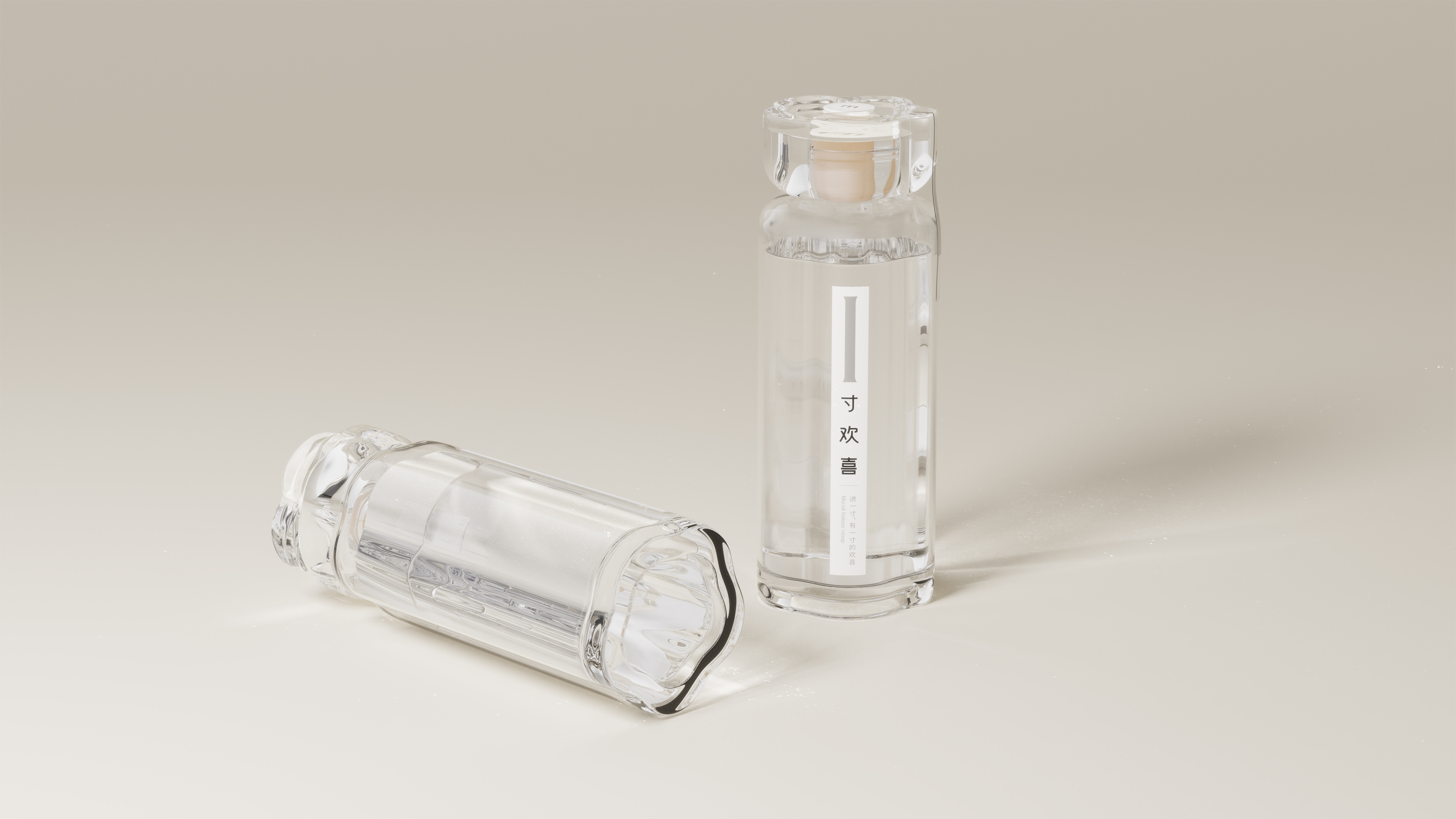
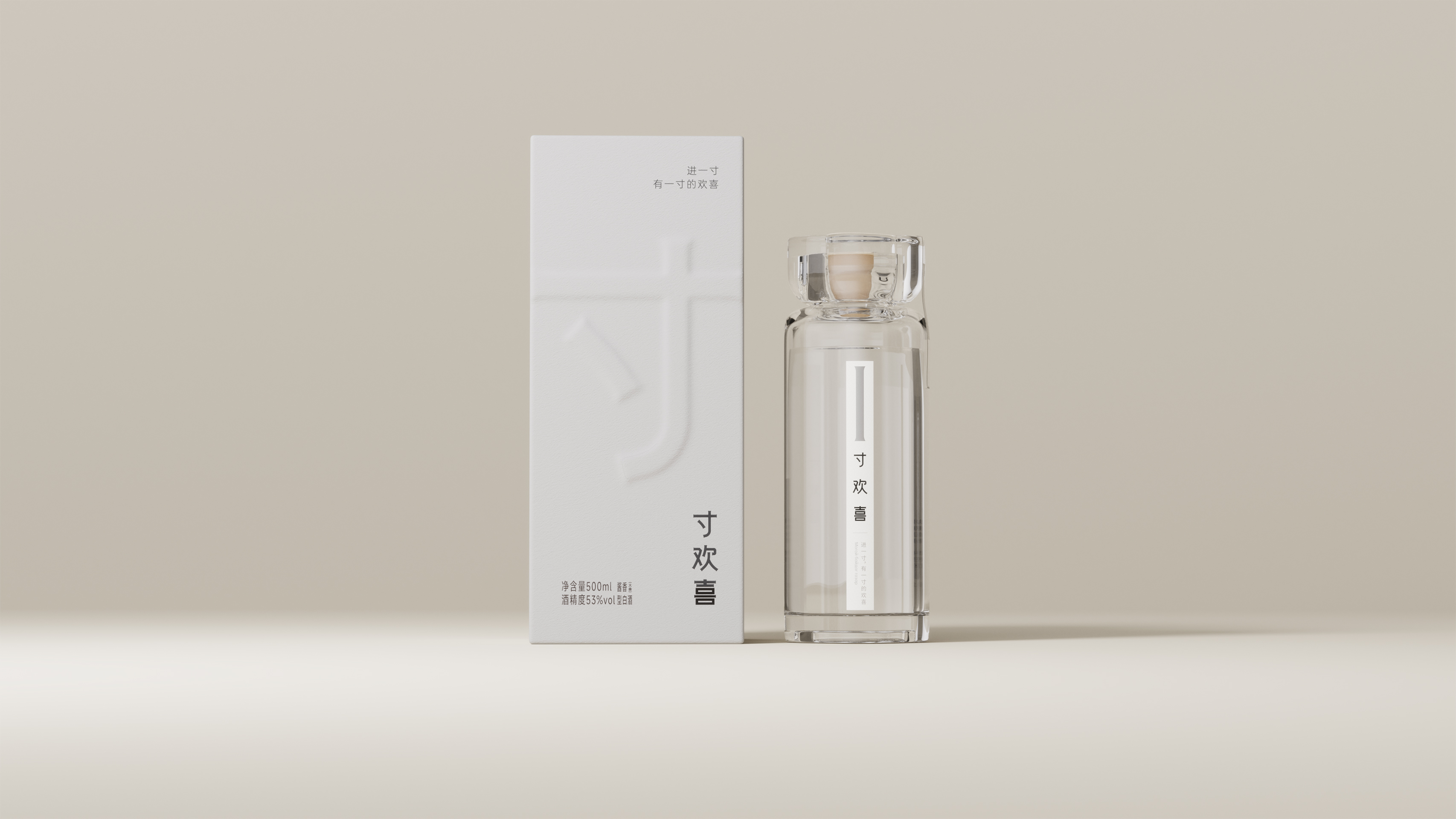
This packaging design features the plum blossom as the visual core element, with the form of a plum blossom seamlessly integrated into the cap and bottle through refined lines, going beyond the thickness and complexity of traditional liquor bottles. The transparent bottle makes the liquor inside fully visible, delivering a subtle interaction experience encapsulated in the phrase "Viewing life through a bottle of liquor" — as the bottle is gently rotated, the liquor inside slowly moves through light and shadow, encouraging the drinker to slow down, observe carefully, and savor the moment. This design marks not only a formal innovation but also promotes a more introspective and moderate attitude toward drinking.
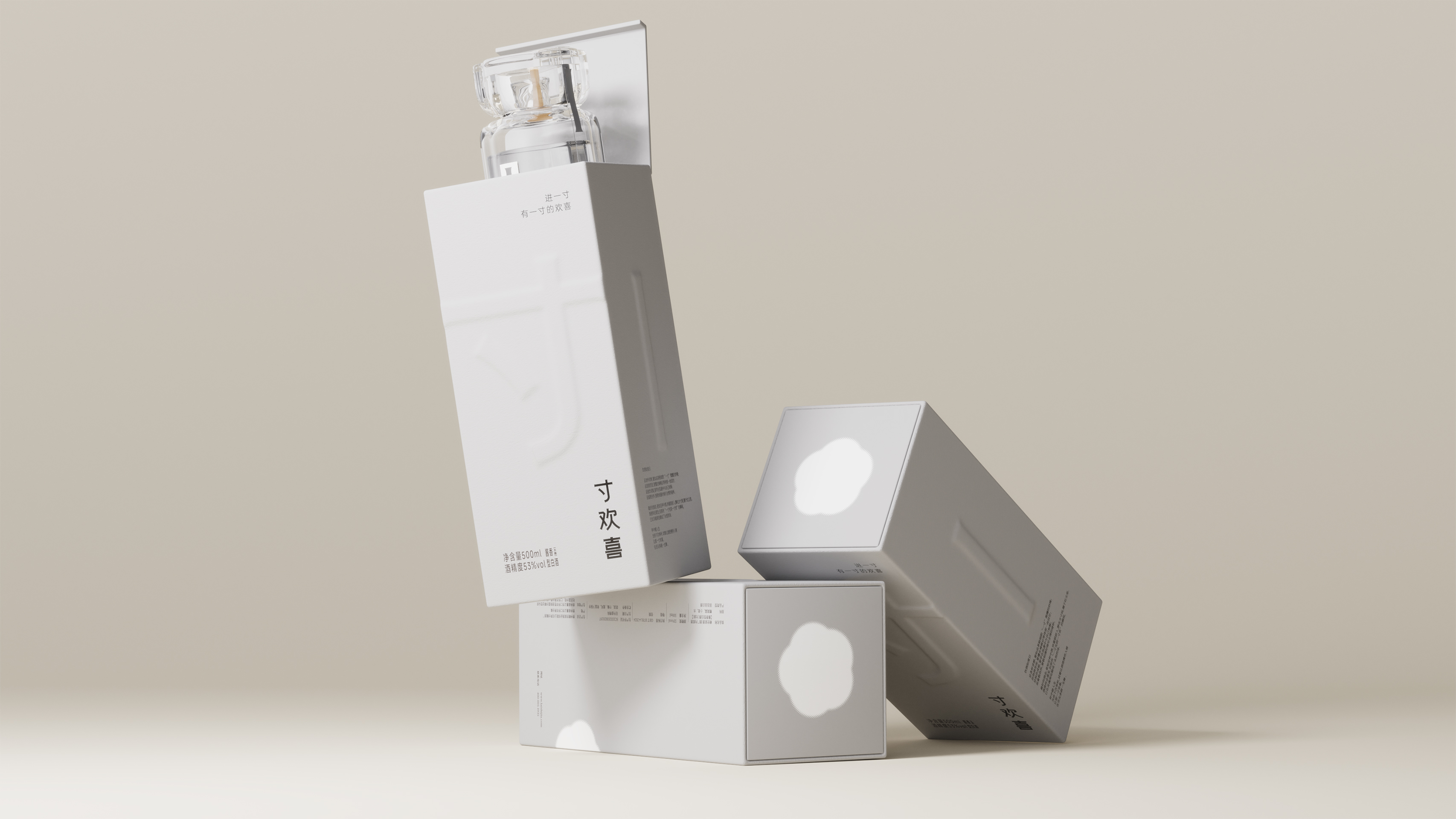
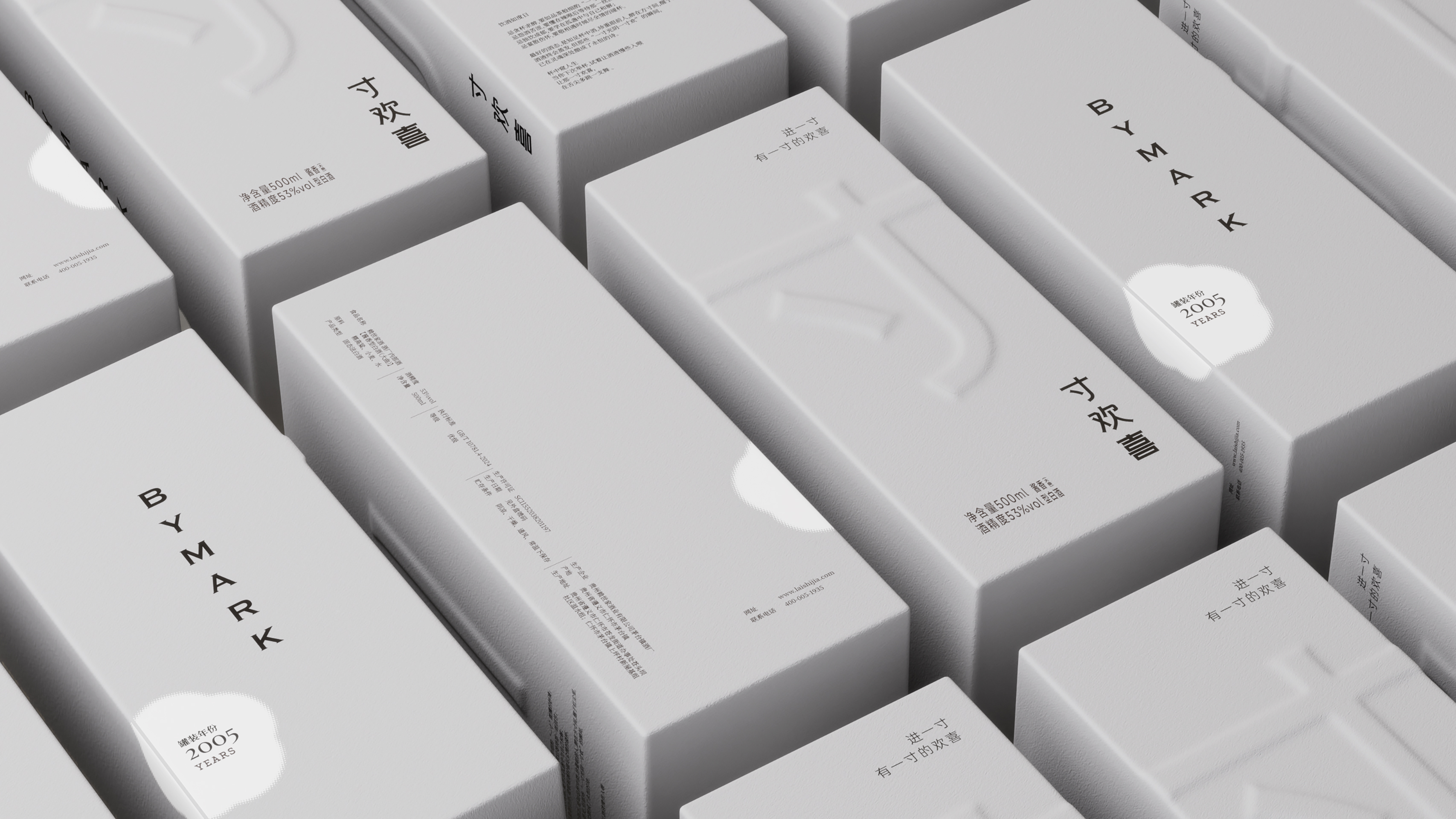
The outer box continues the same refined and minimalist aesthetic as the inner bottle. It takes a soft gray-white color scheme and eco-friendly paper materials, complemented by a subtle embossing technique, providing an understated visual experience. The overall packaging design is restrained yet fresh, interpreting the concept of "Less is More" from the inside out while presenting Eastern aesthetics through the synergy of materials, colors, and processes.
Entrant
ADARC INTERNATIONAL STUDIO LIMITED
Category
Architectural Design - Office Building


Entrant
China Shaanxi Huaqing Palace Cultural Tourism Co., Ltd
Category
Product Design - Imaing & Vision
