2025
Seasonal Resonance
Entrant
MING CHYI BIOTECHNOLOGY LTD.
Category
Packaging Design - Health & Wellness
Client's Name
MING CHYI BIOTECHNOLOGY LTD.
Country / Region
Taiwan
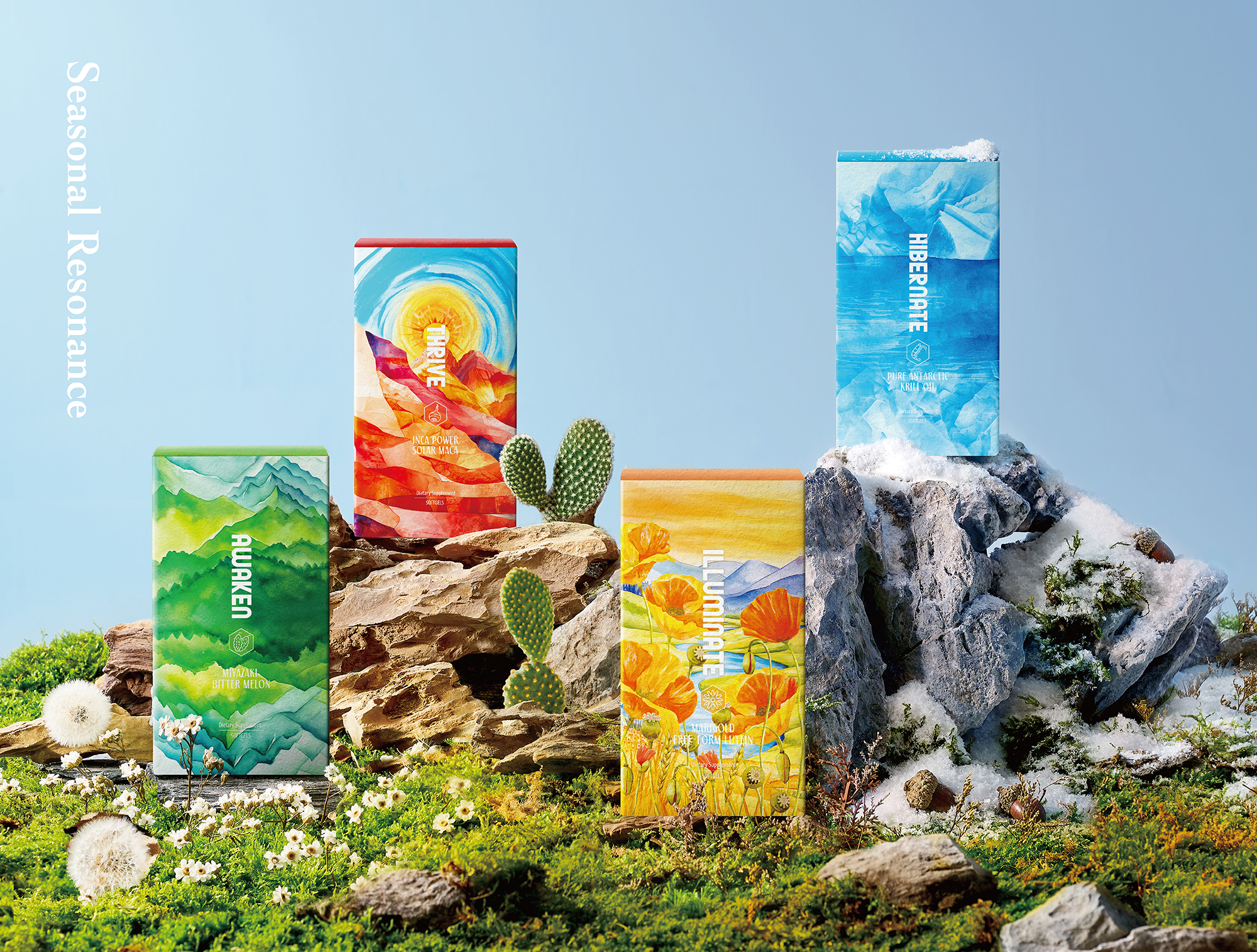
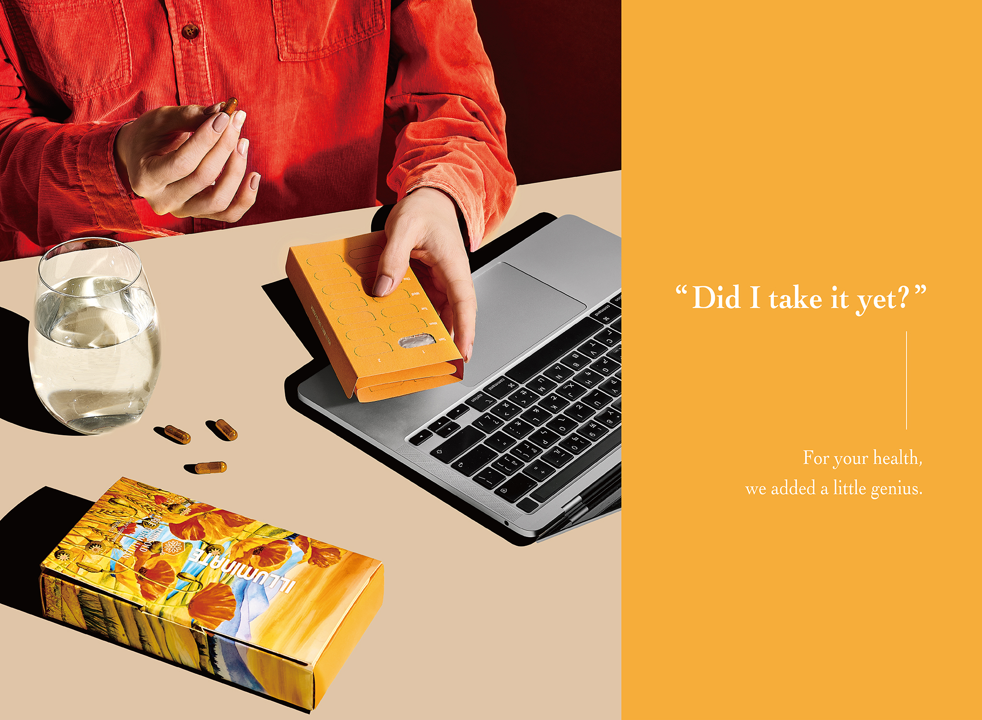
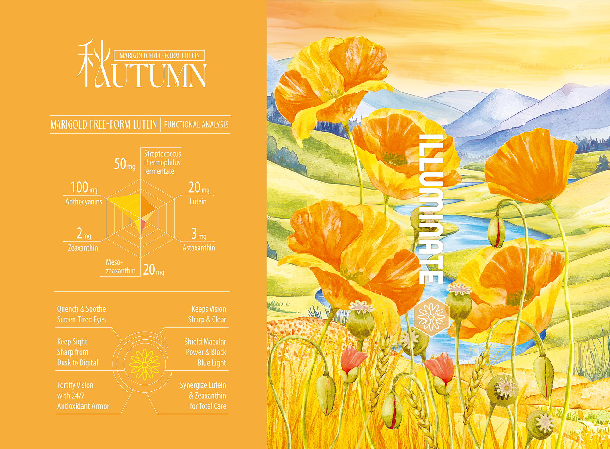
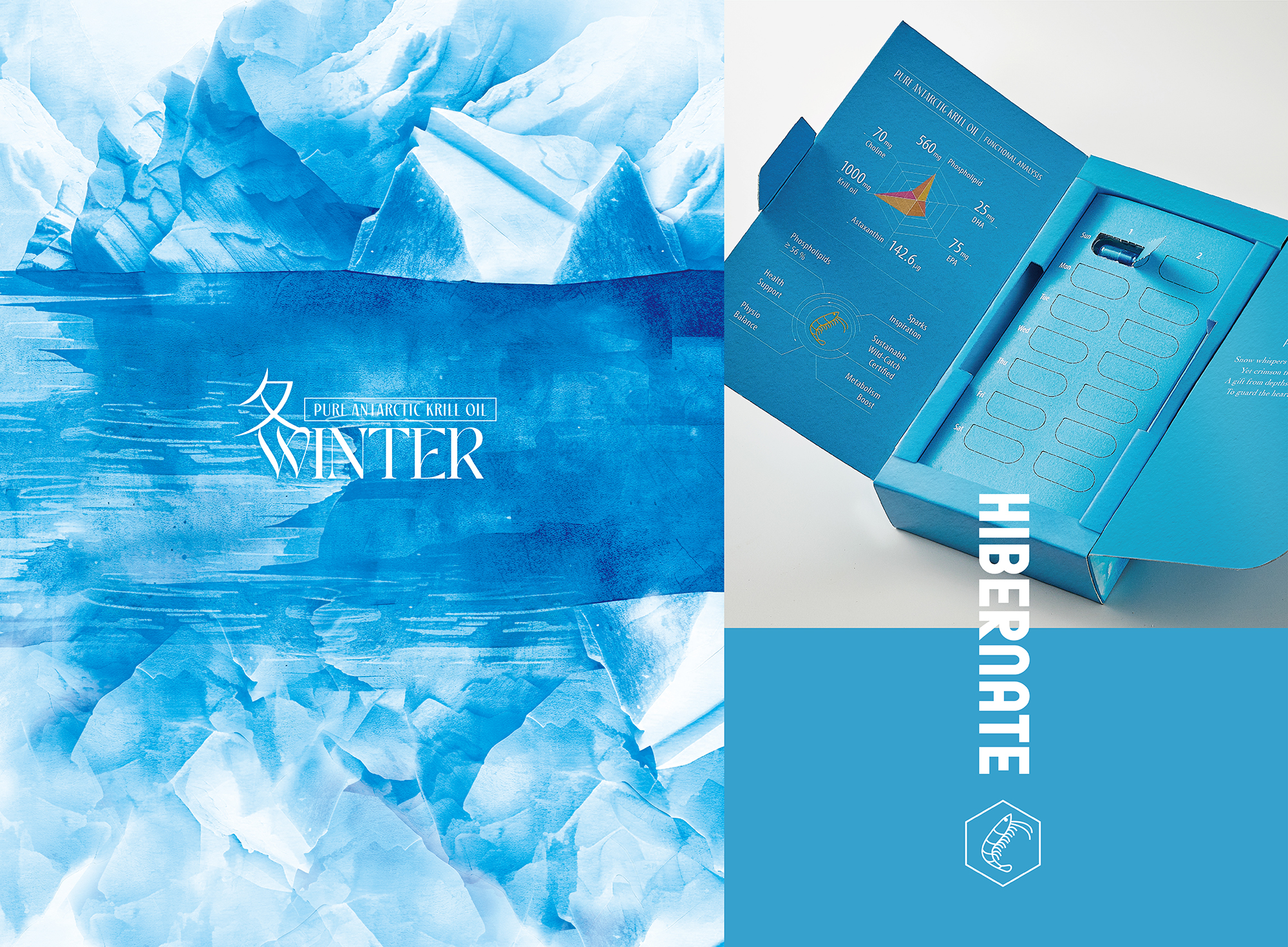
This innovative packaging design project focuses on four health supplements from MING CHYI BIOTECHNOLOGY LTD. (MCB),aiming to transcend the traditional, cold image often associated with health products. The project seeks to redefine their aesthetic appeal by transforming these functional items into captivating works of art.
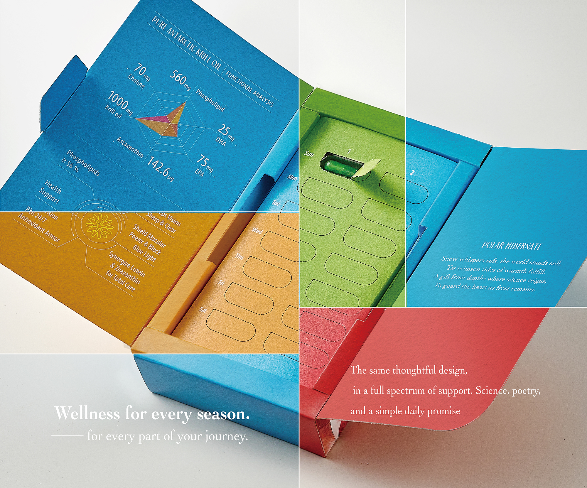
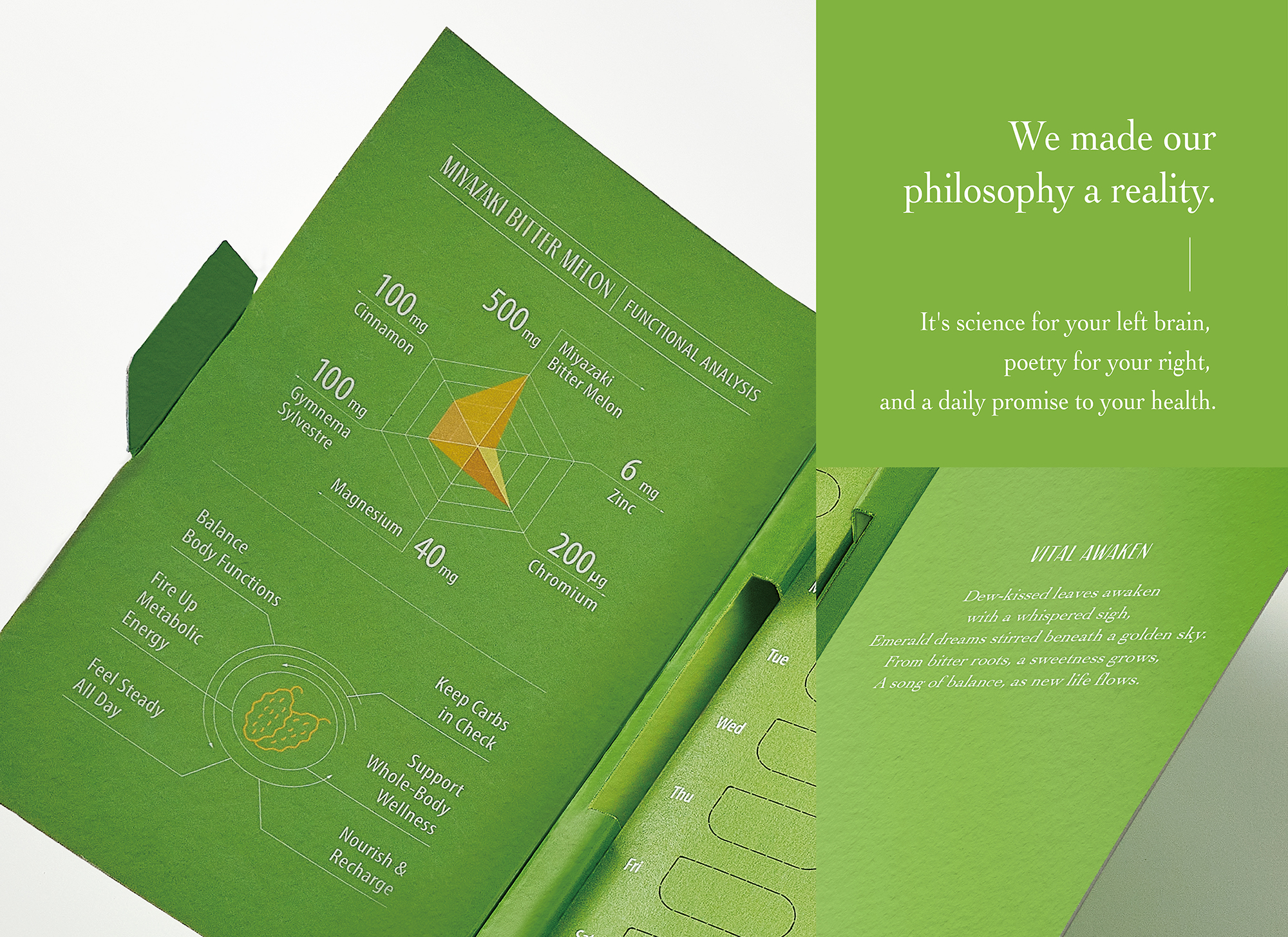
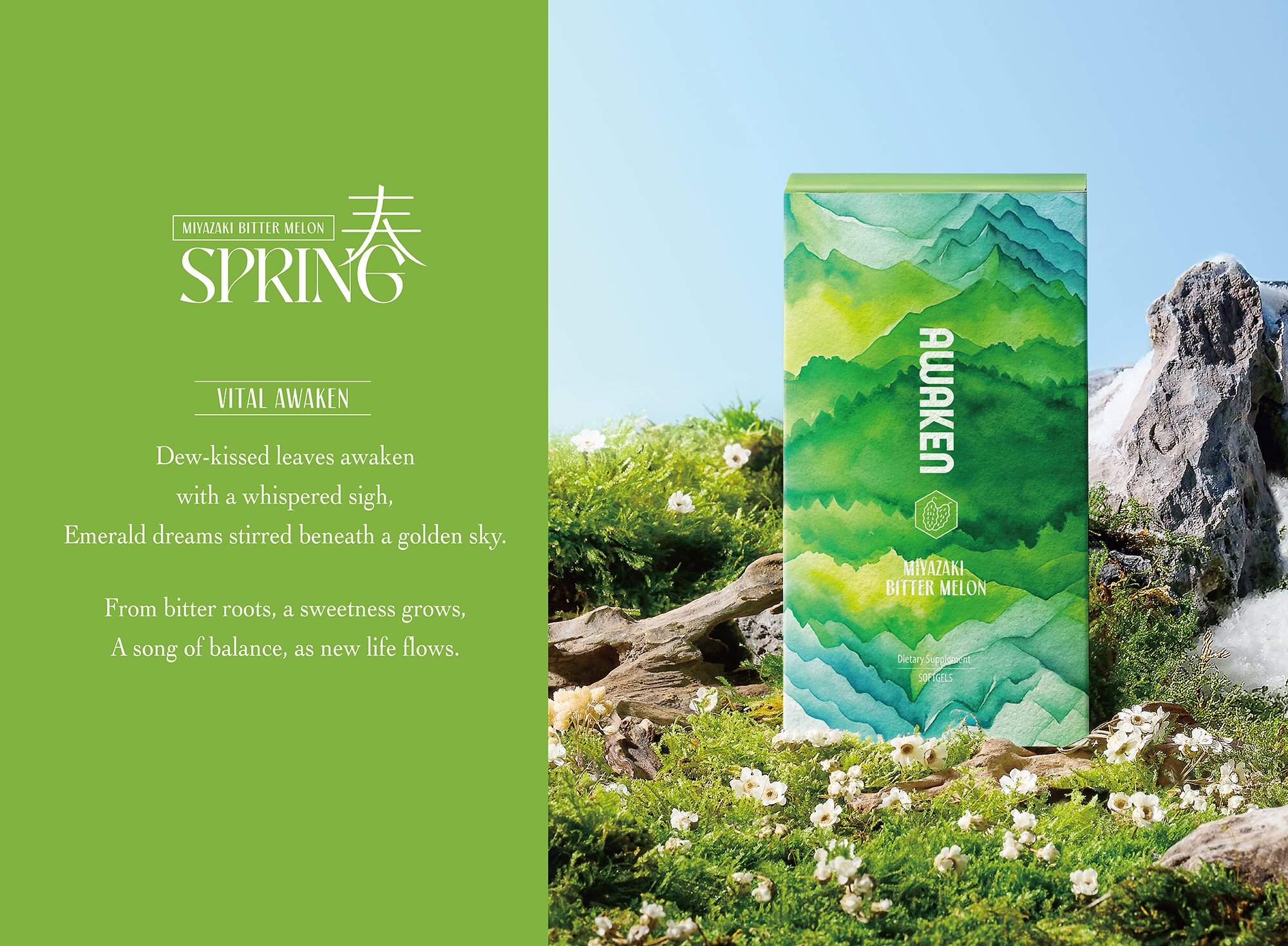
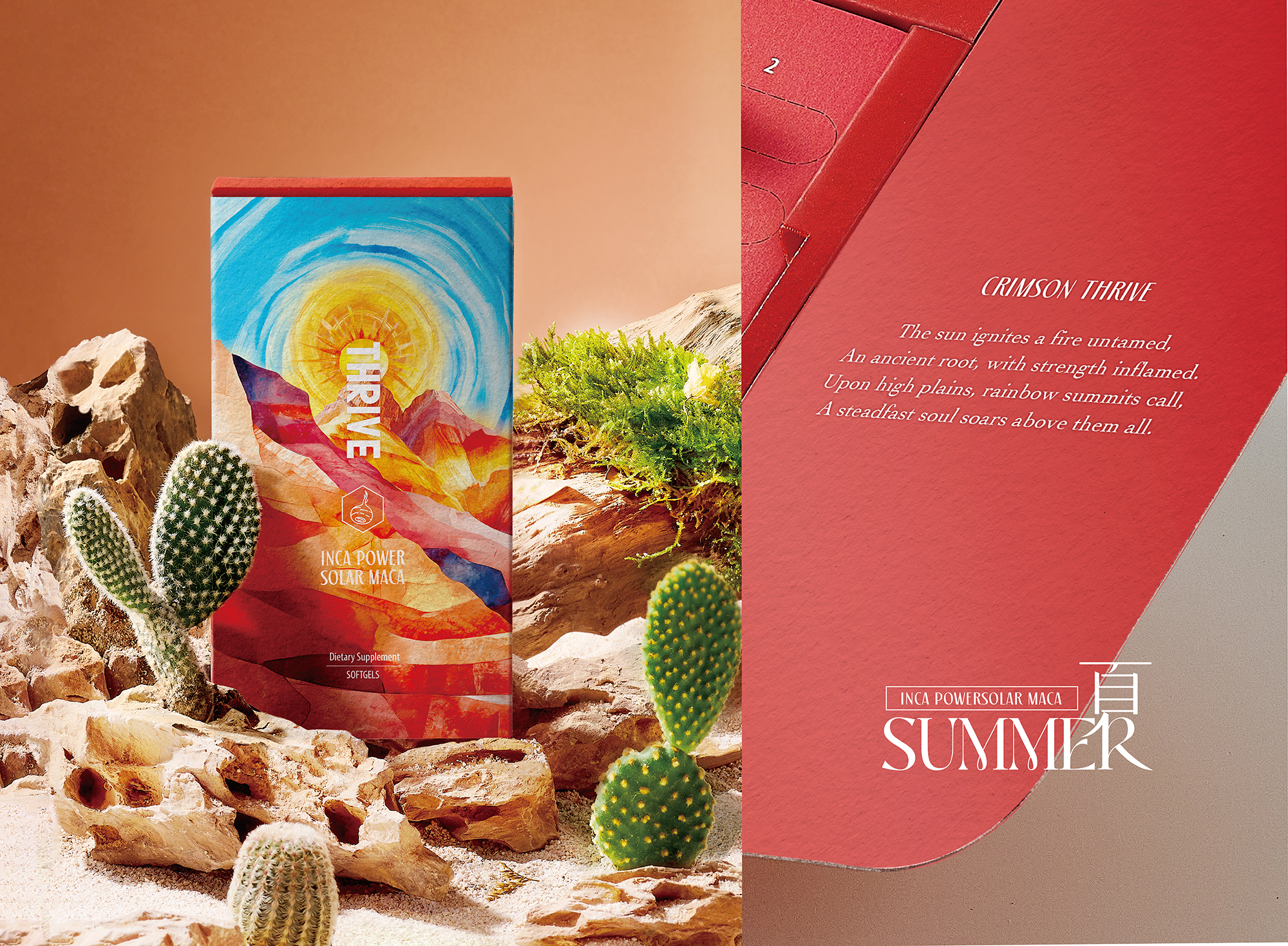
The design of each ingredient is intricately influenced by its origin, skillfully transformed into a captivating visual language that draws inspiration from the ever-changing landscapes of the four seasons. The thoughtful application of color psychology enhances the conveyance of each product's unique function. For instance, the vibrant green of bitter melon symbolizes renewal and evokes the awakening beauty of the spring mountains in Japan—this essence is encapsulated in the theme "Awaken." Similarly, maca is rendered in a bold red, representing energy and capturing the thriving vitality of the Incan highlands during the summer months—hence, we have "Thrive." Transitioning into the autumn, lutein is illustrated in luxurious gold, suggesting abundance while reflecting the rich radiance of Europe's autumnal plains—this is exemplified in the concept "Illuminate." Finally, krill oil is depicted in a serene blue, evoking tranquility and mirroring the hidden opulence of the Antarctic winter seas—summed up in the term "Hibernate."
Through this carefully curated approach, each ingredient not only showcases its unique characteristics but also invites consumers to experience the cycles of nature in their daily lives.The front of the packaging prominently features a cohesive hexagonal identification system, elegantly paired with vertical English slogans that significantly enhance brand recognition. To cultivate a profound sensory connection, the overall design employs a captivating flowing watercolor effect that vividly illustrates the texture of real landscapes.
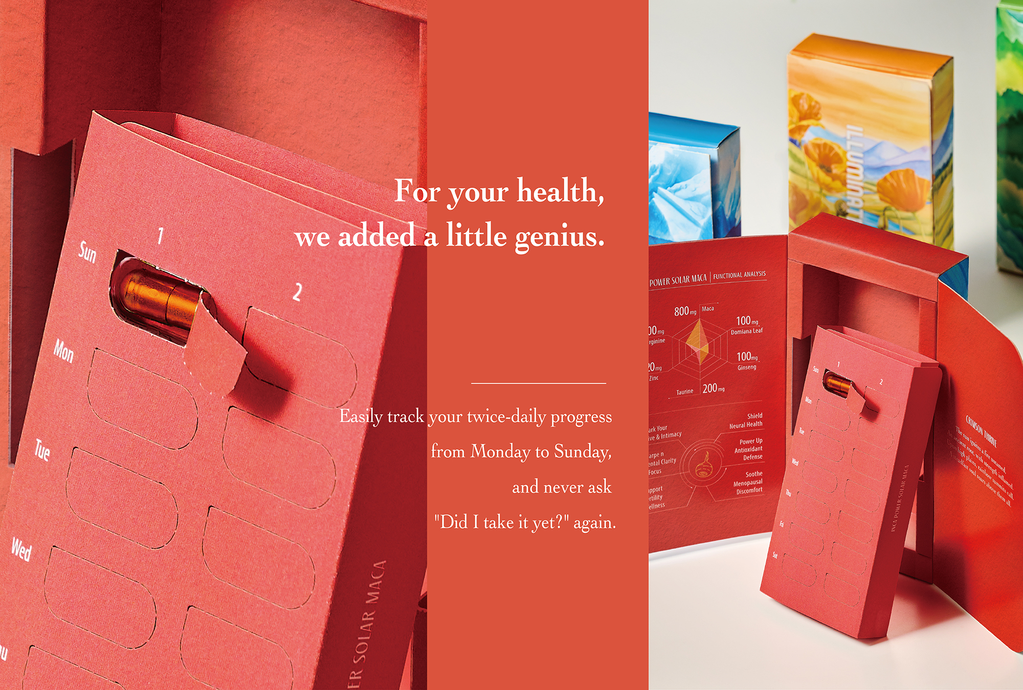
Through the intricate use of precision embossing techniques and specialized coatings, the packaging simulates natural textures, allowing the terrain's undulations to translate into a delightful tactile experience for the fingertips. This project vividly demonstrates innovative strategies for intertwining environmental consciousness with health principles. Specifically, the packaging employs FSC™-certified eco-friendly paper materials, which not only support the sustainable use of forest resources but also reflect a commitment to responsible sourcing.
Credits
Entrant
Avanade UKS
Category
User Interface Design (UI) - Science / Technology


Entrant
Millet Design Co., Ltd.
Category
Landscape Design - Garden Landscape
