Ashley Hodge
1. Please give us a brief bio of yourself and your design background.
Hey! I'm Ashley Hodge, a Design Director with 24 years of experience specialising in branding across multiple channels including digital and e-commerce (desktop and mobile), art direction (stills and video), packaging, print, creative strategy, campaigns, and environmental design.
2. What made you become/why did you choose to become a designer/artist?
I’ve always loved art and design, and the freedom it gives you to express yourself and give a unique point of view in a creative and personal way.
3. Tell us more about your agency/company, job profile, and what you do.
Whippet is an independent creative agency with studios in London and Melbourne. Through brand design, strategy, communications, and environments, we’ve been transforming retail brands globally since 2001.
4. To you, what makes a “good” design?
Good design should make you feel something, and spark an emotion or connection. It's that magic that makes something stand out.
5. How did you come up with the idea for your award-winning design?
Whippet was briefed to bring to life the biggest single product launch in the history of M&S Food, appealing to health-conscious customers at New Year, a crucial moment in the business calendar. We knew our approach had to be bold and assertive: we wanted our customers to be so confident in the Gut Shot that they’d never consider buying a health drink from anywhere else. It had to feel like the natural choice.
So, this presented a clear challenge in terms of drawing attention. We also had to make sure this tiny 150ml product created a big splash in busy stores. If it couldn’t stand out against the noise, the launch would fail.
Our strategy for the Gut Shot launch was built upon two insights:
1. Many people kickstart the New Year with good intentions for health, wellness, and their finances.
2. Health is a crowded and confusing space for customers — so brands need to make their voices heard.
We targeted two kinds of customers for the launch: shoppers with an active interest in gut health, and those whose curiosity made them open to learning more about our product.
To engage these groups, we felt our comms should spotlight the authority of the people who developed the Gut Shot: ZOE's nutritional scientists, and co-Founder Professor Tim Spector in particular. We featured Tim’s face prominently in our designs for window visuals, shelf POS and social media content, emphasising his expertise. Combined with M&S’s leading reputation for producing quality food, this helped us to tell a powerful story that helped people to understand the product and what made it special.
6. What was your main source of inspiration for this design?
Our job was to communicate the health and flavour appeal of the product. But beyond this, we also had to help people understand what a “gut shot” is in the first place.
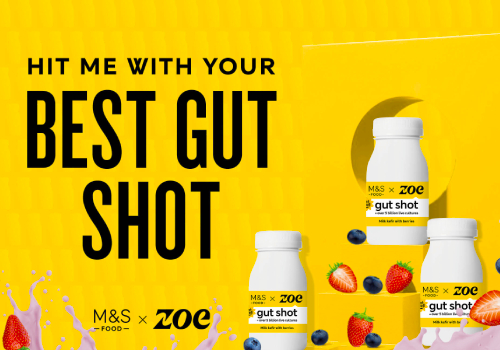
We used the simple bottle shape as a micro pattern throughout our designs, then rendered an exuberant splash of the drink itself to help people quickly understand what’s inside the bottle. This was a departure from the typical, refined style of M&S Food, but we strongly felt that it conveyed the product: both in terms of its fruity, yoghurt-y flavour, and its revitalising effect.
Our main desire for the identity was to evoke the quality and taste of our product – which are always key elements of all M&S Food comms – while giving our POS an exciting, explosive energy.
Now that we had our key visuals, we needed to capture people’s attention. Our window concepts were focused on creating impact with major emphasis on the collaboration behind the Gut Shot. We let the brand’s confident, straightforward sentiment drive our tone of voice – because after all, the proof is in the bottle. In our comms, we used ZOE’s punchy, black, and vibrant yellow packaging to give the message energy.
We developed a key copy line that became a major, recurrent focus of our creative: “Is this the world’s greatest Gut Shot?”. Again, our goal here was to project confidence while sparking people’s curiosity about the product. When we featured this line on a bright yellow backdrop alongside large 3D bottles, it brought verve and excitement to M&S store windows – a standout contrast to the January gloom.
From windows through to shelf-level POS, our in-store scheme had to cater to every stage of the customer journey. Our delicious visuals aimed to catch people’s attention from as far away as across the street, but once they were inside we had to help direct them to the Gut Shot fixtures. These appeared in the “Food on the Move” section, often located in a low-traffic corner of the store.
Our tone of voice played a key role in navigation. Hanging posters invited curiosity with the statement, “This way to good gut health”, alongside others that repeated our key line, “Is this the world’s greatest Gut Shot?”.
Signage also played on the bottle’s distinct shape to help build brand recognition, supported by social media and press ads in the weeks leading up to launch. In stores, large cut-out bottles helped to steer customers from the entrance to the shelves. Again, these championed the flavour and excitement of the product by using our key assets: the bottle outline, energising yellow, and a playful splash of fruit.
With its blend of bold product imagery, rich colour, and empowering tone of voice, our identity turned the launch of the M&S Food x ZOE Gut Shot into a major event — both in-store and online.
7. Do you think your country and its cultural heritage has an impact on your design process?
No, I do not.
8. Congratulations! As the winner of the London Design Awards, what does it mean to you and your company and team to receive this award distinction?
Awards are always great to receive, as they’re a recognition of all your hard work by your peers – so they do mean a lot to everyone involved. It takes a whole team to create amazing work, and I’m lucky enough to work with some of the best designers, account directors, and copywriters in the industry.
9. Can you explain a bit about the winning work you entered into the London Design Awards, and why you chose to enter this project?
M&S Food is our biggest client, and the Gut Shot was important for them. It wasn’t just another health drink — they saw it as a category-defining product, one that could spearhead M&S’ ambition to become a go-to retailer for health needs.
For us, it was a chance to bring our creative skills and brand comms knowledge to the largest product launch in the history of M&S Food. This was a great project built around an interesting ask: create a bold, confident identity and build definitive appeal for an innovative product, targeting health-conscious customers at a crucial time of year. That’s the kind of challenge we relish at Whippet.
The launch itself was incredibly successful, and so naturally we’re hugely proud of that. 75% more Gut Shots were sold than was forecast pre-launch, and now M&S sells more Gut Shots than Coke or bottled water. It was the biggest ‘Food on the Move’ volume line, outselling the benchmark rate of sale lines by over 300%.
10. Where do you see the evolution of design industry going over the next 5-10 years?
Design has been evolving rapidly over the last few years, with AI impacting certain parts of our industry, such as photography and copy. It’s going to be interesting to see how it develops and affects the industry — or not. I believe it has a place for certain things, but a computer can never match the mind of a designer in conjuring the big idea or the magic we see in the most creative executions.
11. What advice do you have for aspiring designers who want to create award-winning designs?
Great design is everywhere, from fly posters to packaging to music videos and theatre experiences. Creativity is all around us: soak it in and think how you can use it to inspire what you do. Don’t just sit around and look on Pinterest, waiting for the next big idea — as you won’t find it sitting down!
12. What resources would you recommend to someone who wants to improve their skills in the design industry?
We never stop learning, so I always encourage everyone to keep up to date with all the latest training and trends that are going on in the industry. The DBA has amazing courses to expand your knowledge and learning.


