2025
Beautyagent
Entrant
CIAO TIAN Interior Design
Category
Interior Design - Commercial
Client's Name
Country / Region
Taiwan
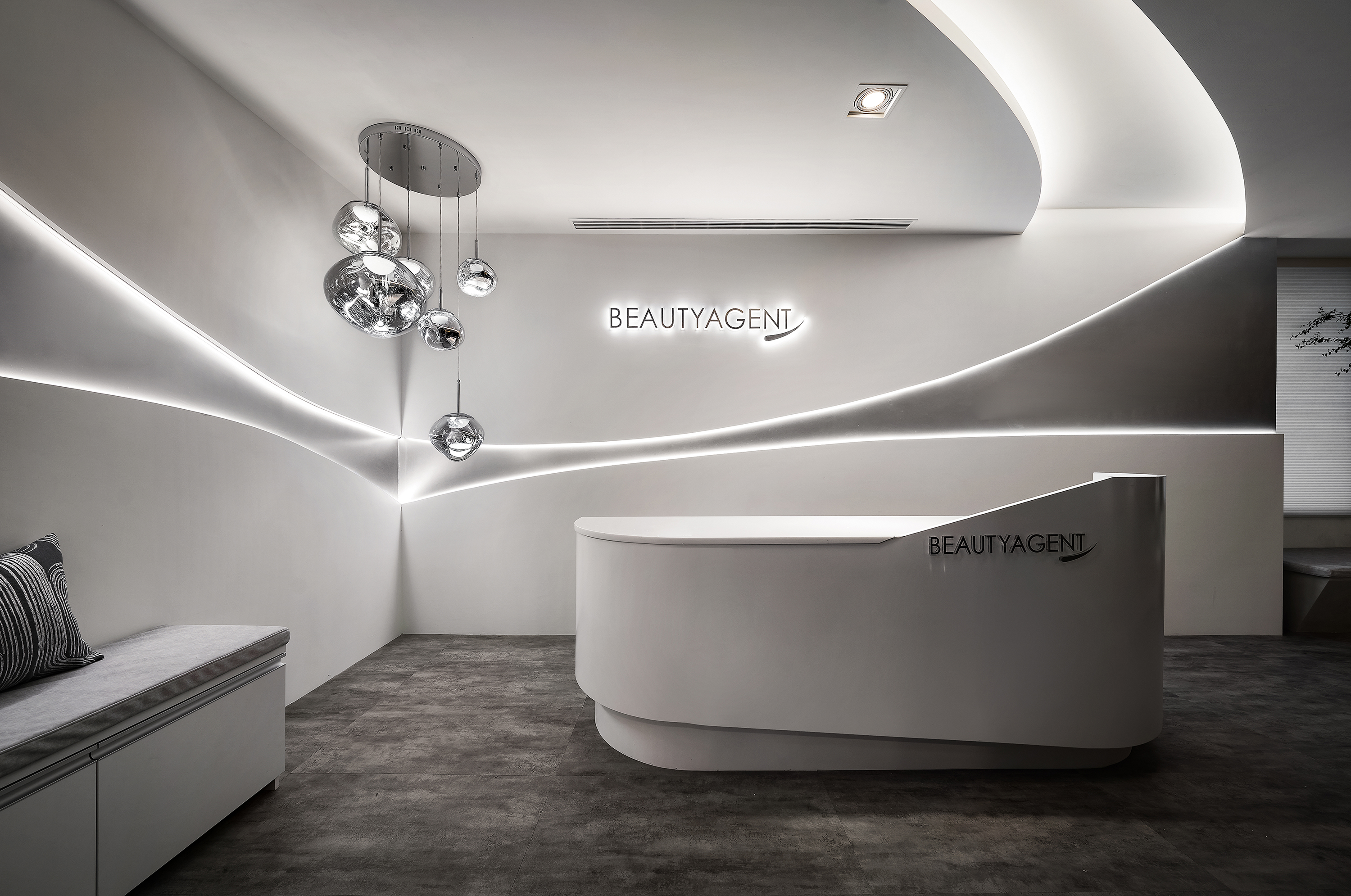
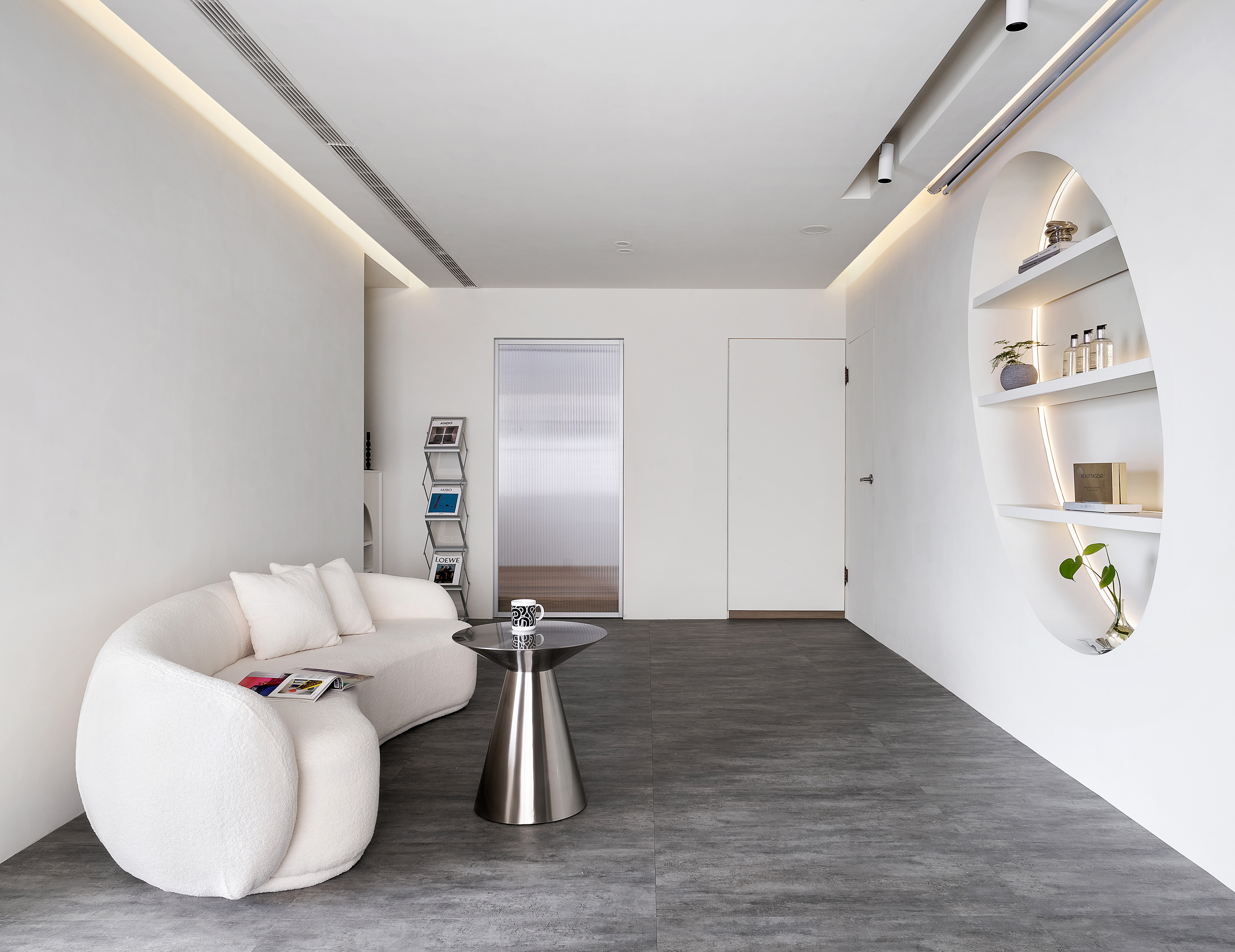
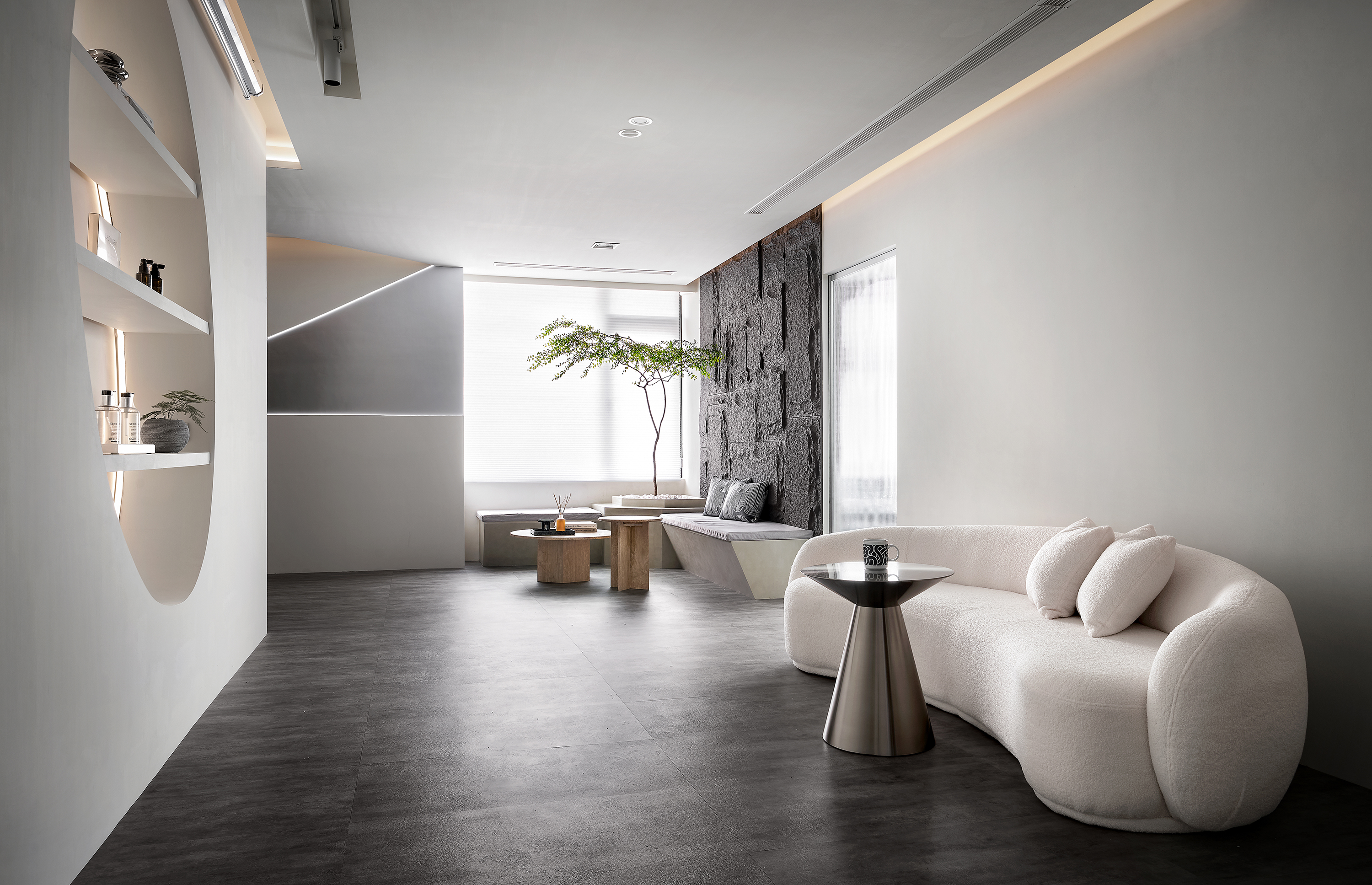
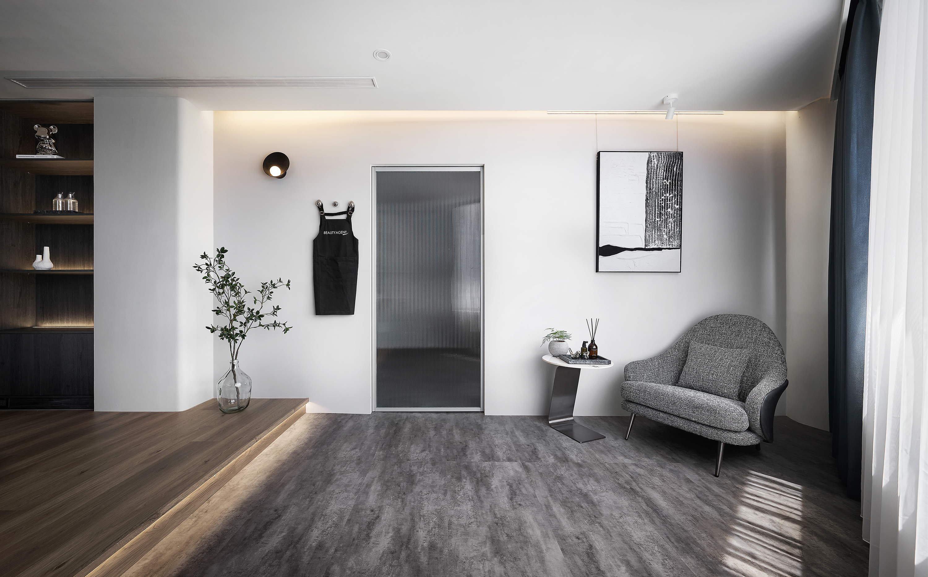
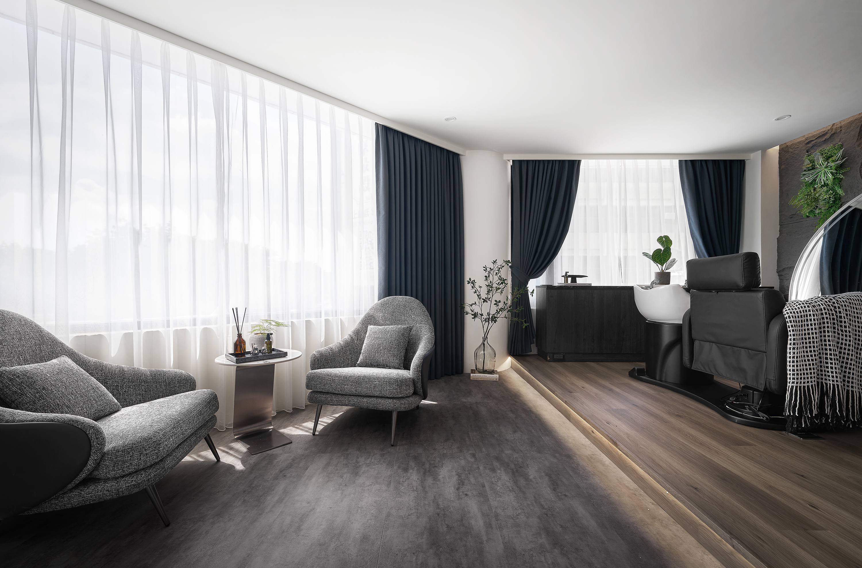
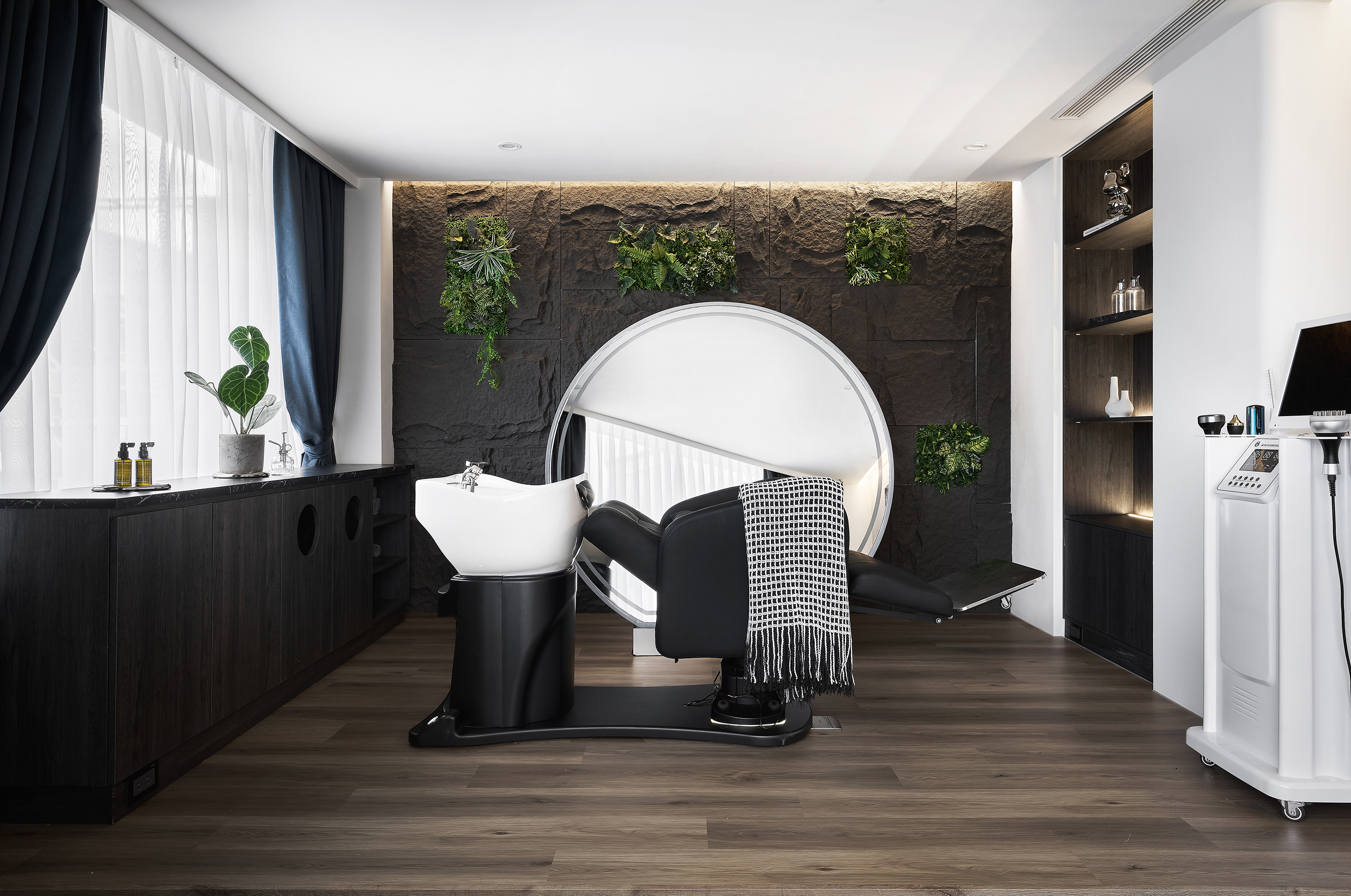
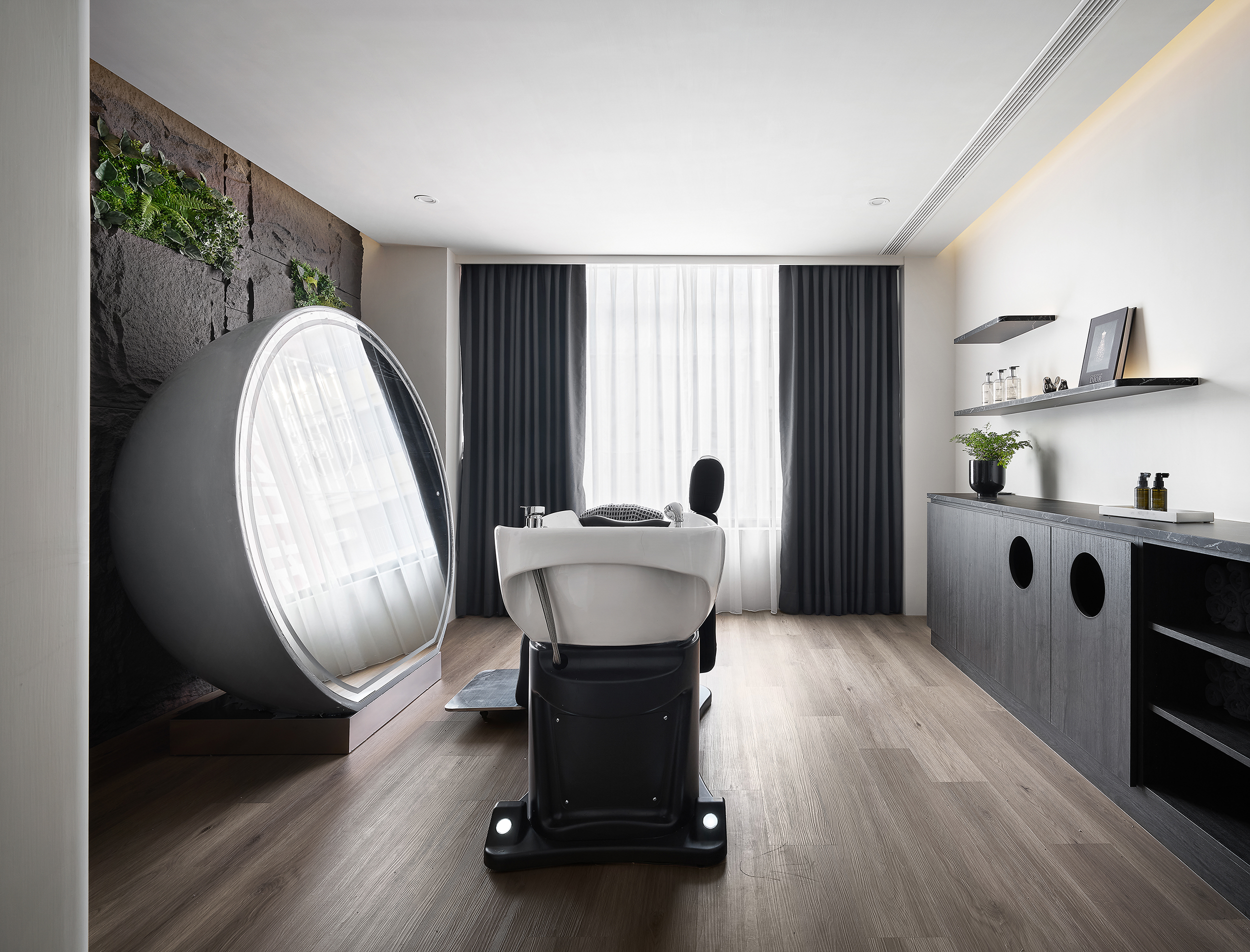
Starting with the concept of “purity and dynamism,” the design redefines the image of a scalp care salon, blending the precision of technology with the softness of nature. The streamlined wall design conveys both balmy and professional vibes. The dominant color palettes of white and gray, enhanced by lighting, contribute to a clean and brilliant appeal. The pleasant tones ensure everyone feels comfortable and at ease.
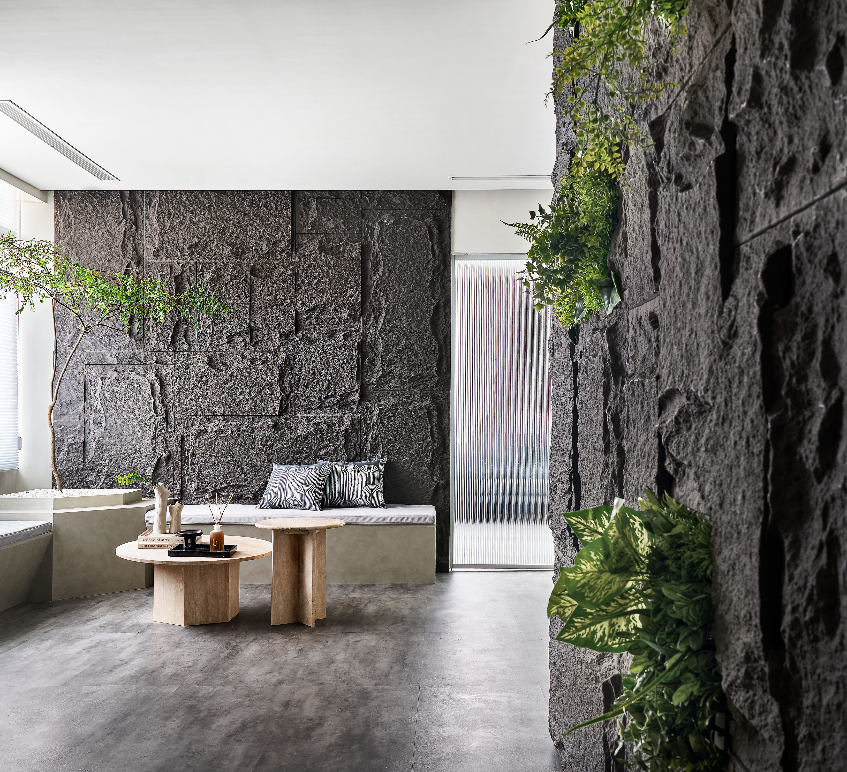
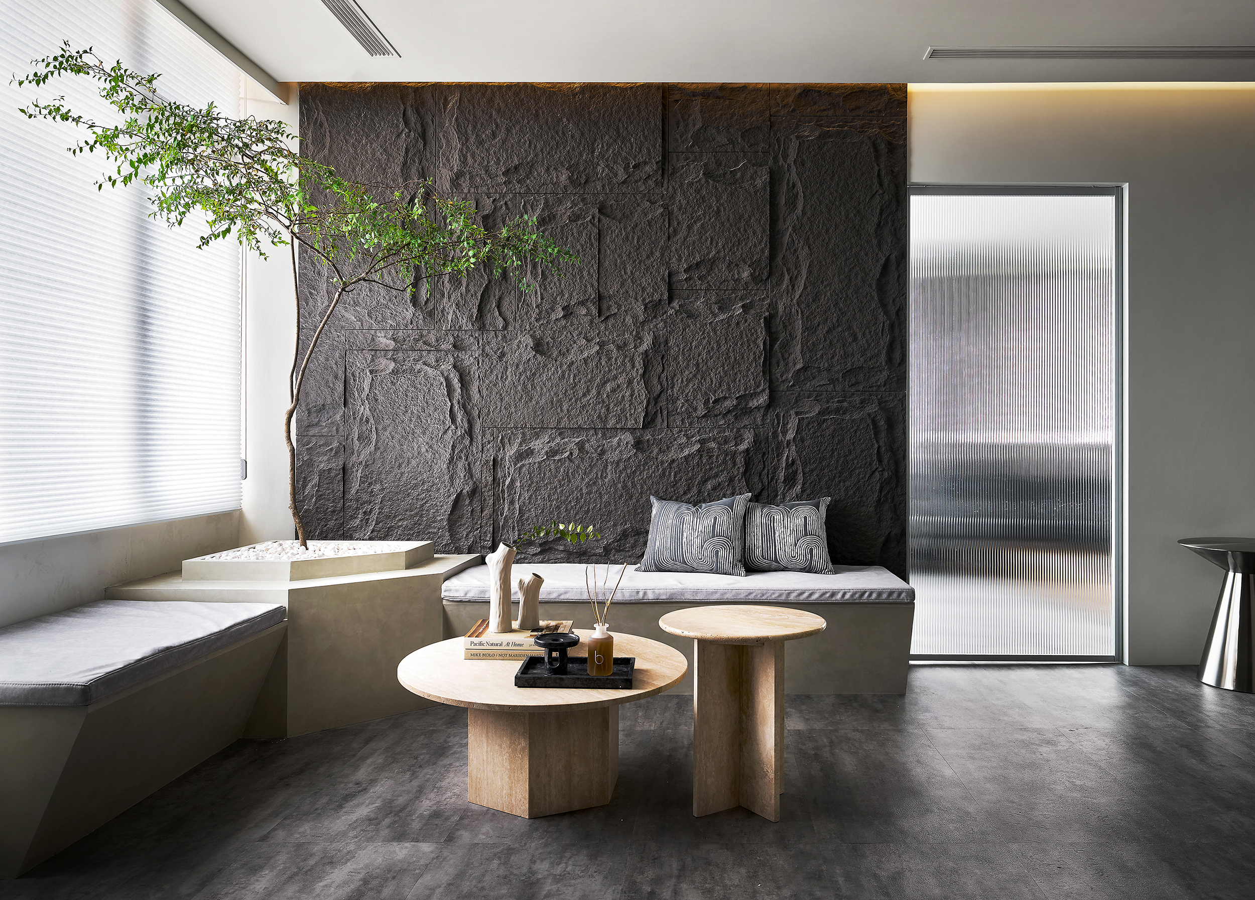
The space is more than a salon for scalp health care but an aesthetic sanctuary that responds to inner demands. Intentionally amplifying the subtle warmth of the space renders connections to the customer’s daily emotions with every detail. Whether concentrating on treatments or tranquility in relaxation, the environment embodies the belief in “embracing every day with confidence.” Unconventionally, the project incorporates expertise and aesthetics rather than functionality, expressing the values of beauty and health with the design language. By bridging the gap between professional care and sensory adventures, the space performs exclusive experiences with eyesight, tactile impressions, and deep savoring.
Following the core concept of purity and dynamism, the plain white walls and matt grayish flooring compose a calming visual keynote while metal and glass infuse in a futuristic image and refined quality. The lighting features a gradual transition between warm and cool tones, subtly shifting according to different phases of treatment and inviting the customers to an immersive experience that spontaneously fosters trust and connection with the brand. Greenery accents and marble walls bring biophilic and botanical vitality to the space and echo the non-pharmacologic therapy. Abstract depictions of hair and cellular microstructures integrated with the interior convey the brand spirit – every strand of hair deserves to be cherished. These arrangements achieve an aesthetic realm dedicated to confidence and wellness, perfectly aligning with the brand's values.
Grounded in the principles of “smooth traffic flows” and “atmosphere formation,” the design employs curved lines to define a transitional space seamlessly. The curation leads the people here to effectively and smoothly enhance every action they proceed with, whether staff’s work or customer’s waiting and experience.
Credits

Entrant
HANGZHOU KEGUO BRAND MANAGEMENT CO., LTD
Category
Packaging Design - Retail

Entrant
BV TECHNOLOGIES USA LLC
Category
Product Design - Travel Accessories