2025
2024 Taichung Transport Totems EasyCards
Entrant
Transportation Bureau of Taichung City Government & CHU IDEA Ltd.
Category
Communication Design - Product and Service Branding
Client's Name
Transportation Bureau of Taichung City Government
Country / Region
Taiwan
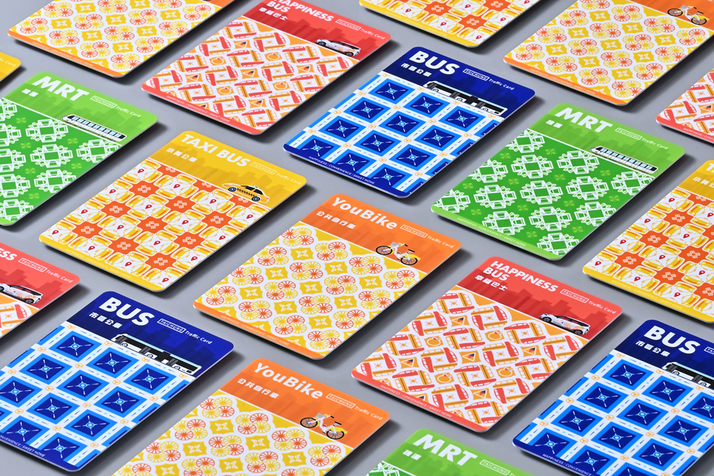
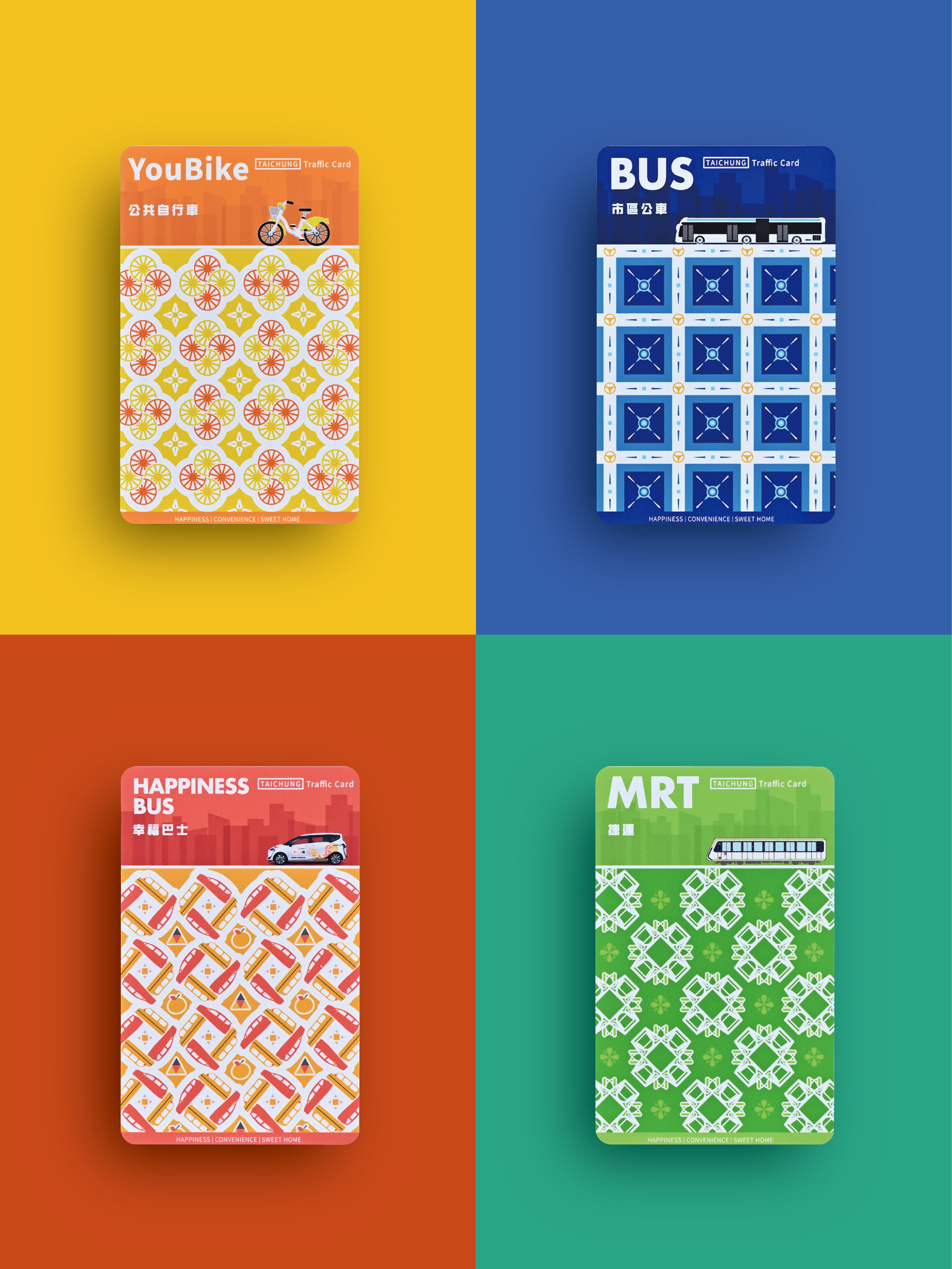
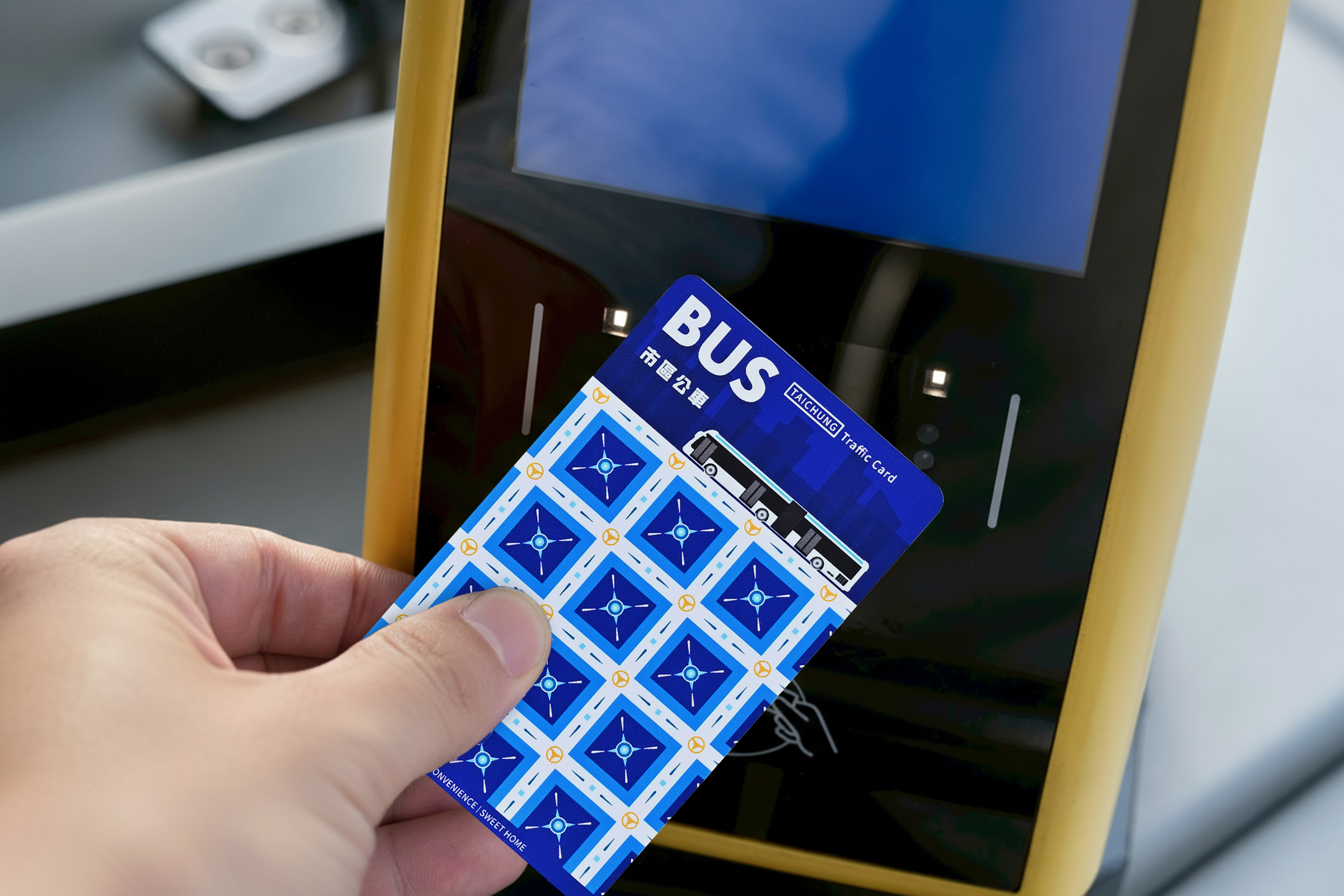
The development of public transport in Taichung ranges from urban bus, taxi, U-Bike, MRT, and the bus in the countryside. For each of these systems, we have set up representative colors for them according to their different user groups, service areas, and passenger experiences. In this series of e-ticket cards, we incorporated the concepts of totem and semiotic to highlight their unique characteristics.
Urban bus – Utilizing the blue color symbolizes that urban bus in Taichung is the earliest major artery to the sea and carries the starting point of the external city connection. The steering wheel motifs of bus combine with the network of intersecting roads in the city center, representing the lifeblood of the urban traffic and core transportation system.
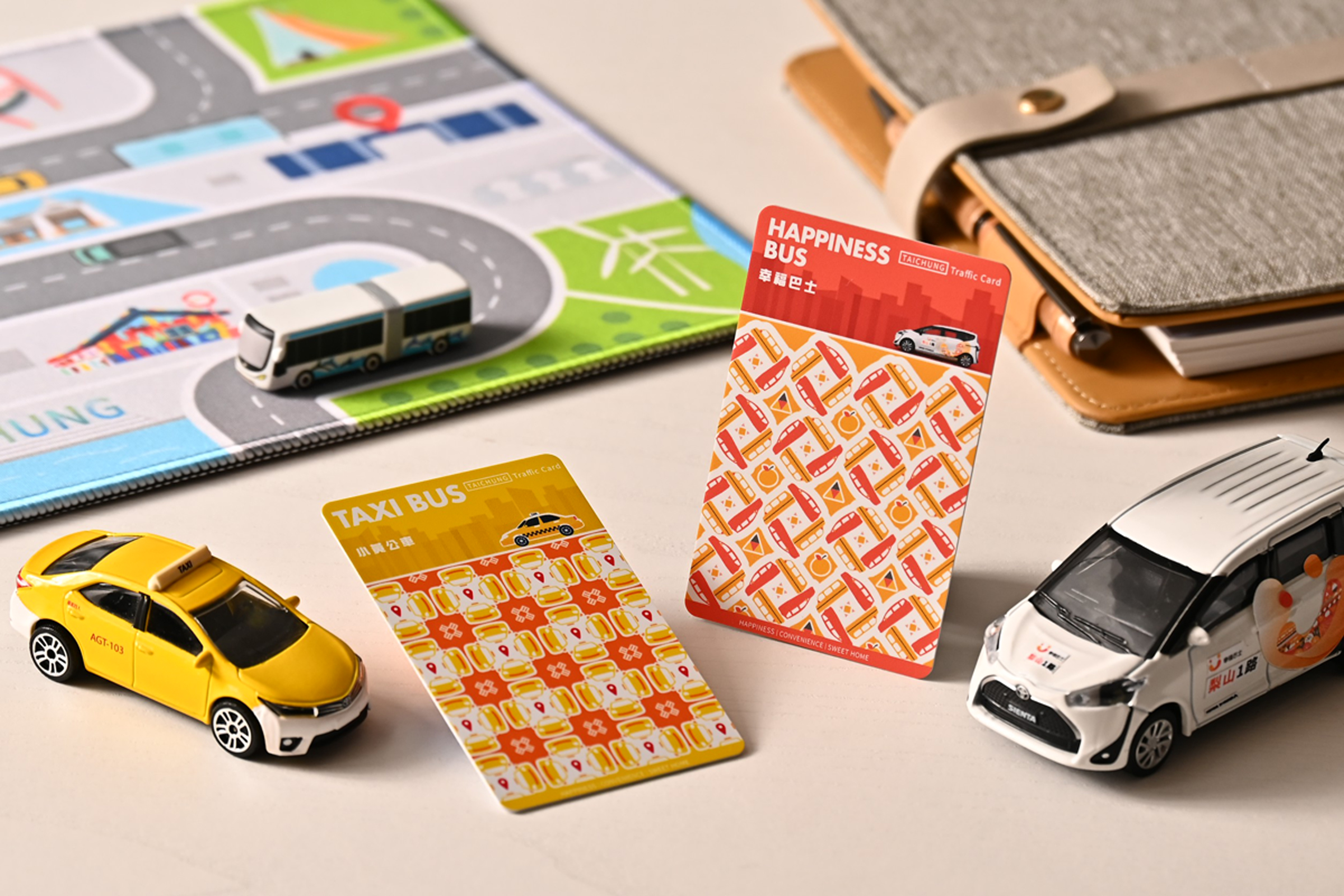
Taxi Bus – The yellow based on the color of taxi, and this transport system represents taxi-bus services for edge city.
The totem design draws inspiration from the roof tiles of traditional Taiwanese three-section compounds, showcasing local culture and highlighting its important role in building urban-rural connections.
YouBike –Utilizing orange yellow showcases the vitality and flexibility of students and commuters. The wheels motif of bicycle sharing symbolizes free movement, carbon reduction, and the circular energy of urban life.
MRT – The green color and totem symbolize that Taichung’s first MRT is like a newborn seedling, bringing growth and transformation to the city. Meanwhile, it represents the future vision of transportation development, emphasizing the concept of sustainability and environmental protection.
Happiness Bus – The orange color symbolizes warmth, safety, and caring, close to the needs of senior people. The totem design is inspired by pears, a local specialty from Lishan in the mountainous area, reflecting the features and identity of local culture, conveying the core values of community service and social care.
Other than the decoration of appearance, we are convinced that design is a part of influence that impacts life. And the Totem also carries the concept of integrating aesthetics into rational transportation design, which is becoming a new symbol to connect daily life of each citizen, cultural heritage, and urban development.
Credits
Entrant
LubanEra·Design
Category
Interior Design - Retails, Shops, Department Stores & Mall

Entrant
Chieh Lee
Category
Interior Design - Exhibits, Pavilions & Exhibitions
