2023
Fong Moon Ting Cantonese Restaurant
Entrant
MET Creative Brand
Category
Interior Design - Restaurants & Bars
Client's Name
Rongfang Wang
Country / Region
China
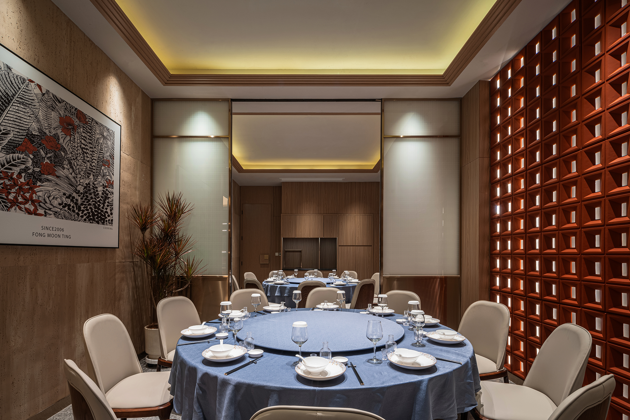
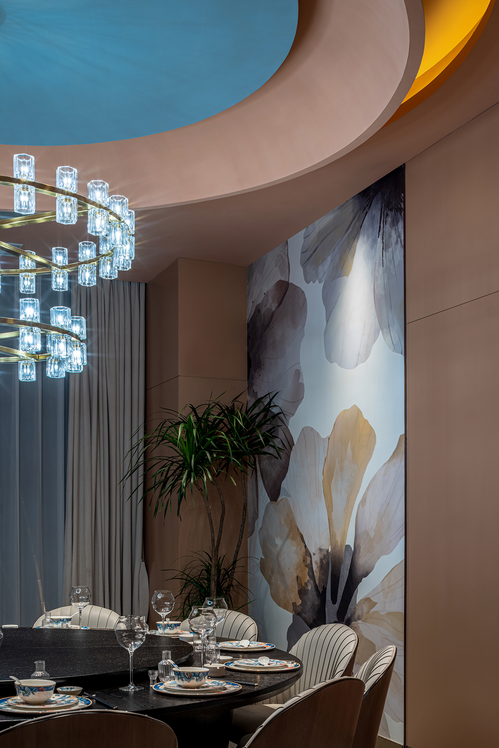
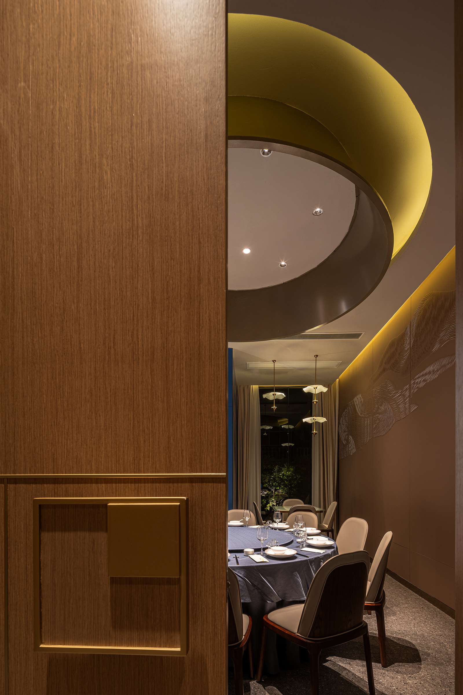
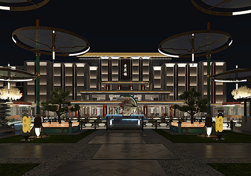
Based on traditional dining spaces, Fong Moon Ting Cantonese Restaurant pursues an immersive dining scene experience through the multi-dimensional design of art spaces. By incorporating vibrant lighting, the restaurant has achieved a seamless flow of ambiance and enhanced sensory appeal, embracing the latest fashion trends with a fresh attitude, and meets the current consumer needs in different periods and scenarios with the overlapping and transformation of restaurant-bar functions.
The burgundy body creates a new form using deconstructivist techniques. Golden brands and lighting stand in it, and elegance comes from the intersection of light and shadow. The vertical arrangement of red bricks imparts a sense of rusticity, while the abundance of plant life infuses a vibrant energy. The convergence of form, color, and texture generates a distinct artistic tone for this particular project.
Retro red bricks and free greenery are artificially manipulated to form a street-side landscape. While ingeniously transitioning and dividing, they also create a landscape for the space. The natural vitality of plants promotes attitudes and captures the gaze and footsteps of passersby.
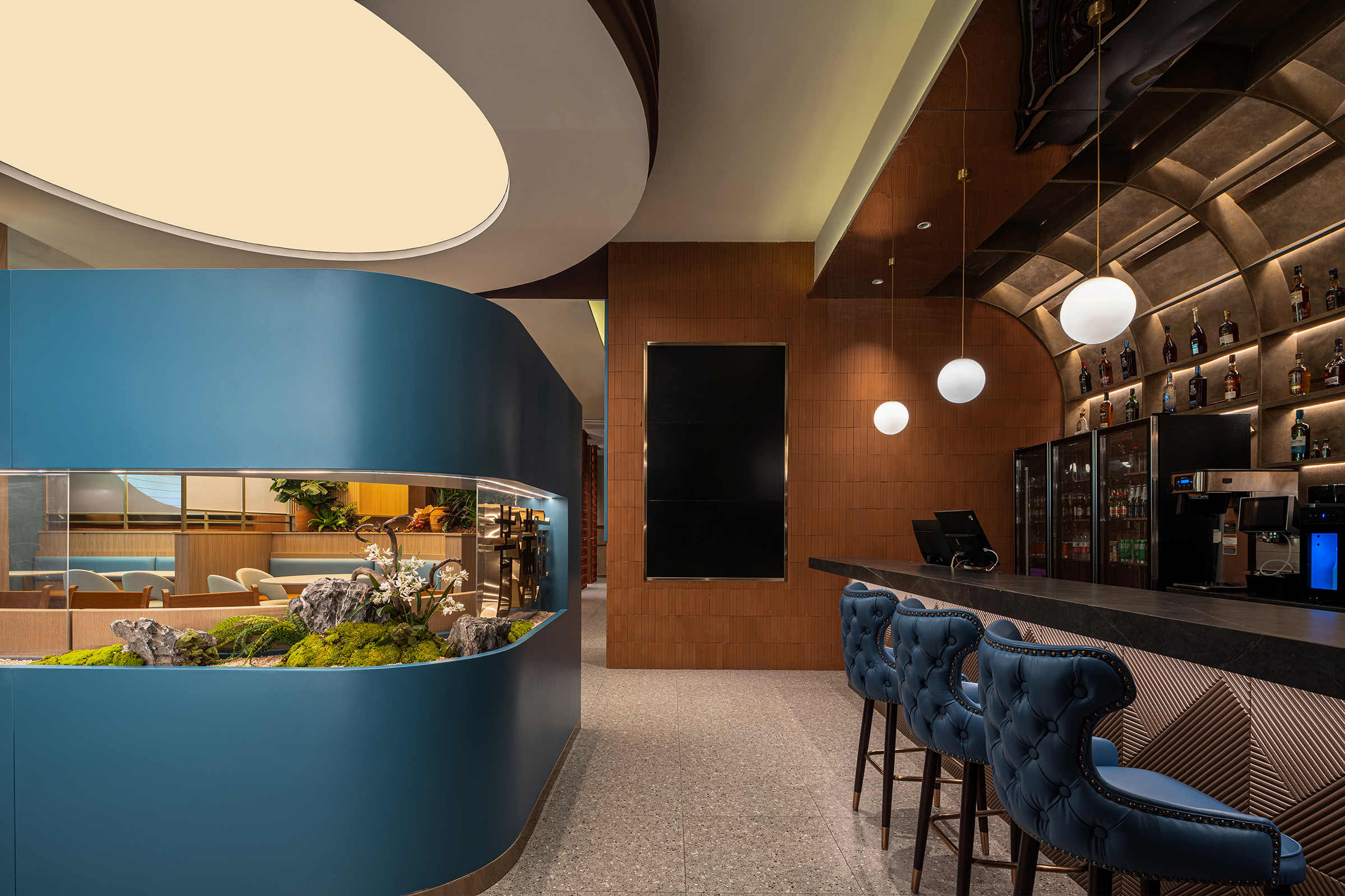
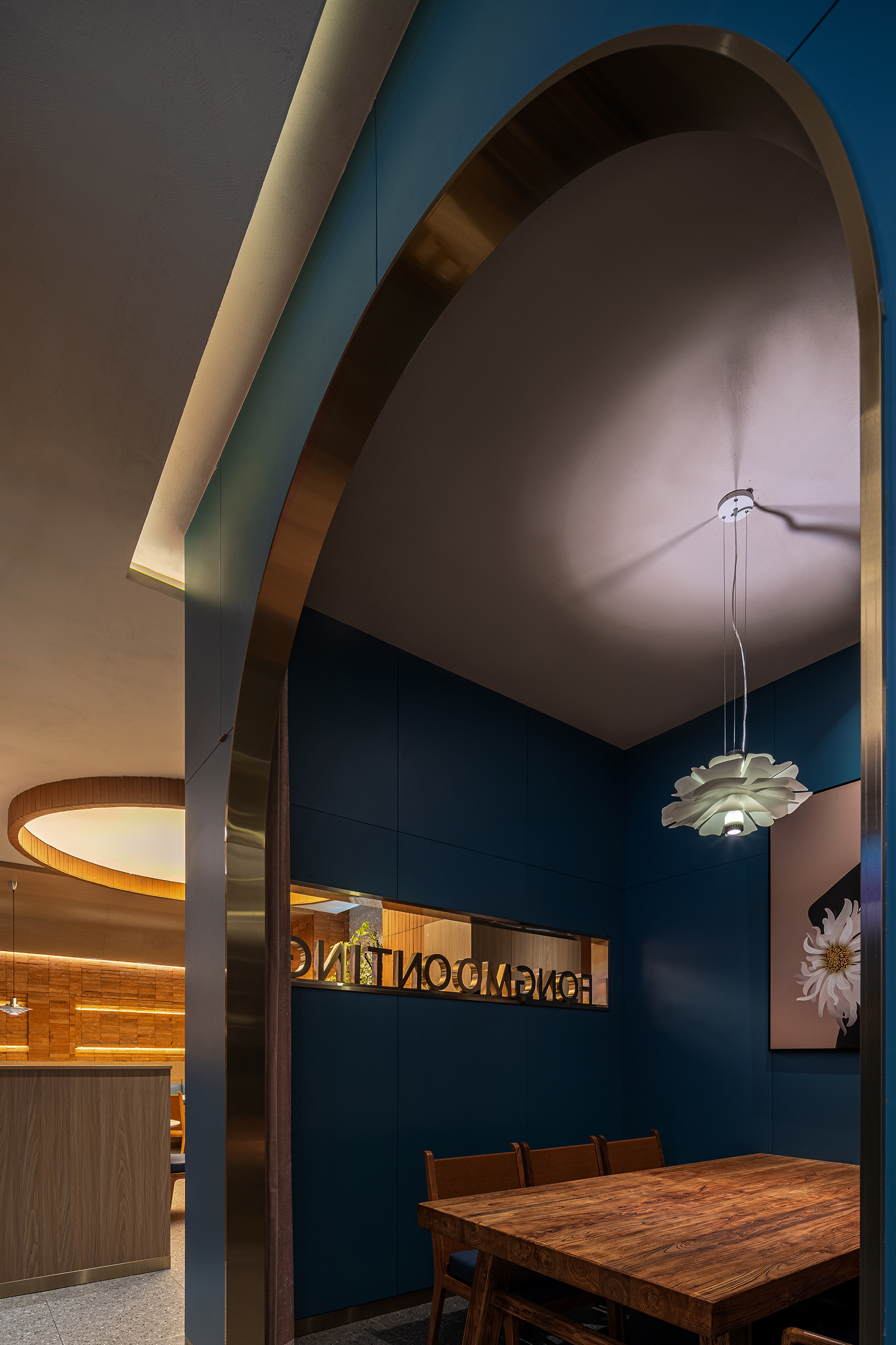
Embracing the scenery within the interior space, the hollow partitions are immersed in a symbolic blue hue representing the brand. Adorned with elements such as flowers, plants, rocks, and stones, these partitions establish a harmonious dialogue with the outdoor landscape, while also creating a sense of transparency in the separated spaces.
The counter on the right-hand side of the bar incorporates a cashier function, and its integration of colors and textures creates a unique and innovative experience. Soft upholstered benches, spherical chandeliers, and curved grille frames create a relaxing space, while the deep stone and mirrored ceilings collide with the glamour of the city in metal accents, welcoming customers or midnight drinks, making it easy to navigate.
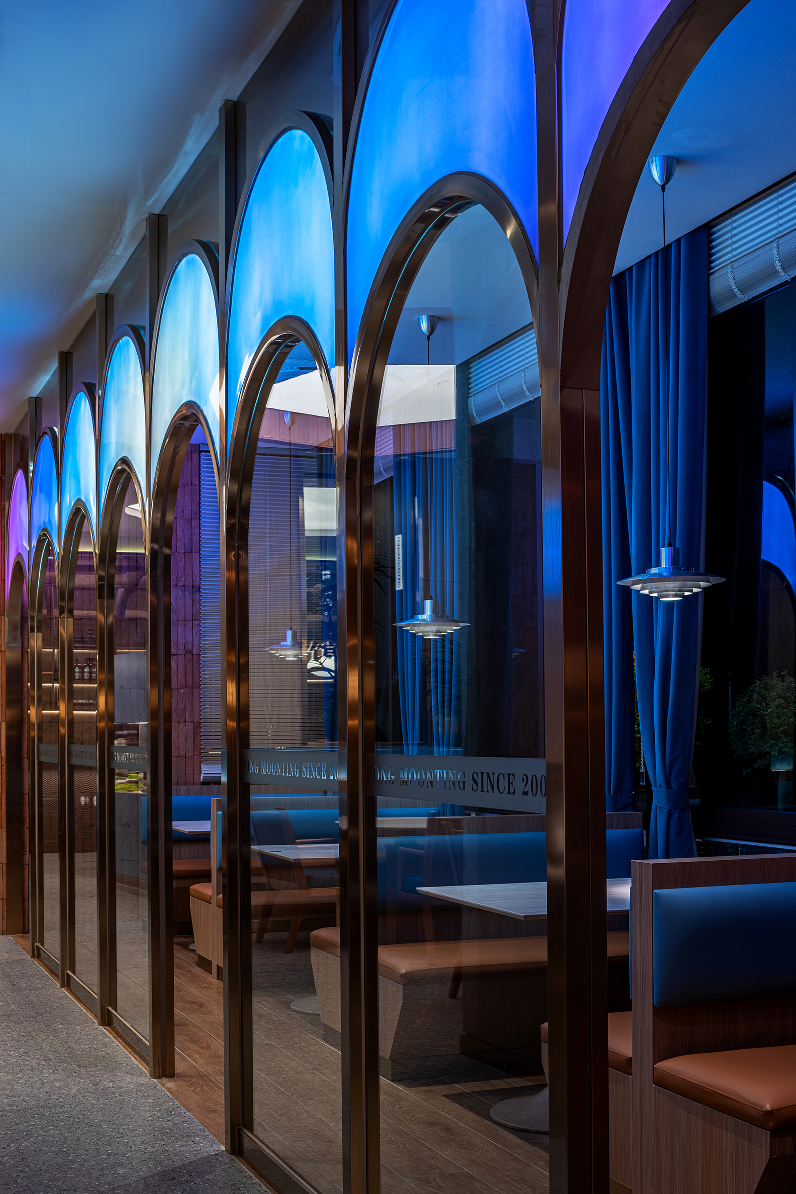
Seated in front of the window, an arched glass partition delineates the cardholder area, unveiling the interior's sense of hierarchy and quietly instilling a sense of amusement.
Next to the scattered seats, the stacked red bricks continue the rough texture in my memories, while the various lights give the space a lively meaning.
Credits

Entrant
inDareSpace
Category
Interior Design - Showroom / Exhibit

Entrant
Anyang Yanjia High end Original Design Agency-Bingchuan LIU
Category
Architectural Design - Hotels & Resorts

Entrant
ZK interior design
Category
Interior Design - Living Spaces
