2026
ChocoCrush
Entrant
SureShot B.V. (company
Category
Packaging Design - Snacks, Confectionary & Desserts
Client's Name
ChocoCrush
Country / Region
Netherlands
Gallery


About The Entry
CHOCOCRUSH – Chocolate That Looks as Exciting as It Tastes
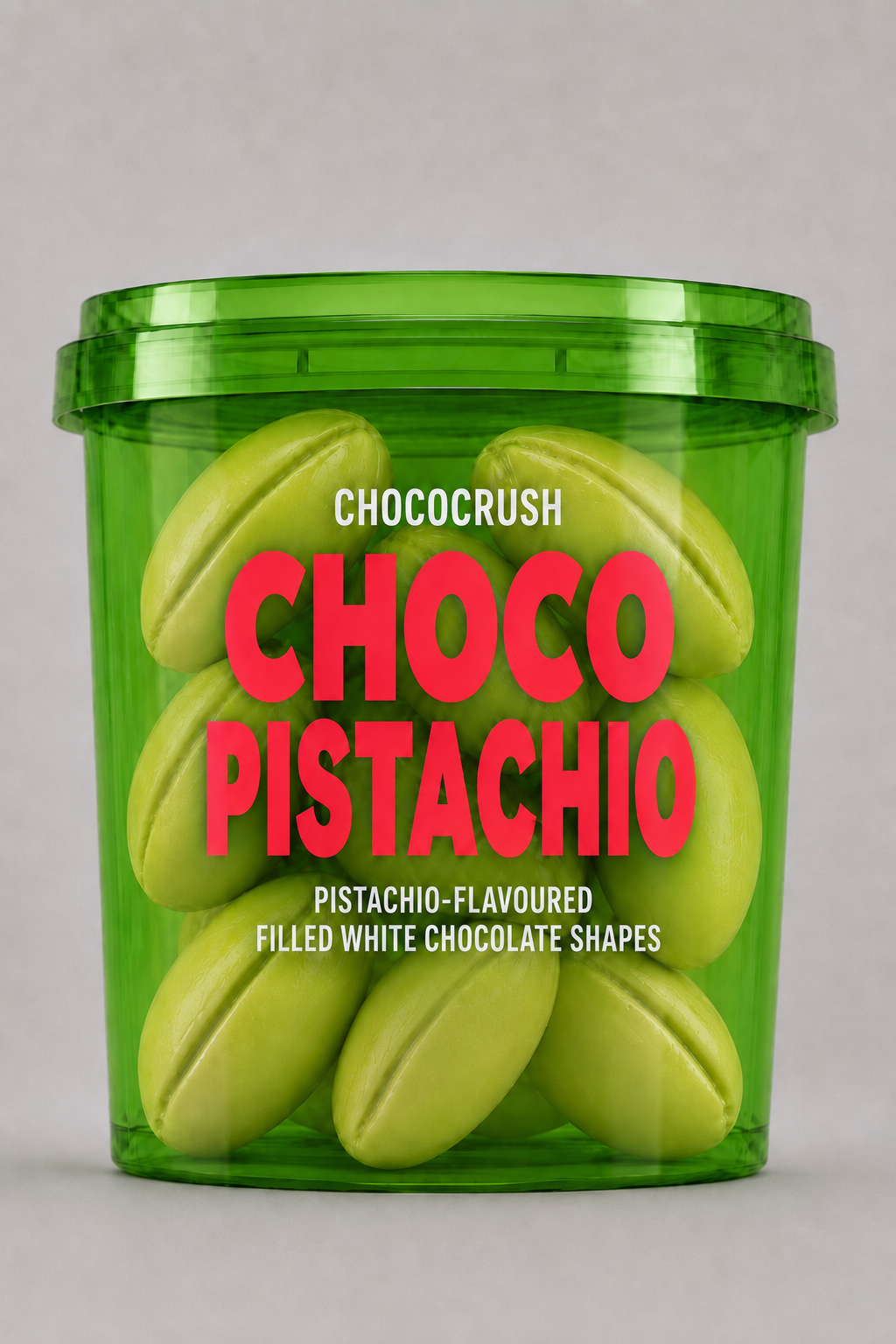
CHOCOCRUSH was created to bring a new sense of fun, colour and energy to the chocolate category. Moving away from traditional chocolate packaging, the range combines bold product shapes, vibrant colours and transparent packaging to create an instantly recognisable and highly visual brand experience.
The collection features filled white chocolate shapes in distinctive flavours including Pistachio, Mango and a colourful Fruit Mix. Rather than hiding the product behind conventional packaging, the transparent tubs make the chocolates themselves an essential part of the design. Their sculptural shapes and striking colours immediately communicate flavour, indulgence and playfulness.
Each variant has its own strong colour identity: green for Pistachio, warm orange for Mango and electric blue for Fruit Mix. The oversized red CHOCO typography creates a consistent visual signature across the range, while the clear hierarchy makes each flavour easy to recognise at a glance.
The result is packaging designed to stand out in a crowded confectionery environment, both on shelf and on social media. CHOCOCRUSH turns the product into the hero and transforms a simple tub of chocolate into a colourful object people want to discover, share and enjoy.
The design reflects the core idea behind the brand: chocolate can be premium and indulgent without taking itself too seriously.
Credits


Entrant
XIA YUQING
Category
Communication Design - Student Design