2024
New Visual Identity for Radio Nordjyske's Podcasts
Entrant
DNMH AGENCY | ZITE
Category
User Interface Design (UI) - Podcasts
Client's Name
Det Nordjyske Mediehus
Country / Region
Denmark
Challenge:
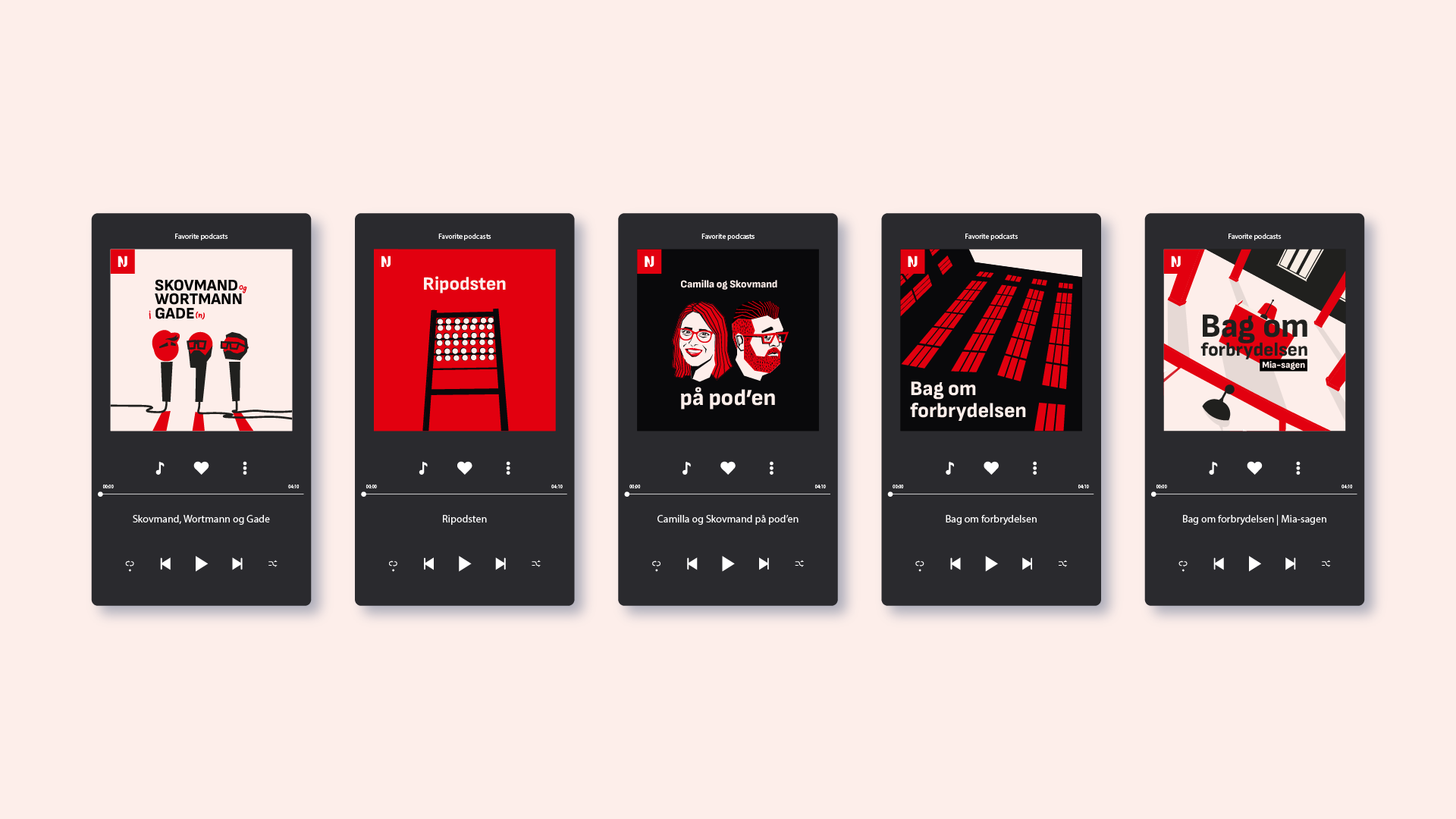
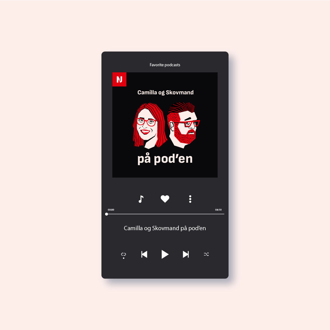
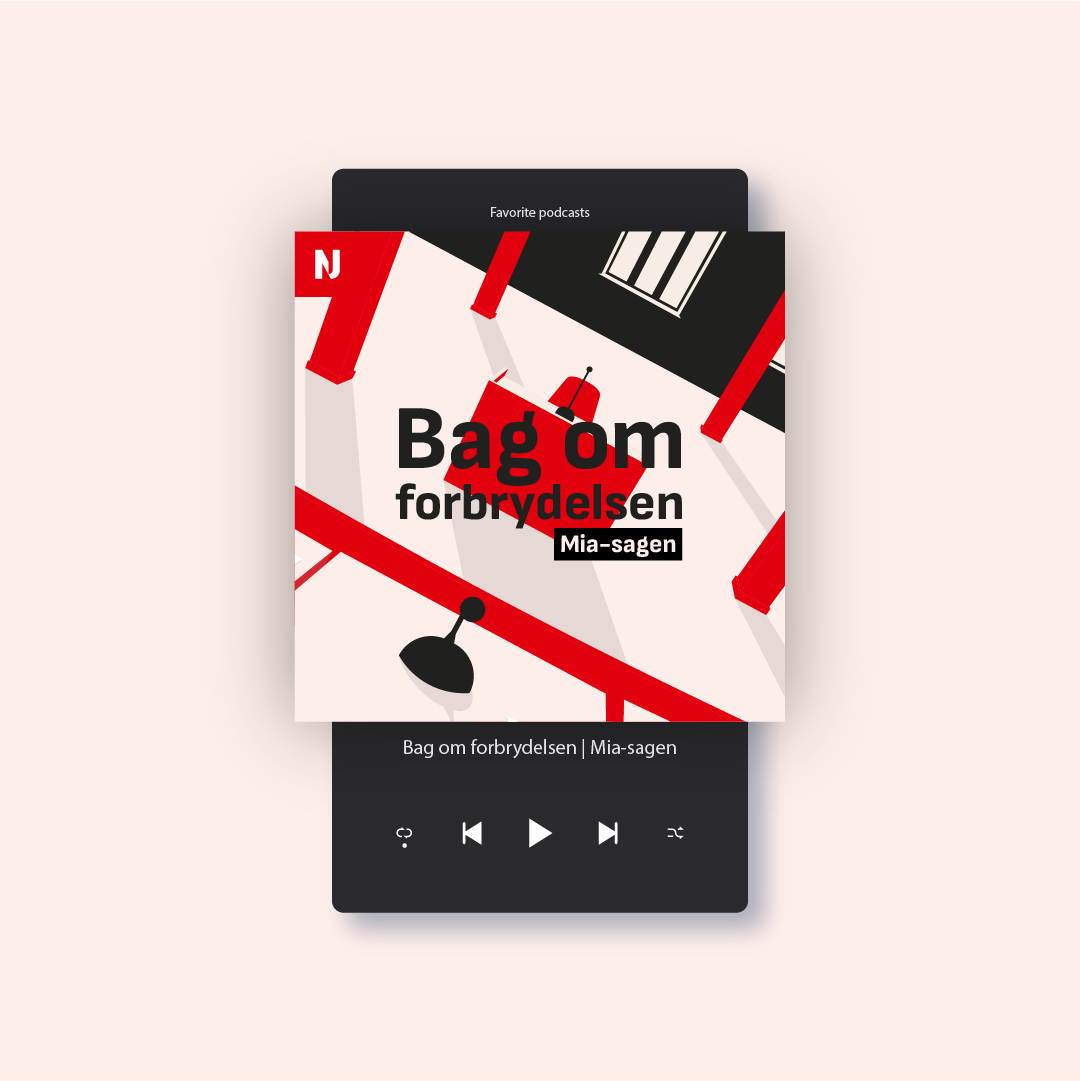
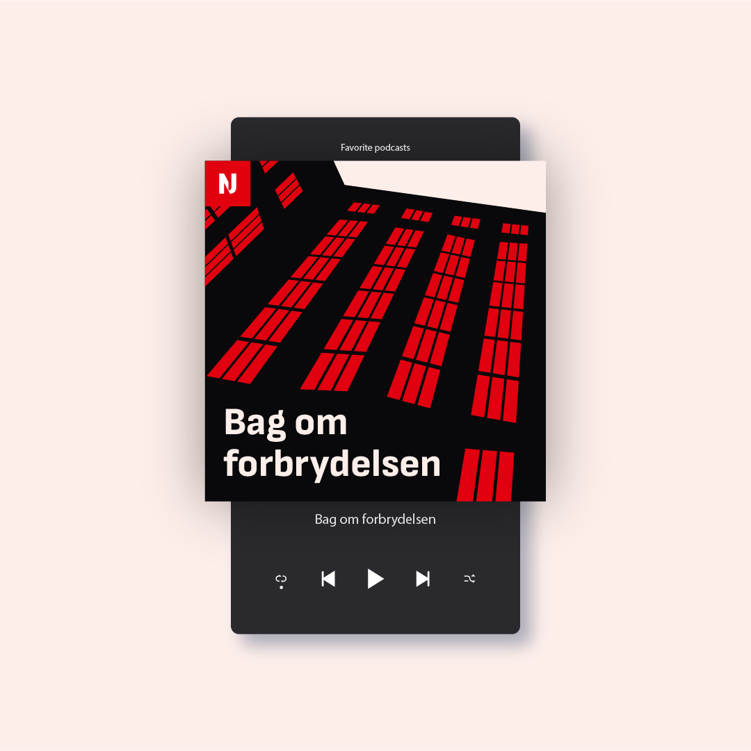
How do you design a visual language that resonates with the gripping suspense of True Crime, matches the vigor of a football game, and still fits under the broad umbrella of Radio Nordjyske's established visual identity? Our task was to create a style that not only complements our brand's overall design but also celebrates the individuality of each podcast.
Solution:
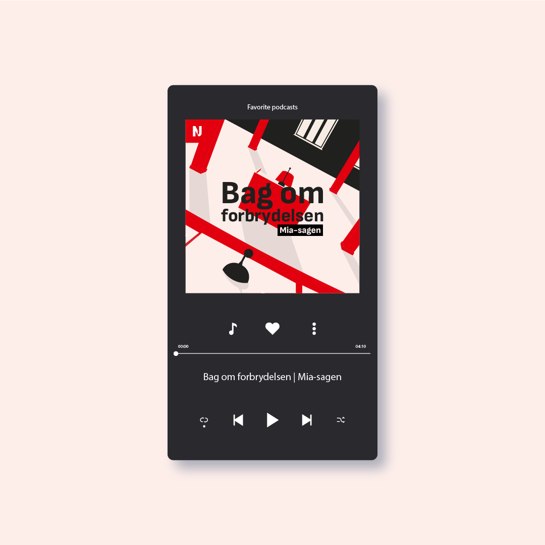
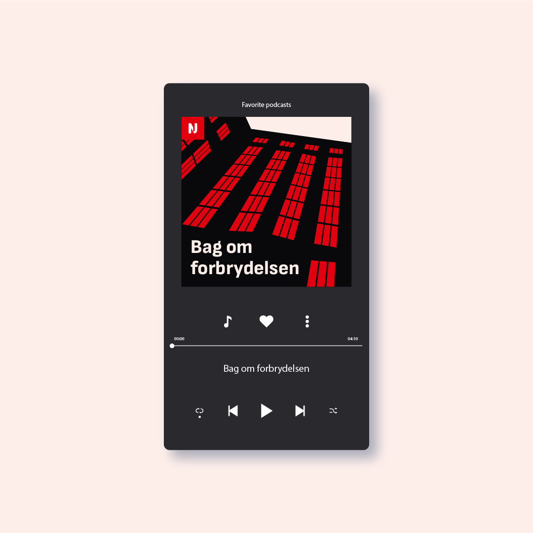
Our approach was to craft a dynamic, graphic illustration universe deeply rooted in Nordjyske's brand colors and ethos. This was not merely a design task but a narrative journey. Using the Nordjyske CVI's color palette as our cornerstone, we developed a range of illustrations that echo the essence of each podcast while maintaining a harmonious connection to our brand identity.
Each design element was carefully chosen, each color meticulously picked, to ensure that while a cover distinctly represents its podcast's theme – be it the intrigue of True Crime or the excitement of football – it also aligns seamlessly with Radio Nordjyske's visual identity. These are not just covers; they are the faces of our stories, uniquely individual yet unmistakably Nordjyske.
Every podcast tells a story, and every story deserves its spotlight. The new visual style is more than just an aesthetic choice; it's a commitment to Radio Nordjyske’s listeners - to engage, entertain, and encapsulate the world of podcasting in every hue and stroke. We're not just creating covers; we're crafting experiences.
Results:
Since the launch of our redesigned podcast covers, Radio Nordjyske has seen a significant uptick in engagement and listenership. Listeners now recognize Radio Nordjyske’s podcasts not just by their content but by their visual identity.
The launch of these redesigned podcast covers marked a new era for Radio Nordjyske. Listener engagement soared, with audiences not only connecting to the podcasts’ content but also resonating with their visual representation. We've achieved a delicate balance - celebrating diversity in content while maintaining a consistent and recognizable brand identity.
We've successfully bridged the gap between content and design, creating a visual language that speaks to our diverse audience.
Credits
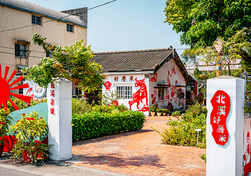
Entrant
National Yunlin University of Science and Technology
Category
Landscape Design - Rural Design

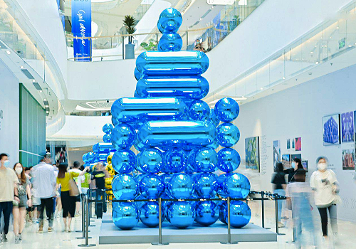
Entrant
China Resources Land (Fuzhou) Real Estate Co., Ltd
Category
Architectural Design - Public Art & Public Art Installation

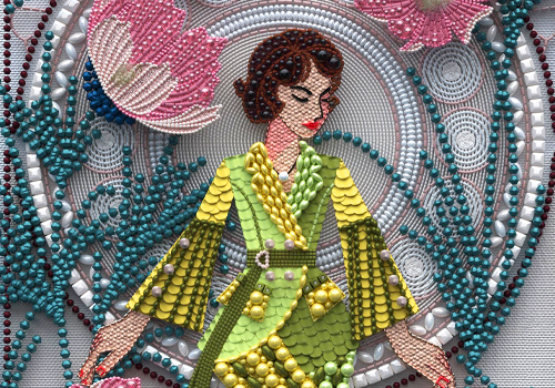
Entrant
Donghua University/ Haiying Lin
Category
Product Design - Product Design / Other__
