2024
TRIBECA Restaurant & Bar
Entrant
Cloud Ocean Design Co., Ltd (China, Singapore)
Category
Interior Design - Restaurants & Bars
Client's Name
Country / Region
China
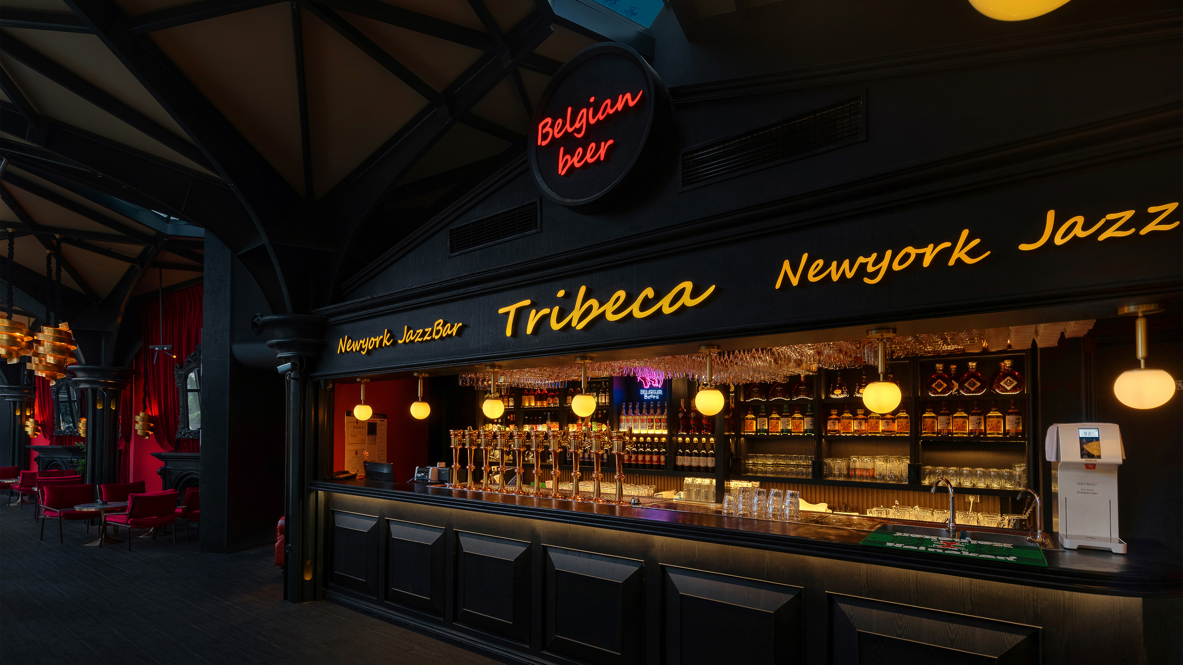
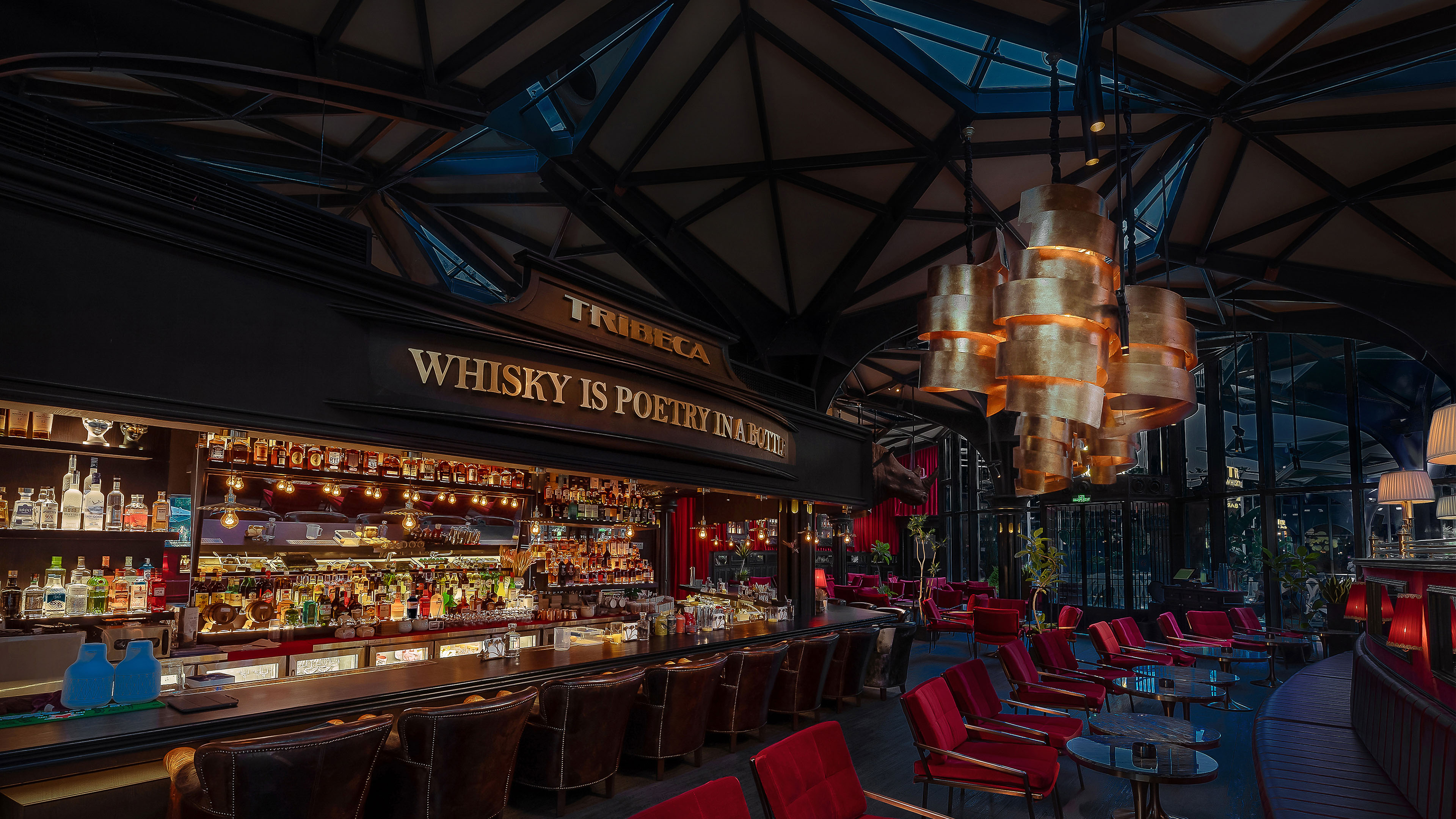
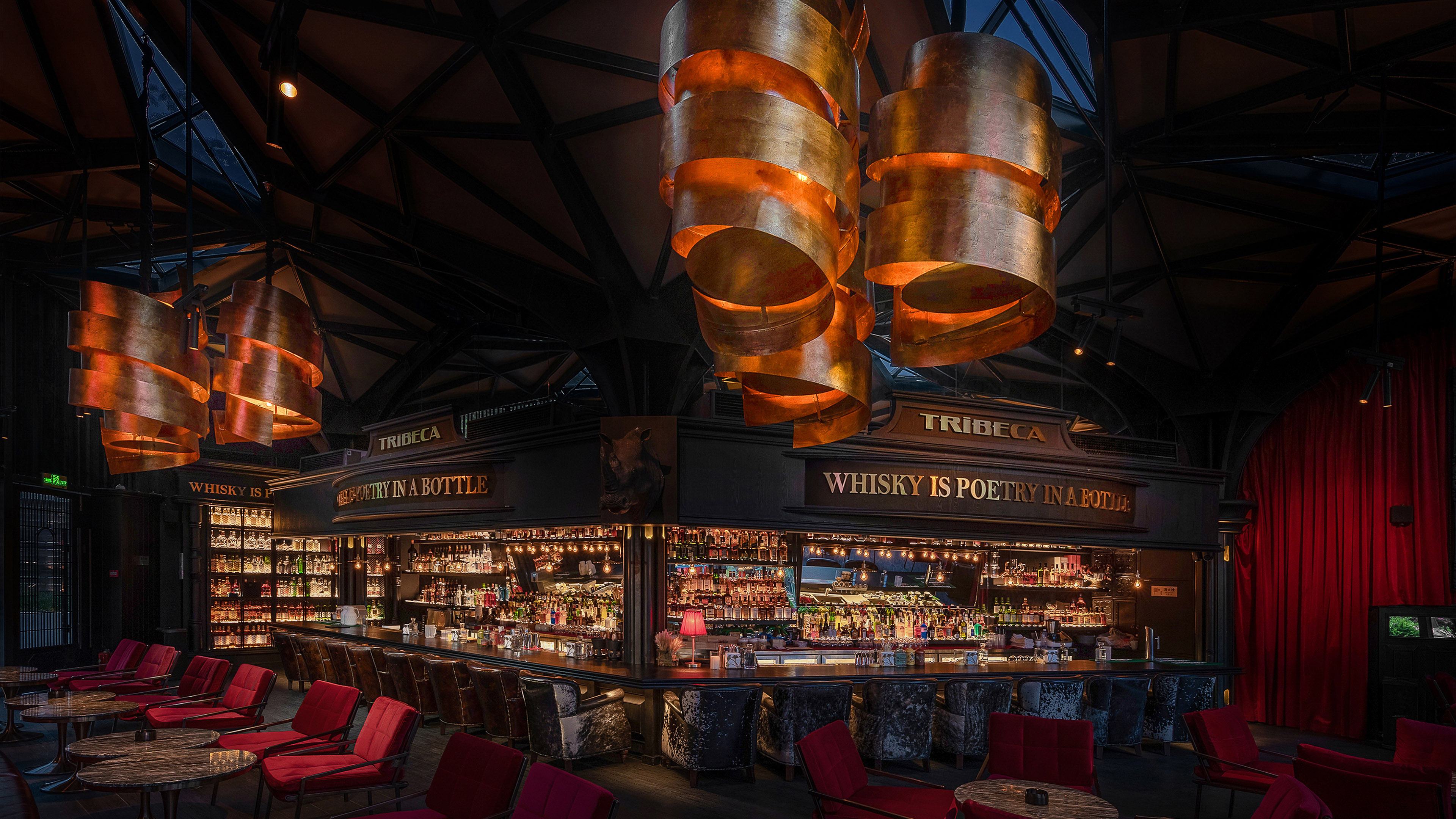
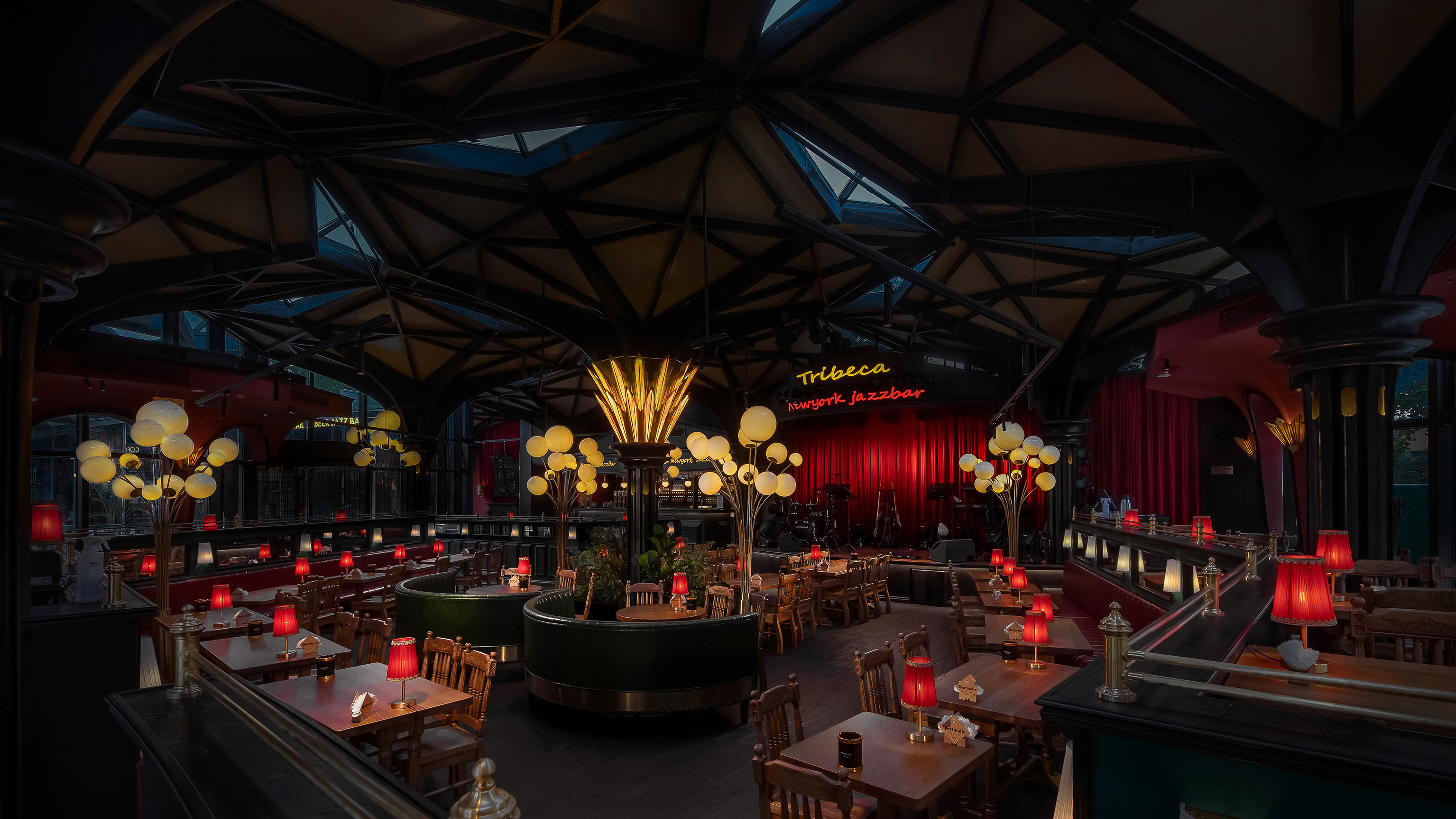
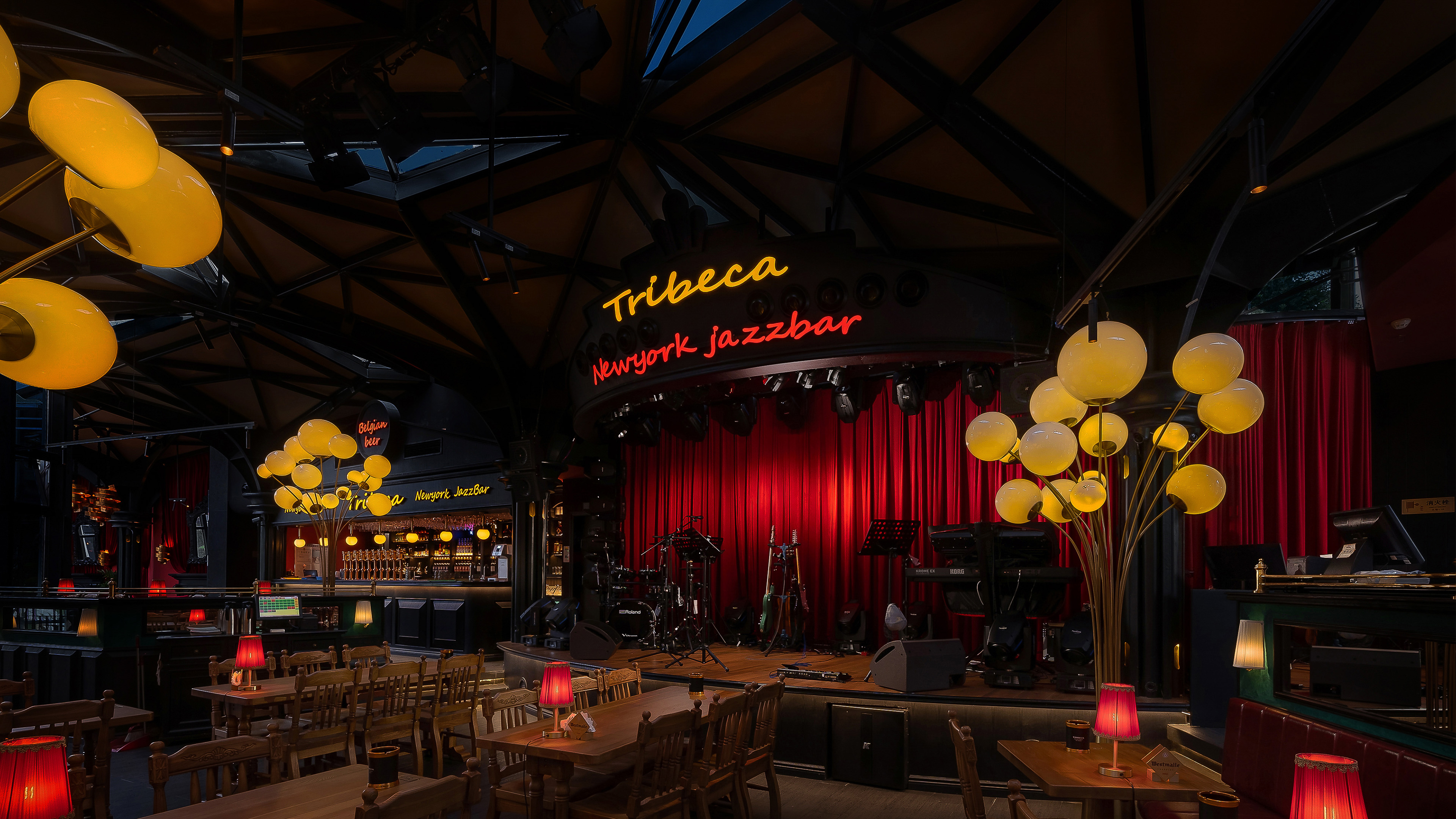
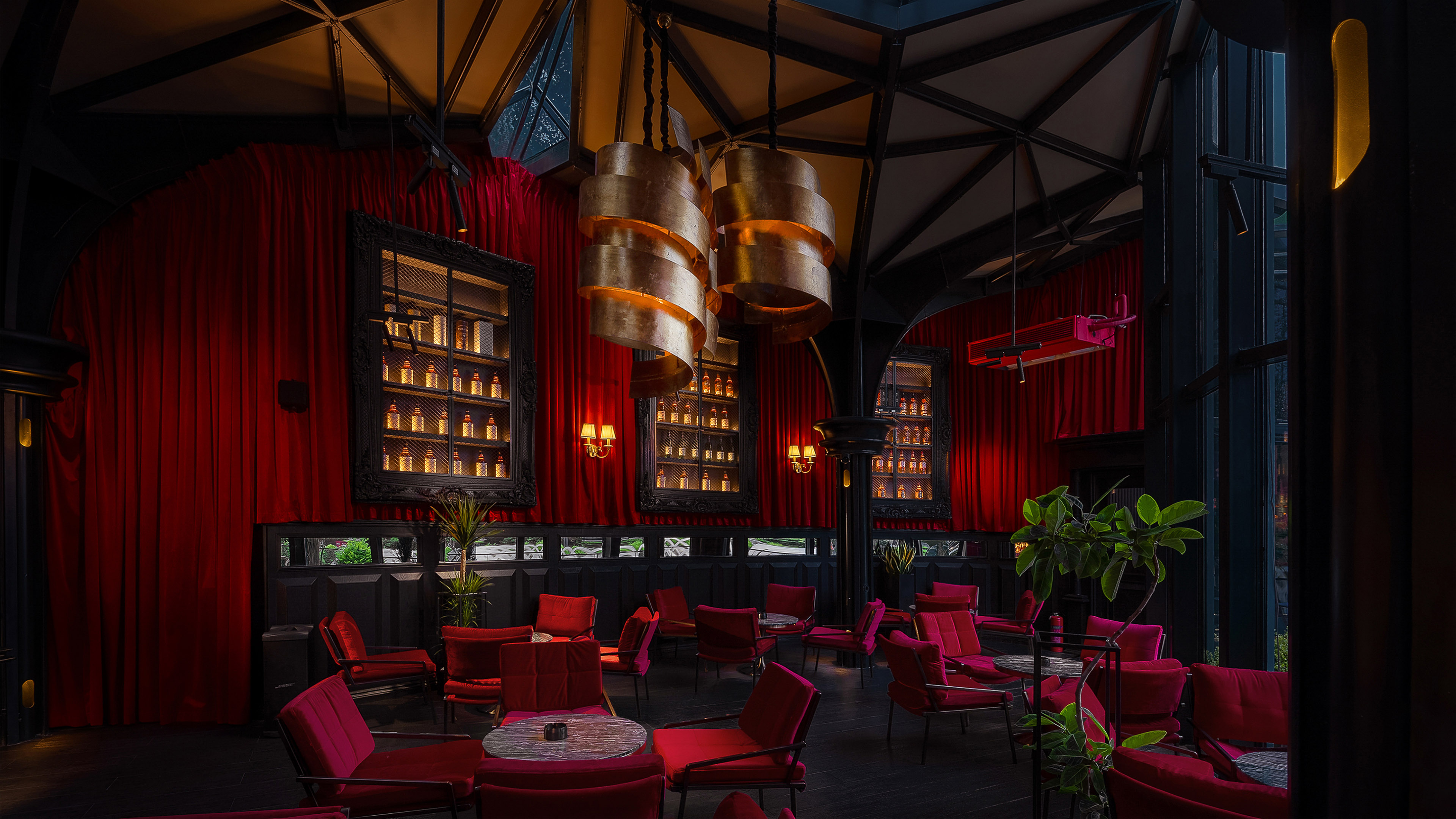
Through a careful blend of aesthetics and functionality, we've created a harmonious connection between people and space – the focal point of our design. The Western-style bar, inspired by classical opera houses, features a central stage layout and horseshoe-shaped seating that extends towards the rear, elevated for enhanced spatial depth and optimal viewing for patrons at the back.
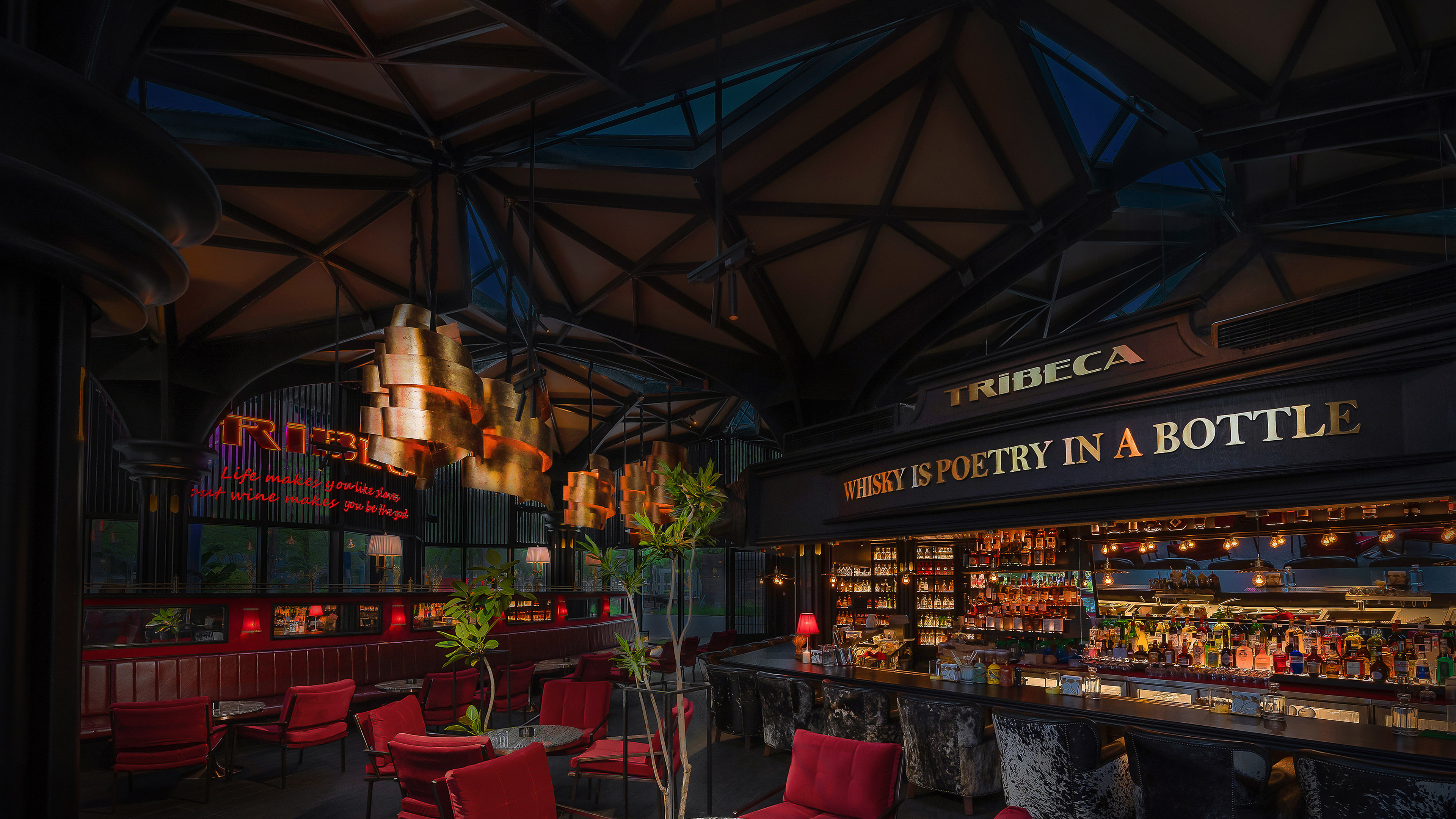
The top of the Western-style bar building preserves the original glass design, allowing sunlight to directly illuminate the space during the day, satisfying indoor lighting needs and adhering to eco-friendly principles. In the evening, the interior lighting design utilizes localized sources to create a diffuse reflection, reminiscent of antique candlelight, enhancing the retro aesthetic. The dining area cleverly employs lighting to delineate zones, creating a relaxed and intimate environment for friends to gather and chat.
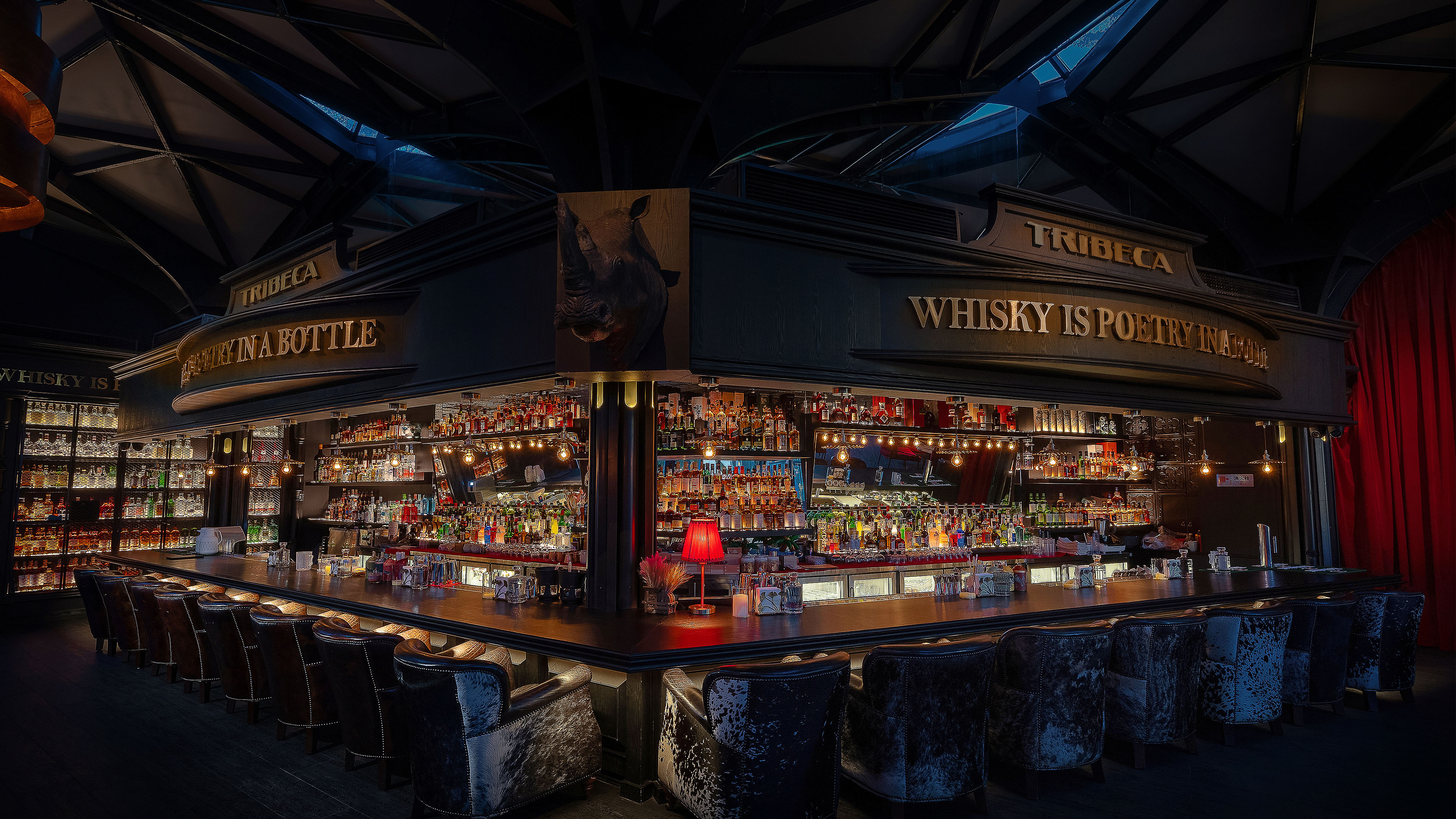
The color palette embraces classical tones, ultimately opting for a combination of black, red, and green. Combining vibrant interplay of light and shadow with a well-defined spatial layout, we have focused visual attention, harmonizing dynamism and tranquility to create a comfortable and elegant atmosphere. In the whisky bar, the centerpiece is the bar counter, inspired by the Japanese "board-front" design, elevating the outdoor bar counter while lowering the internal cocktail counter to ensure eye-level interaction between the bartender and seated guests.
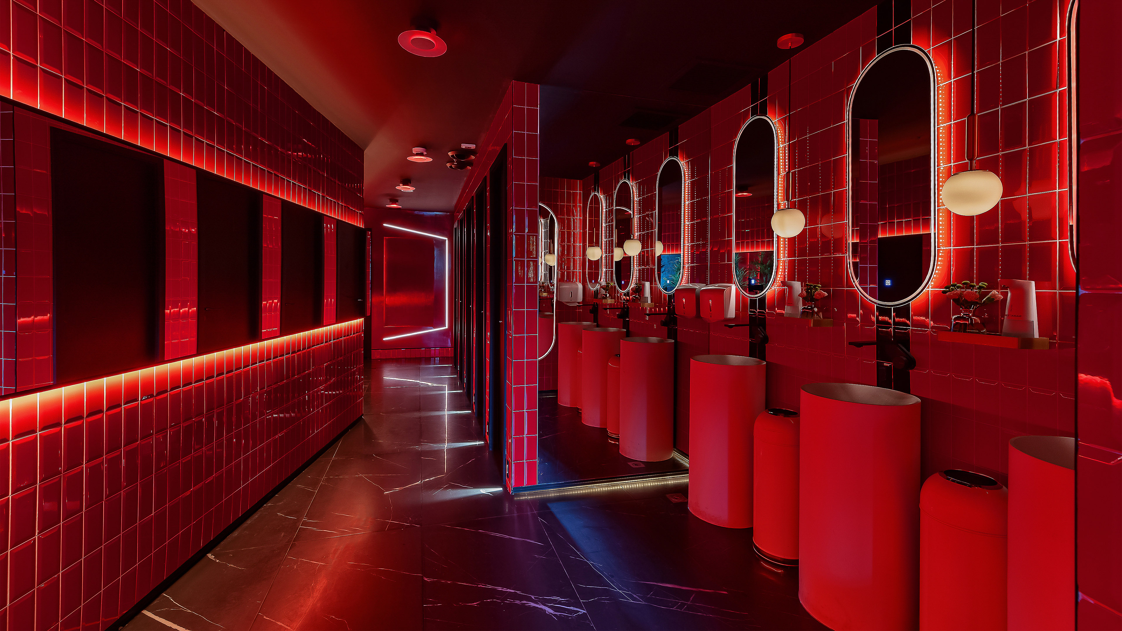
The meticulous detailing in the British Peninsula area features fur decor using the beloved British velvet horsehair, and the wall and cabinet structures showcase Baroque pattern carvings reminiscent of early European design, accentuating an elevated sense of style. The restroom utilizes ample mirrors to expand the space and incorporates a bold red color scheme to captivate attention, evoking a luxurious atmosphere and reinforcing the authentic and elegant style of an English whisky bar.
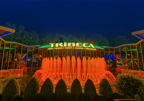
The outdoor area complements the indoor embrace, with the "TRIBECA" logo at its center. A music fountain is designed to enhance the visual focal point, and outdoor seating is arranged in a dispersed manner around the entire building. Lush greenery and seating combine to evoke a manor-like atmosphere. Outdoors complement the architecture, enhancing the overall experience in a symbiotic relationship.
Credits
Entrant
Matrix Design
Category
Interior Design - Commercial

Entrant
Hangzhou Vogue Environmental Art Design Co., Ltd.
Category
Interior Design - Restaurants & Bars
