2025
Millefiori VIS Design
Entrant
Shanghai LightBrand Cultural Creative Co., Ltd.
Category
Communication Design - Company Branding
Client's Name
-
Country / Region
China
Gallery


About The Entry
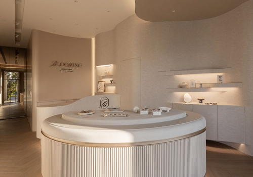
To make sure everyone is comfortable, we steer clear of the conventional pink labeling of intimate products and opt for natural, neutral hues like light gray and off-white in our designs. Our main motif, a flower that can rotate and change shape, may take on distinct forms, just like actual flowers, signifying that individuals of diverse body types, genders, and orientations are worthy of respect. Because the user controls the petal-opening effect during wear and removal, sensuality is a display of confidence rather than an attempt to please others. A dynamic visual system that genuinely brings design to life was created by the brand. The packaging's rotating and changing petal patterns make opening the box feel like opening a flower in bloom. Although the lining material feels as soft as actual petals, it is actually composed of mycelium, which is a mushroom's root structure. After use, it will break down into fertilizer in 45 days and can be buried in the ground. The packaging's surface uses embossing techniques rather than conventional color printing, which can save up to 70% of ink. A moist towel can be used to easily wipe away any dirt. We have combined the natural growth patterns of flowers with minimalist geometric lines, infusing mechanical designs with a sense of organic beauty. By using rotating petal motifs to symbolize diverse identities, and drawing inspiration from Mondrian's geometric abstraction and Kandinsky's 'point, line, plane' theory, our brand logo dynamically adapts to different contexts. Additionally, scanning a QR code with a smartphone reveals an animation of flowers slowly blooming, enhancing the interactive and visual richness of the brand. From the rotatable badges on staff uniforms to the petal-shaped opening and closing clasp on product tags to the store lighting, which is designed to project a gradient of overlapping petals, a neutral gray-white color scheme is consistently used across all touchpoints. As a tactile extension of this color scheme, mycelium material readily echoes the brand's "soft yet resilient" attitude.
Credits

Entrant
Culture & Tourism Bureau of Chiayi County
Category
Conceptual Design - Exhibition & Events
Entrant
TSK Group
Category
Interior Design - Office
Entrant
Dazhou and Associates
Category
Architectural Design - Plazas