2025
Founders Faction
Entrant
Symbr
Category
Communication Design - Company Branding
Client's Name
Founders Faction
Country / Region
United Kingdom
Gallery


About The Entry
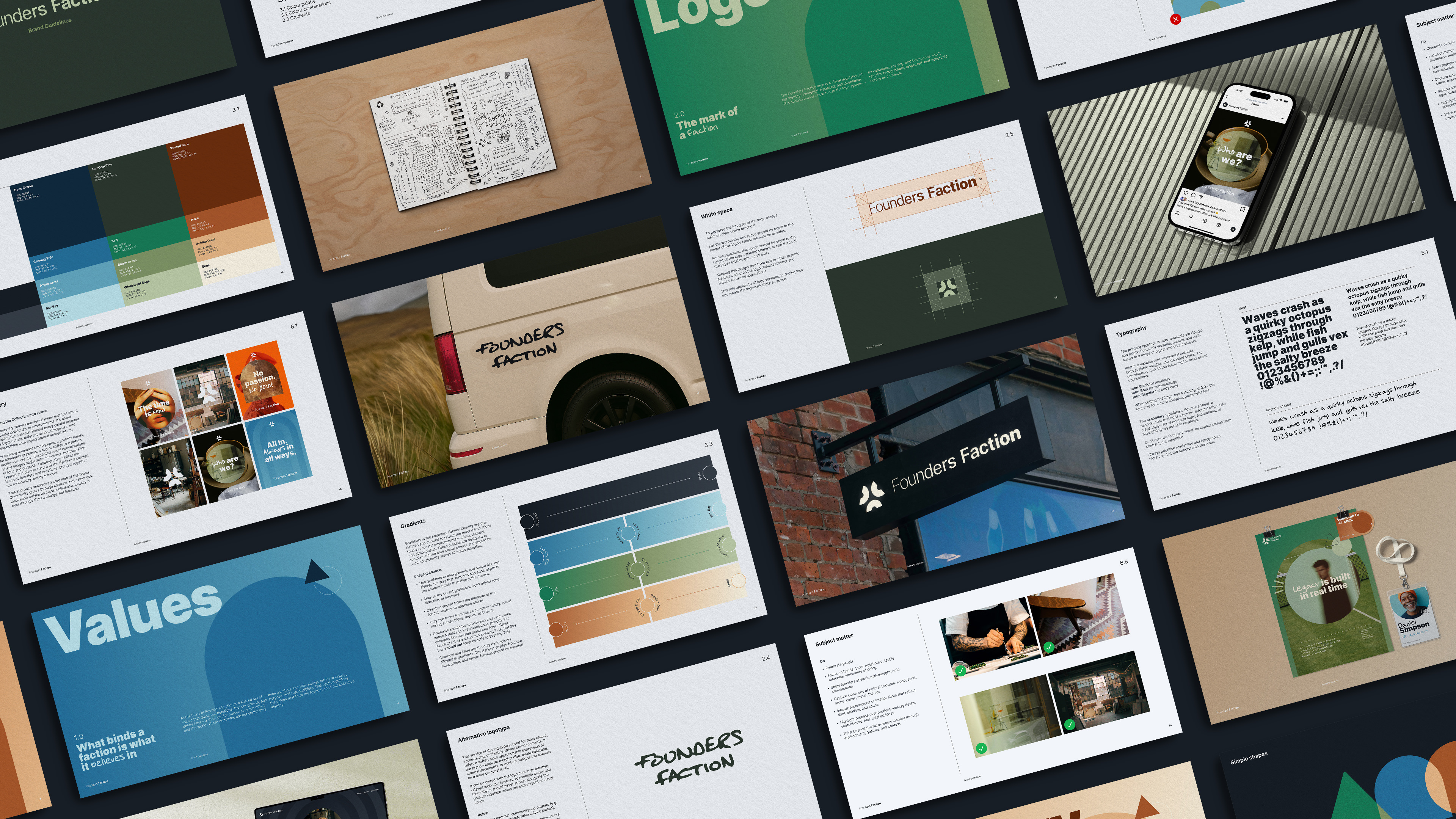
Founders Faction is a brand identity born from a simple but resonant idea: that clarity, purpose, and legacy matter more than hustle for hustle’s sake. Initially envisioned as a coastal co-working space for city professionals seeking pause and perspective, the project evolved into something deeper — a values-led collective grounded in Stoic and Existential ideas. It’s a brand for those building with intent, growing on purpose, and contributing to something greater than themselves.
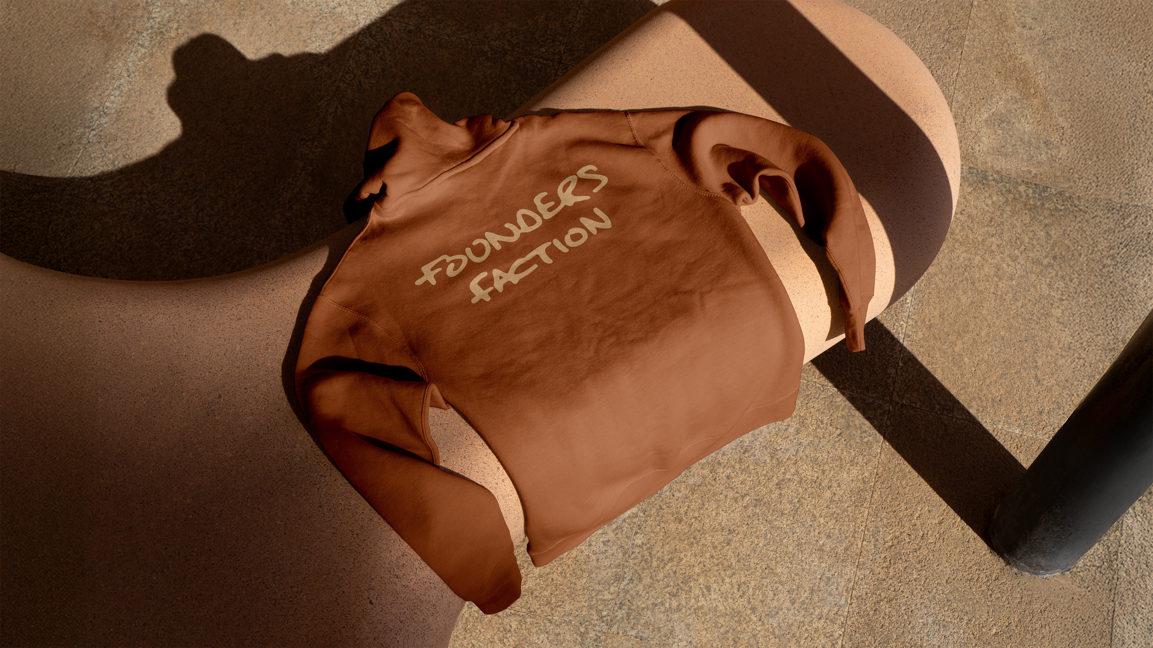
The identity draws on elements of oceanside culture — surf, skate, and salt-weathered materials — with plans to evolve into alpine life in future phases: mountain towns, skiing, snowboarding, and slower, more intentional rhythms of living. It’s a lifestyle as much as a brand, shaped by environment and shared values.
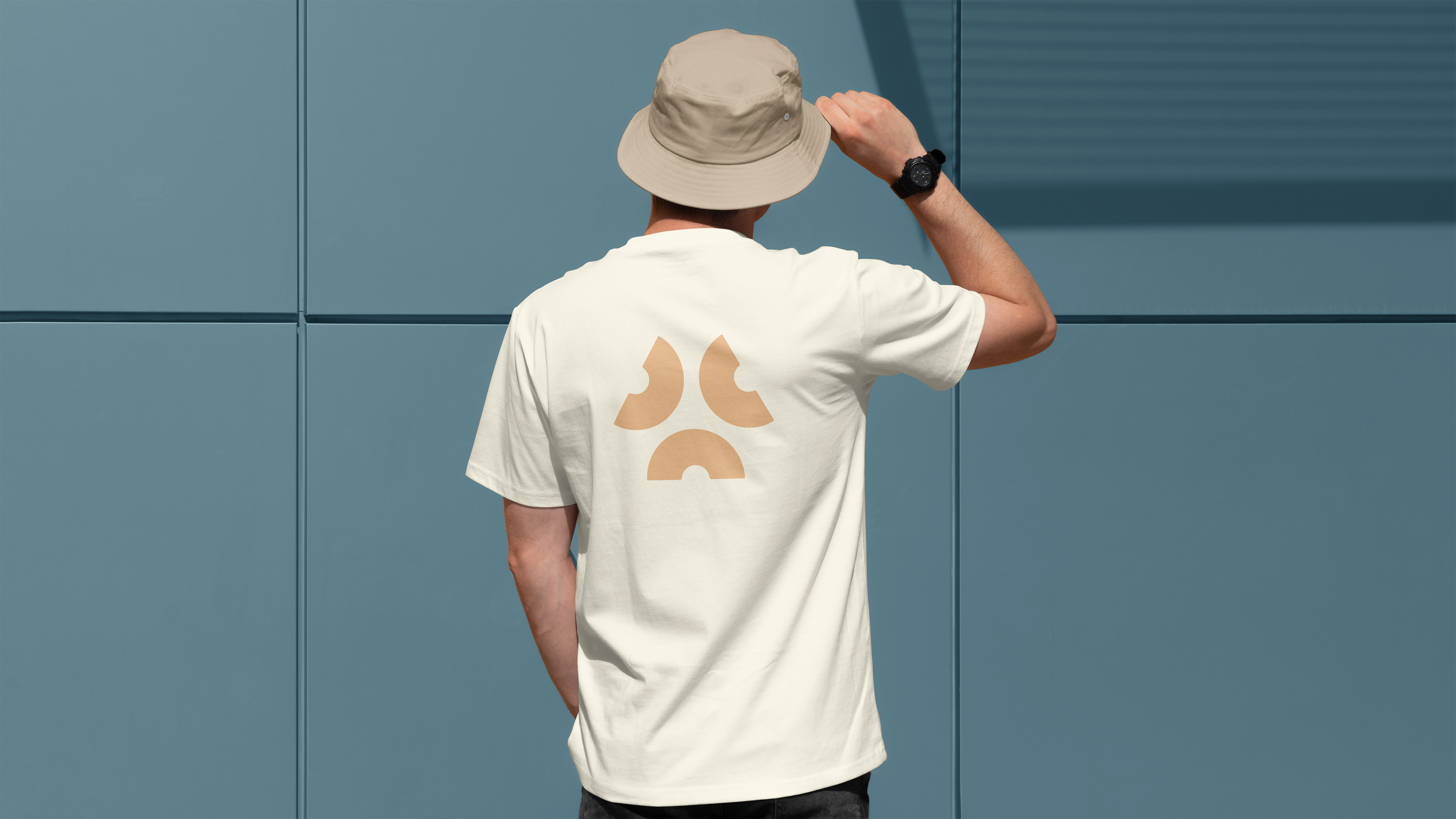
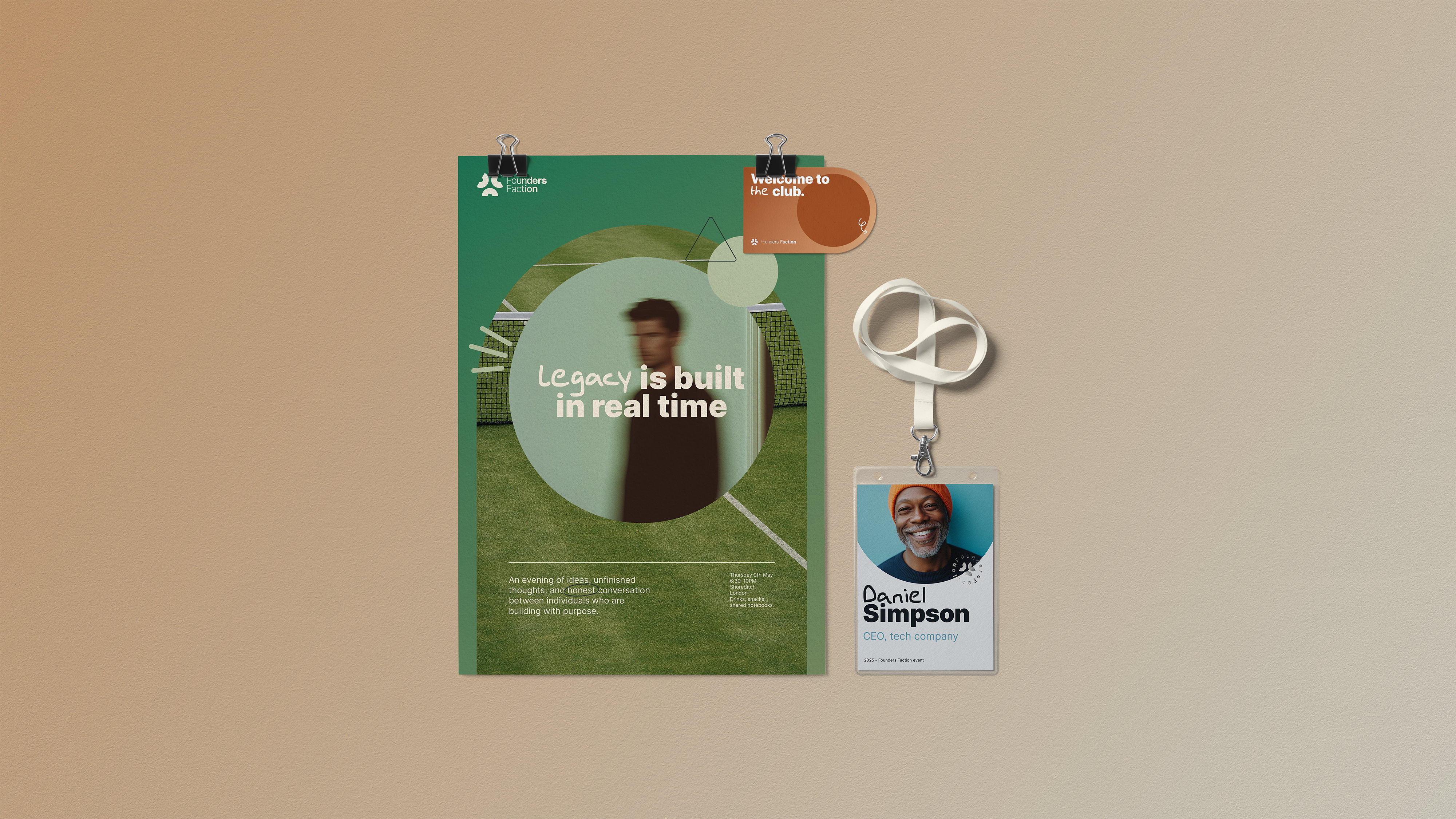
At its centre is a logo made up of three distinct forms, representing individuals with different paths and perspectives. Arranged in a triangle — a shape long associated with stability and strength — the forms suggest community, mentorship, and legacy. This isn’t about conformity; it’s about strength in numbers and aligned intention.
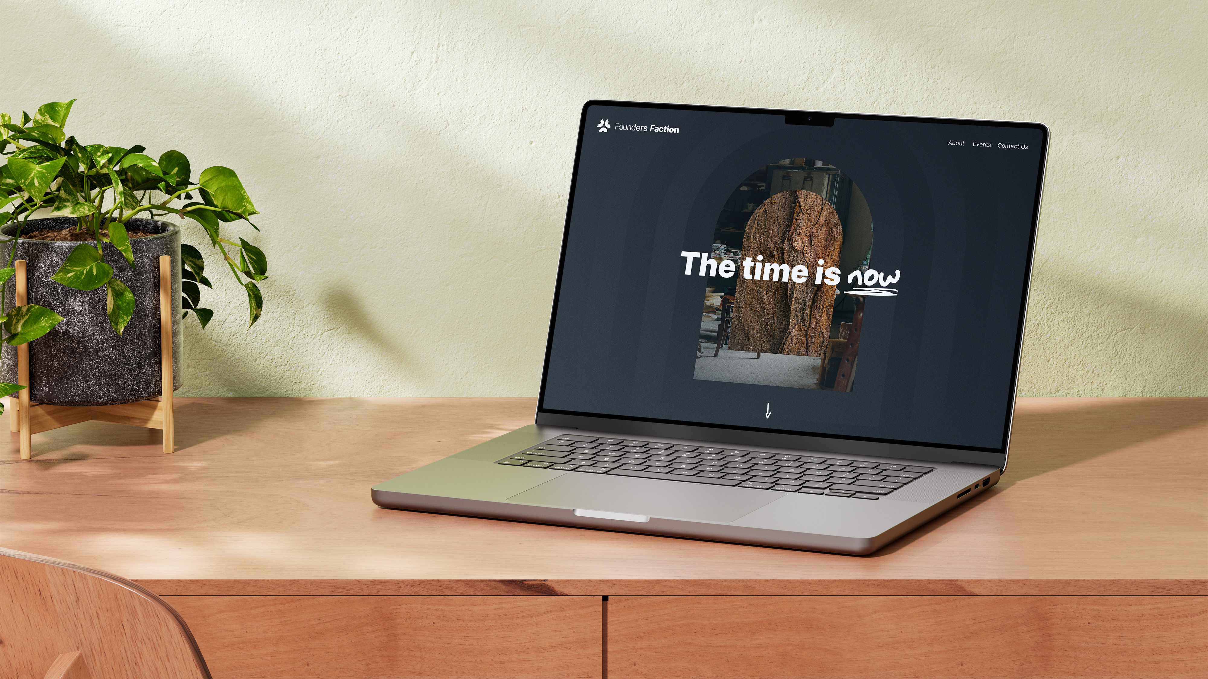
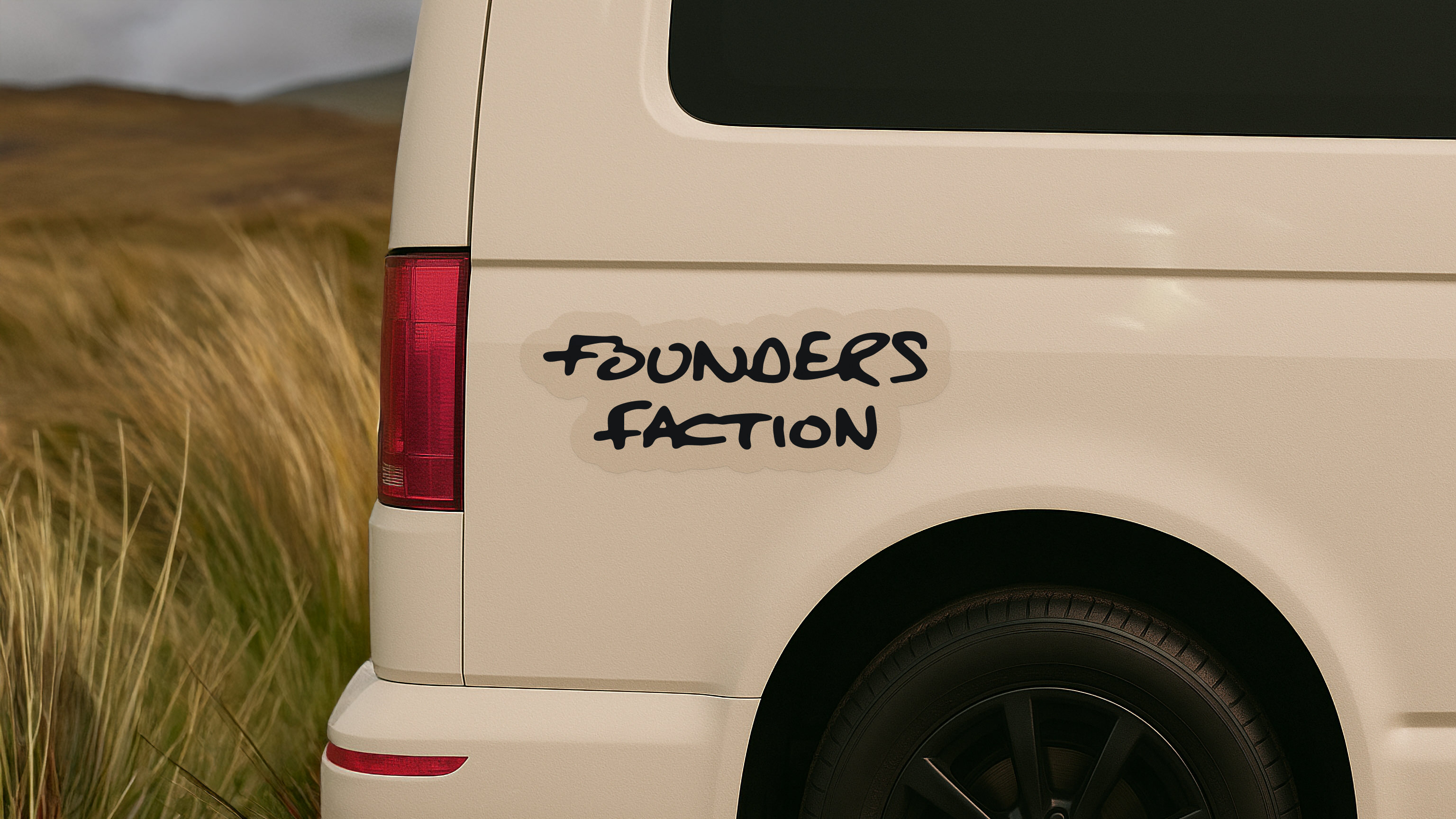
Graphic shapes throughout the system are symbolic of the brand’s three core values: Purposeful Growth, Enduring Legacy, and Collective Energy. They guide layouts and create quiet structure. Hand-drawn doodles — arrows, underlines, bursts — echo the scrappy beginnings of big ideas, and sit naturally alongside Founders Hand, a bespoke typeface used sparingly for emphasis, annotations, and personality.
Typography balances that informal energy with the confident clarity of Inter. The wordmark itself is set in a variable cut of the typeface — its subtle changes in weight and proportion reflect the ebb and flow of the sea, and the shifting dynamics of collaboration.
Imagery focuses on activity and interest — layered visuals that represent different areas of passion and expertise. These compositions are warm, textured, and curated with purpose — capturing the energy, intent, and individuality of those shaping their own path.
This is a brand built to grow — unpolished, purposeful, and disruptful.

Entrant
Beijing Shanhe Jinyuan Art and Design Stock Co., Ltd.
Category
Interior Design - Hospitality


Entrant
Sichuan Zhongyan Industry Co., Ltd. Changcheng Cigar Factory
Category
Packaging Design - Tobacco