
2025
TongTiang Tremella ChenHeYuEr
Entrant
Tongjiang Chenhe Shan Yu Hua Tremella Co., Ltd.
Category
Packaging Design - Dried Goods & Edible Fungi
Client's Name
Country / Region
China
ChenHeYuEr's Tongjiang Tremella packaging embodies "Cultural Heritage, Nature's Bounty, Quality First." Culturally, it reflects a millennium-old legacy—from Han Dynasty medicine to Ming and Qing tribute—giving each box deep historical resonance. In terms of quality, it highlights the nutritional benefits, rich in tremella polysaccharides, high ursolic acid, and 17 amino acids, further supported by EU 190-item pesticide residue testing for safety certification. For brand development, the design supports its cross-border e-commerce strategy and expansion into the broader health sector, creating a visual and experiential foundation for entering the international premium wellness market.
The outer packaging utilizes eco-friendly recycled cardboard, available in off-white and red color schemes, reflecting current green packaging trends. Visually, it captures Tongjiang’s distinctive landscapes—mountains, streams, and forests—through delicate ink wash artistry, reinforcing the product’s regional identity. The main title, "Gong Er" (Tribute Tremella), is rendered in traditional calligraphic script, accentuated with partial hot stamping. This maintains an Eastern aesthetic while using material contrast to enhance visual focus and a sense of premium quality. Structurally, a top handle is integrated, enhancing portability and a sense of ceremony for gifting occasions. The overall structure is robust, facilitating both transport and display.
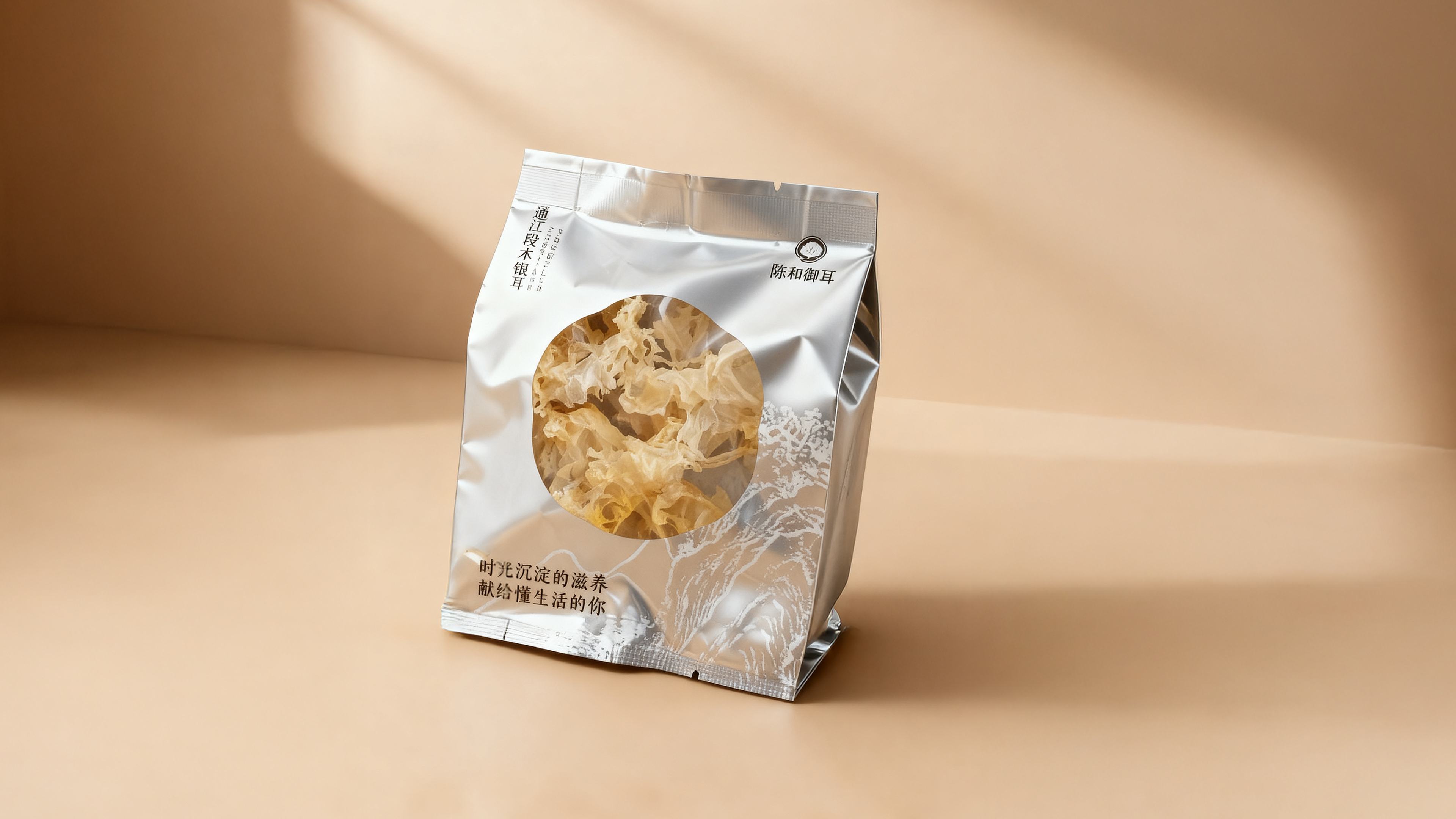
The inner packaging features a modular, individual sachet design, with each tremella portion precisely measured. This caters to the single-use needs of modern households, reducing moisture exposure and waste after opening. The inner bag uses a high-barrier silver aluminum foil composite film, providing excellent moisture and light protection with strong sealing, effectively extending shelf life and preserving nutrients. A circular transparent window on the front of each sachet provides a "what you see is what you get" visual experience. Consumers can clearly observe the tremella's form, color, and quality without opening the package, significantly enhancing product trust and optimizing the purchasing decision experience.
The overall visual language strikes a balance between traditional Eastern aesthetics and natural simplicity, elevating the brand's premium positioning. This packaging solves traditional issues of storage and portion control for dried goods, while elevating the product through design to promote standardization, branding, and gift appeal—demonstrating significant industry value.

Credits


Entrant
Zhejiang Xiaomibu Children's Products Technology Co., Ltd.
Category
Product Design - Baby, Kids & Children Products

Entrant
Donghua University
Category
Conceptual Design - Children
