2025
Plan, Pack, Play, Plan | Packaging Design Exhibition
Entrant
The Hong Kong Polytechnic University
Category
Communication Design - Identity Design
Client's Name
The Hong Kong Polytechnic University, School of Design
Country / Region
Hong Kong SAR
Gallery


About The Entry
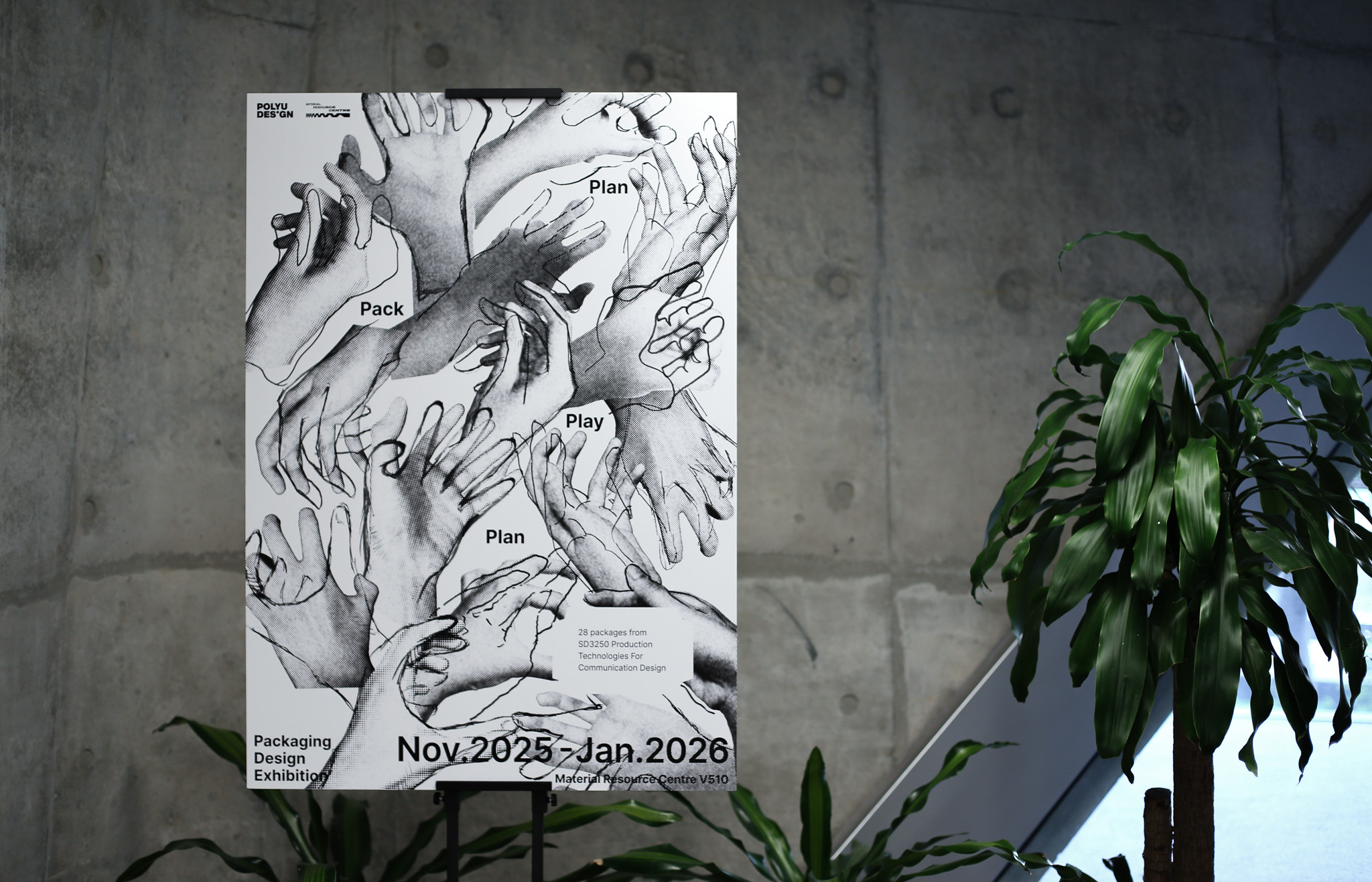
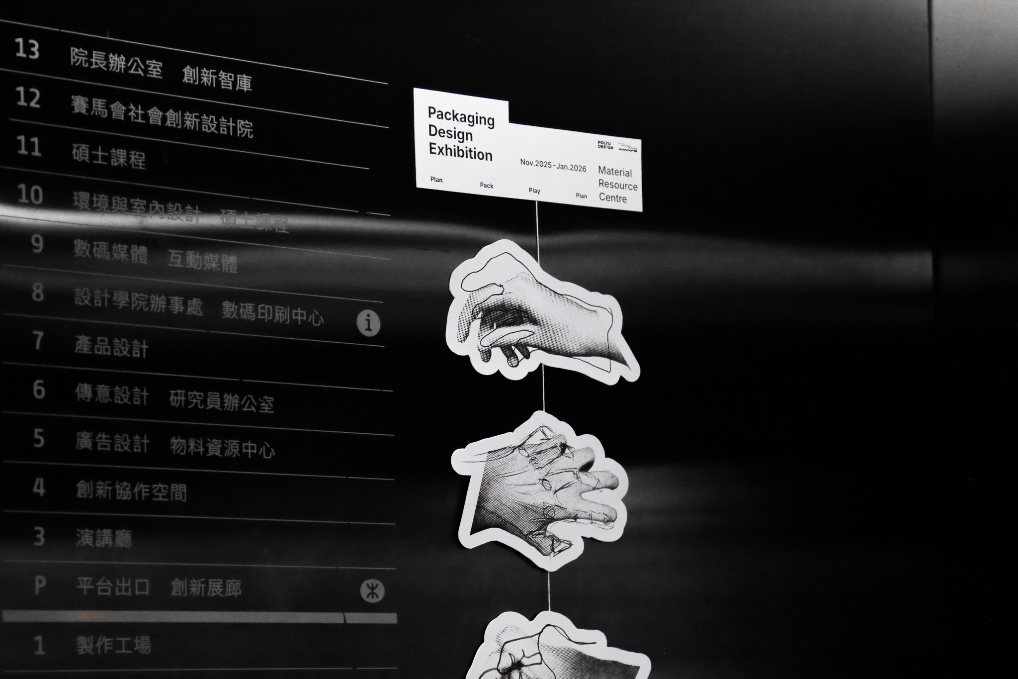
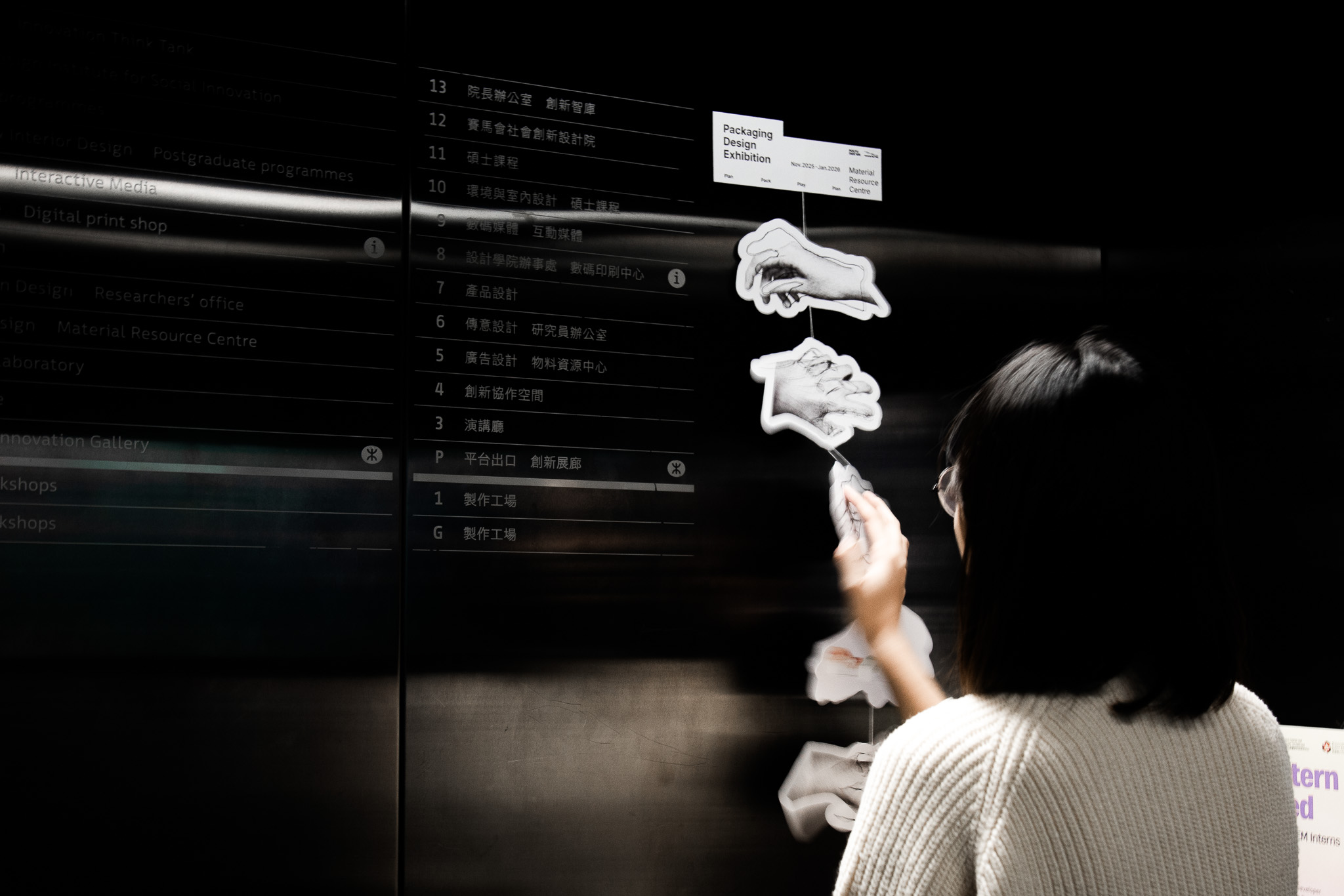
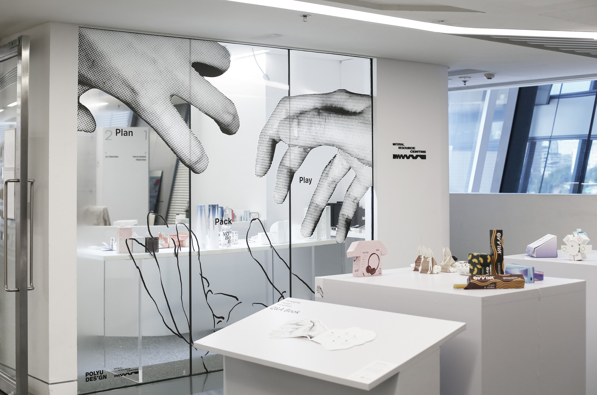
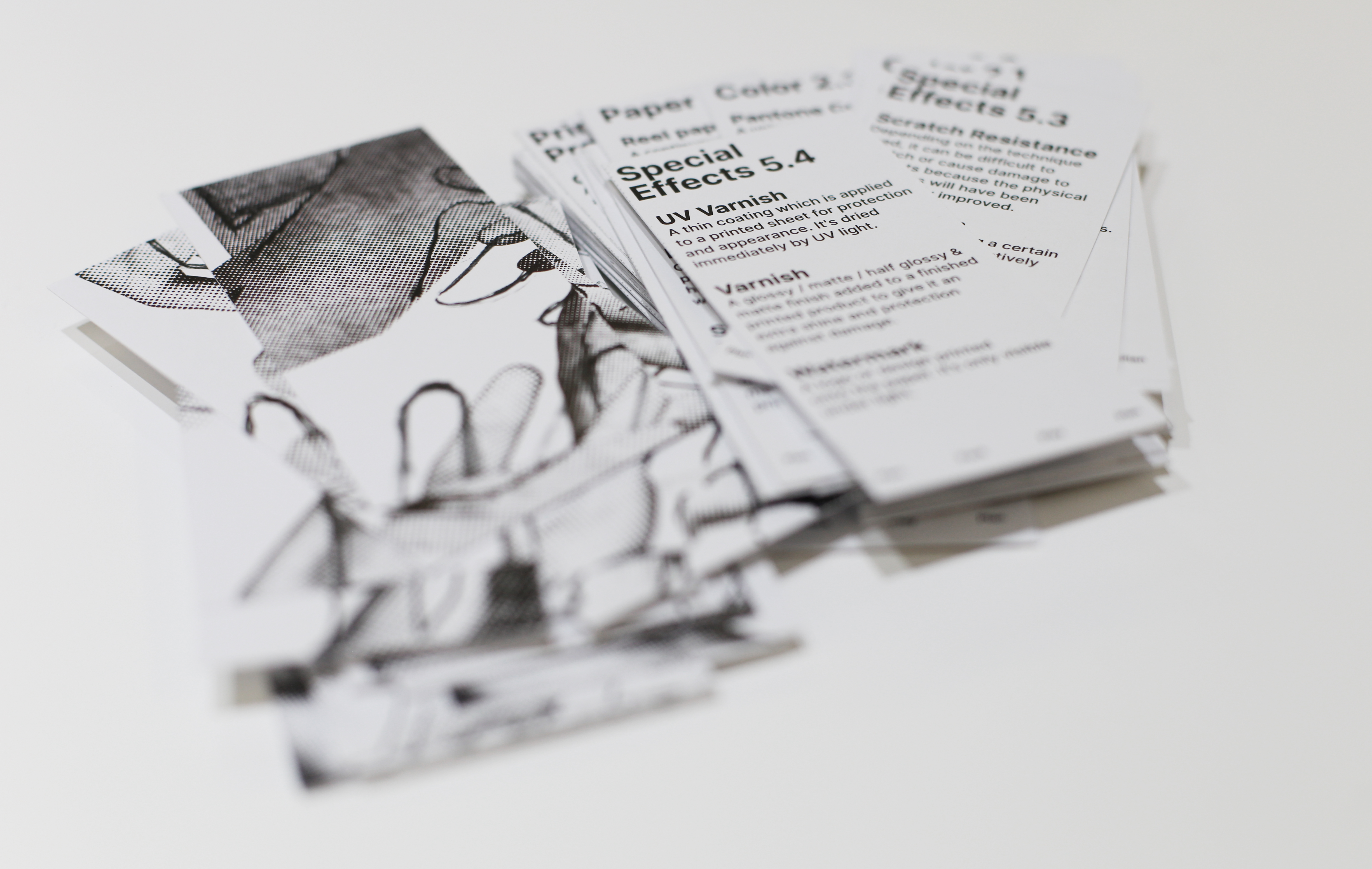
"Plan, Pack, Play, Plan | Packaging Design Exhibition" presents 28 student works from the SD 3250 Communication Design and Production Technology course, currently on display in the Materials Resource Centre, School of Design.
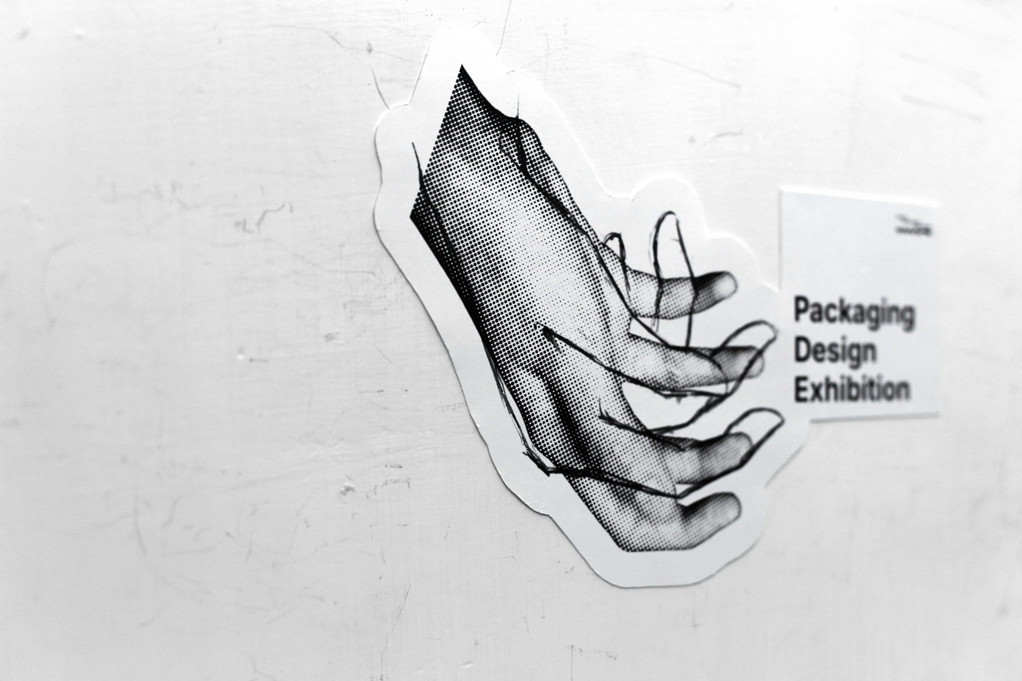
The visual identity is rendered in stark black and white only. This high-contrast, graphic approach, centred on a pair of reaching hands, creates immediate visual impact: a linear, diagrammatic hand represents the designer’s deliberate intention and structured planning, while a bolder, expressive hand symbolises the user’s spontaneous perceptions, emotions, and physical engagement. The deliberate overlapping of these forms serves as both an eye-catching device and a quiet metaphor for alignment: the greater and more natural the shared area, the more successfully the intended message is conveyed. Limited or mismatched overlap gently reveals moments of miscommunication.
By remaining monochrome, the identity draws visitors in with bold visual impact and curiosity, yet ensures the diverse, colourful student packaging works remain the true focus. At its core, the exhibition celebrates the continuous cycle of planning, packing, playing, and planning anew—a process that mirrors the students’ own journey of learning empathy and discovering that the most meaningful designs arise when designer and user perspectives truly meet.
Credits

Entrant
Liaoning Weishikang Glasses Co., Ltd.
Category
Fashion Design - Eyewear

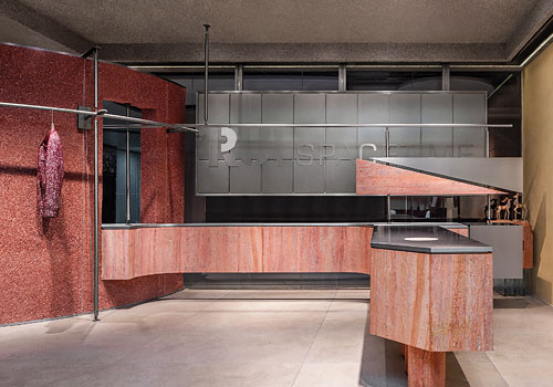
Entrant
syncform Architectural Design & Consultant Co., Ltd
Category
Interior Design - Office
Entrant
Jiming Bai, Yifan Zhang, Yifan Li, Tongtong Zhang
Category
Architectural Design - Sustainable Living / Green
Entrant
LubanEra·Design
Category
Interior Design - Retails, Shops, Department Stores & Mall