2026
FIFO Bread Line
Entrant
Agencia Target
Category
Packaging Design - Snacks, Confectionary & Desserts
Client's Name
Fifo Paes
Country / Region
Brazil
Gallery
About The Entry
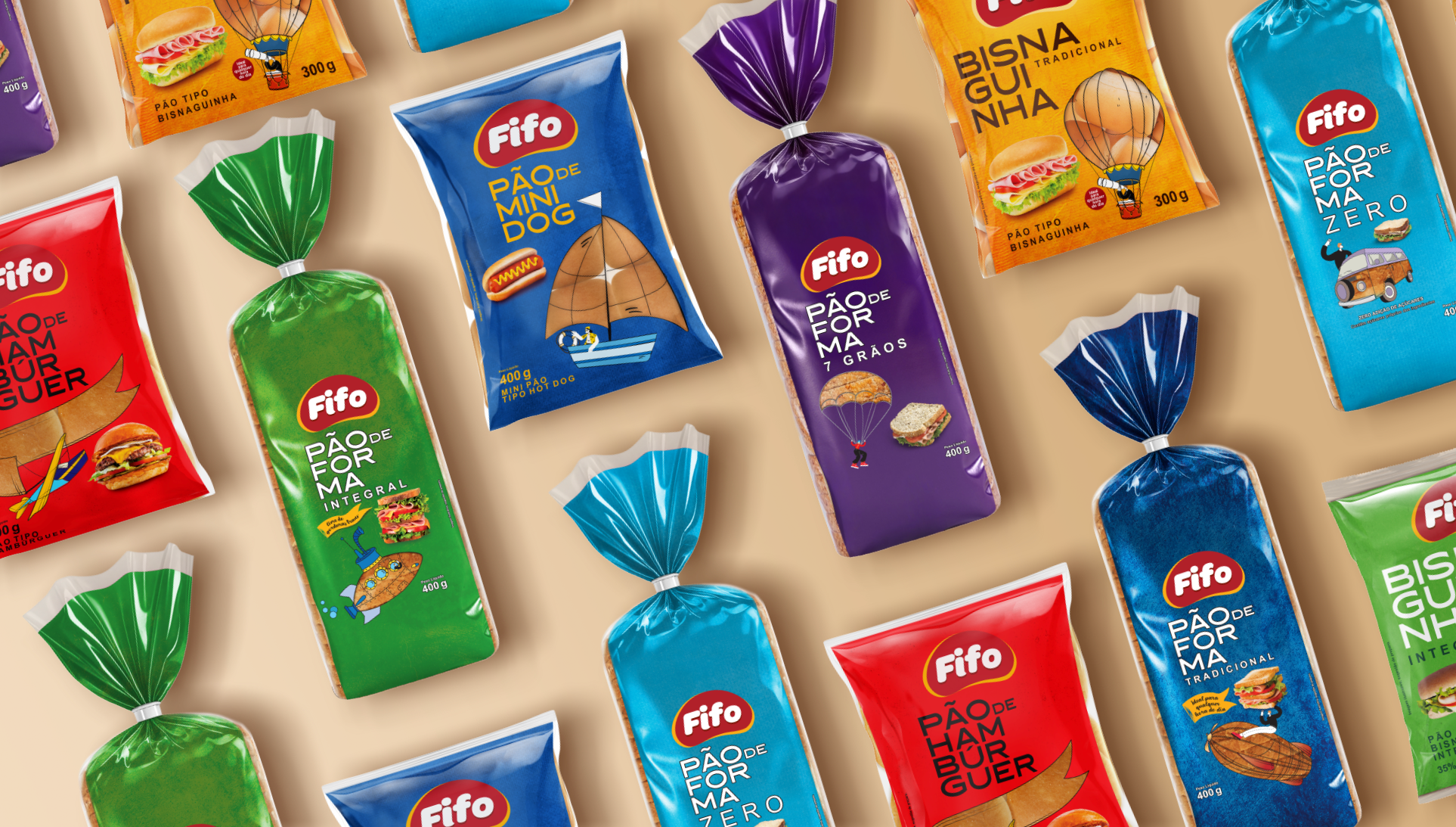
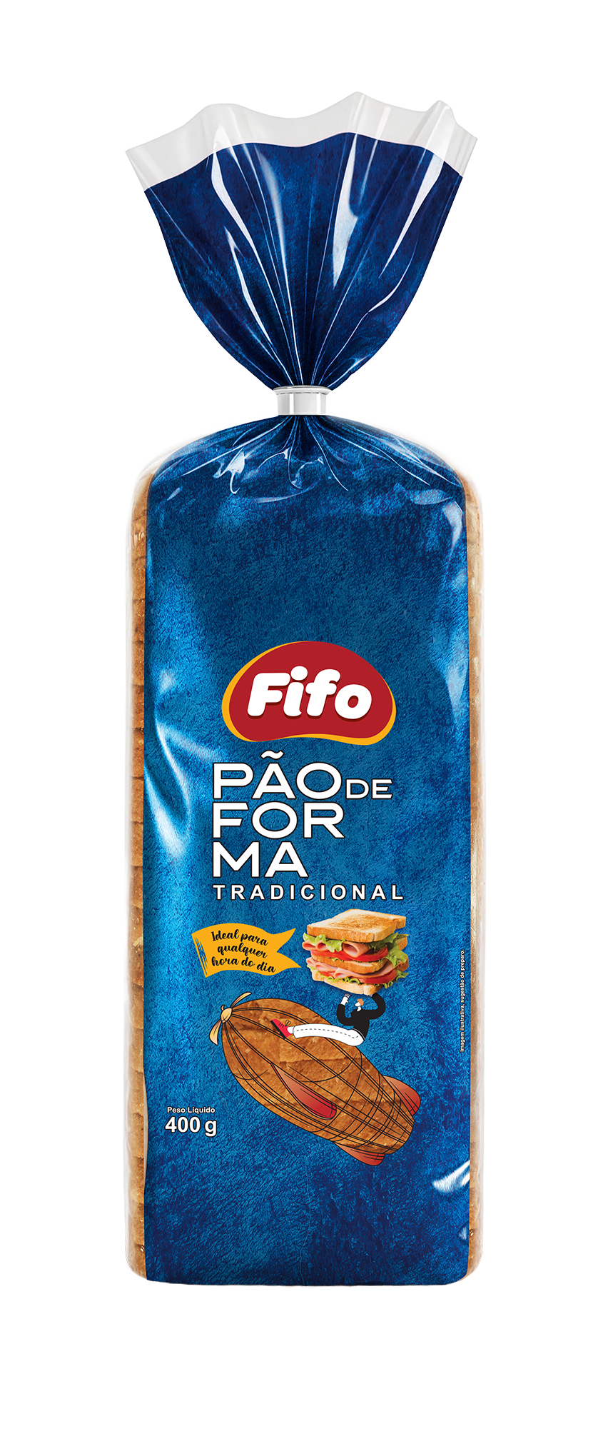
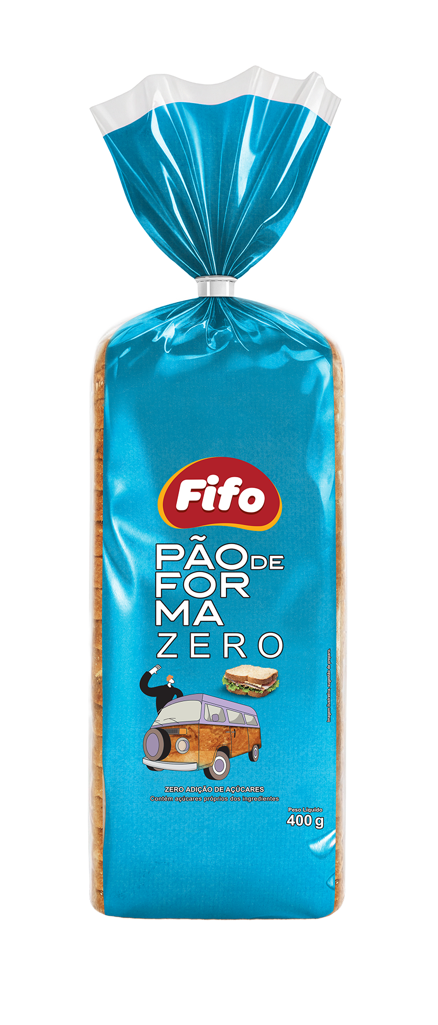
Target agency was responsible for developing the packaging design for Fifo’s bread line, working end to end—from logo creation and brand architecture to building the visual system and rolling it out across multiple SKUs. The project’s main goals were to organize the portfolio, ensure clear communication at the point of sale, and strengthen brand recognition on shelf.
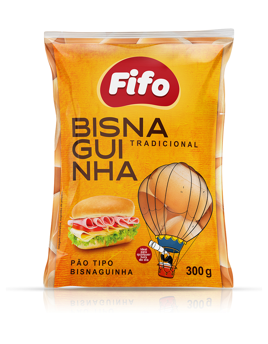
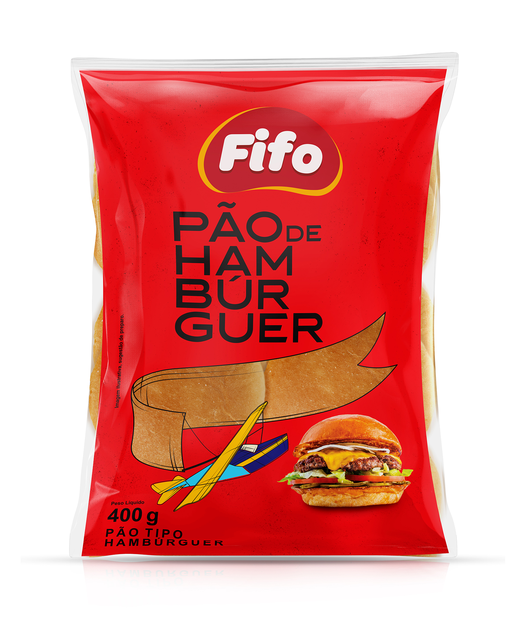
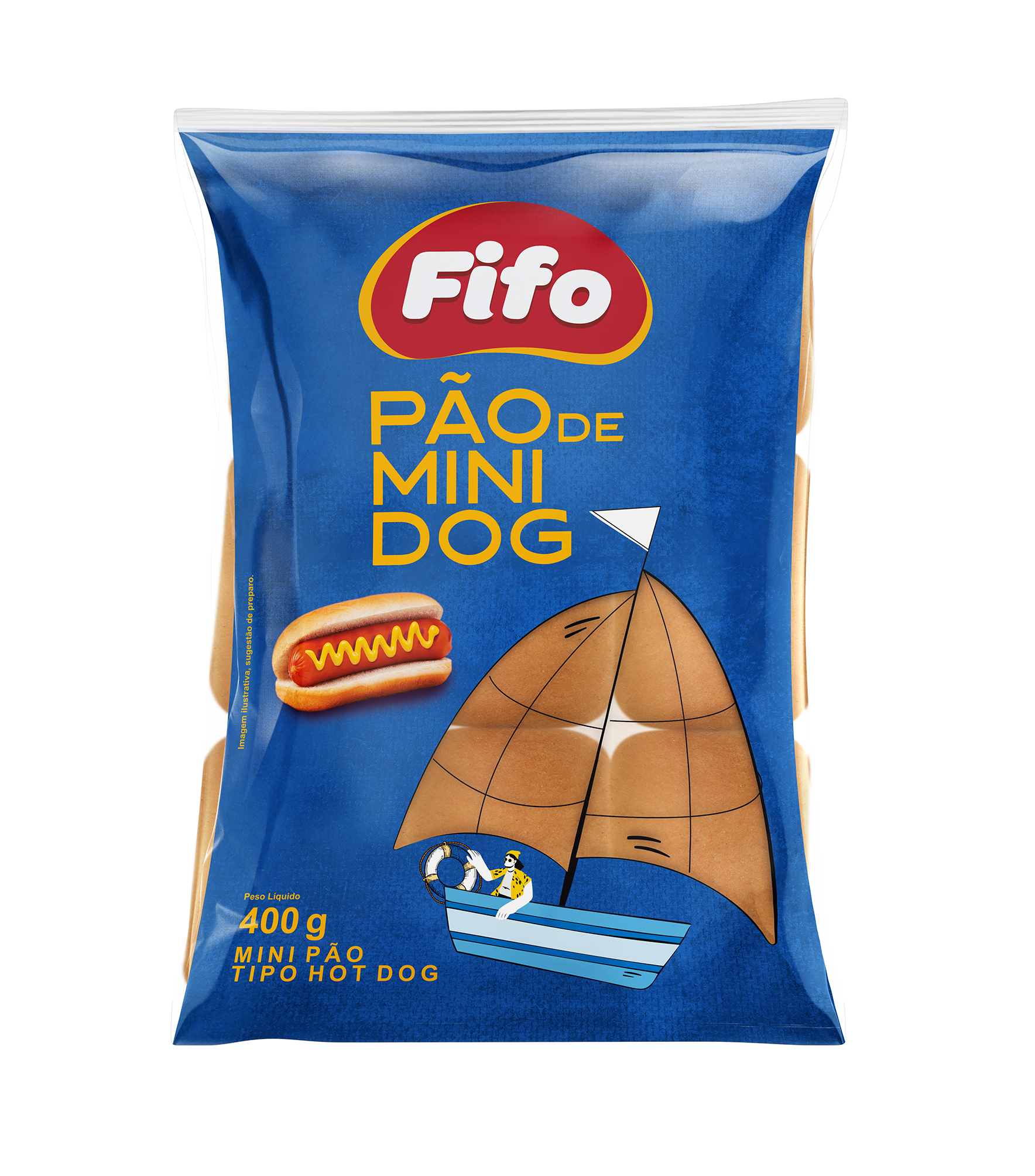
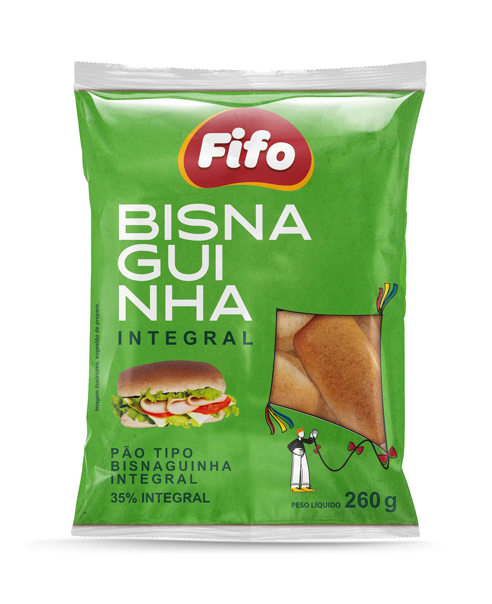
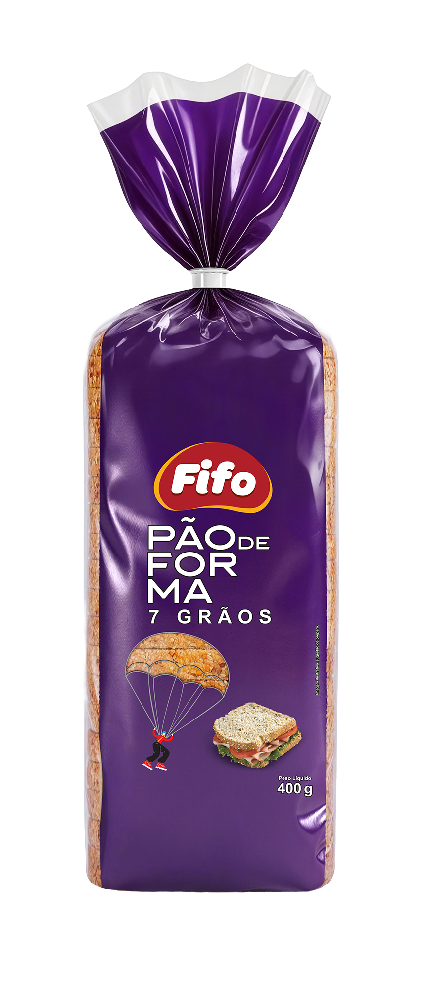
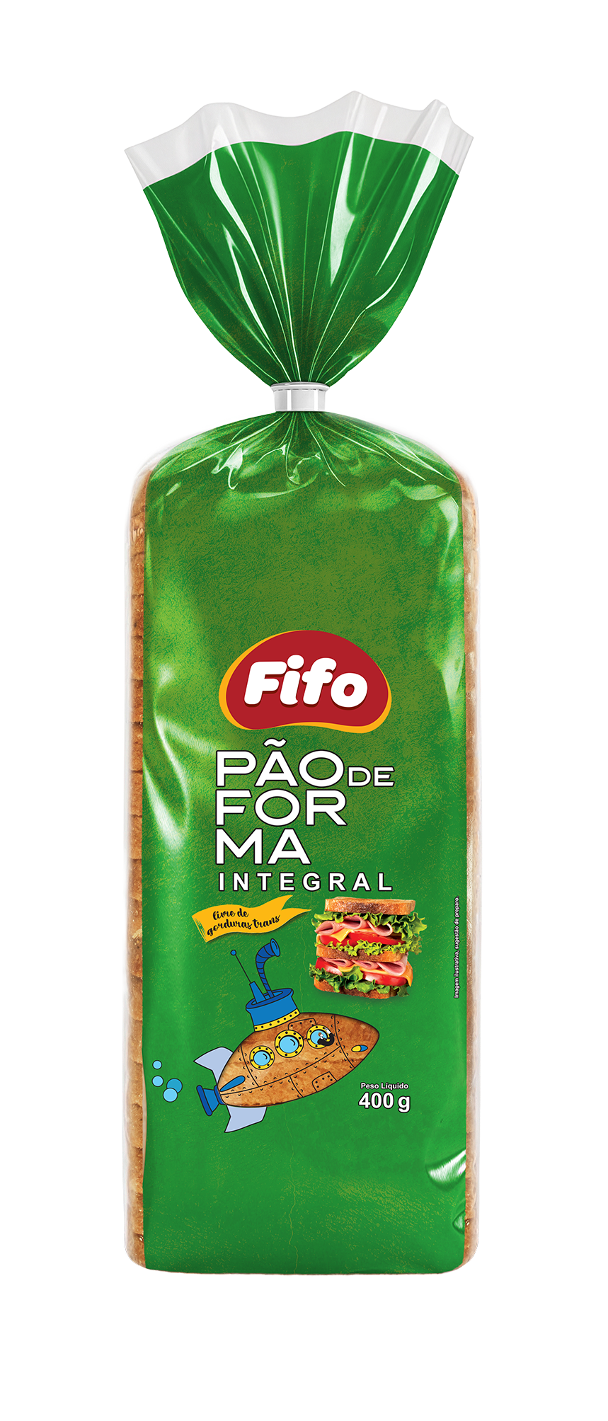
The core identity concept was to use vintage-inspired illustrations around a “transportation” theme. The product windows were integrated into these illustrations, creating a direct interaction between the product and the visual identity while adding a playful tone. This approach increased shelf impact and introduced a “collectible” feel, sparking consumer curiosity in two ways: first, by connecting with the fun illustrations; and second, by encouraging shoppers to discover the artwork across the other products in the range.
Each product is identified through bold, well-structured typography and clear hierarchy, enabling quick reading of the bread type, flavor, and variant (traditional, whole wheat, burger buns, English cake, etc.).
Color was also used strategically as a differentiation tool, with distinct, easy-to-understand color codes for each category and variation—green for whole wheat, yellow/orange for traditional, and red for burger buns—making it easier for shoppers to navigate the shelf and choose the right product.
Overall, Target’s work positions Fifo as an accessible, modern, and trustworthy brand, with packaging that is functional, eye-catching, and highly organized—designed to deliver immediate shelf impact and make purchase decisions easier.
Featured Media
Credits
Entrant
湖北工业大学/湖北美术学院/华中科技大学
Category
Conceptual Design - Gaming, AR & VR

Entrant
Peace S-route CO., LTD
Category
Conceptual Design - Exhibition & Events

Entrant
SHENZHEN PENGKAI PRINTING Co.,Ltd.
Category
Packaging Design - Retail
Entrant
Huizhou Mushengmian Clothing Co., Ltd.
Category
Fashion Design - Children's Clothing