2026
Uniquederma Tibetan Treasured Nourishing Cream
Entrant
Hangzhou Uniquederma Biotechnology Co., Ltd.
Category
Packaging Design - Beauty & Personal Care
Client's Name
Country / Region
China
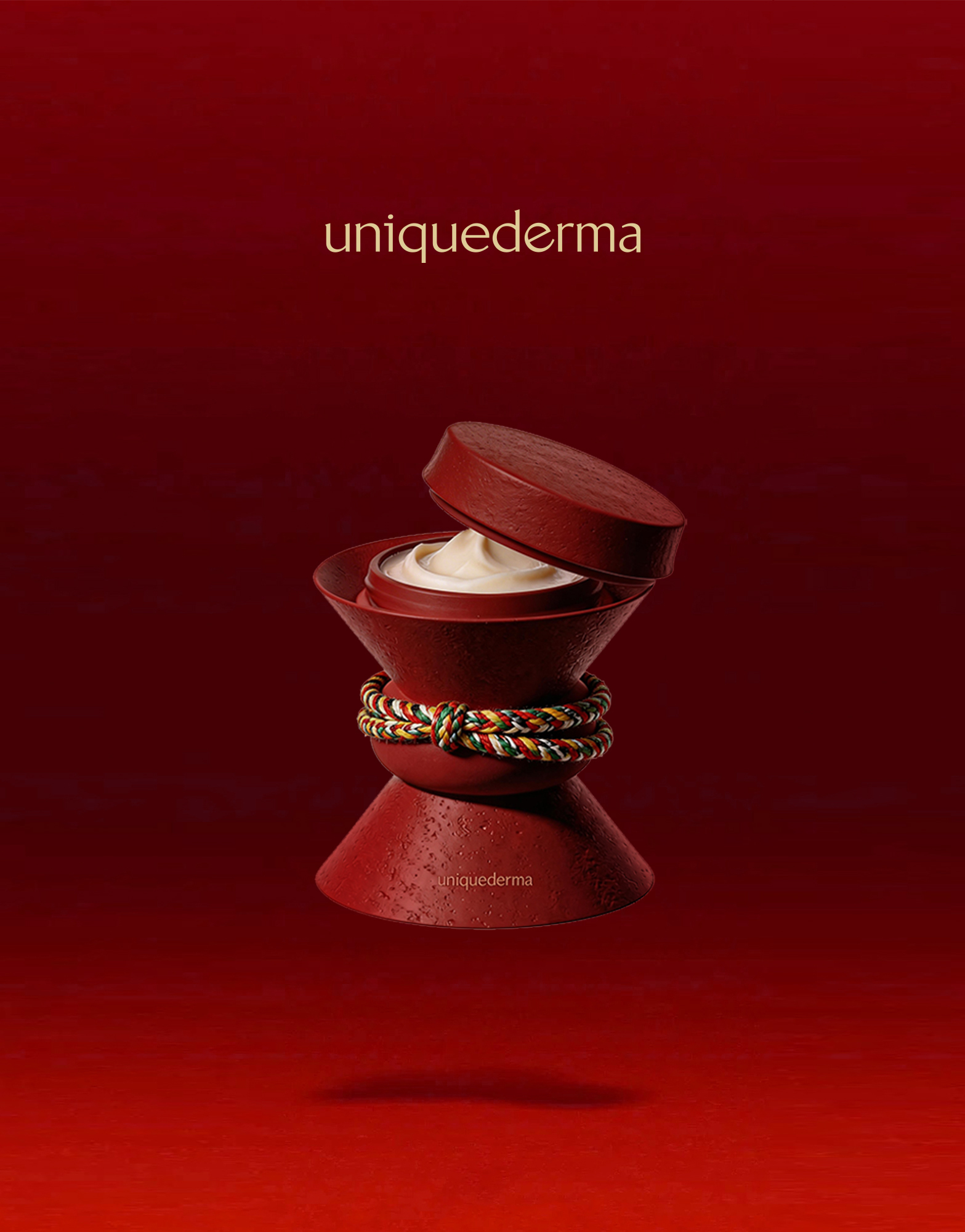
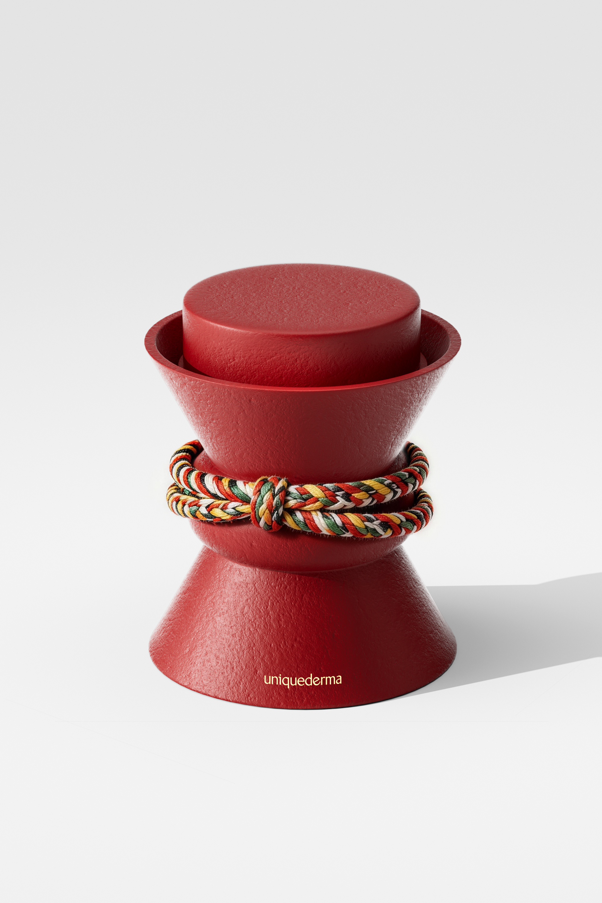
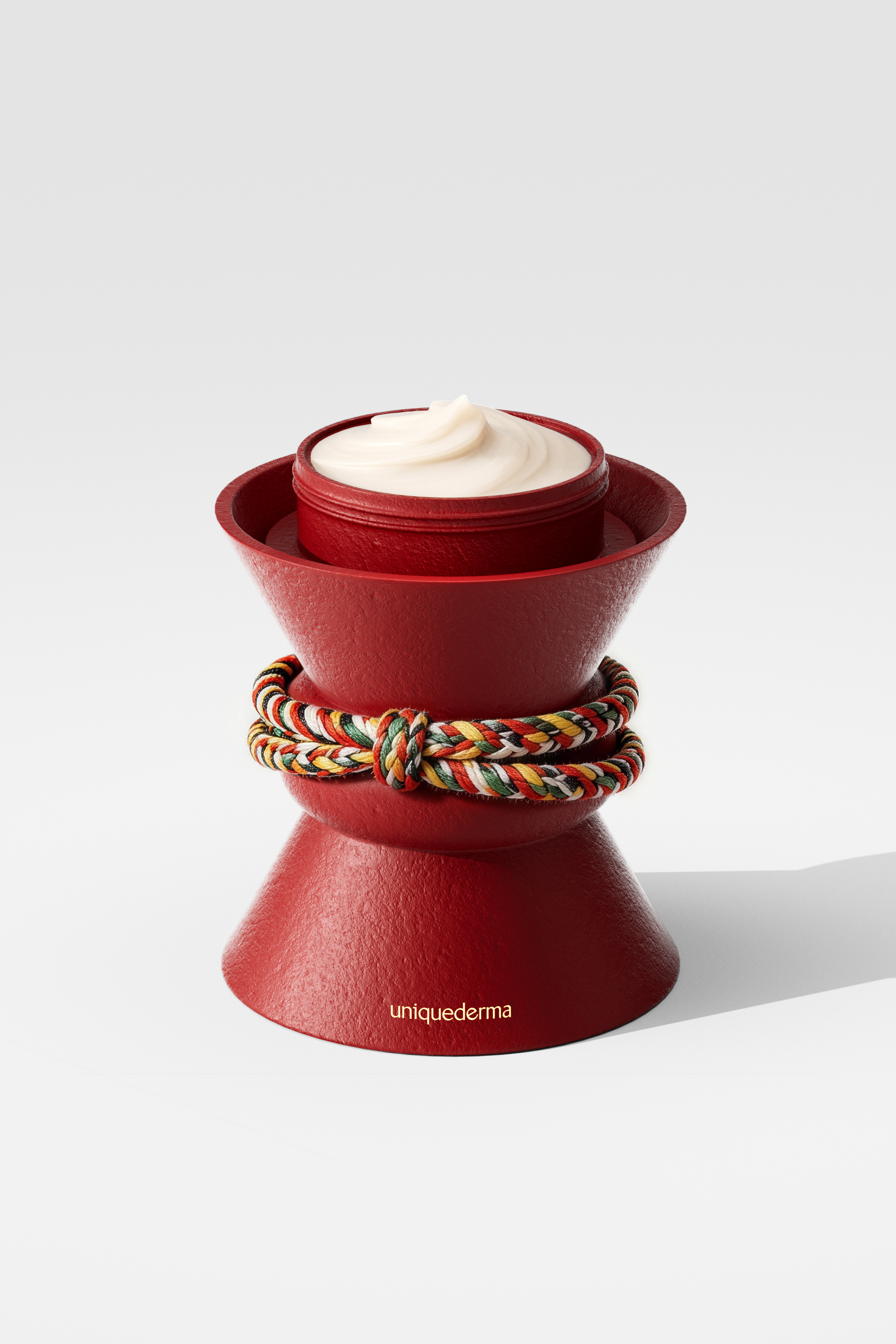
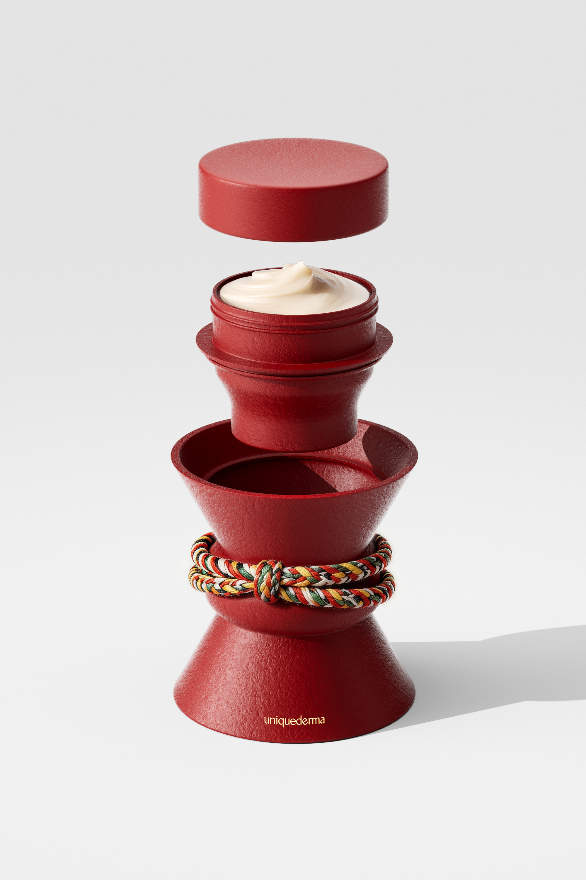
The packaging for Uniquederma Tibetan Treasured Nourishing Cream integrates the natural landscapes and rich culture of Tibet into its design language. Through a modern geometric reimagining of traditional Tibetan ritual objects, it creates a harmonious blend of cultural reverence, functionality, aesthetic narrative, and humanistic warmth.
The bottle’s silhouette is inspired by the sacred forms of the traditional offering lamp stand and the Vajra, with its stacked form echoing the layered relationship between stupas and offering lamps. The lamps symbolize the awakening of wisdom and illumination, embodying the cellular renewal and repair within the skin. The Vajra represents indestructible strength; its sturdy, symmetrical shape perfectly echoes the cream’s core promise of effective anti-aging and barrier repair. The tiered layers anchor the spiritual symbolism, with a cinched center that nestles naturally in the hand, making every application effortless. Through compound technology, the exterior features a raw, earthy clay texture, contrasting with the smooth cream within to embody the formula philosophy of potent botanicals rising from the earth. The deep red hue, inspired by the traditional robes of Nyingma monks, imbues the packaging with a sense of sacredness and gravitas. Encircling the center is a vibrant, five-colored Endless Knot—a profound nod to the Tibetan color system, symbolizing protection and auspiciousness. Together, these design elements transform a simple container into a profound statement of Tibetan cultural heritage.
Sustainability is deeply embedded in the entire design philosophy. The inner cartridge allows for convenient replacement while preserving the outer shell for reuse, effectively reducing environmental impact. Beyond sustainable packaging, a deep respect for nature defines the formula itself. Driven by a four-year charitable project in Tibet, the brand has sourced key botanicals—including Lamiophlomis rotata, Cordyceps, Rhodiola, and Terminalia chebula—directly from local growers. This approach harnesses the resilience of high-altitude plants for superior anti-aging benefits while actively supporting the development of the local Tibetan industry. This is more than a product; it is a vessel of humanistic care and social conscience, radiating warmth from the inside out.


Credits

Entrant
Creatives Data
Category
User Interface Design (UI) - Best Visual Design - Aesthetics

Entrant
Cultural Affairs Department, Yunlin County Government
Category
Conceptual Design - Public Space