2024
MIN SHAN NONG YE
Entrant
East Awaken Brand Design (Chengdu) Co.,Ltd
Category
Communication Design - Company Branding
Client's Name
Country / Region
China
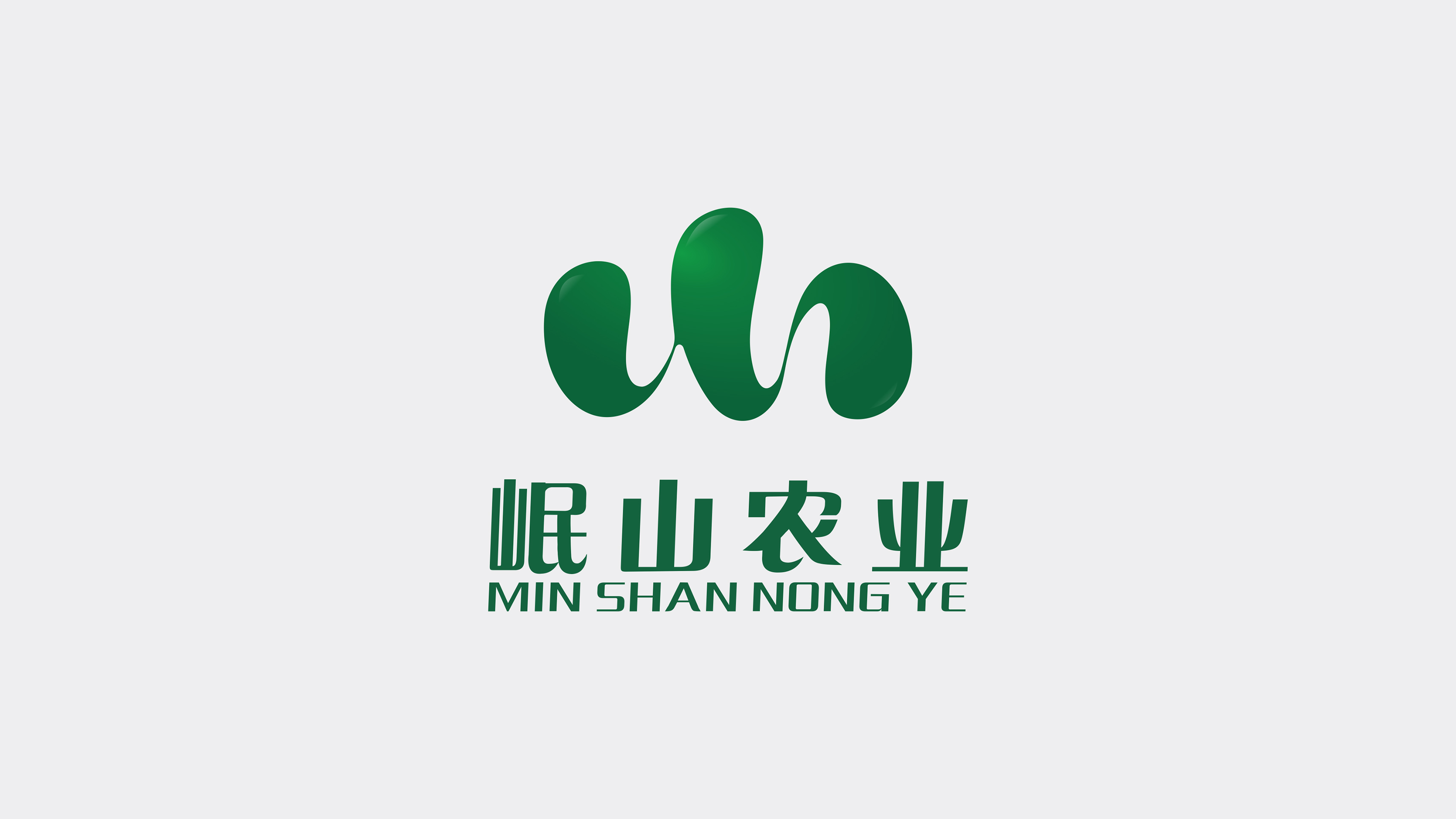
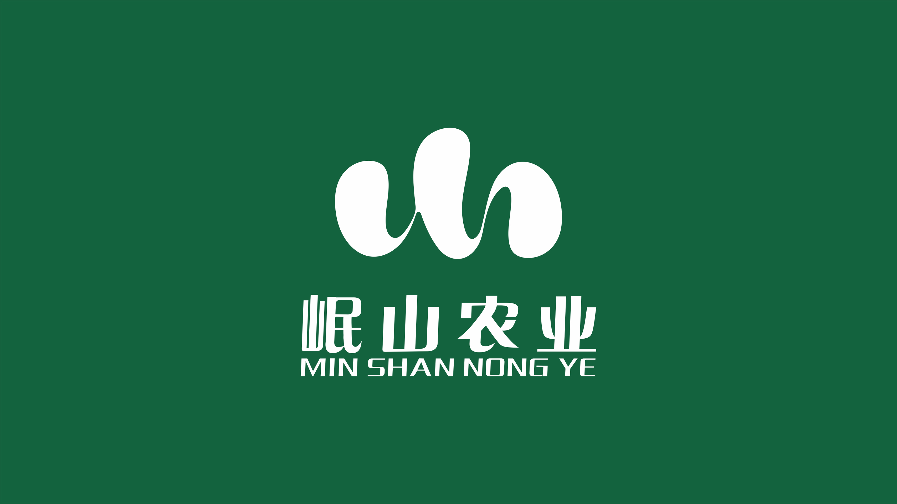
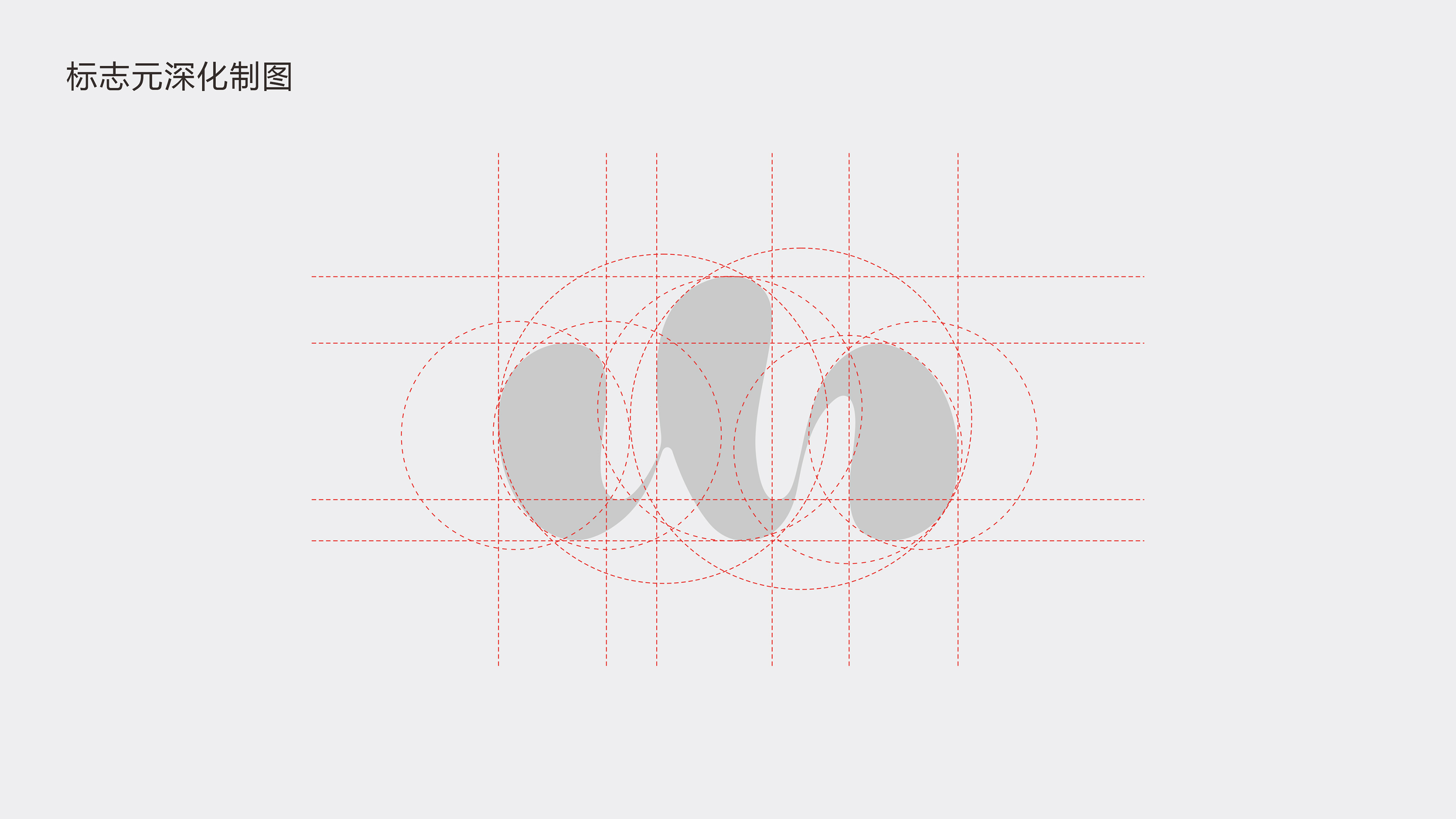
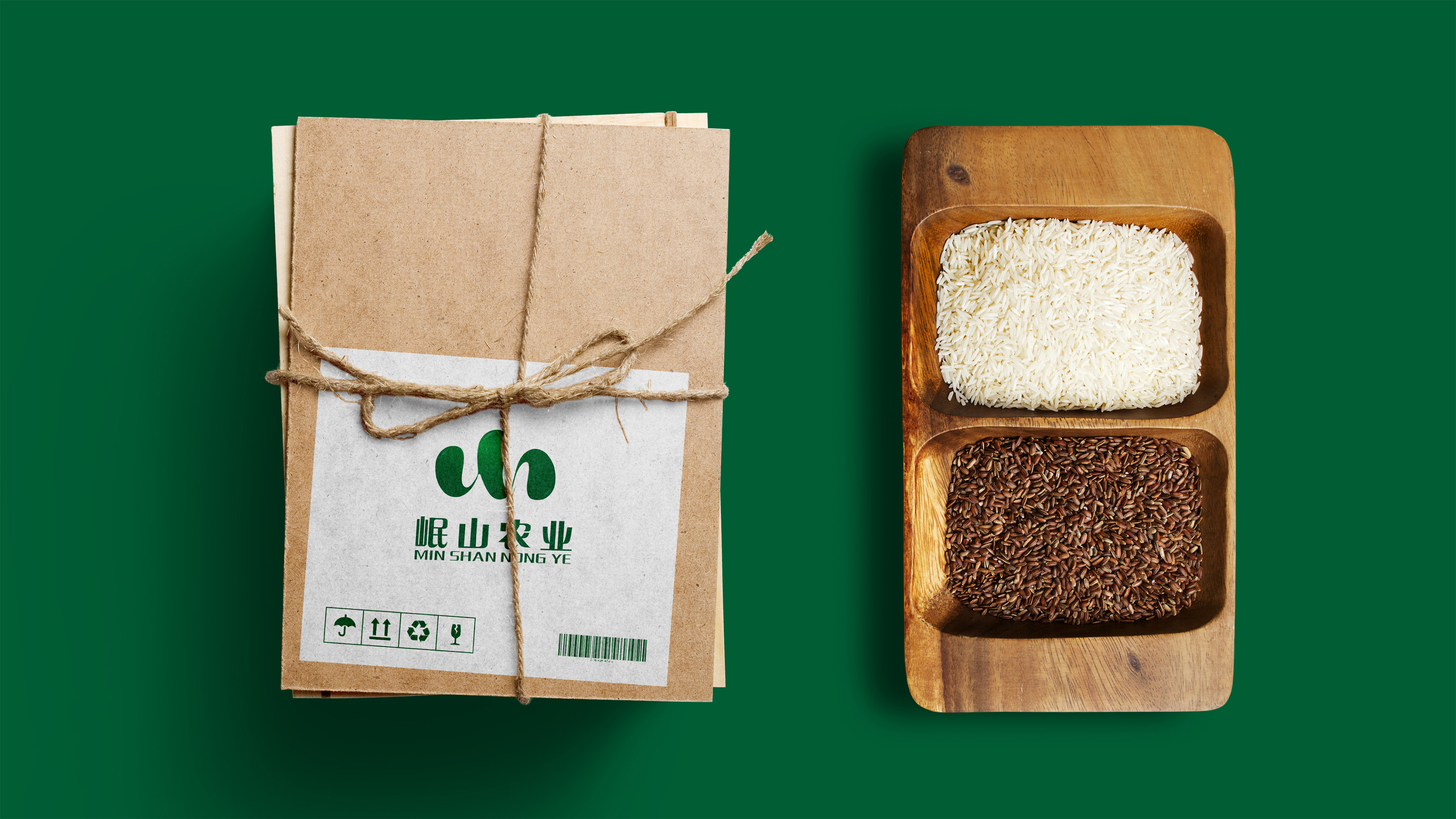
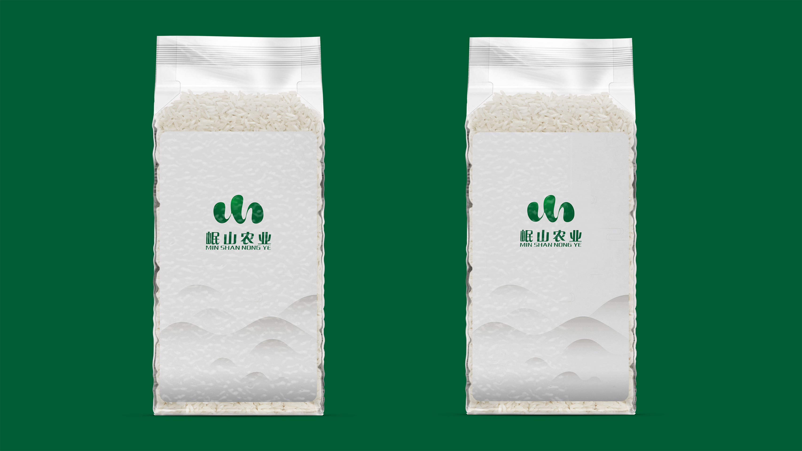
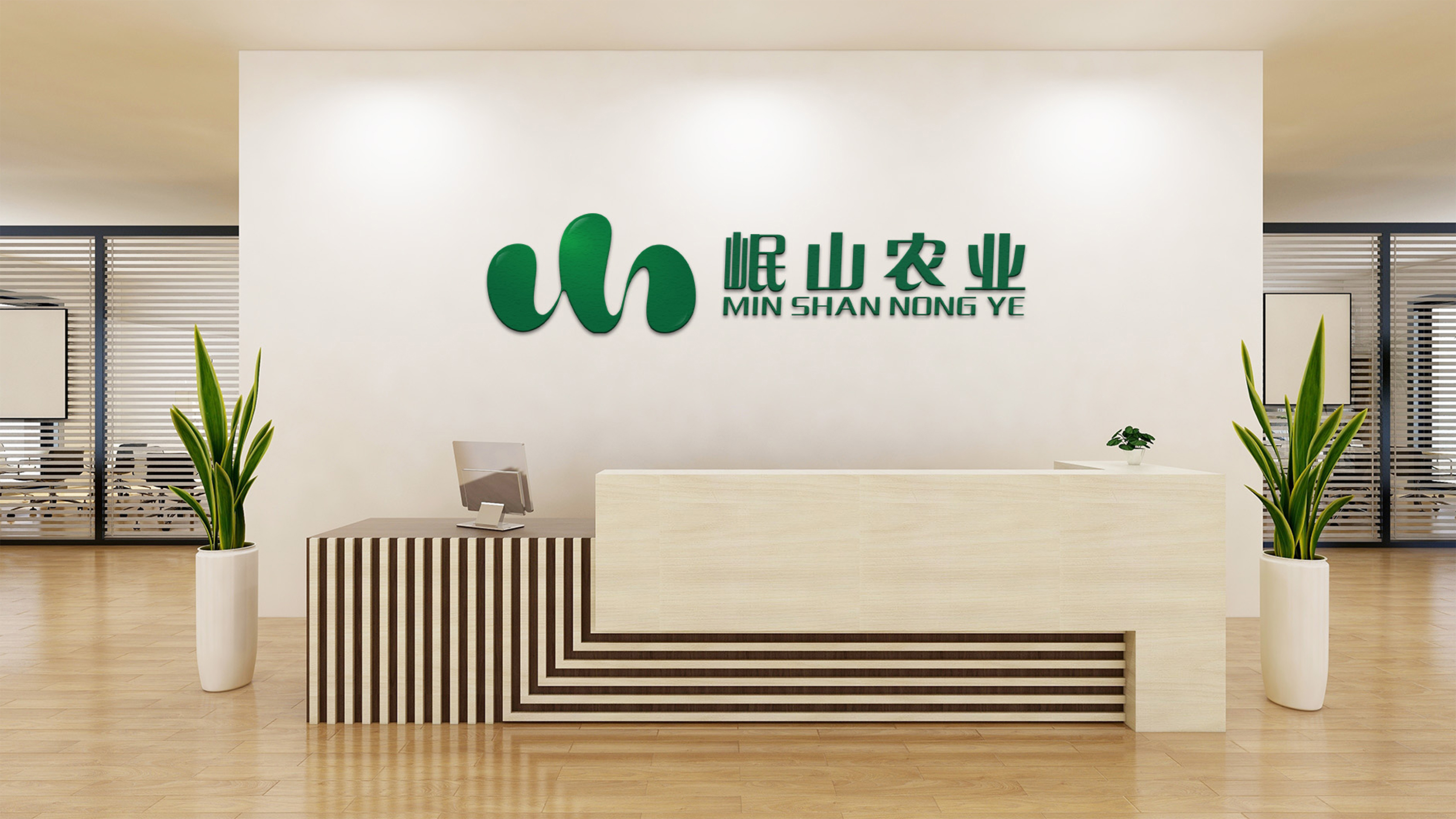
MIN SHAN NONG YE, inspired by natural mountains and rivers, integrates the enterprise's field of operation and local natural landscape. Simulating the geographical features of a fold mountain range from the south of Gansu province to the northwest of Sichuan province in China, this logo adopts elements of "mountain" and "water", on which this agricultural enterprise relies. This logo is a variant derived from the letter M, the first letter of Min, and S, the first letter of Shan, which symbolizes agricultural products' origin is Min Shan, reflecting the enterprise's close ties with this region and emphasis on the natural bounty.
This logo is formed through one-stroke shaping, making it minimalist but recognizable. The drawing in the middle looks like rolling mountains, water ripples, and wheat waves, embodying the enterprise's dedication to the agricultural sector of Min Shan and the enterprise's down-to-earth and innovative spirit. This logo takes green as the main tone, which echoes fresh and healthy agricultural products, conveying the brand's commitment to providing natural, pure, and original products and catering to users' pursuit of healthy lifestyles.
This logo combines regional characteristics, natural aesthetics, and enterprise spirits. The unique visual elements and color schemes are reminiscent of the enterprise's field of operation- original and healthy agricultural products, reducing communication costs and enhancing brand recognition.
Credits

Entrant
CLOCHEL
Category
Product Design - Bakeware, Tableware, Drinkware & Cookware

Entrant
GUANGDONG VANWARD NEW ELECTRIC Co., Ltd.
Category
Product Design - Product Design / Other__


Entrant
Sprout Technologies
Category
User Interface Design (UI) - Best Use of Emerging Technology
