2025
Dareman
Entrant
Opal Cosmetics(Huizhou)Co. Ltd.
Category
Packaging Design - Beauty & Personal Care
Client's Name
-
Country / Region
China
Gallery
About The Entry
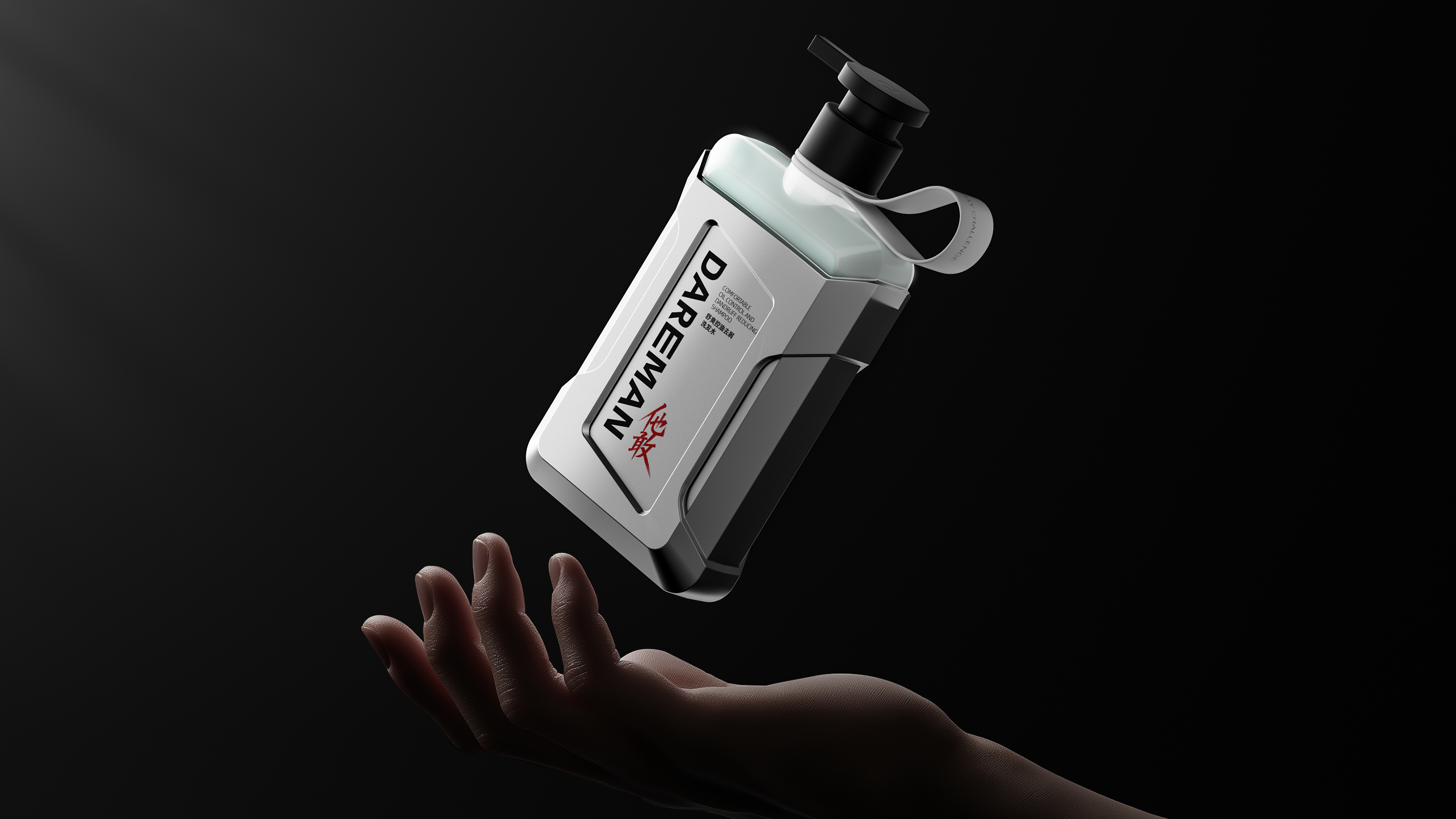
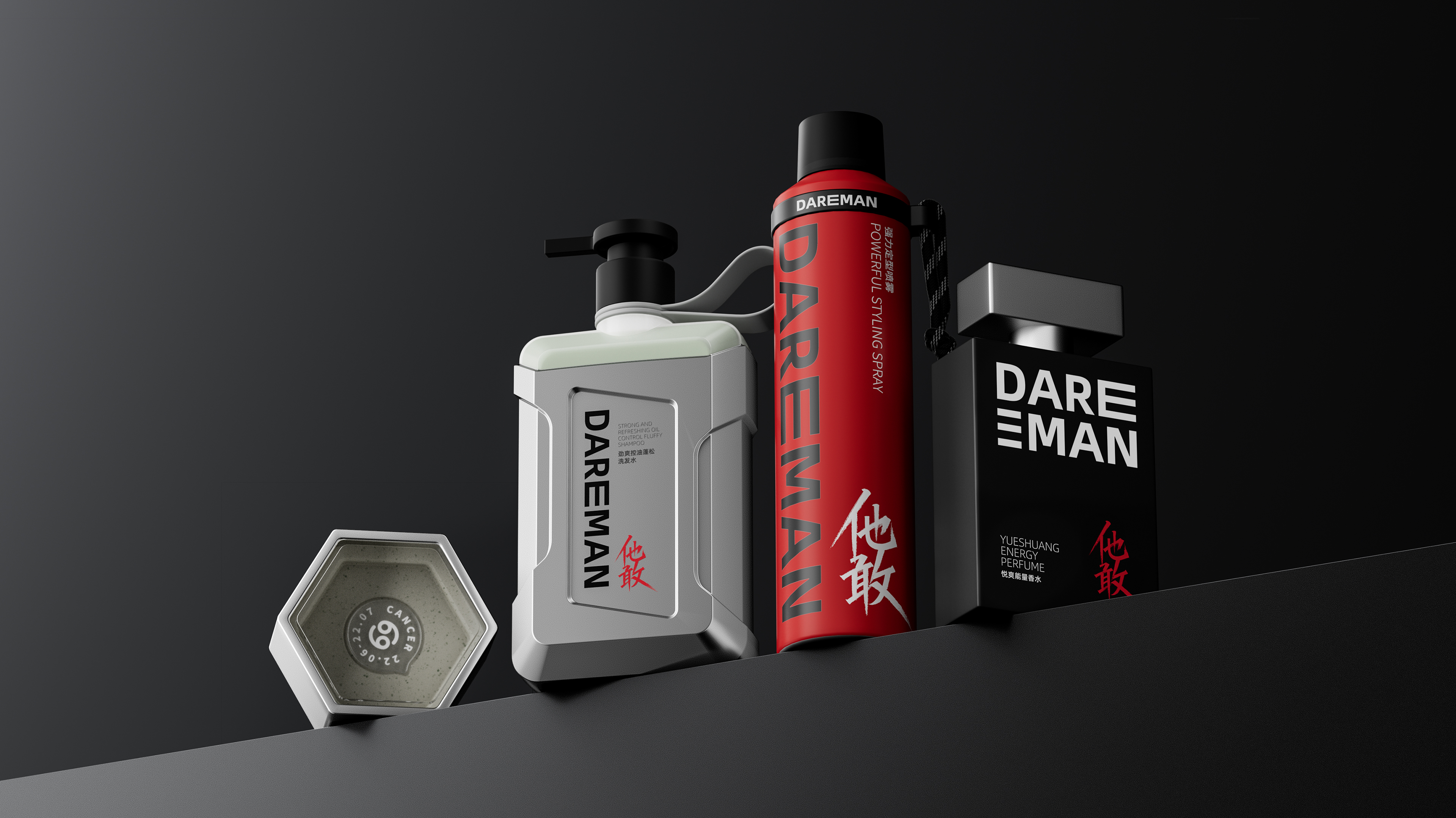
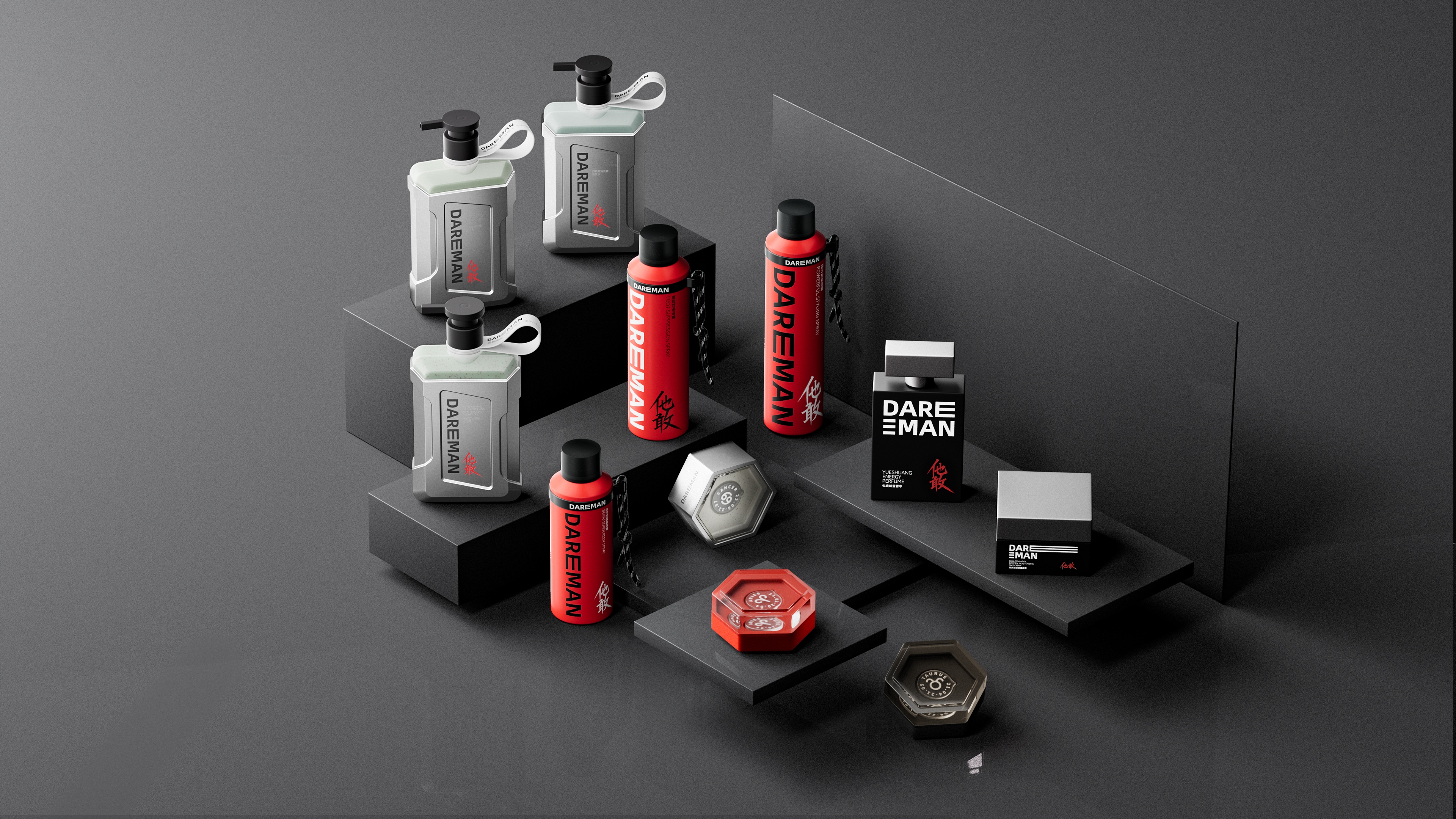
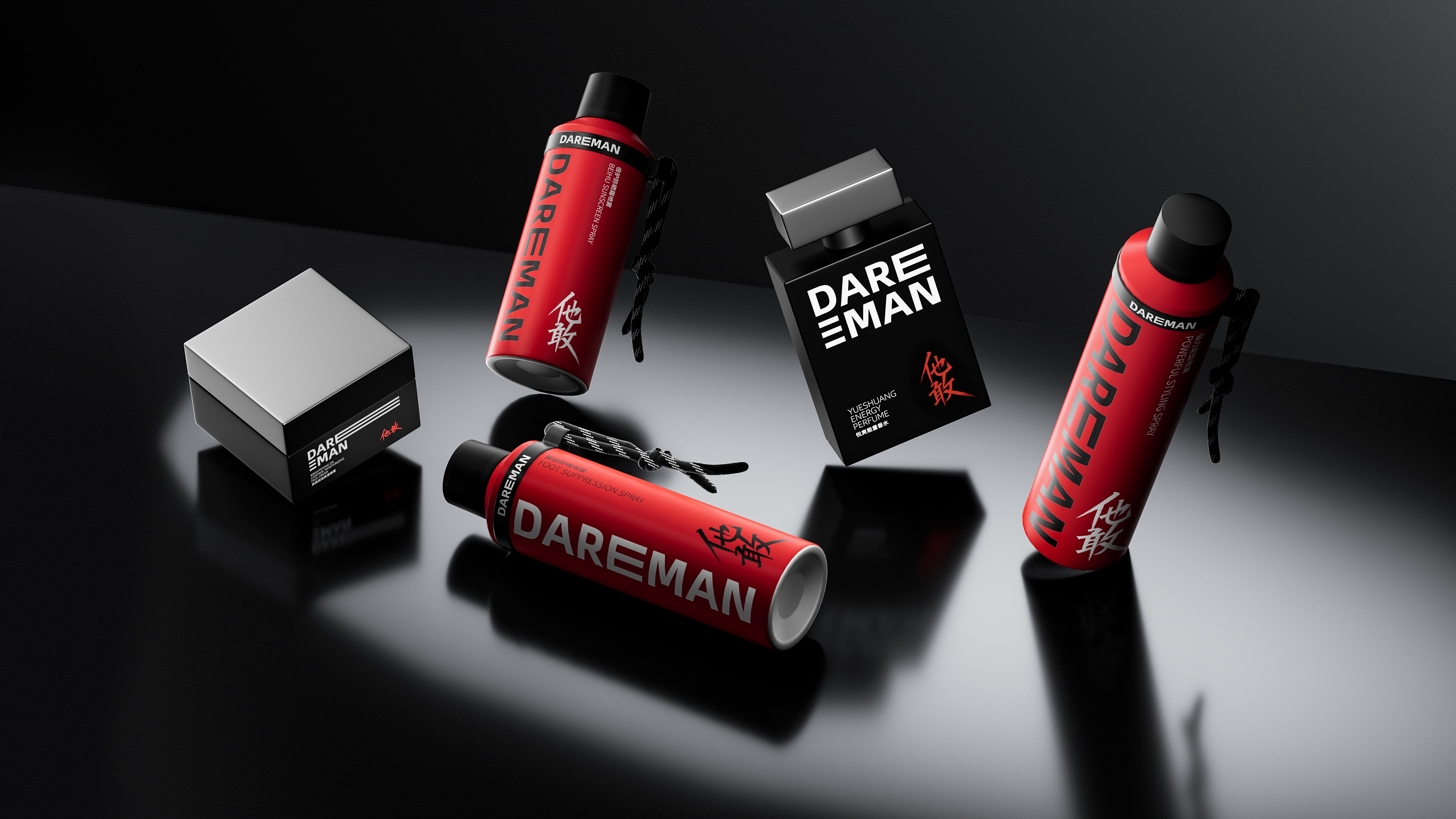
Dareman is a full-range grooming brand driven by the daring spirit of “He Dares.” With cutting-edge design and exceptional quality, Dareman creates grooming products for modern men that exude power, texture, and avant-garde style. Embracing the attitude of “rising with the wind, advancing against it”, the brand encourages every man to boldly explore the unknown and express his unique style.
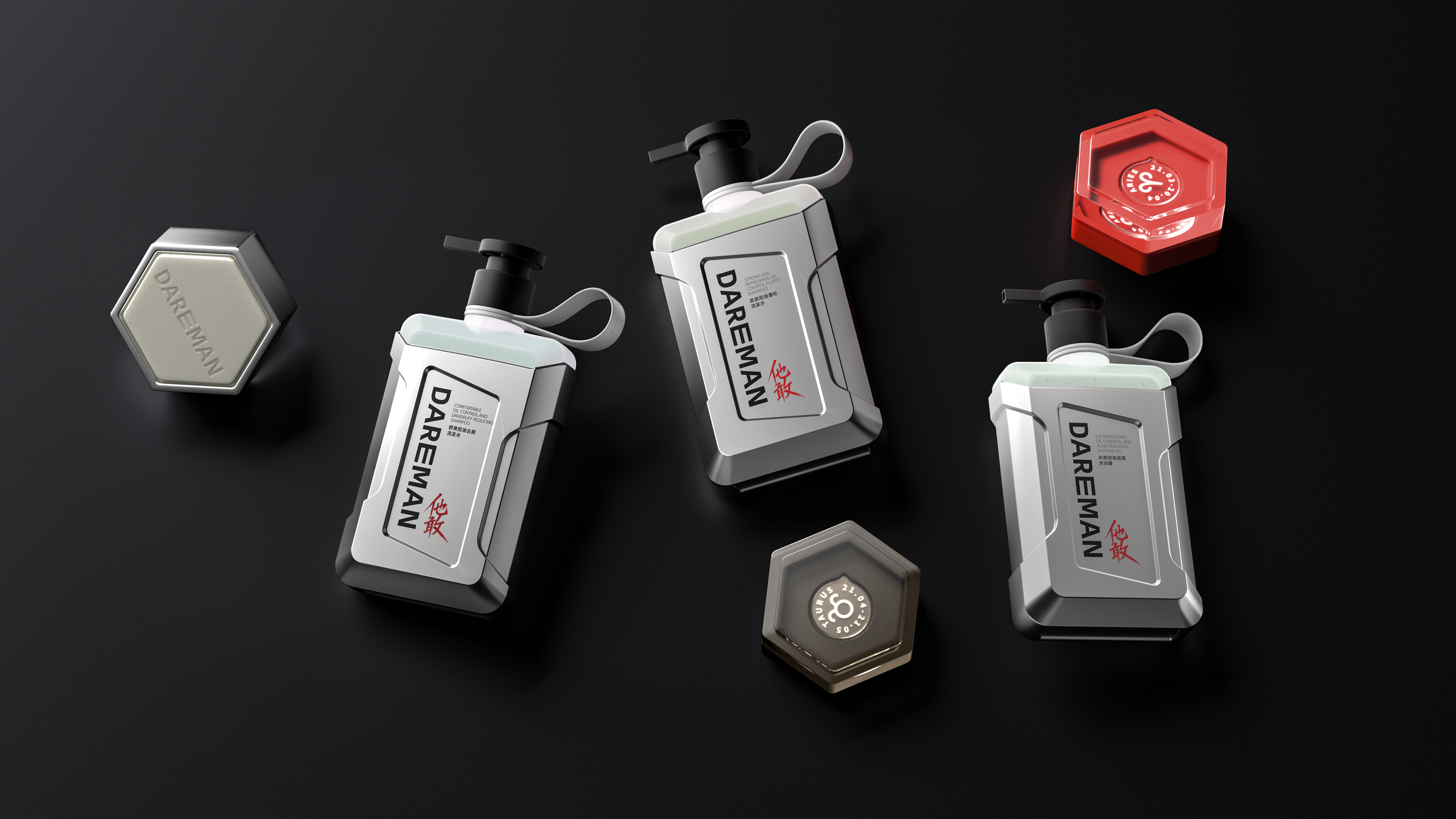
Tired of the similar men’s product packaging? Dareman dares to break the mold, crafted to amplify modern masculinity. Its design language centers on three core values: bravery, responsibility, and strength. The aerosol can is inspired by fire extinguishers, delivering a powerful visual impact; the body wash bottle merges elements of outdoor gear and energy packs, with rugged, assertive lines; the cleansing bar takes cues from gym dumbbells, channeling strength into everyday care. Every detail is a bold expression of masculine identity.
Dareman doesn’t rely on complexity—it makes deliberate choices in materials like aluminum, glass, silicone, PP, HDPE, metal, polyester, and acrylic. Each one is selected for a clear functional benefit: boosting durability, enhancing grip, and ensuring ease of use. Take the tough silicone handle, for example—not only portable, but built to last. This focus on utility perfectly reflects the modern man’s taste: clean, efficient, and purposeful. At the same time, we stay mindful of our environmental impact by using recyclable materials like PP and HDPE, staying true to our sustainability promise.
The packaging adopts Dareman’s signature colors—Molten Red (PANTONE 1788 C) and Obsidian Black (PANTONE 426 C)—as the primary palette, conveying a sense of power, confidence, and premium quality. It is complemented by Titanium Gray (PANTONE COOL GRAY 4 C) and Aurora White (PANTONE P 179 C), creating a visual system rich in power and professional character. Molten Red symbolizes passion and action, Obsidian Black represents stability and professionalism, Titanium Gray adds a metallic, technological feel, and Aurora White creates a refreshing and pure visual experience. The color combination is layered and dynamic, enhancing visual impact while significantly boosting brand recognition and memorability. It perfectly embodies DAREMAN’s core spirit of daring to break through and striving for excellence.
The DAREMAN series is unique in its font design. The Chinese logo "他敢" is based on the style of Chinese stele inscriptions, breaking the traditional calligraphy rule of hiding the tip of the pen. The strokes are sharp and exposed, showing the power of metal cutting and the momentum of breaking through. Every stroke is ready to go, interpreting the brand's spirit of daring to challenge and moving forward.
The English logo “DAREMAN” enhances the visual tension and adaptability through the extension of the letter “E”. It can be flexibly divided into sections according to different packaging sizes, and still maintains a high degree of recognition and unity in various applications, highlighting the brand's unique sense of power and uniqueness.
Credits


Entrant
Kris Lin international Design
Category
Interior Design - Office


Entrant
Shanghai United International School
Category
Product Design - Lighting