2025
Drooly Infinitely: A Bold New Identity
Entrant
NZR Retail&Branding
Category
Communication Design - Websites
Client's Name
Evapify
Country / Region
Poland
Gallery


About The Entry
Retail and branding agency NZR developed the brand identity, packaging, web design, and communication strategy for Drooly, a new-generation tobacco-free nicotine pouch. After years in the market, Evapify sought to disrupt the industry with a bold, visually engaging identity that would set it apart from competitors. Their goal was to deliver a high-quality product at a fair price while cultivating a modern, open-minded, and inclusive community.
At NZR, we took inspiration from the infinity symbol, reflected in the double ‘O’ in Drooly’s name and the dotted texture that forms the core of the brand’s logomark. The infinity symbol represents endless possibilities, connection, and energy - echoing the brand’s philosophy that every individual is part of a larger, interconnected system. This ties into Drooly’s vision of fostering a strong, like-minded community centred around innovation and self-expression: Drooly Infinitely.
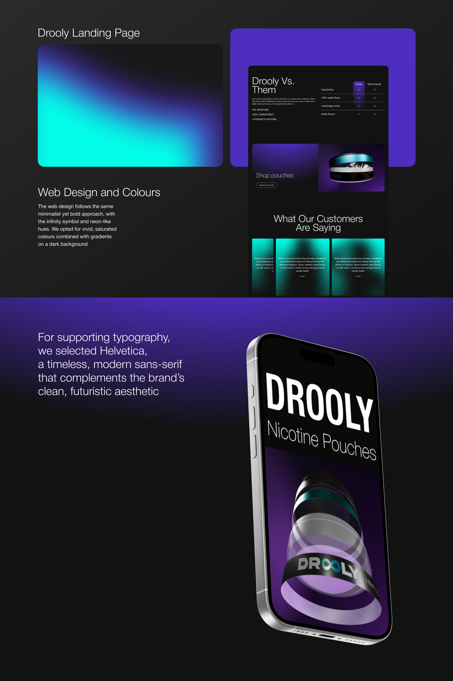
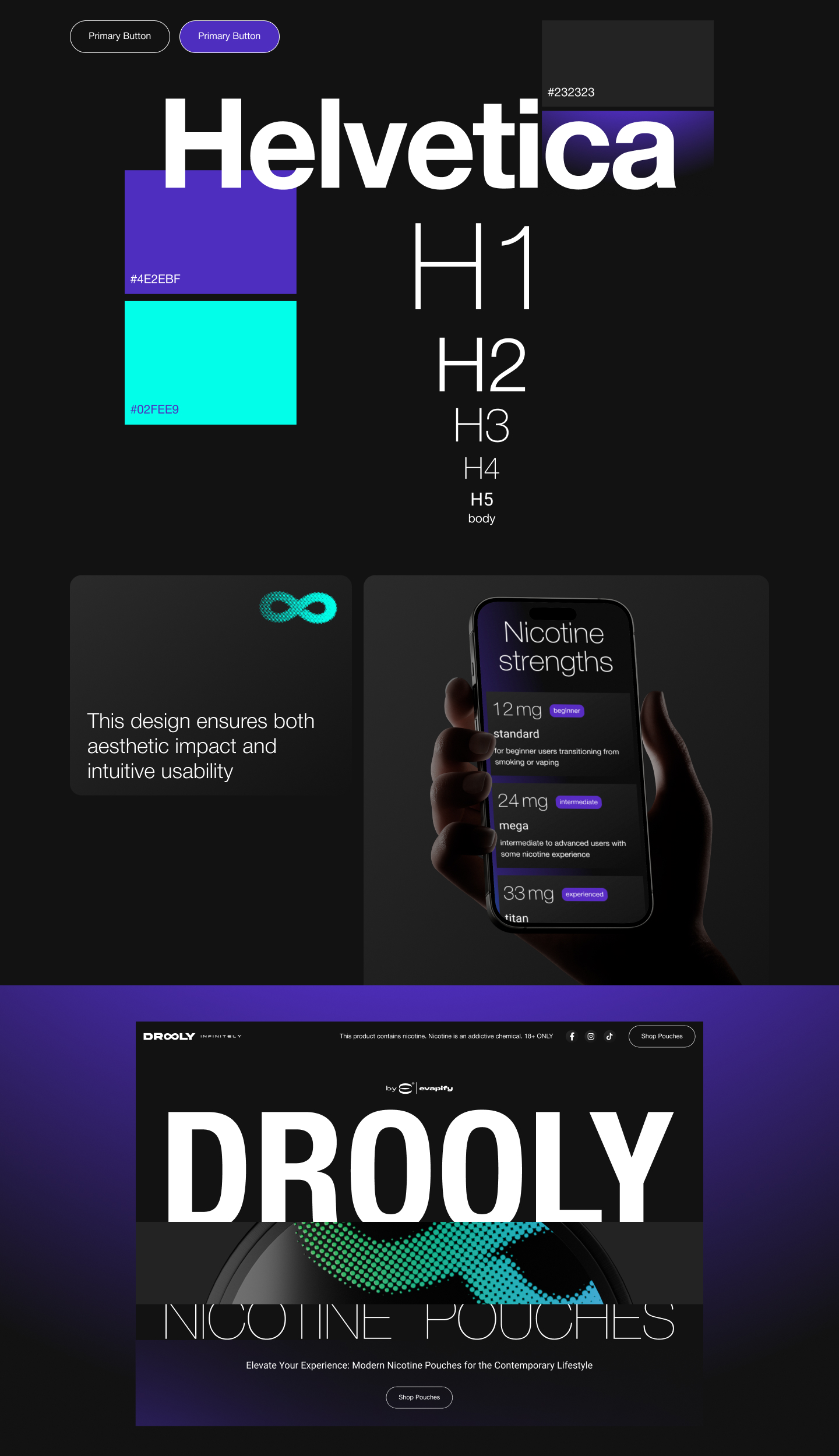
To make the brand distinctive and ownable, we created a fully custom logotype, seamlessly integrating the infinity-inspired mark into the lettering. No existing font was used: the logo was built from scratch based on lettering to ensure uniqueness. For supporting typography, we selected Helvetica, a timeless, modern sans-serif that complements the brand’s clean, futuristic aesthetic.
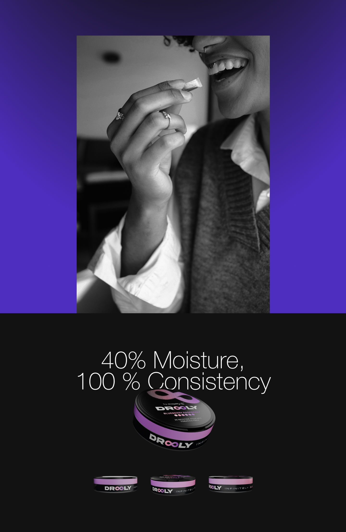
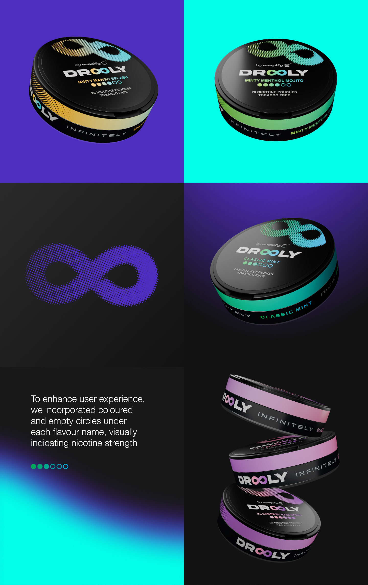
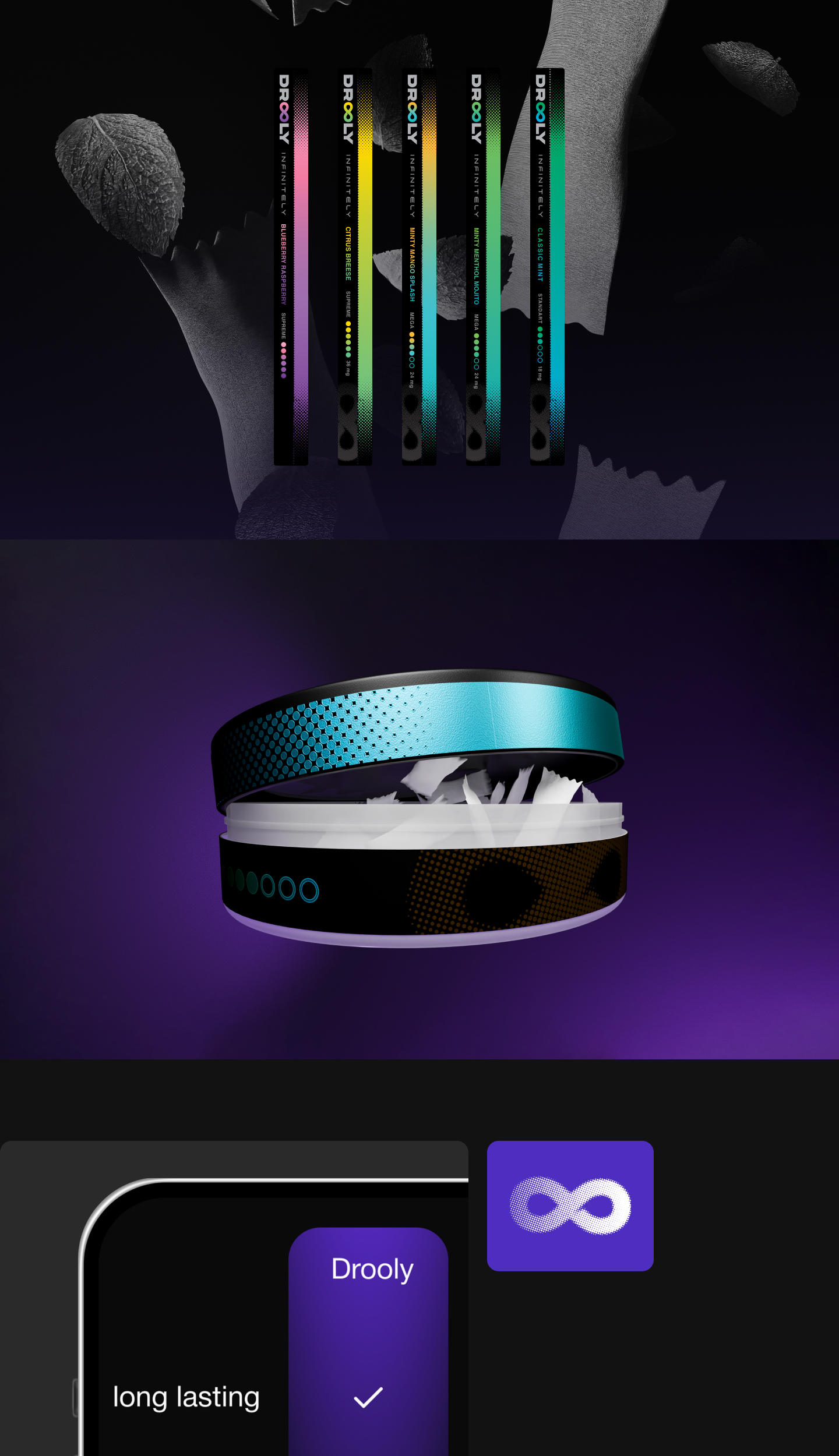
We also developed a flexible visual system built around the infinity symbol with dot pattern, reinforcing brand recognition across packaging, digital media, and promotional materials. The colour palette plays a crucial role in differentiating Drooly. We opted for vivid, saturated, neon-like hues combined with gradients on a dark background, evoking a high-tech, futuristic appeal that resonates with a creative, trend-conscious audience.
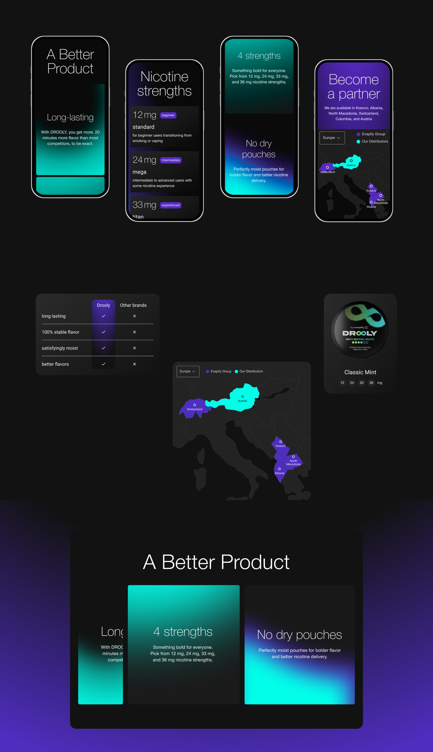
The web and packaging designs follow the same minimalist yet bold approach, with the infinity symbol and dotted pattern taking centre stage. To enhance user experience, we incorporated coloured and empty circles under each flavour name, visually indicating nicotine strength. This design ensures both aesthetic impact and intuitive usability.
From digital to physical touchpoints, every element of Drooly’s identity is crafted to stand out, foster engagement, and leave a lasting impression.
Featured Media

Entrant
CreativeWeb
Category
User Interface Design (UI) - Best Visual Design - Aesthetics

Entrant
Fullhouse Interior Design
Category
Interior Design - Residential

Entrant
Atelier Xiang / LimoSpace FF&E TEAM
Category
Interior Design - Office