2026
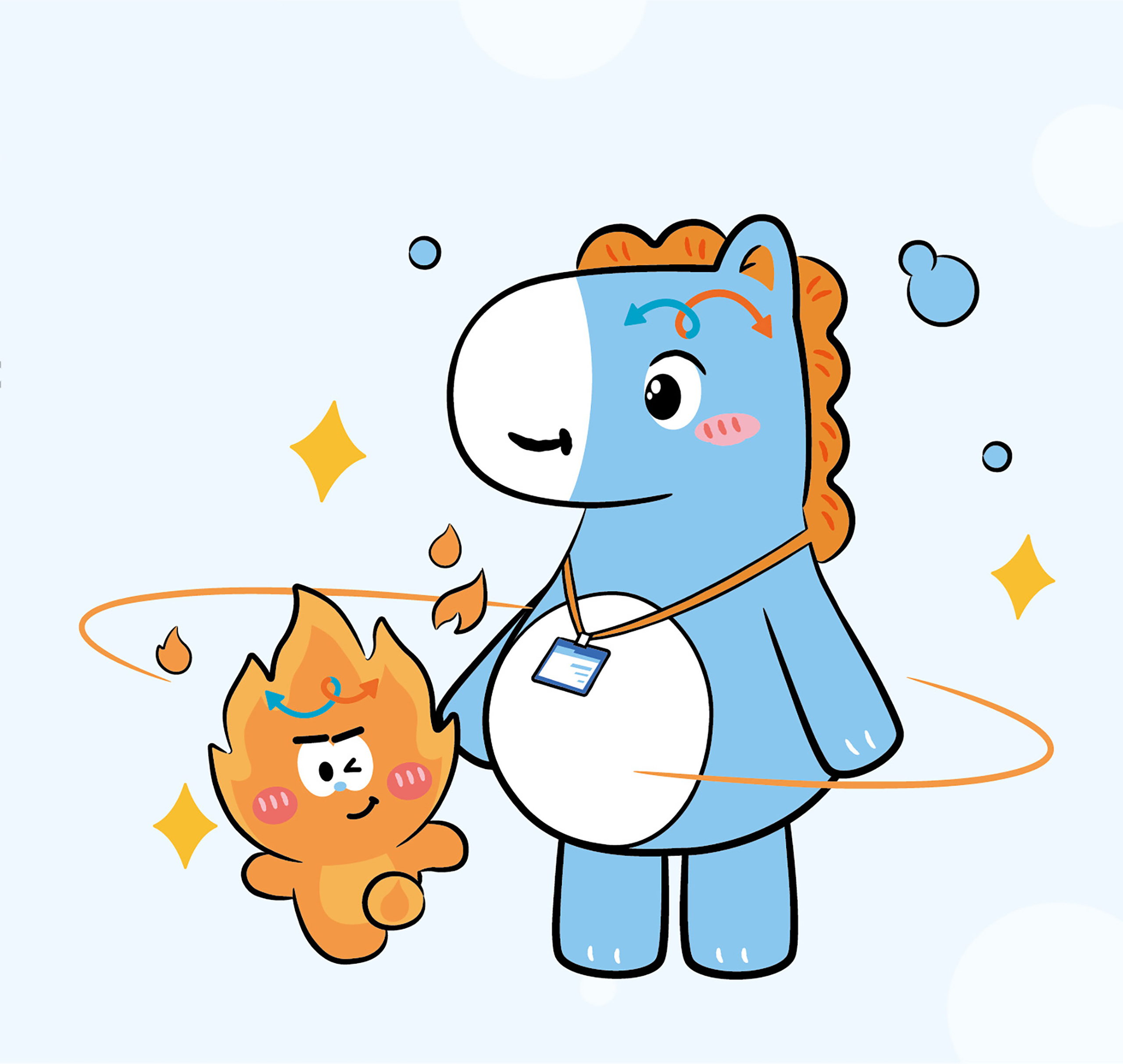
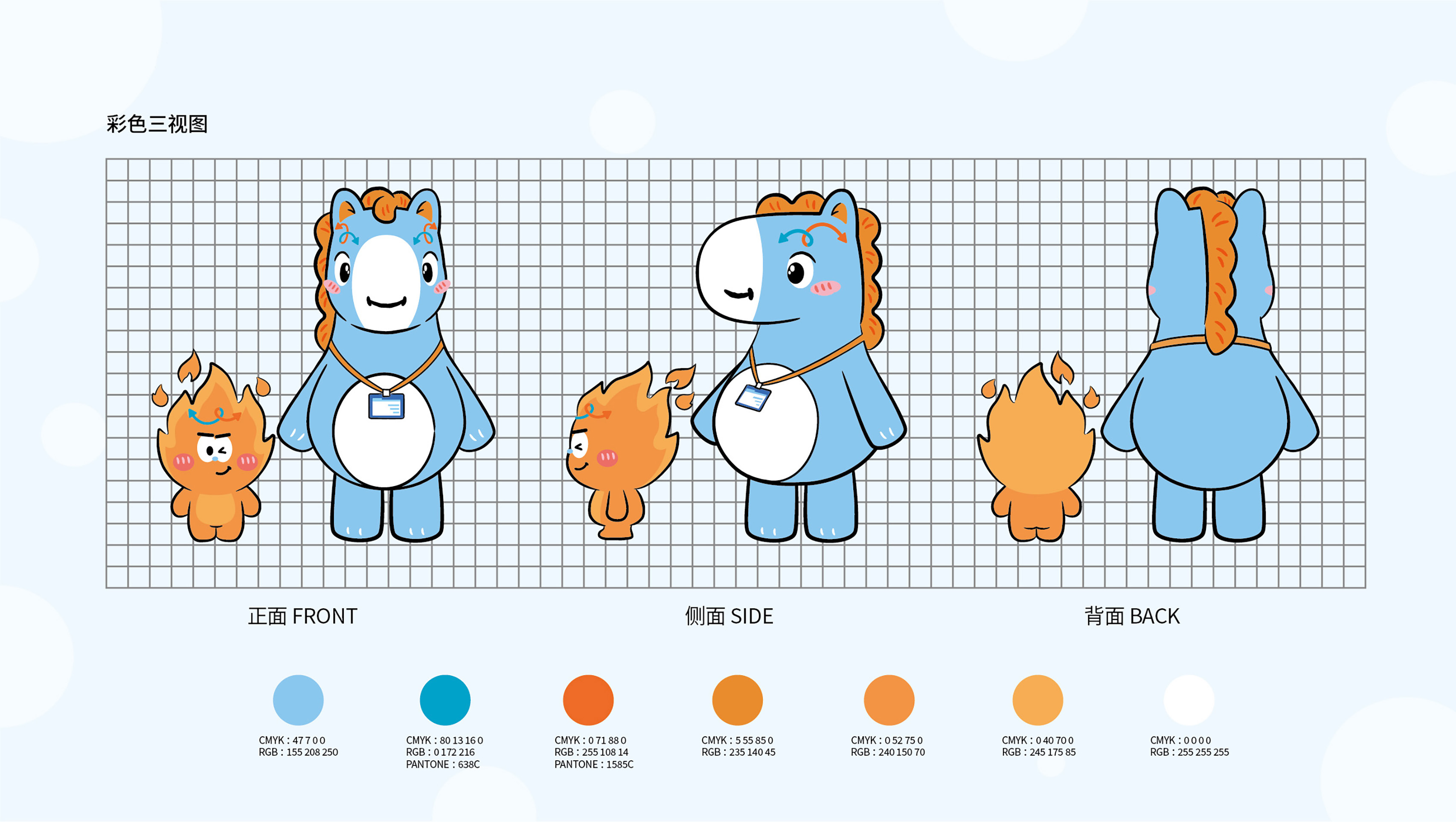
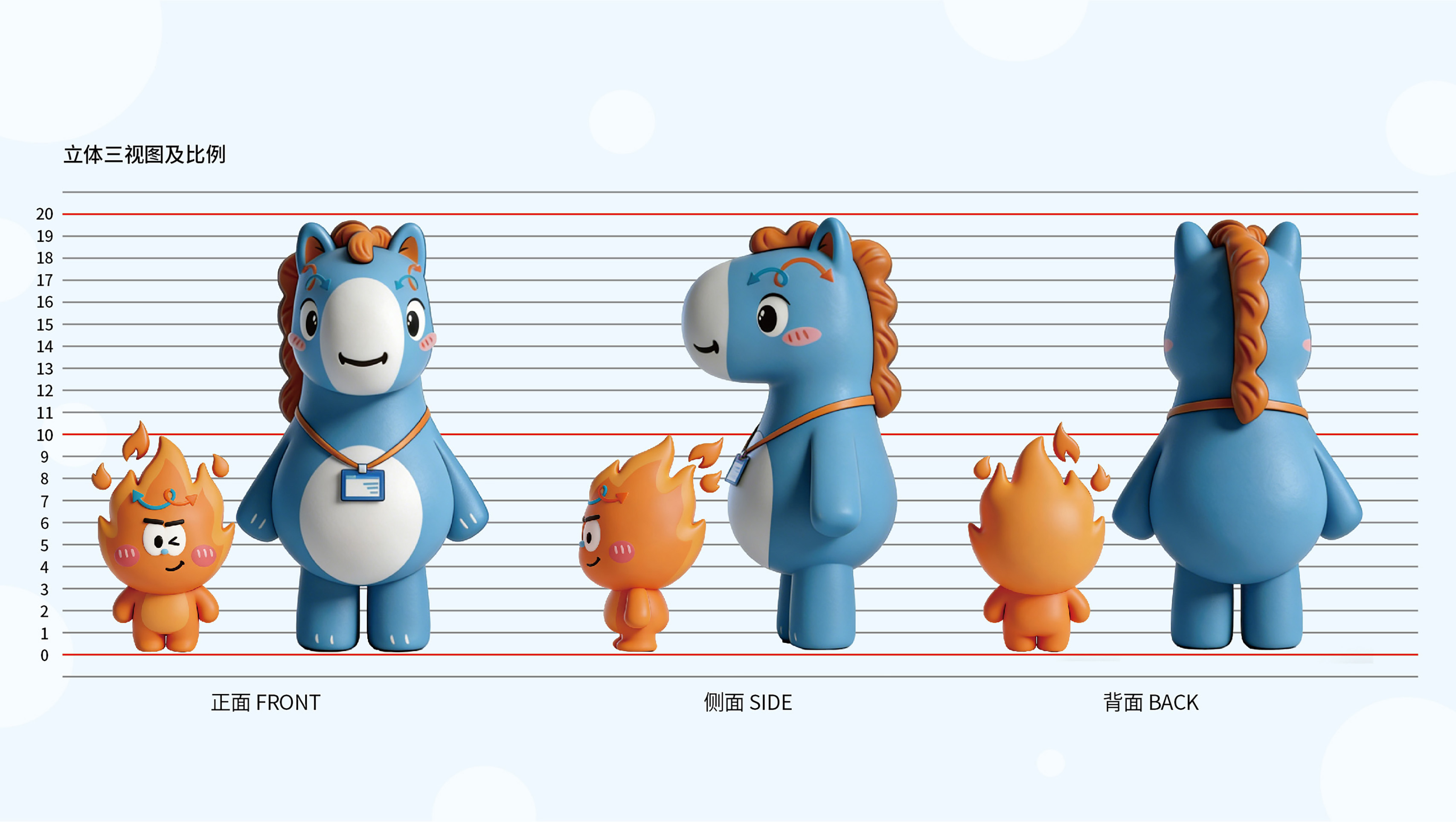
"MADUDU" and "MAXIAORAN"
Entrant
Innovent Biologics, Inc.
Category
Communication Design - Icon
Client's Name
-
Country / Region
China
Gallery

About The Entry
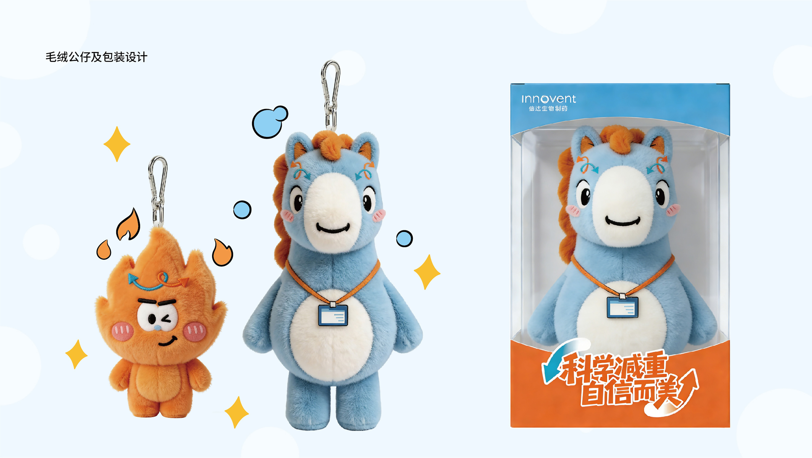
Exclusively crafted for a pharmaceutical product, this dual-character IP aims to deliver medical information through a more approachable cast of characters, making complex mechanisms of action intuitive and comprehensible. Through personified expression, it transforms product functions from rational explanations into memorable and perceptible visual experiences. This enhances the efficiency of medical communication while building distinctive brand identity and deepening emotional engagement.
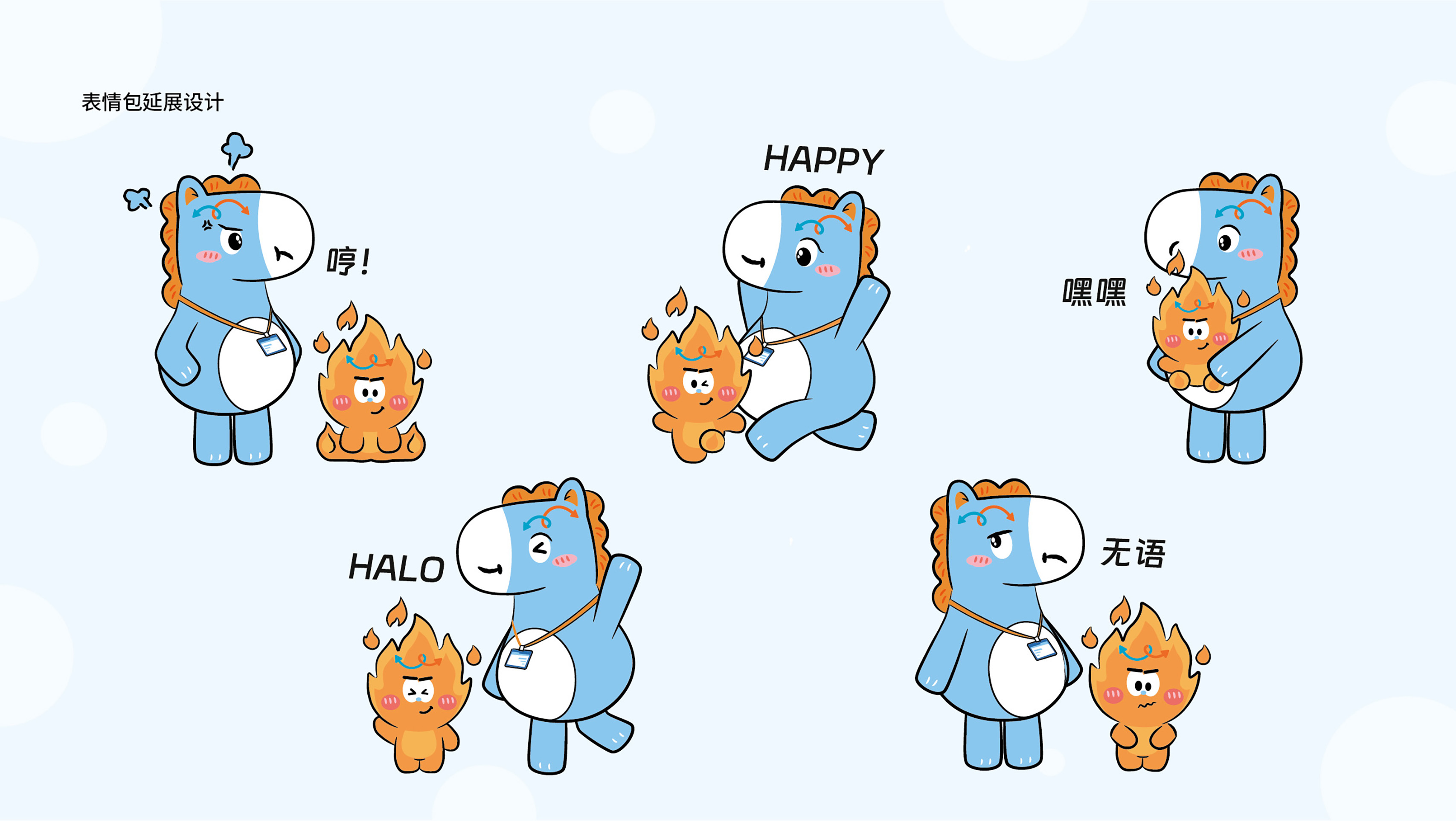
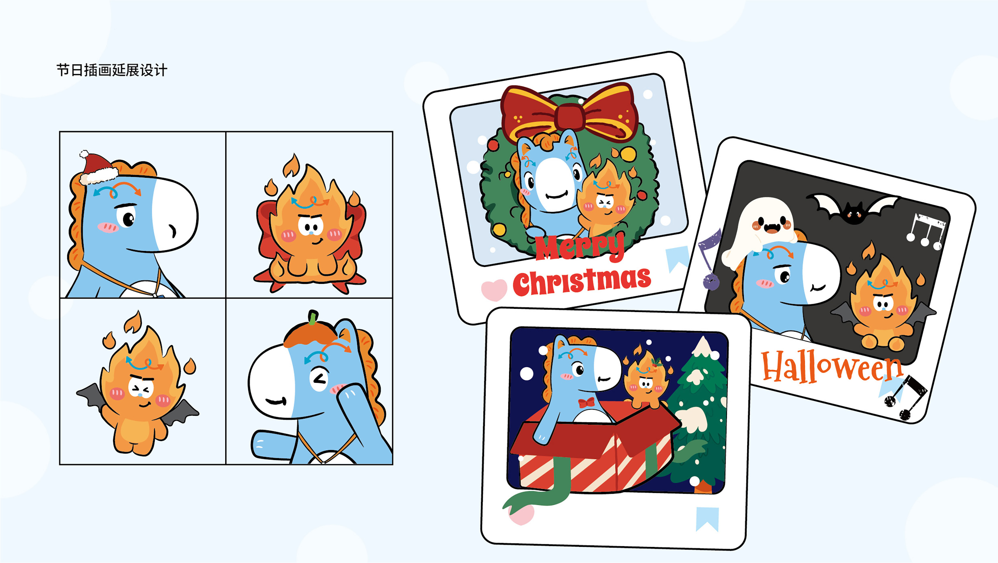
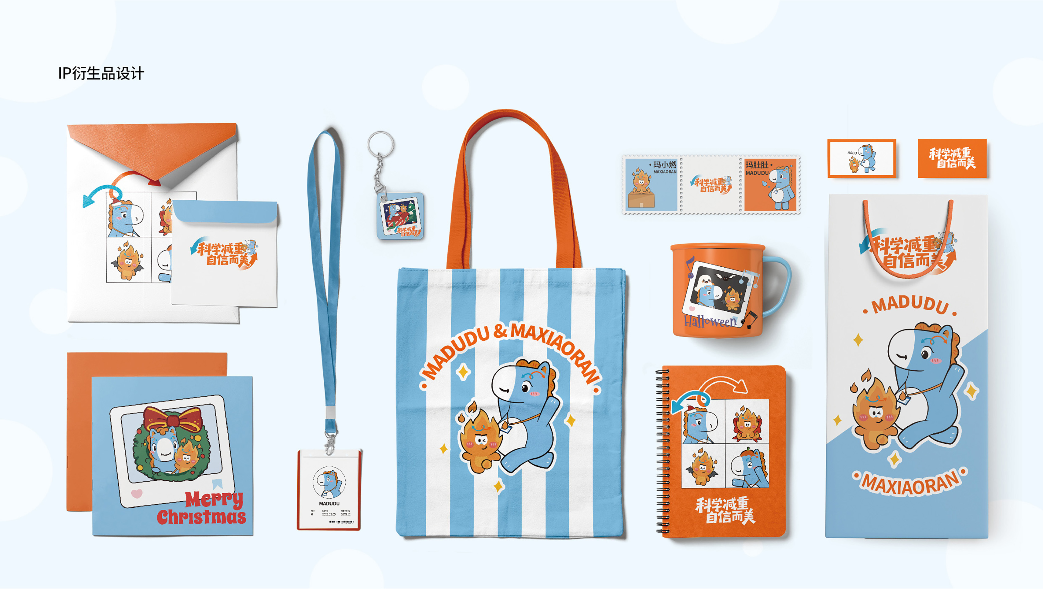
Complementary and interdependent, MADUDU and MAXIAORAN work together to build a complete narrative relationship: the former embodies real-life health concerns and the desire for improvement, while the latter represents the scientific intervention and motivation for change provided by the product. Their sustained interaction forms a visual system rich with narrative possibilities and designed for story expansion.
In terms of character design, MADUDU takes the form of a sky-blue pony, drawing its color from the core brand palette to convey calmness, trust, and wellness. The rounded body and prominently protruding abdomen visually communicate the typical health concern of abdominal fat accumulation, resulting in high visual recognizability and a resonant appeal.
MAXIAORAN is modeled after an orange-red flame. This color scheme symbolizes energy, metabolism, and the onset of change, while its warmer tone helps mitigate the clinical detachment often linked to medical products. The flame-like dynamic form intuitively metaphorizes the product's mechanism—facilitating fat burning, activating metabolism, and delivering sustained effects. This visual strategy translates the product's functional benefits into an accessible and memorable form.
Credits
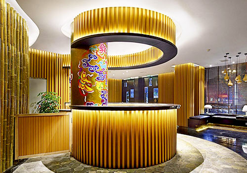
Entrant
Shanghai Shuozhiyun Real Estate Marketing Planning Co., Ltd.
Category
Interior Design - Hotels & Resorts
Entrant
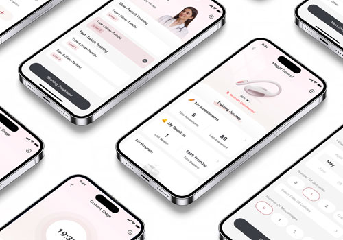
Shenzhen Root Innovation Technology Co., Ltd.
Category
User Interface Design (UI) - User Experience

Entrant
NAKED PROJECT INTERIOR DESIGN LIMITED COMPANY
Category
Interior Design - Hotels & Resorts