
2026
totemio
Entrant
Eunjin Hong
Category
Communication Design - Product and Service Branding
Client's Name
RISD
Country / Region
United States
Gallery


About The Entry
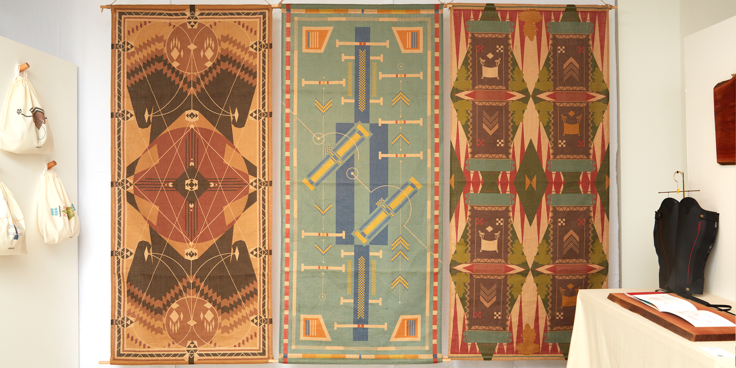
In South Korea, horseback riding has long been perceived as an inaccessible "noble sport." "totemio" is a brand design project that shatters this stereotype, repositioning equestrianism as a vibrant, accessible leisure activity centered on emotional stability and the profound bond between humans and animals.
The name totemio, a synthesis of ‘totem’ (protector) and ‘mio’ (mine), encapsulates the brand’s core philosophy: “A protector of my inner self.” It envisions the stable not just as a sports facility, but as a sanctuary where urban dwellers can breathe energy into their lives and nurture their mental well-being.
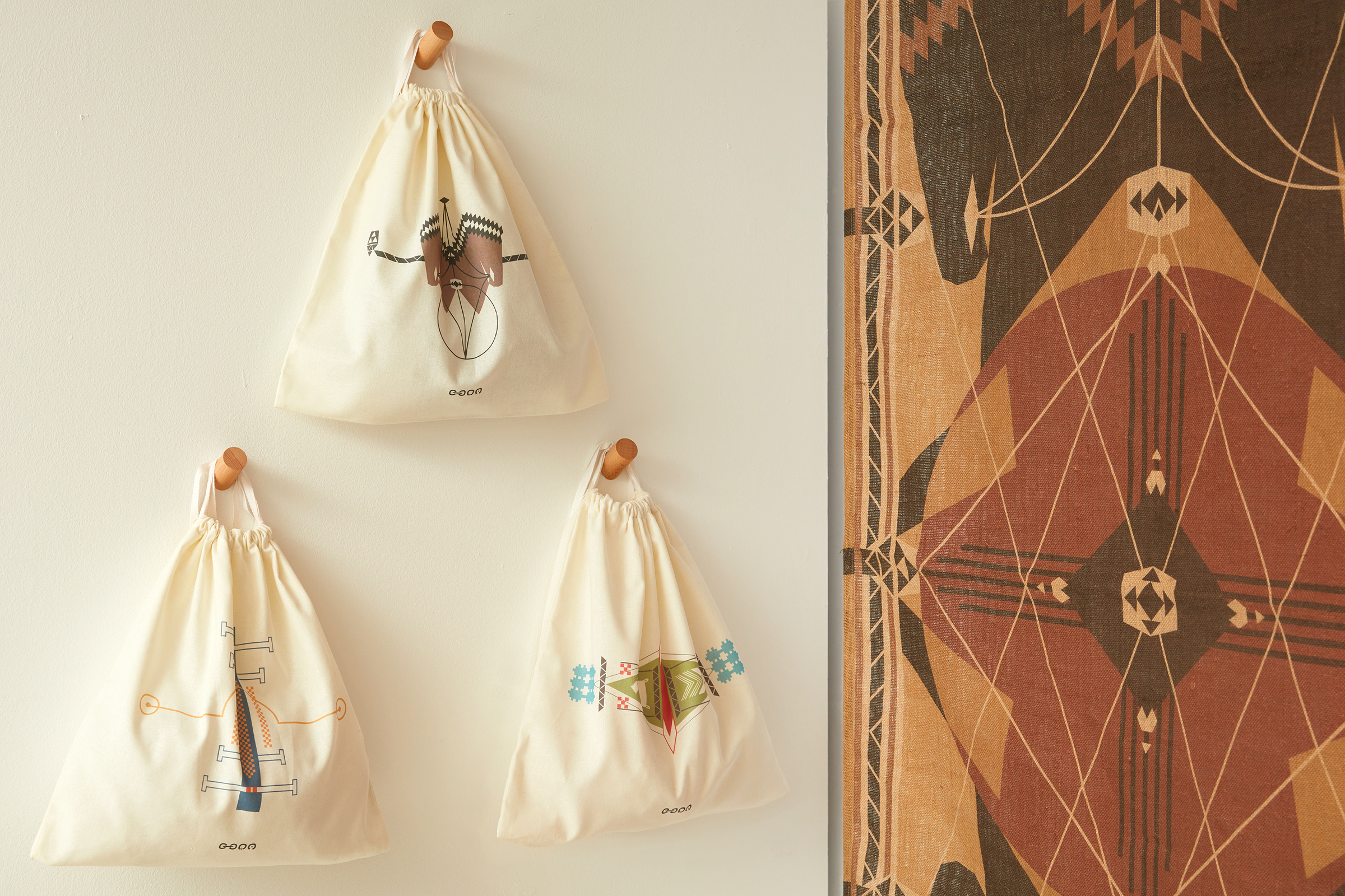
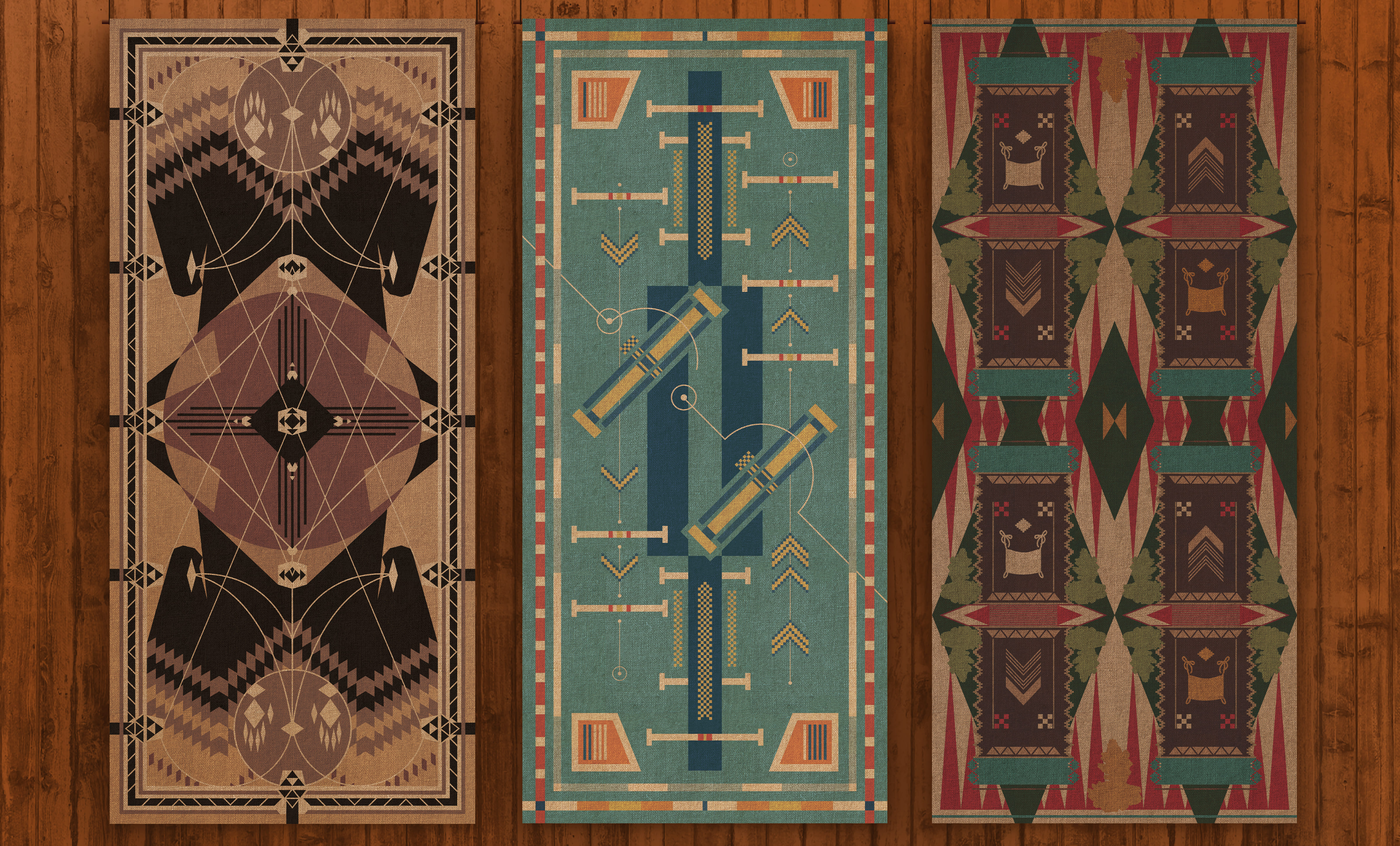
The visual identity is anchored by a raw, forceful typography that mimics the energy of a brushstroke. This organic texture conveys a sense of speed and liberation. The brand’s symbols utilize a riding crop motif, reimagined through the same painterly strokes to symbolize the rhythmic connection between rider and horse. When the logotype and symbol merge into the brand’s signature, they form a silhouette reminiscent of a totem pole, standing as a pillar of strength and soul-recharging.
From the high-energy fabric posters representing Dressage, Show Jumping, and Cross Country to the tactile experience of the branded bags and chaps, every touchpoint is designed to be approachable yet empowering. 'totemio' invites everyone to “Recharge your soul,” turning a traditional sport into a modern lifestyle movement.
Featured Media
Entrant
Next Gadget Lab Limited
Category
Product Design - Workplace & Office
Entrant
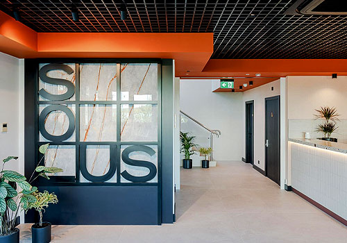
2G Design & Build
Category
Interior Design - Showroom / Exhibit
Entrant
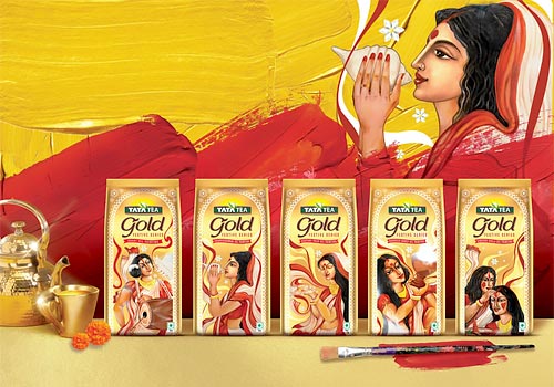
TREE DESIGN PVT. LTD.
Category
Packaging Design - Limited Edition