2026
Sage Health Branding
Entrant
Office of Fields
Category
Communication Design - Company Branding
Client's Name
Yve Health (Formerly Sage Health)
Country / Region
United States
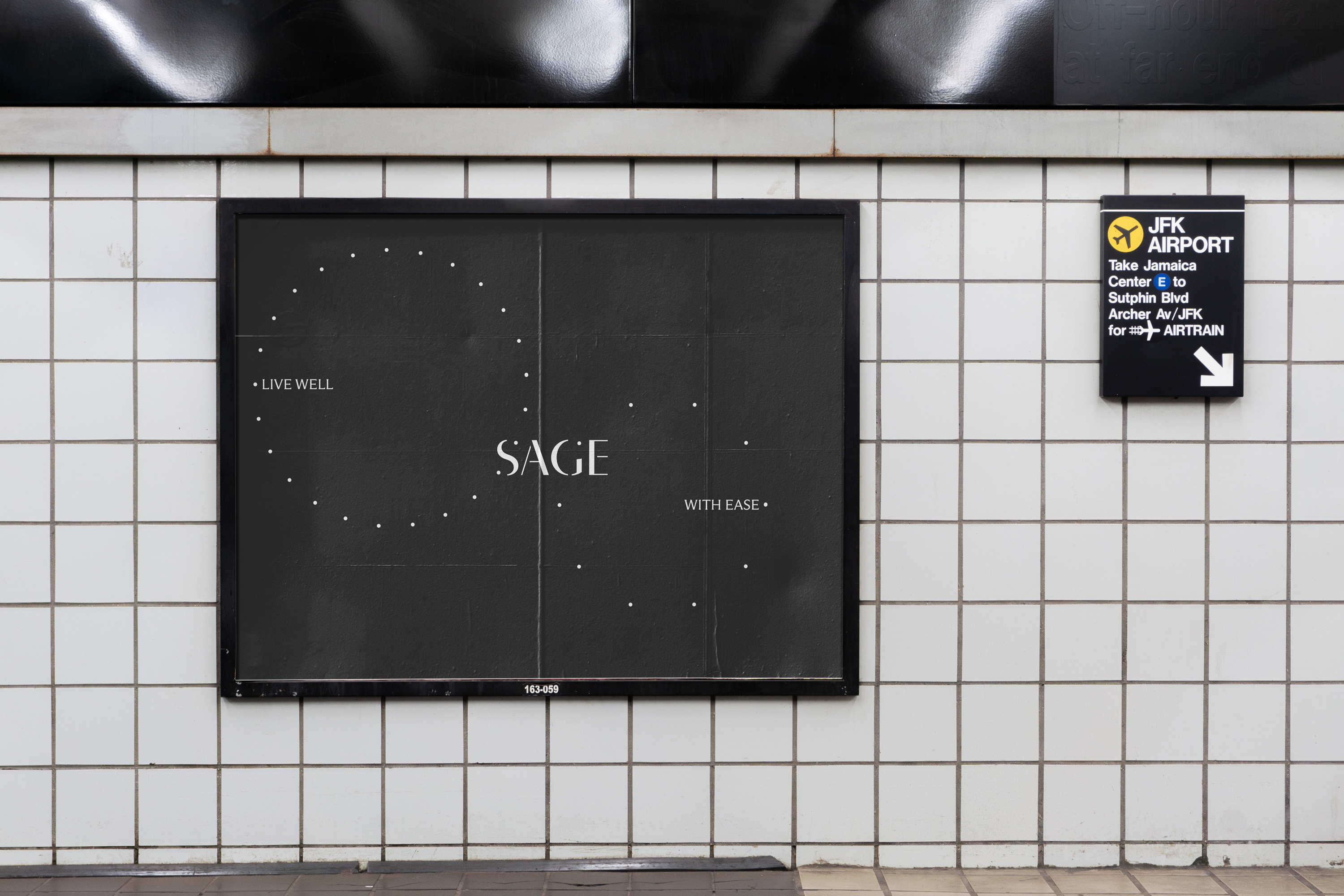
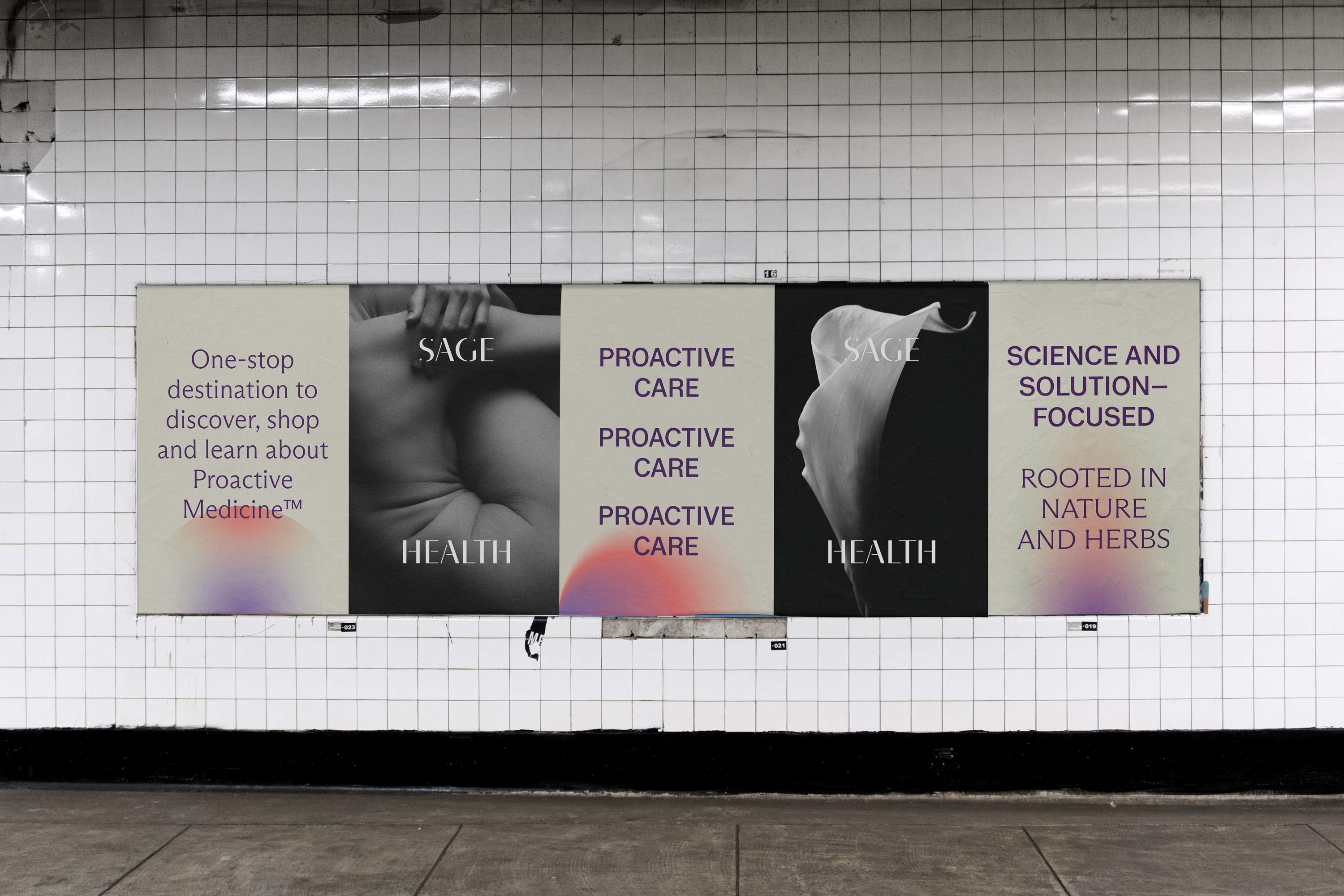
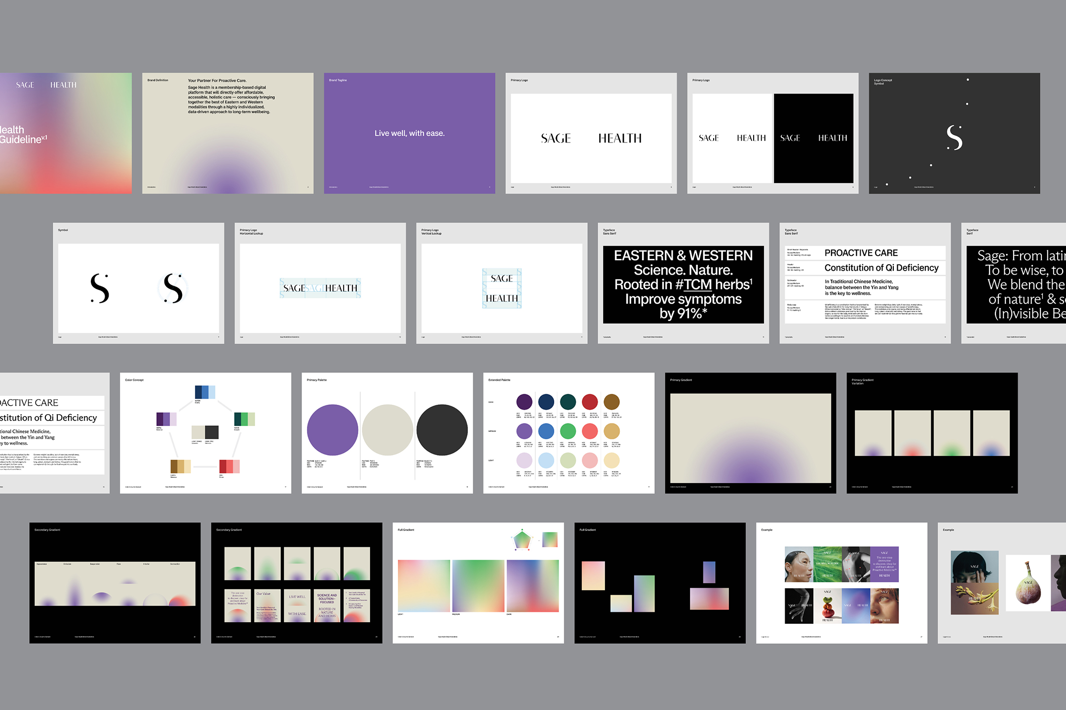
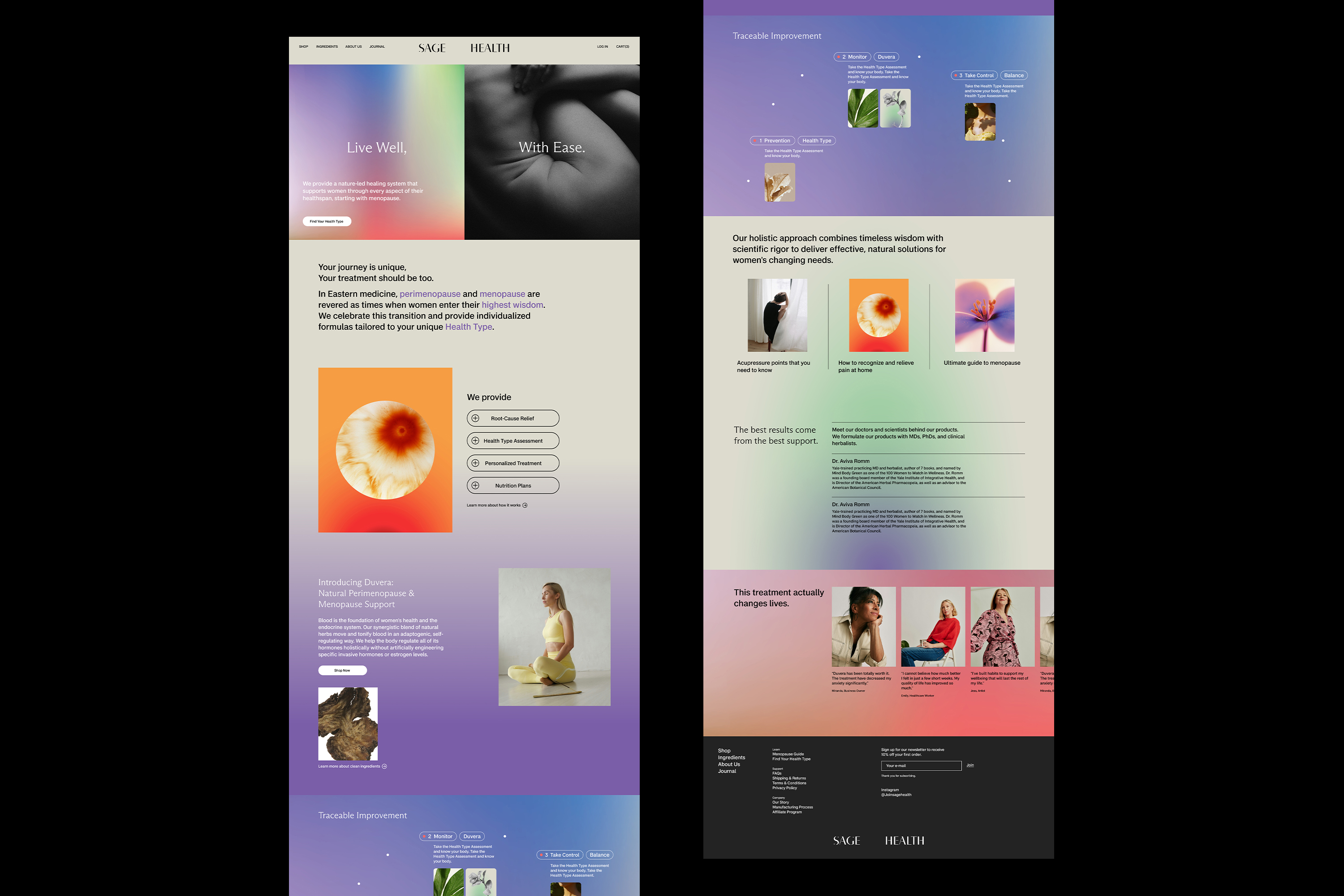
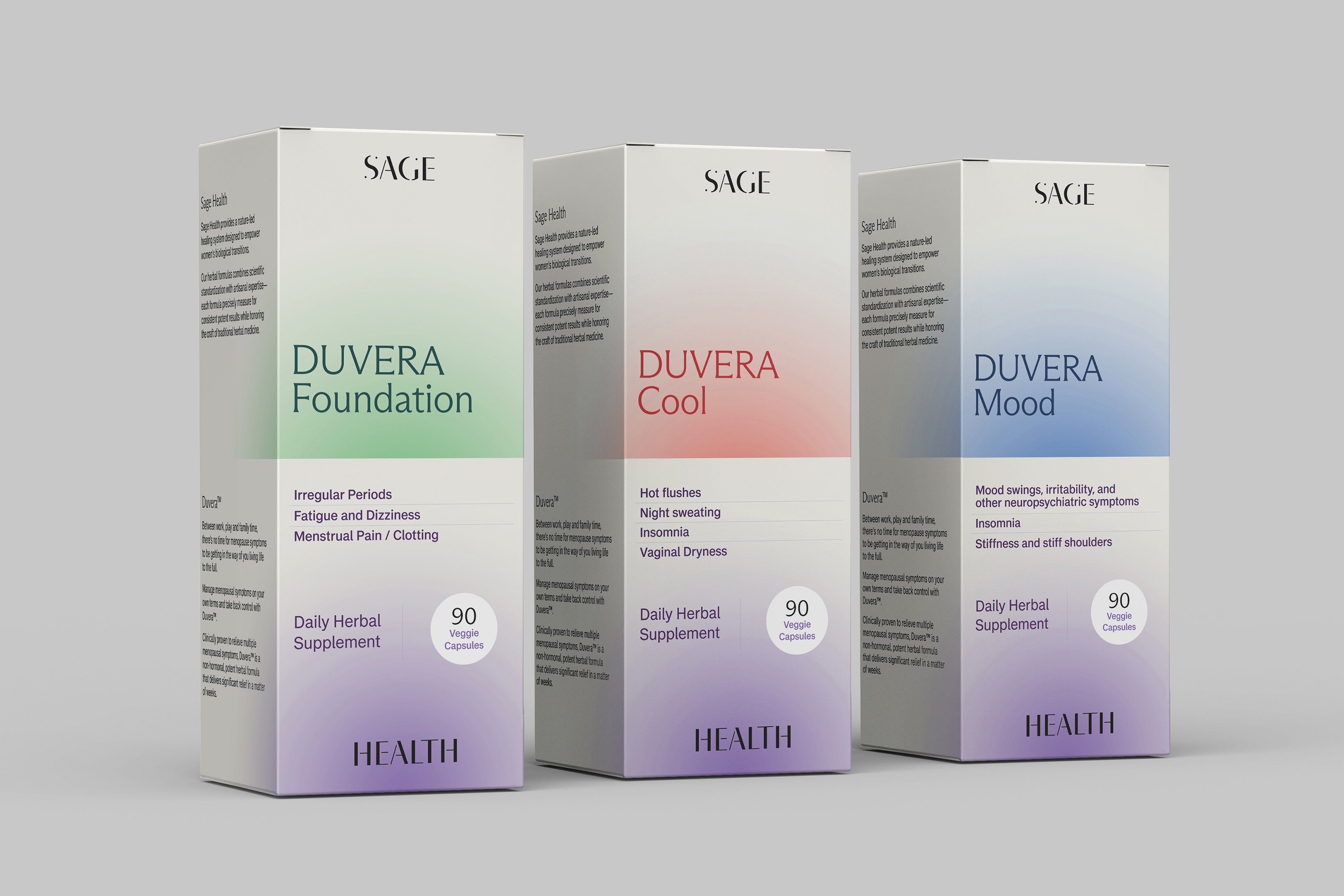
Sage Health is a digital platform providing affordable, holistic healthcare through the integration of Eastern and Western wellness modalities. The goal was to develop a cohesive visual system that balanced cultural influences from both traditions while conveying credibility, innovation, and scientific trust.
A key challenge was translating the principles of Eastern medicine into a visual language that would resonate with Western audiences while preserving its cultural foundations. The identity draws from Eastern philosophies and symbolism while reinterpreting them through a contemporary visual system, creating a bridge between two cultural perspectives on health and wellness.
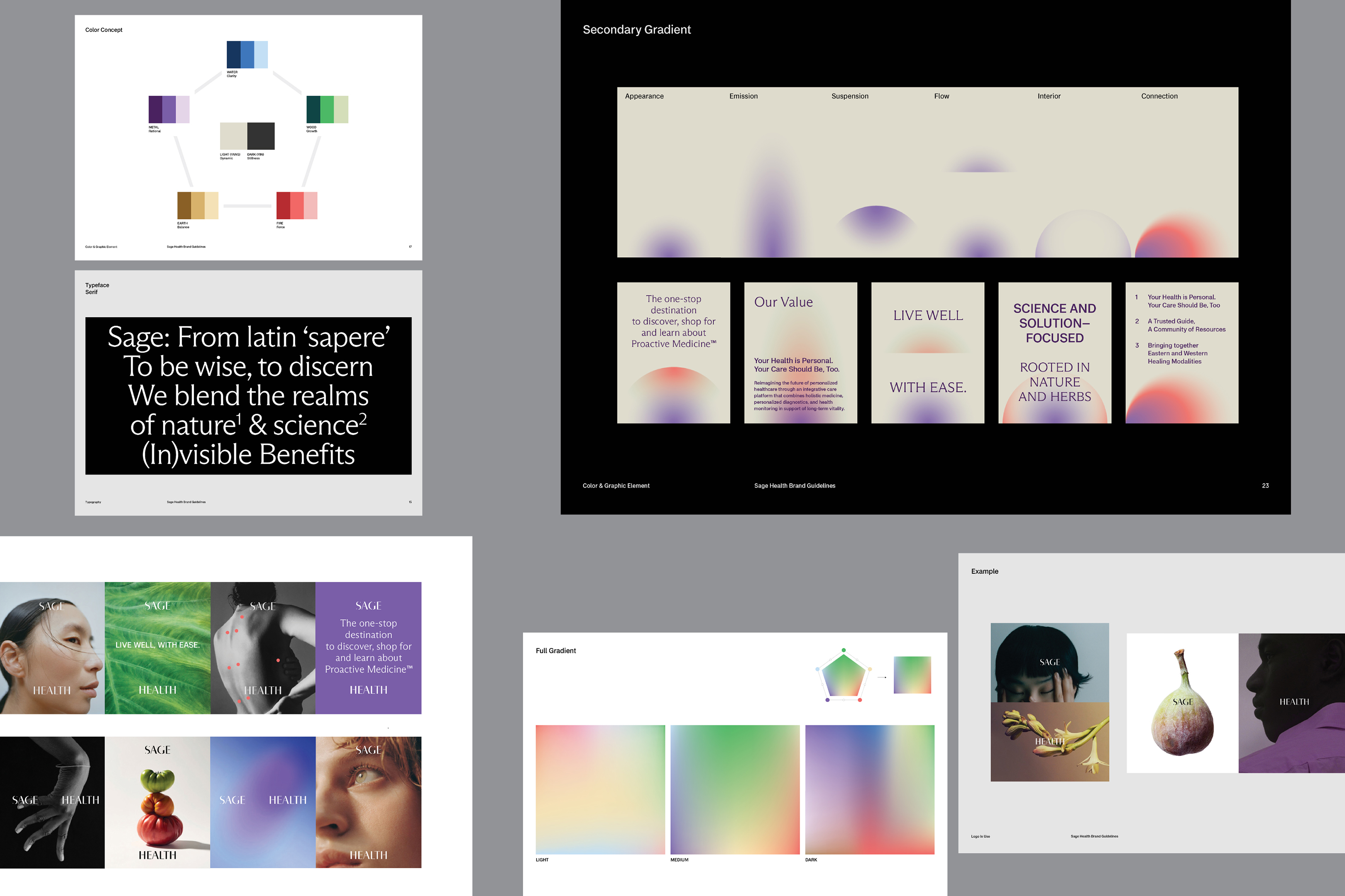
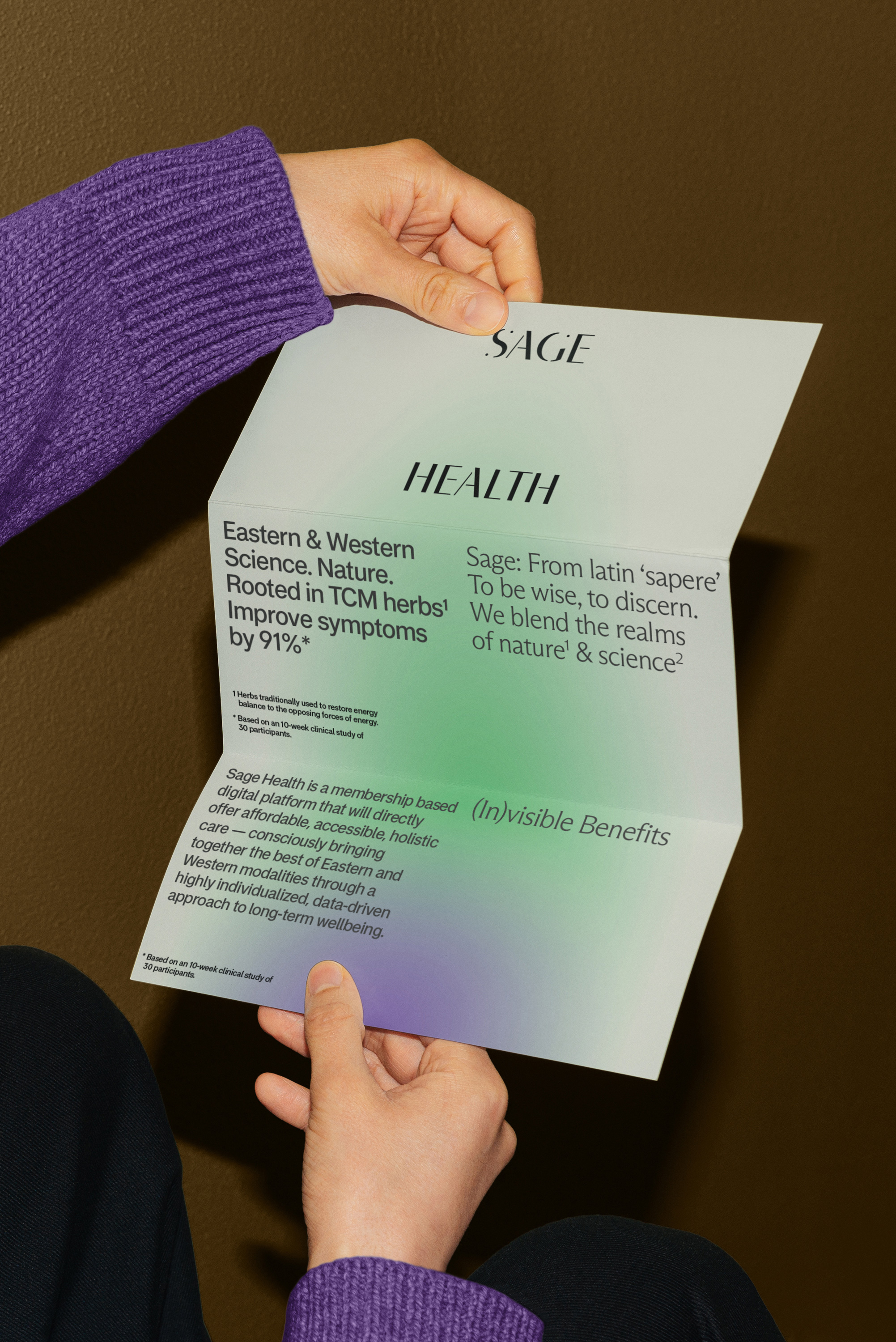
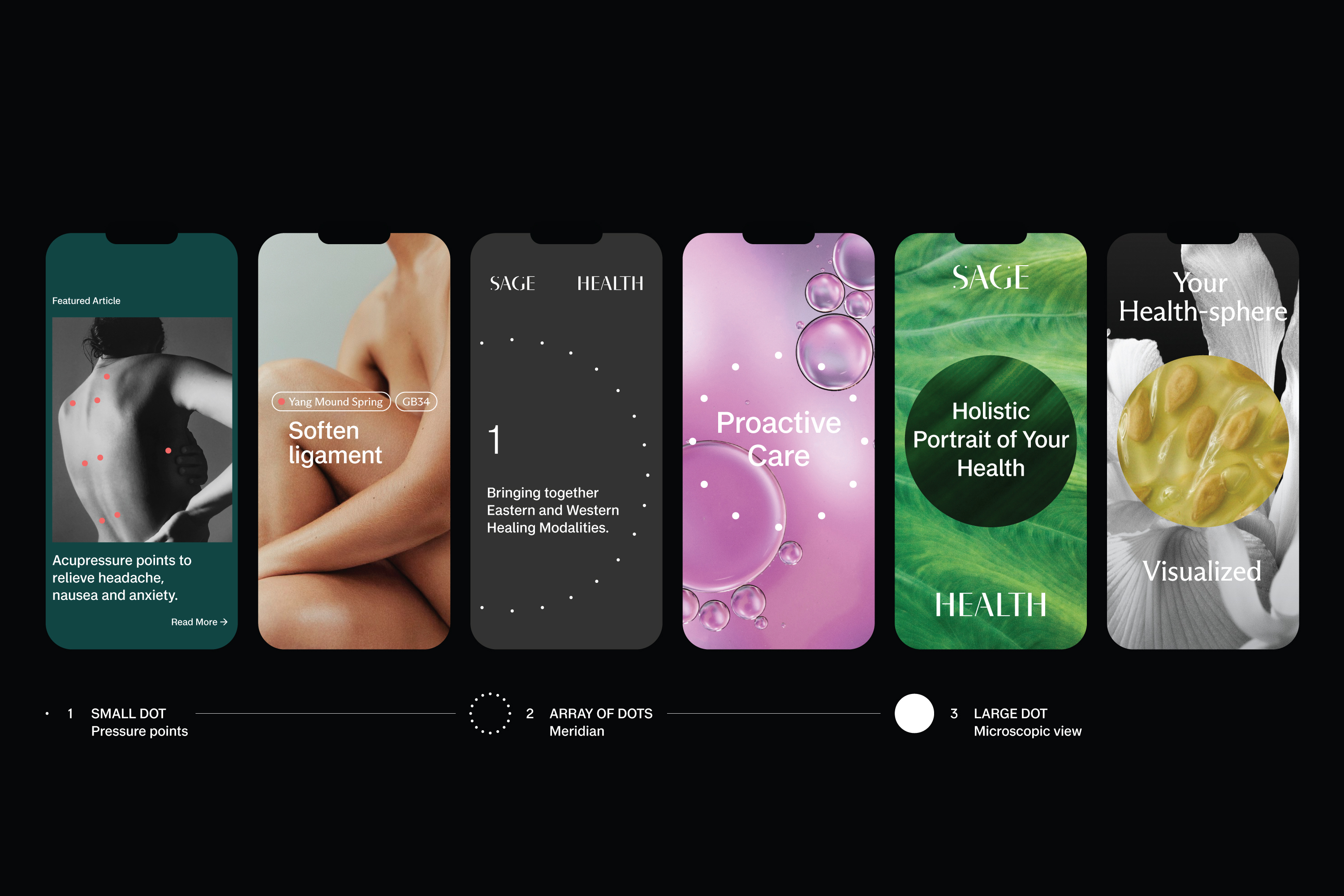
The identity system was developed around the symbolism of the circle, representing continuity, balance, and wholeness. Circular forms within the logotype expand outward to express movement and ongoing care, while the letter “S” subtly references the Yin Yang symbol. The color palette draws from the Five Elements philosophy in Eastern medicine, and gradients were introduced as a core visual language inspired by breathwork and illumination.
The project resulted in a cohesive and scalable brand identity system across digital, print, packaging, and marketing applications. The final visual language established a distinct brand presence that balanced wellness, innovation, and medical credibility.

Credits

Entrant
Tong Ouyang | Sheng Rui Wang | Lei Yan | Yi Xin Qin
Category
Conceptual Design - Children

Entrant
Shenzhen Root Innovation Technology Co., Ltd.
Category
Product Design - Baby, Kids & Children Products