
2026
LEAN IN COIN
Entrant
Shenzhen Heyue Jewelry Co., Ltd
Category
Product Design - Jewellery
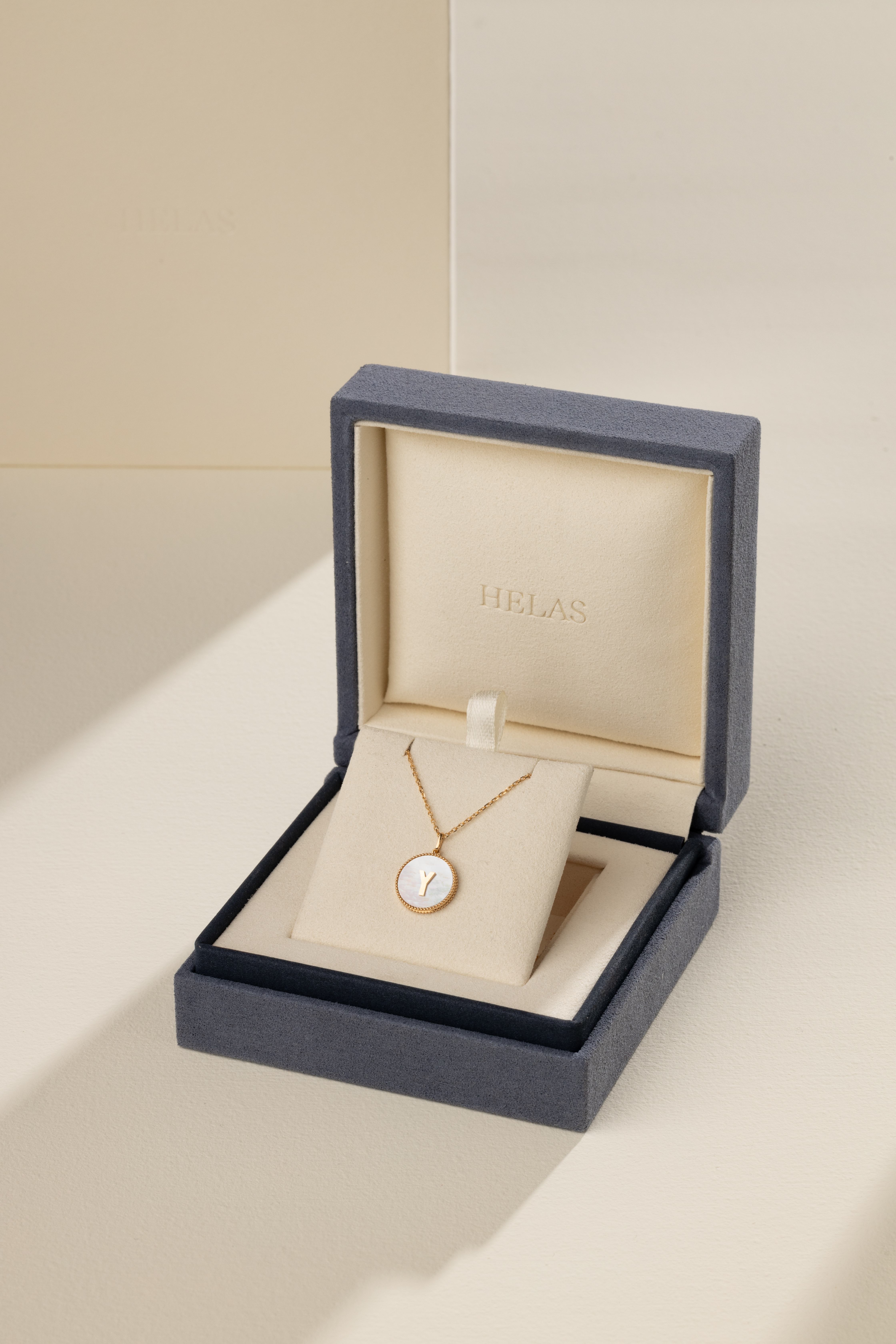
Client's Name
HELAS
Country / Region
China
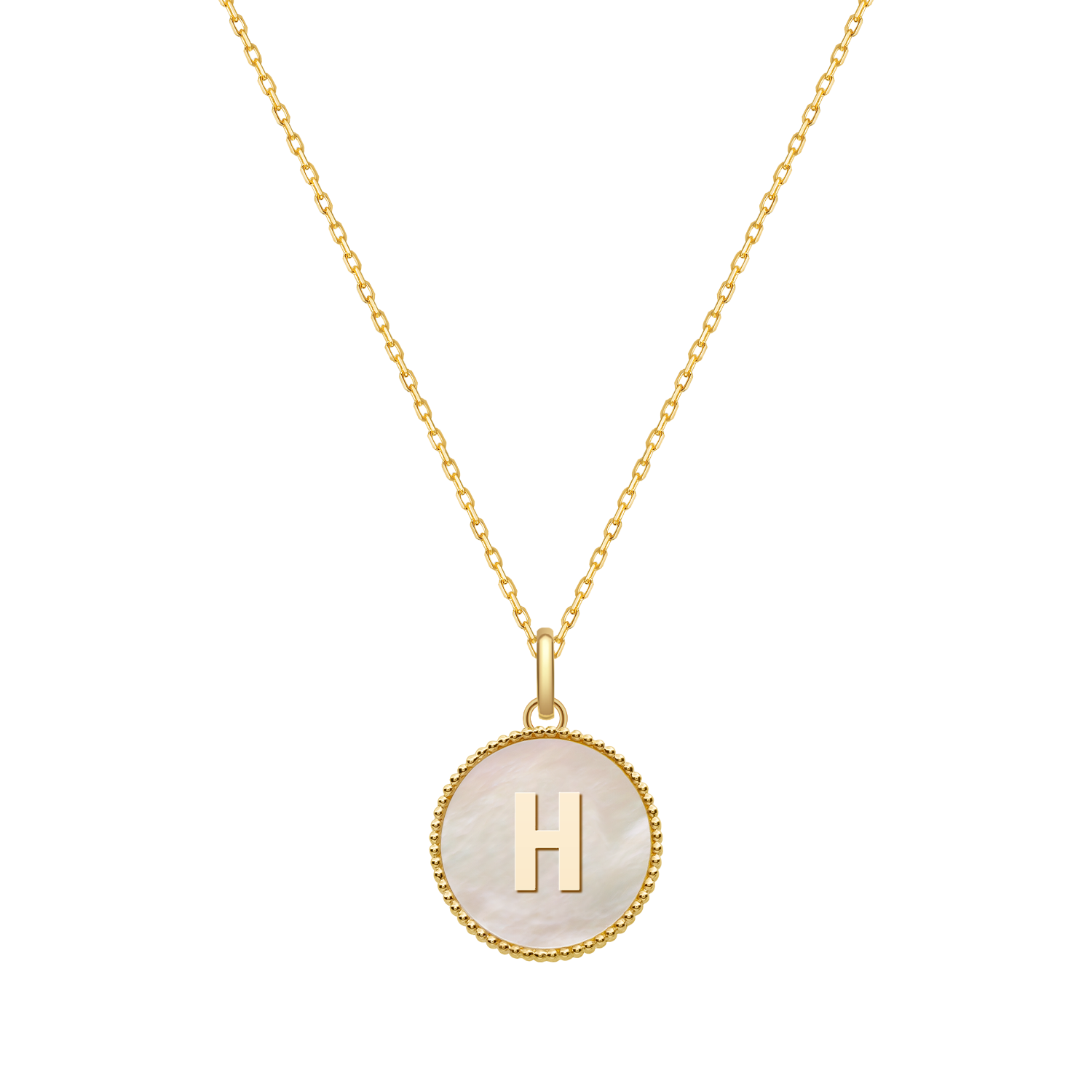
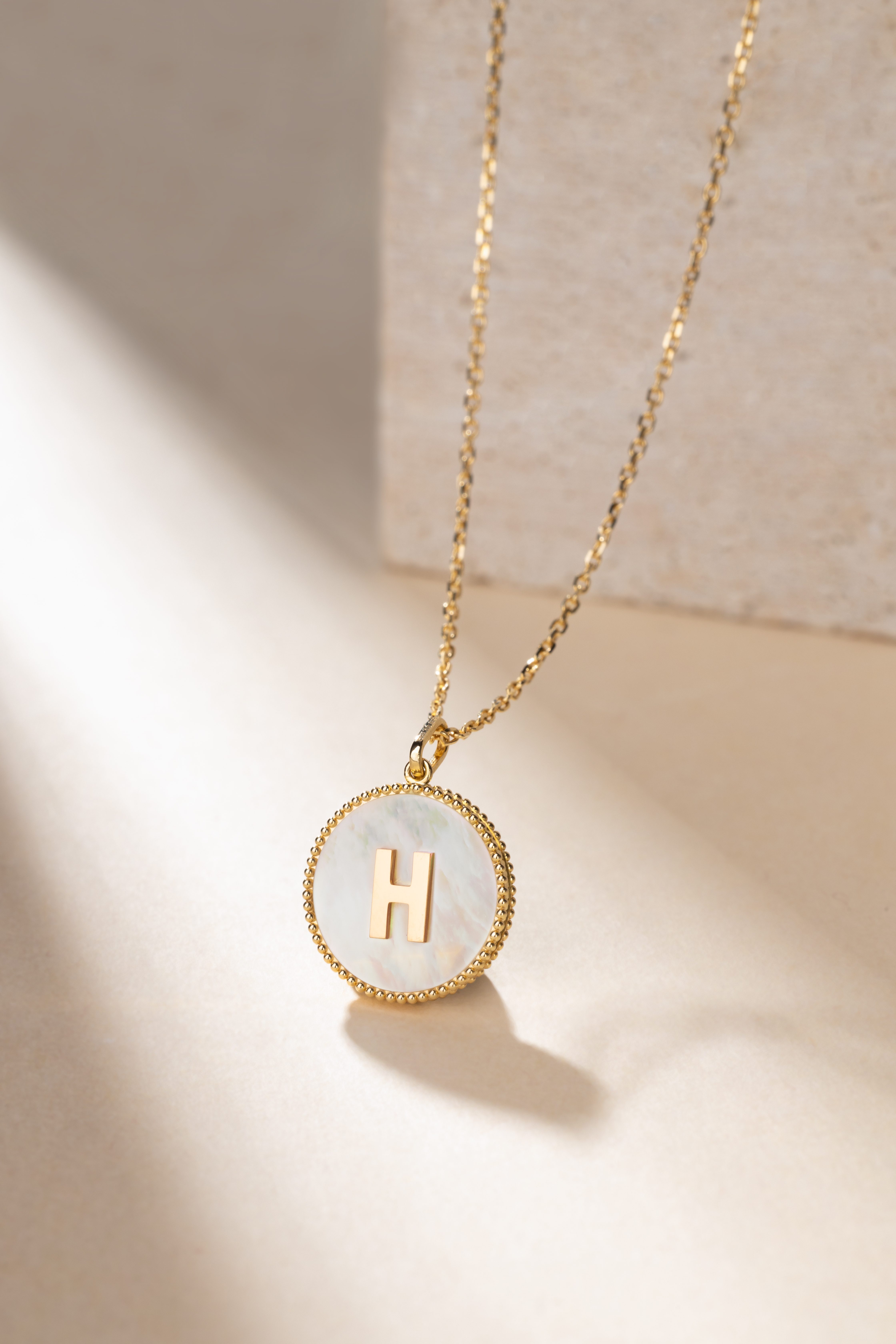
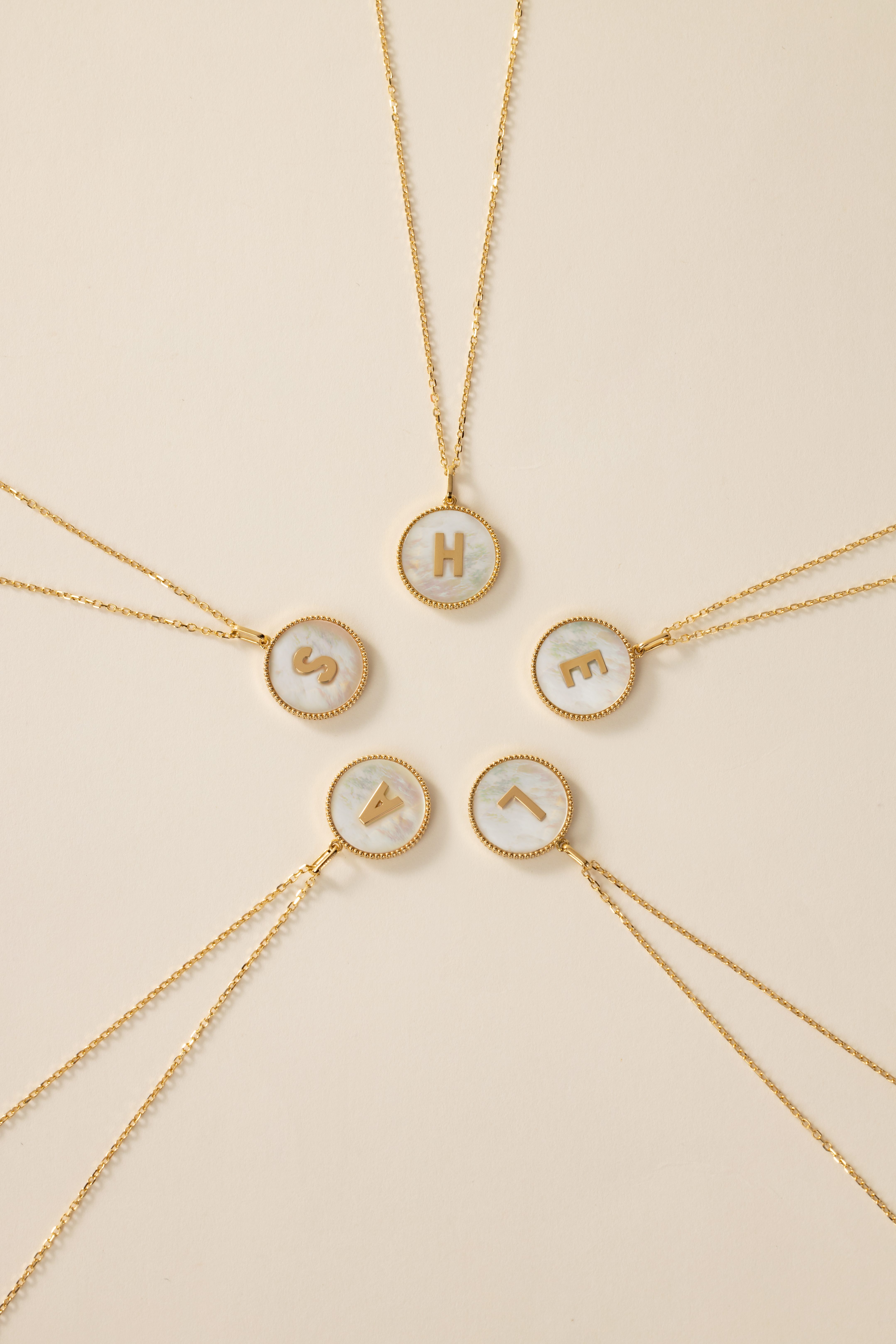
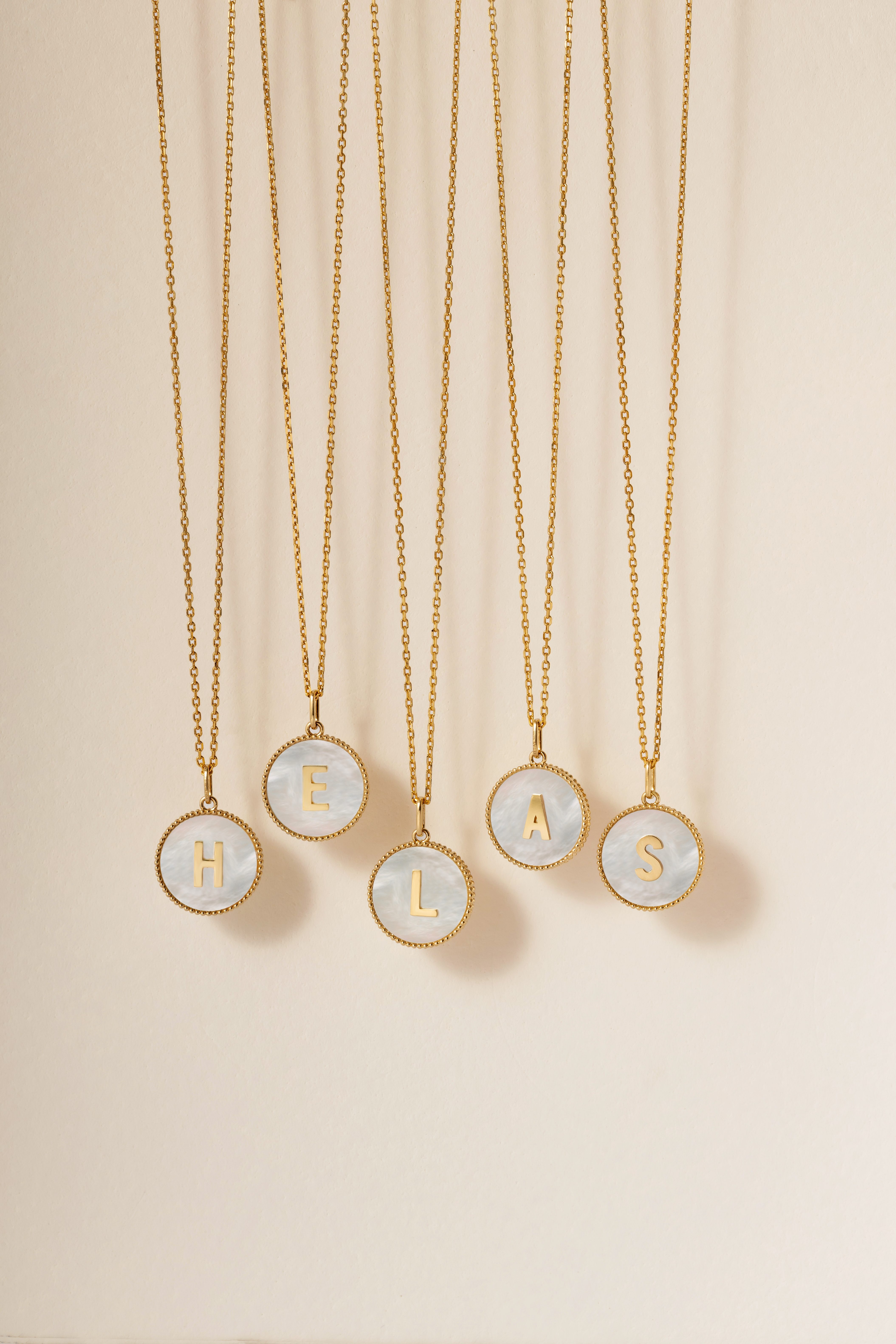
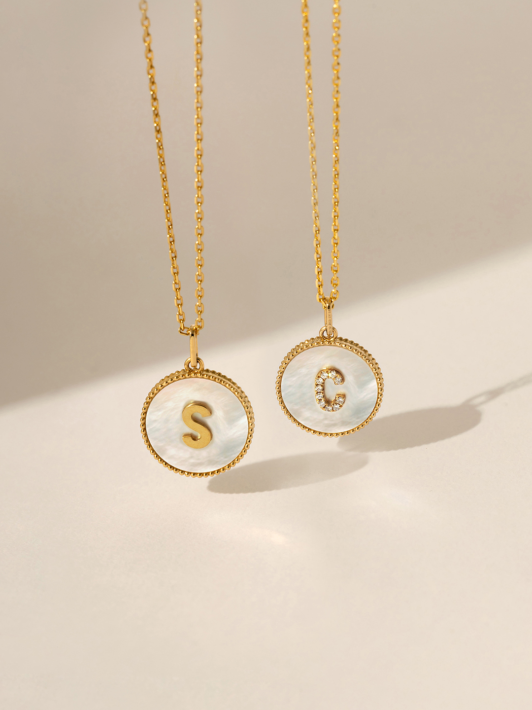
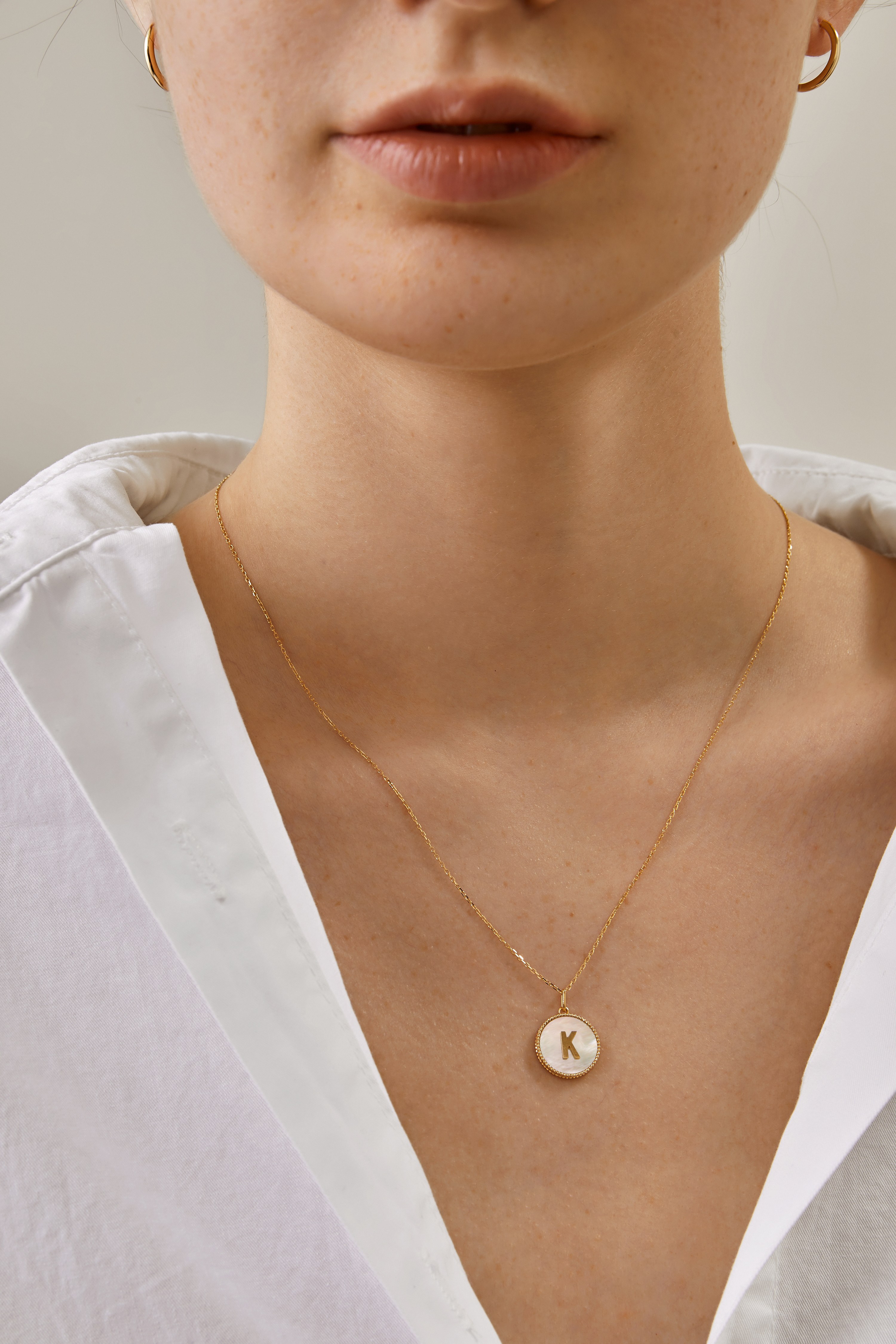
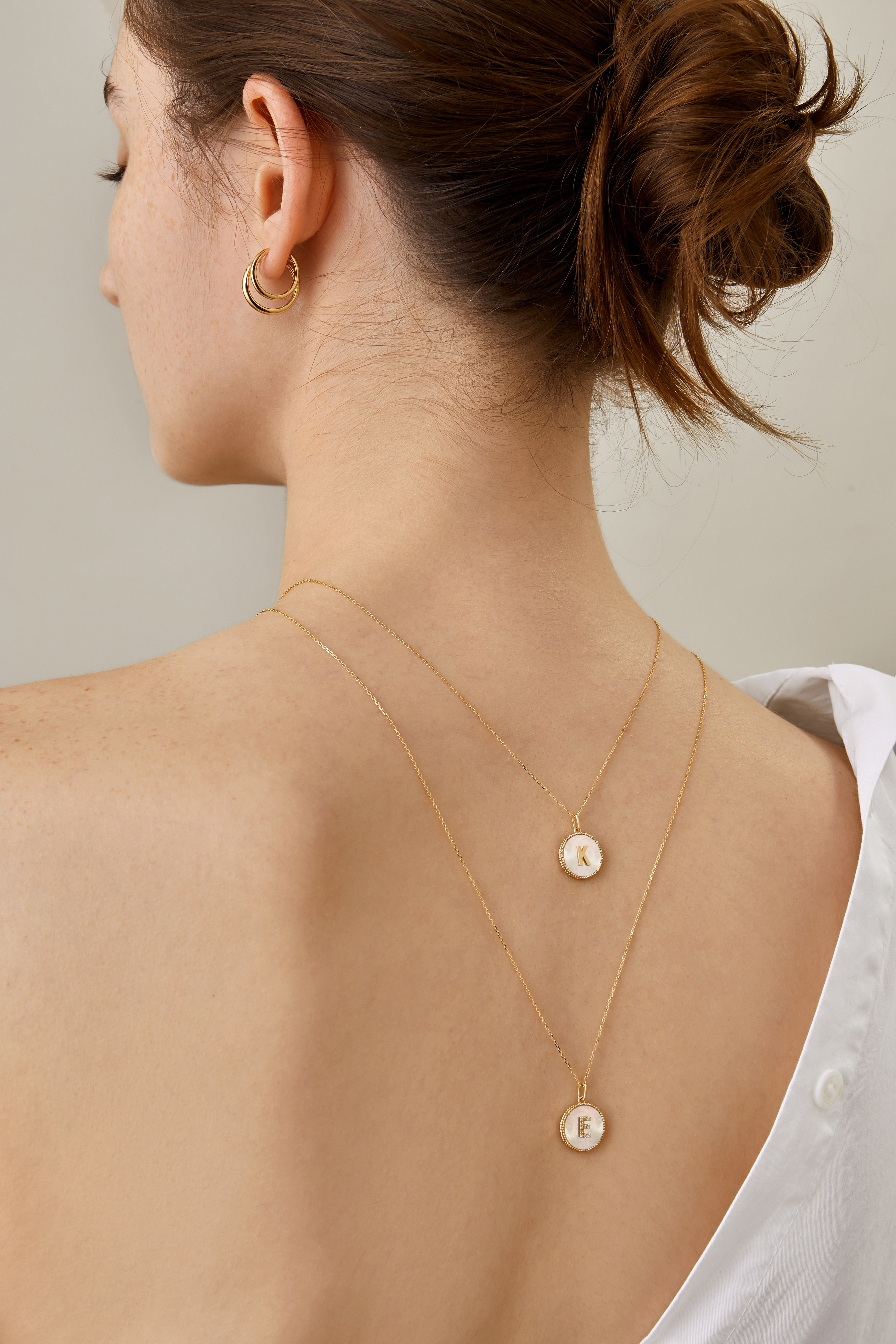
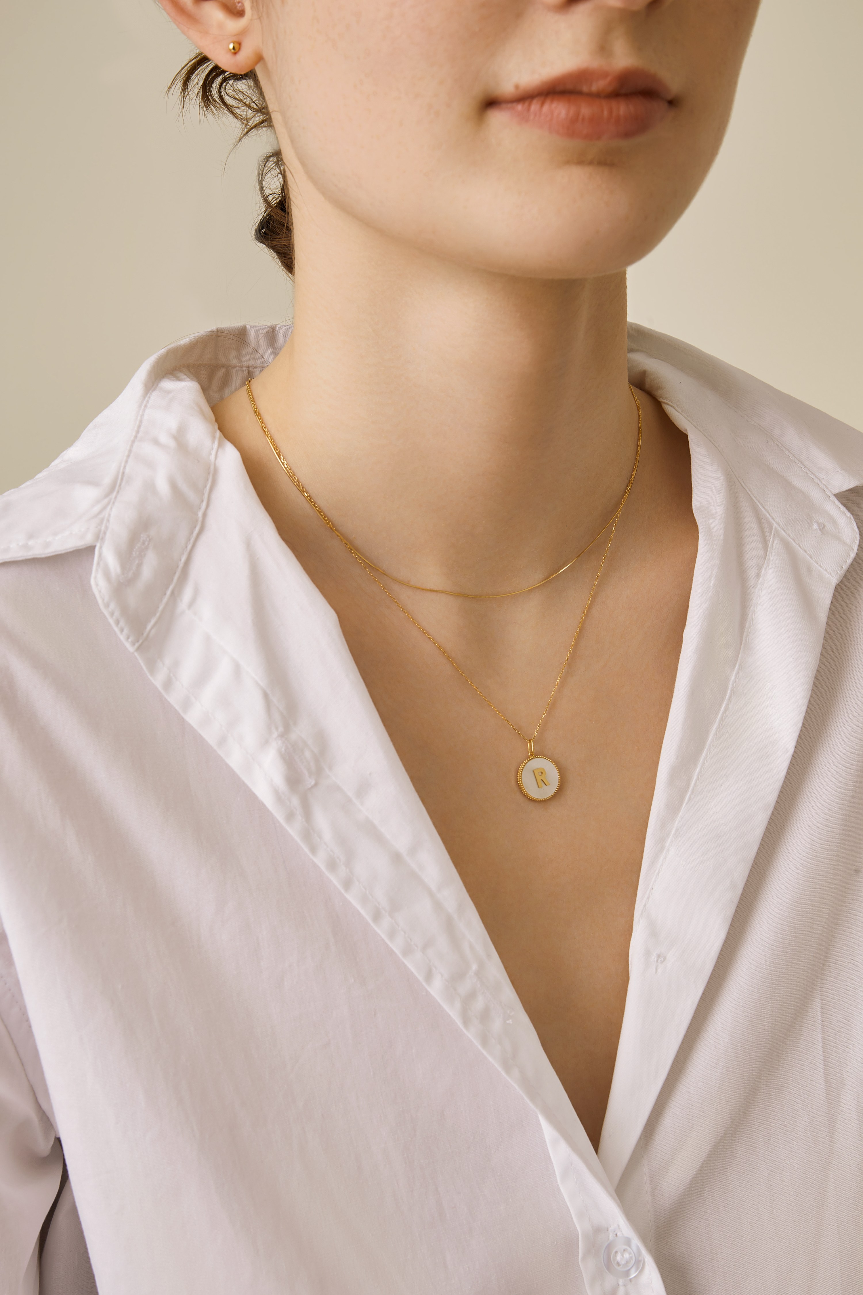
This necklace collection is a wearable tribute to the feminist book “LEAN IN.” More than just a piece of jewelry, it is an intimate emotional companion and a bold signature of personal identity, supporting modern women who aspire to cultivate inner depth while blooming outward in a world of constant flux.
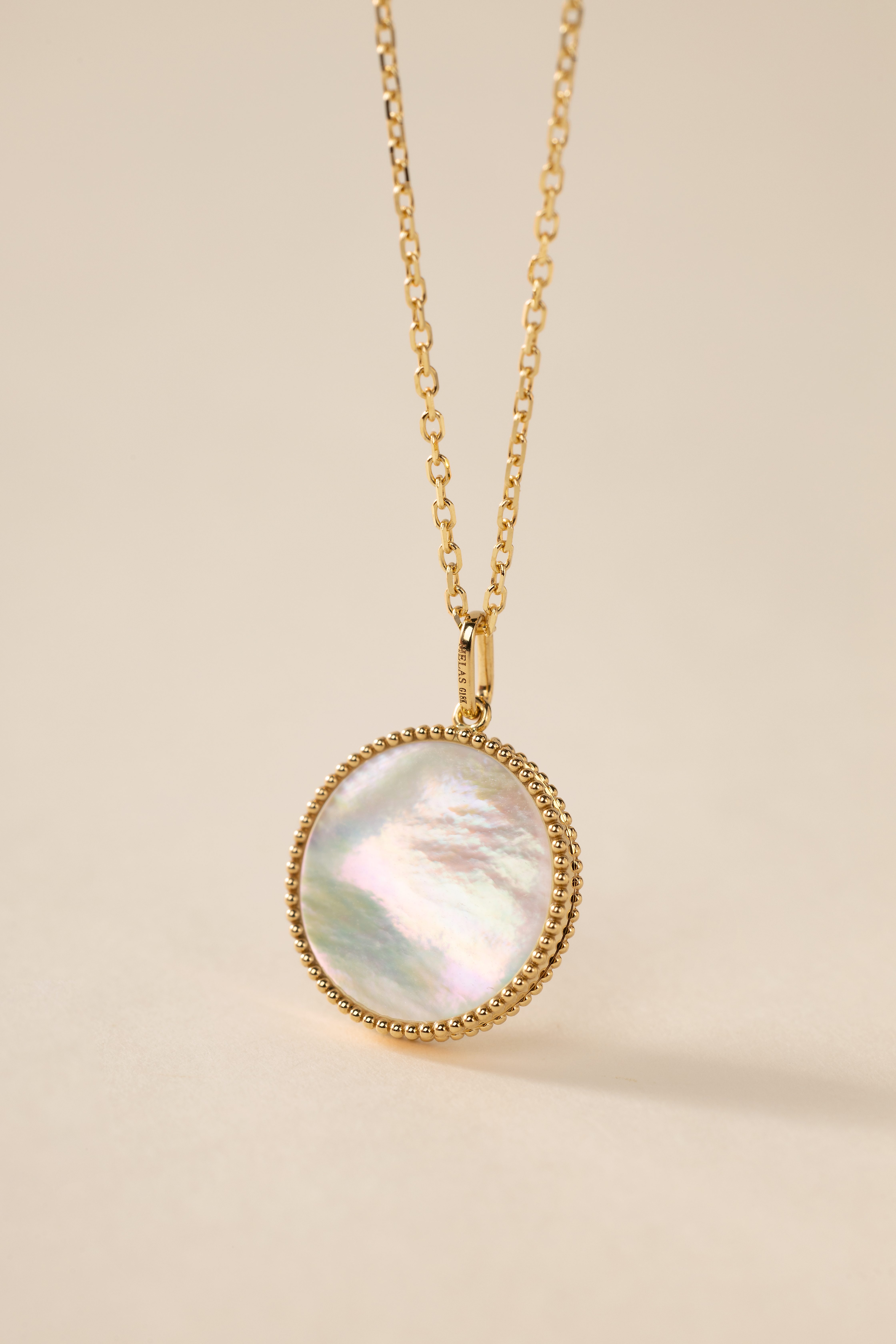
Its aesthetic narrative explores a striking geometric contrast—pairing a fluid outer circle with structured, angular lines at its core—to express a beautiful harmony of grace and resilience. The silhouette forms a perfect circle reminiscent of a vintage shield, conveying a steadfast sense of security. At the center of each pendant rests a unique letter, rendered in crisp, modern lines with sharply defined edges. This distinct structure reflects the multifaceted nature of contemporary womanhood: a fiercely principled, resolute inner self beneath an understated, sophisticated presence. The color palette harmonizes warm and cool tones, ensuring everyday versatility. A timeless, warm karat gold hue is chosen to flatter Asian skin, paired with natural mother-of-pearl sourced from Australian deep-sea silver-lip pearl oysters. As ambient lighting and viewing angles shift, the mother-of-pearl reveals a mesmerizing iridescence, casting a soft, flattering glow against the skin and elevating everyday style with refined chic.
In a true breakthrough of craftsmanship, each pendant seamlessly embeds the sharp, geometric letter into the organic mother-of-pearl base. Utilizing a specialized setting technique, the design gives the central letter a striking sense of suspension that seems to expand outward, tangibly capturing the dynamic momentum of breaking through and leaning in. To ensure this delicate artistry endures daily wear, the outer rim is finished with a signature vintage milgrain border—a hallmark of high jewelry—creating a raised, protective barrier that safeguards the natural mother-of-pearl within. With uncompromising attention to detail, each asymmetric letter has been microscopically balanced in weight to ensure perfect stability. This allows the pendant to rest flat and securely against the skin, preventing any flipping or accidental knocks for graceful, long-term wear.
Credits

Entrant
Suzhou Jianxiang Times Health Technology Co., Ltd.
Category
Product Design - Personal Care

Entrant
GM LANDSCAPE DESIGN
Category
Landscape Design - Cultural Heritage Design

Entrant
Goldsmiths, University of London
Category
User Experience Design (UX) - Climate Interaction Systems