
2026
MANDELIC ACID PURIFYING ESSENCE
Entrant
FANKOL Biotechnology (Guangzhou) Co., Ltd.
Category
Packaging Design - Beauty & Personal Care
Client's Name
-
Country / Region
China
Gallery
About The Entry
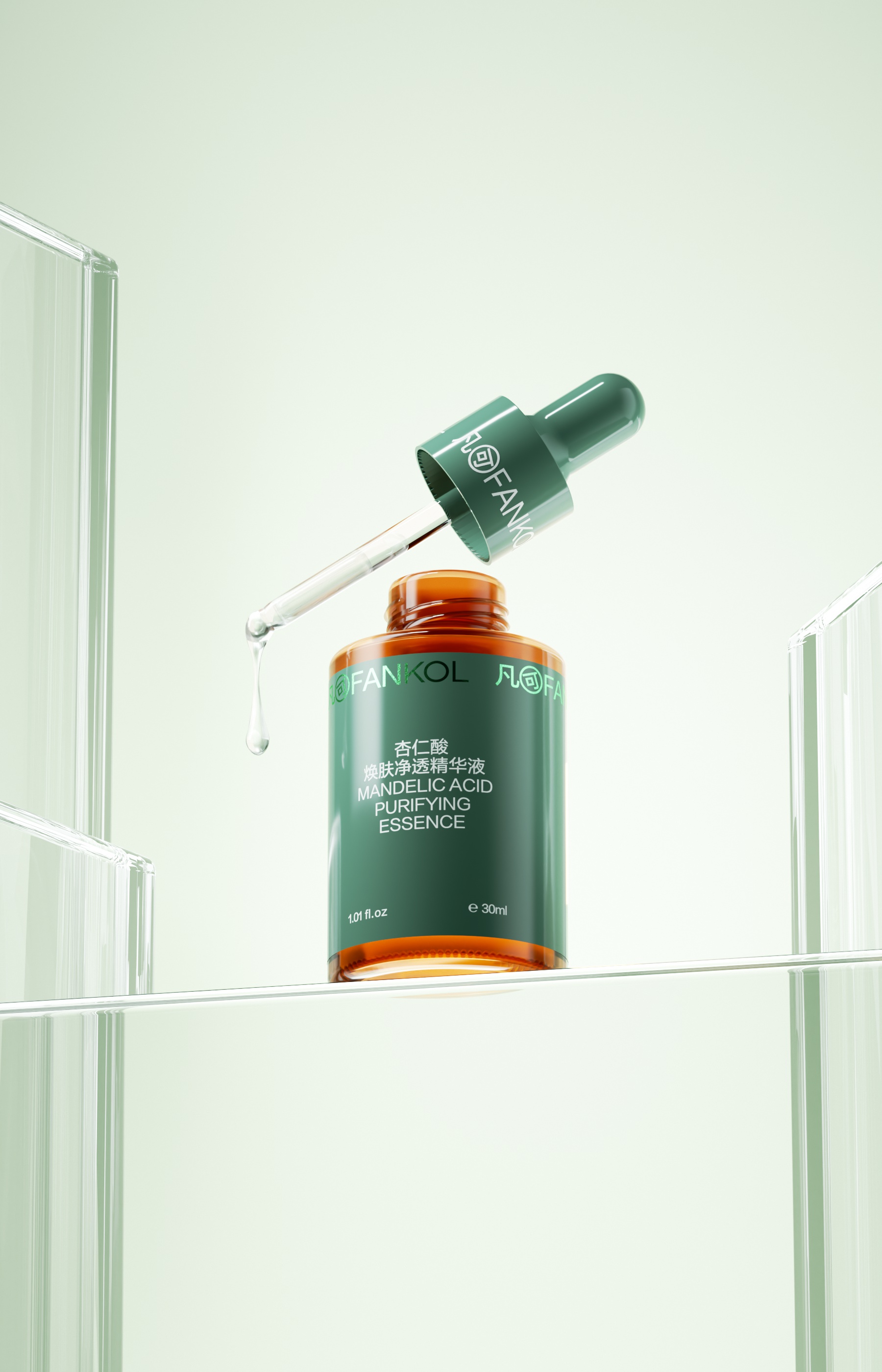
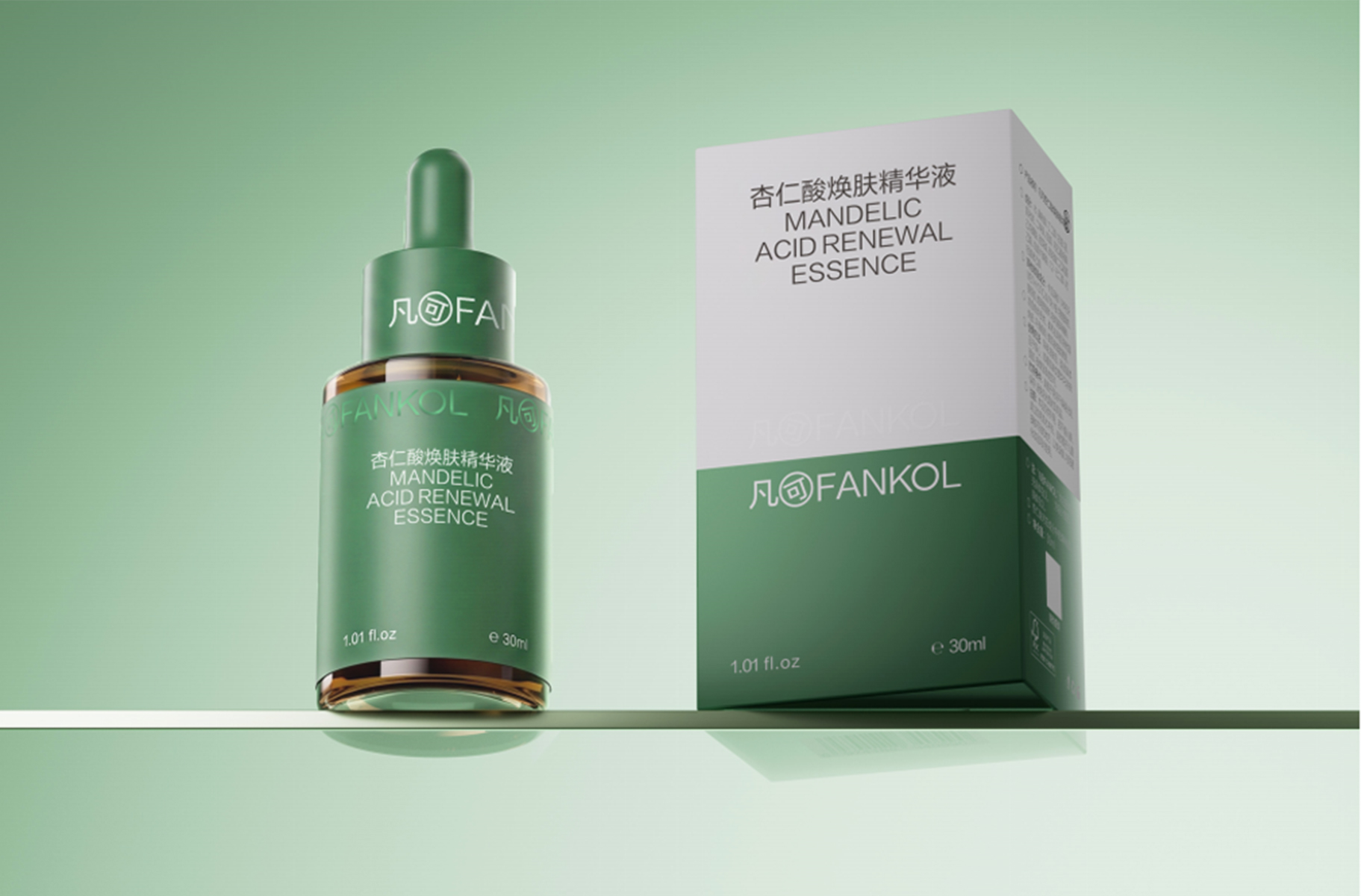
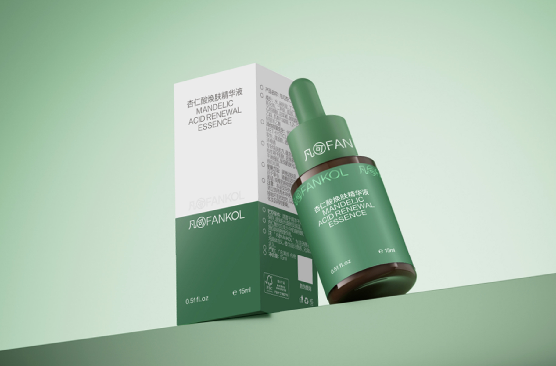
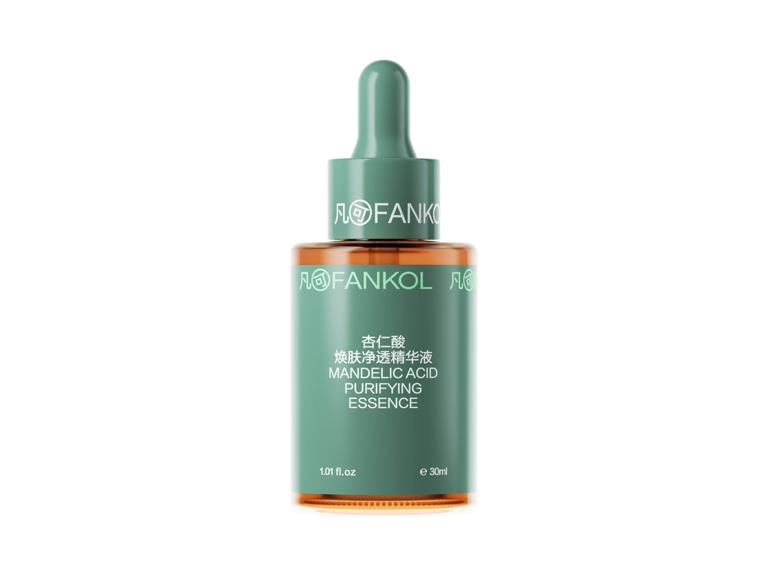
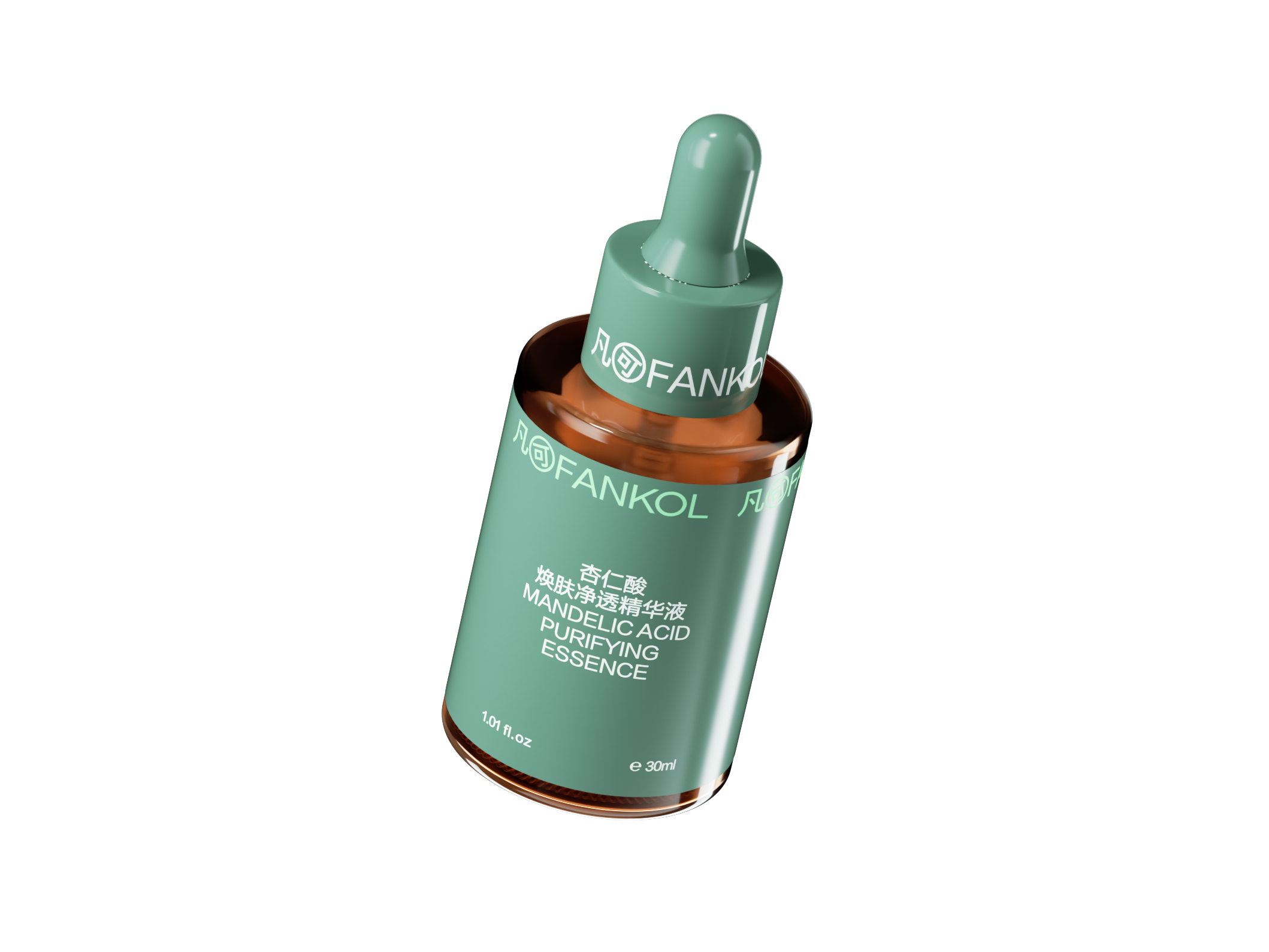
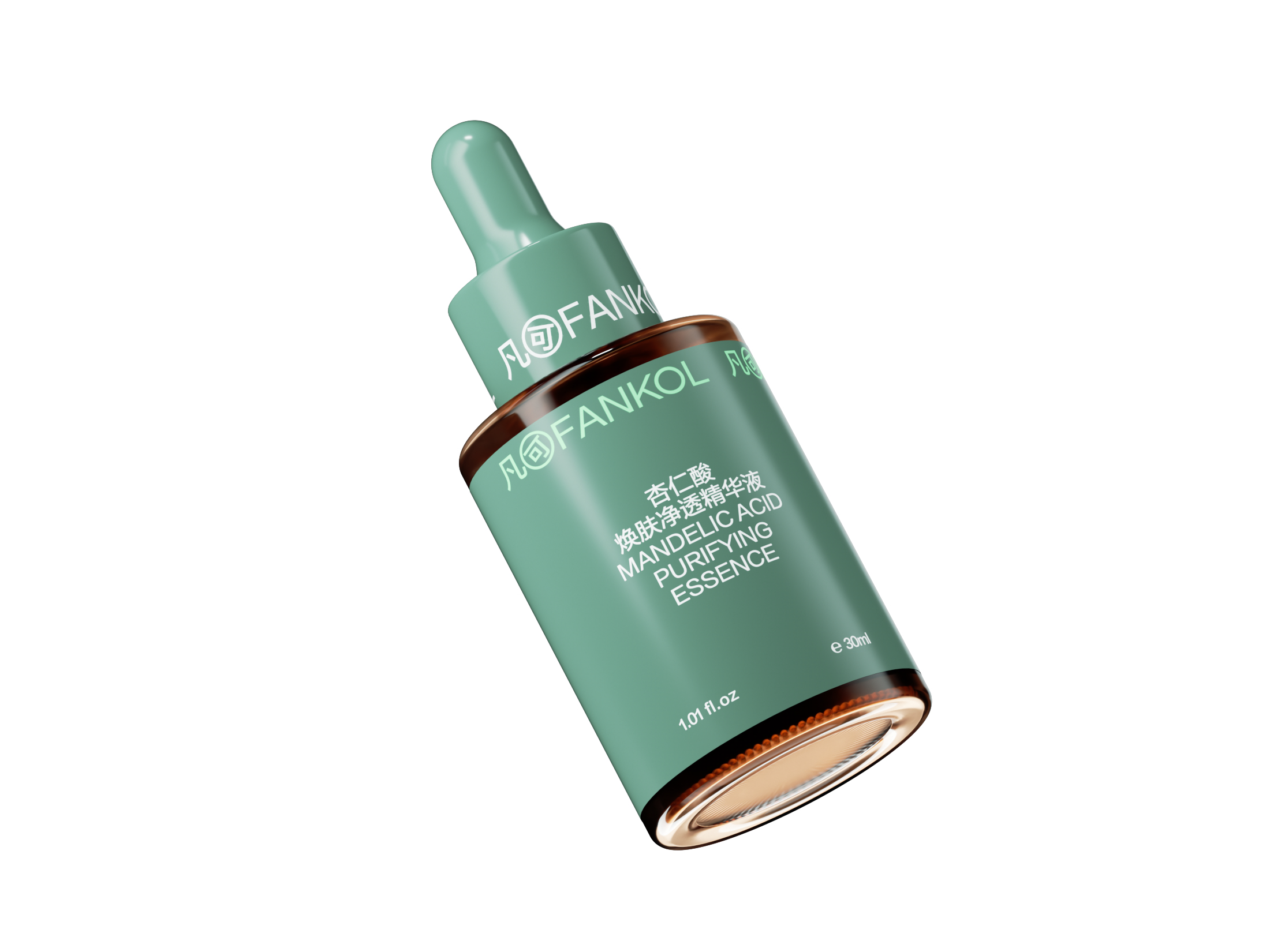
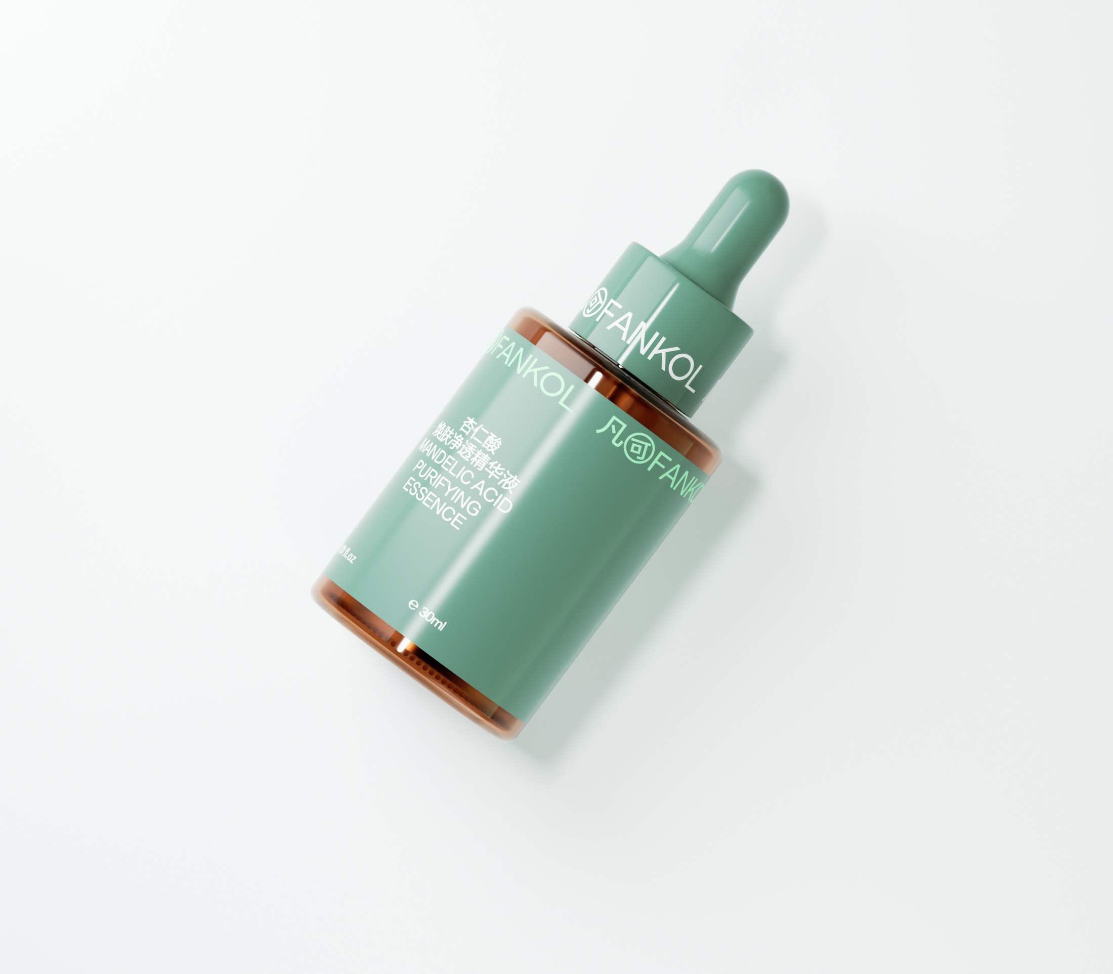
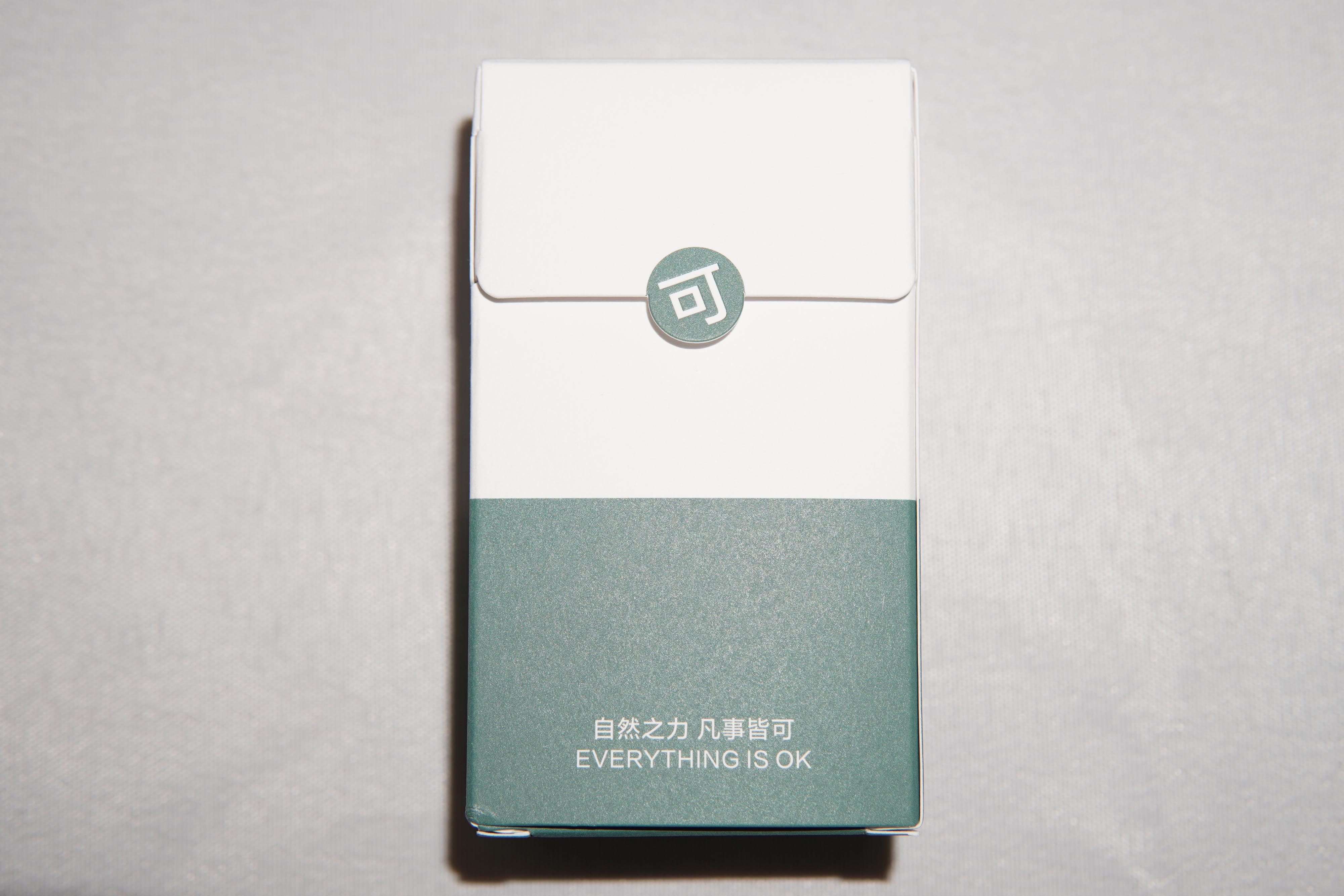
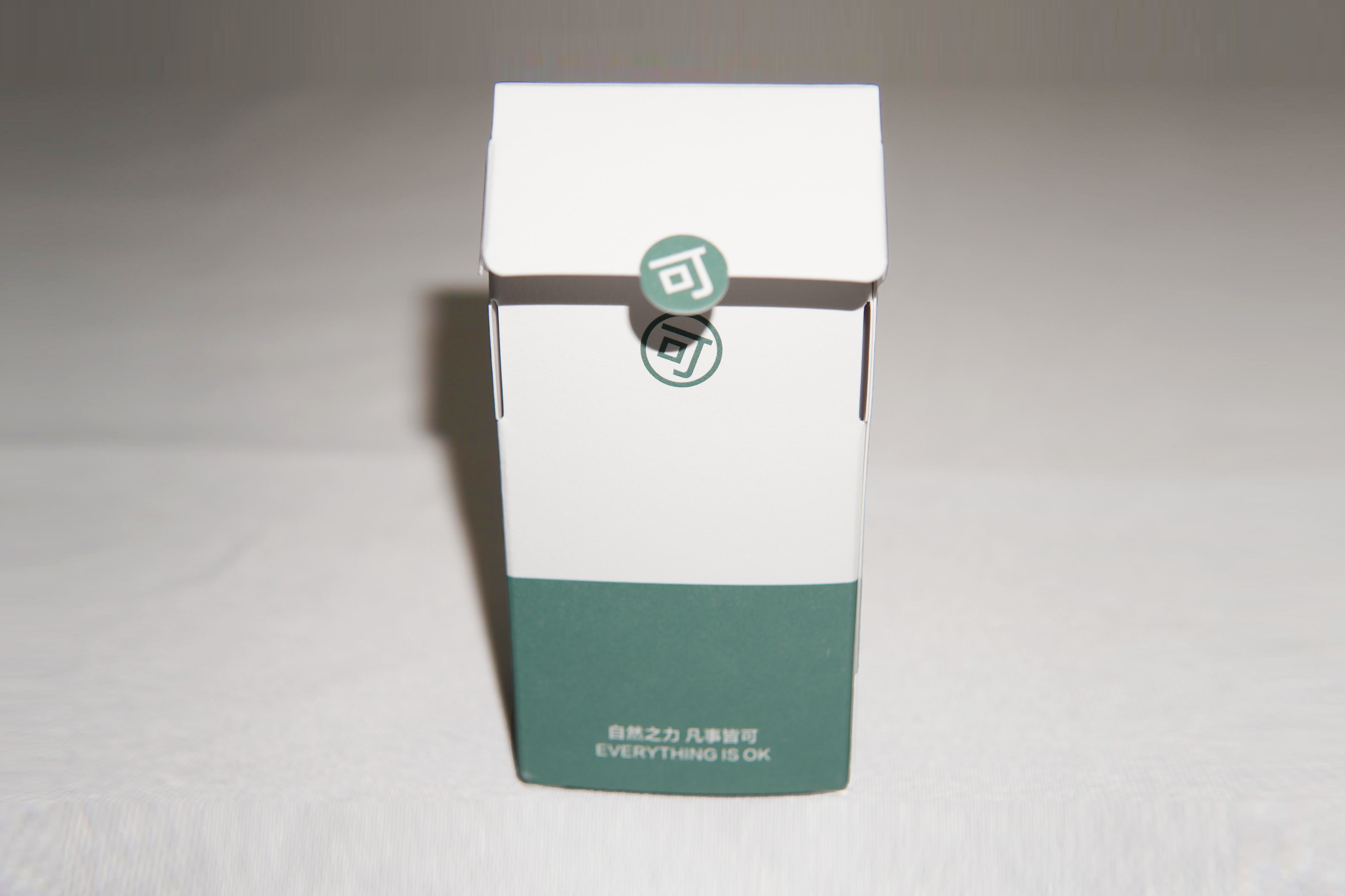
This packaging takes a restrained, pure design language that reflects the product’s gentleness and efficacy. The overall design uses clean geometric forms such as straight lines and cylindrical shapes as well as modern typography as the primary visual elements, reducing the design to its essentials. The color palette is drawn from highland landscapes and traditional Chinese low-saturation mineral tones. The primary color, “deep green,” is derived from the resilient vegetation deep in the plateau, symbolizing the activity of the product’s plant-derived ingredients. “Cashmere white” metaphorically evokes the softness and purity of snow-capped mountains and morning mist. This low-saturation palette conveys a soothing and stable visual impression, aligning with the product positioning of a gentle mandelic acid purifying essence suitable for sensitive skin. In addition, the outer box adopts a clean, two-toned design, enhancing the sense of purity while creating a clear and structured information layout.
In terms of materials and craftsmanship, the outer box is made from eco-friendly paper with a natural texture and thin matte coating. It avoids any non-biodegradable plastic lamination, fully preserving the paper’s delicate tactile quality. Blind embossing and spot raised UV are used to replace colored ink decoration, significantly reducing ink usage and environmental impact while subtly reinforcing the brand’s commitment to sustainability.
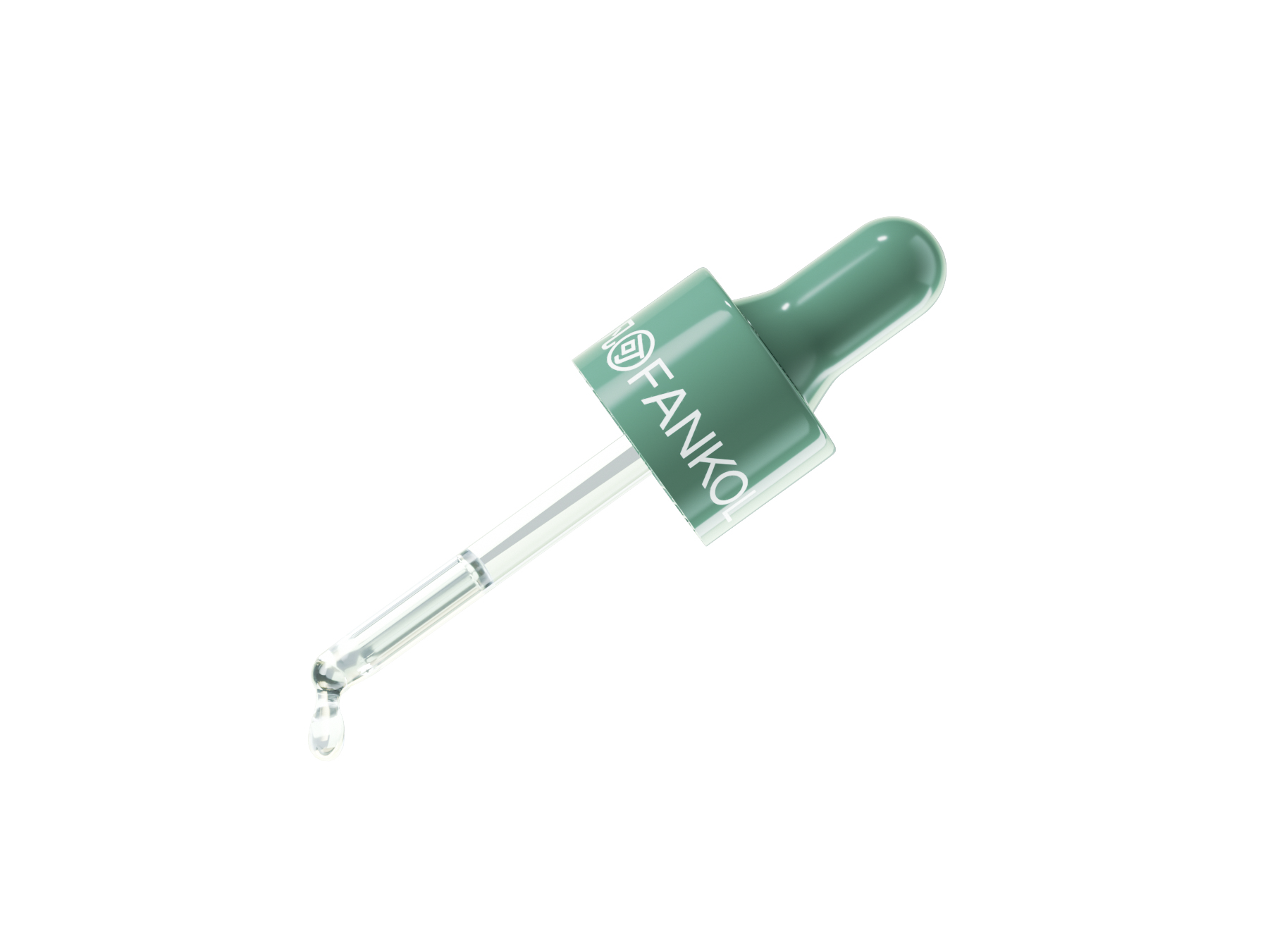
Functionally and formally, the bottle is made of glossy brown semi-transparent glass, effectively blocking light to preserve the optimal activity of the mandelic acid. The outer packaging avoids traditional flip-top or drawer-style design and instead introduces a custom seal printed with the character “可” at the opening. This both echoes the brand name and, in a playful, emoji-like manner, conveys the uplifting message “everything is ok,” adding a sense of ritual to the unboxing experience.

Entrant
FREES DESIGN
Category
Conceptual Design - Exhibition & Events
Entrant
Wang Yun/ Huang Guangwei
Category
Communication Design - vis
Entrant
Shenzhen Yongyiyue Home Furnishing Co., Ltd.
Category
Product Design - Home Furniture / Decoration