2026
Visual Identity Design for the Nanhai Research Institute of
Entrant
Harbin Litiebin Industrial Design Co., Ltd.
Category
Communication Design - Company Branding
Client's Name
Harbin Engineering University
Country / Region
China
Gallery




About The Entry
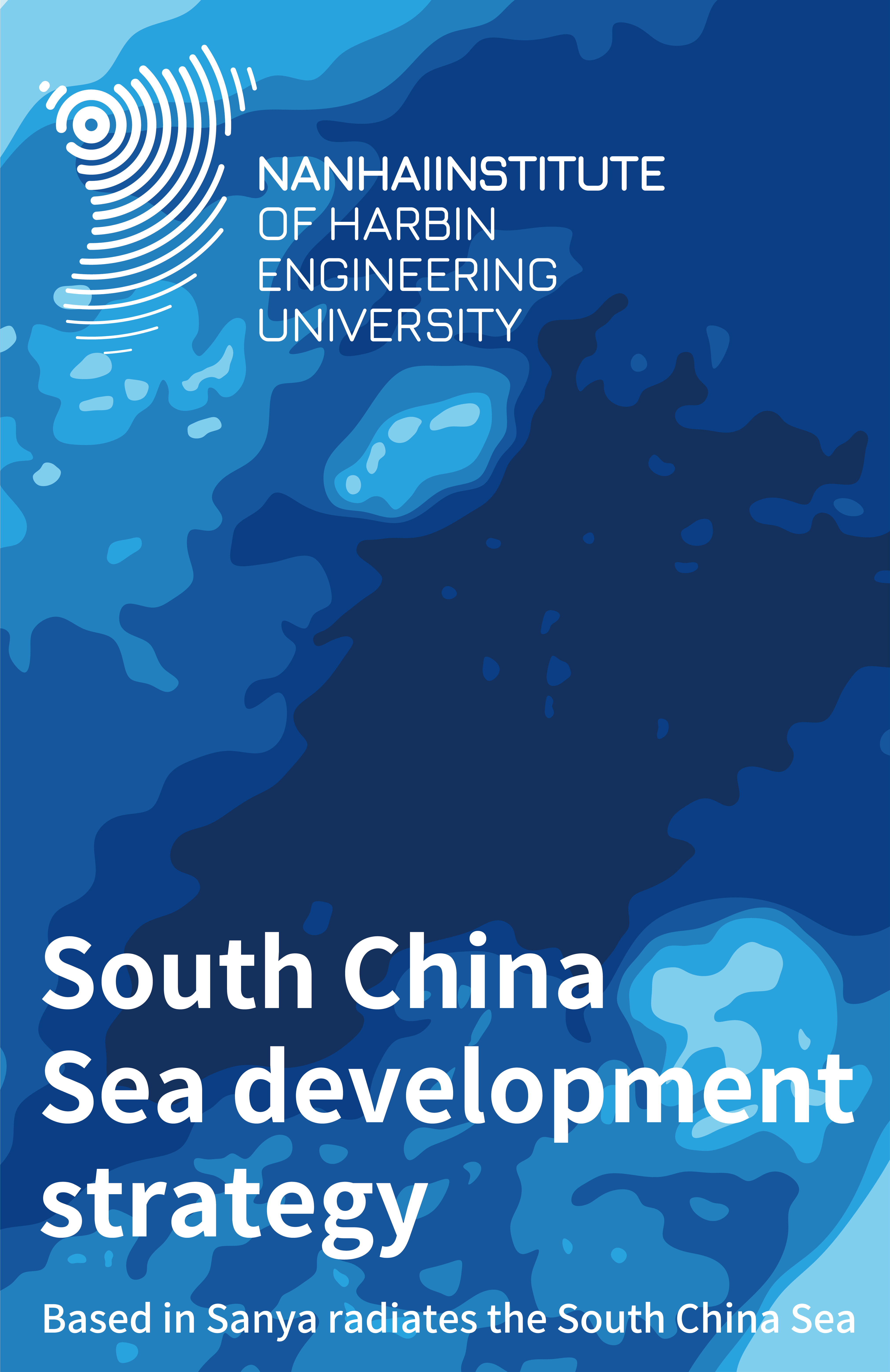
The visual identity system for the Sanya Institute of Harbin Engineering University is inspired by the relationship between geography, ocean movement, scientific exploration, and regional influence. Rather than using conventional marine symbols such as ships, islands, or waves as separate decorative elements, the design begins with the actual spatial logic of the institute: rooted in Sanya, extending toward the South China Sea, and serving long-term marine research and national development.
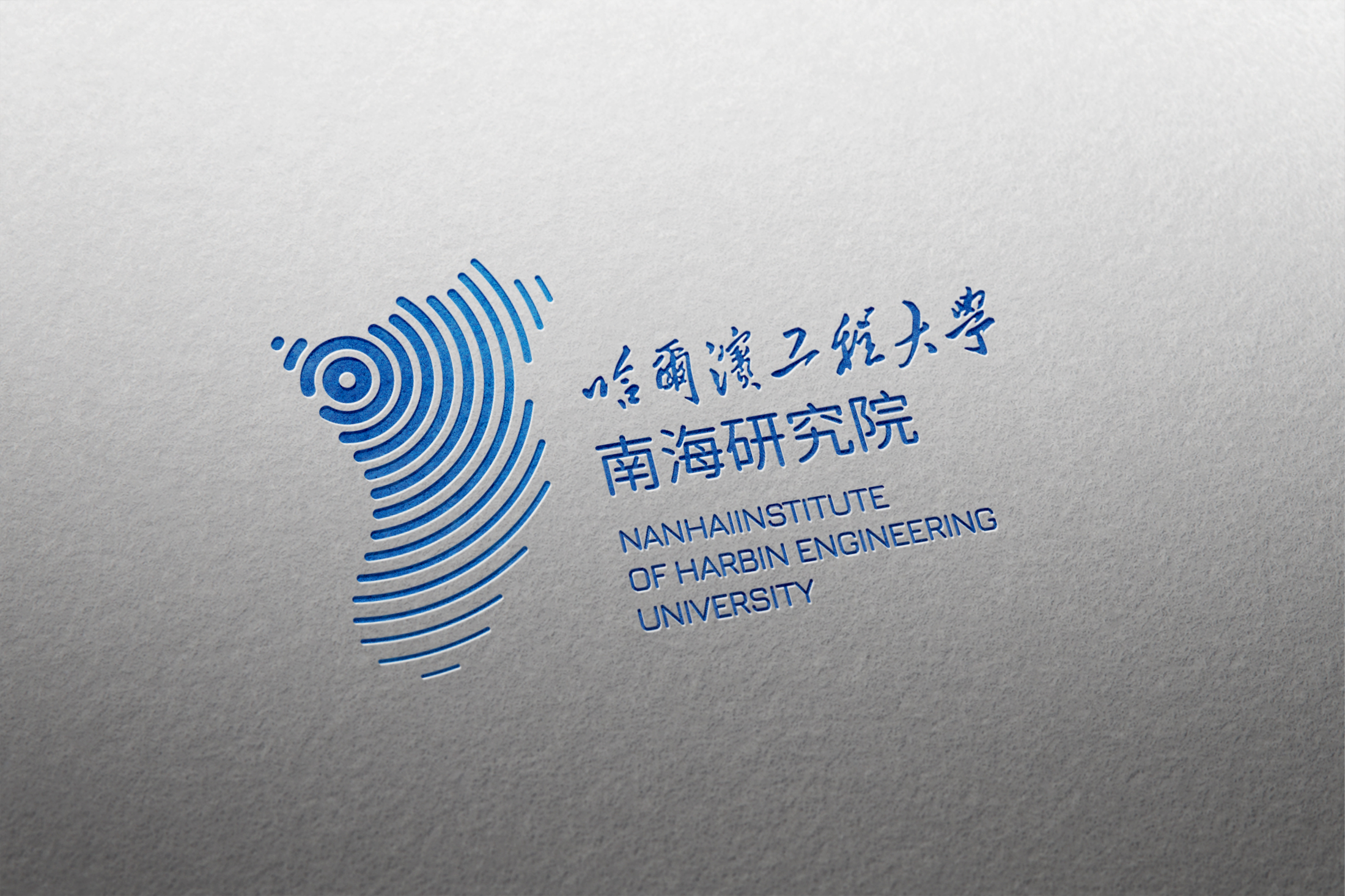
The outer contour of the logo is derived from the geographic outline of the South China Sea. Within this form, the central dot marks the institute’s real geographic location in Sanya, turning the logo into a simplified visual map. From this point, multiple curved lines expand outward across the surrounding area, expressing the institute’s research reach, technological influence, and strategic deployment throughout the South China Sea.
The creative inspiration also comes from the dynamic characteristics of the ocean. The layered curves resemble rolling waves, while their radiating structure suggests sonar signals, sound waves, data transmission, and the diffusion of scientific knowledge. These visual meanings are not assembled from different icons, but are generated through one continuous linear system. This gives the symbol a unified structure and allows nature, technology, and geography to be expressed simultaneously.
The overall form also resembles a fingerprint. This adds another layer of meaning: uniqueness, identity, and scientific recognition. It reflects the institute’s distinctive academic position and its commitment to developing original technologies in deep-sea exploration, marine information systems, ocean engineering, resource development, and ecological protection.
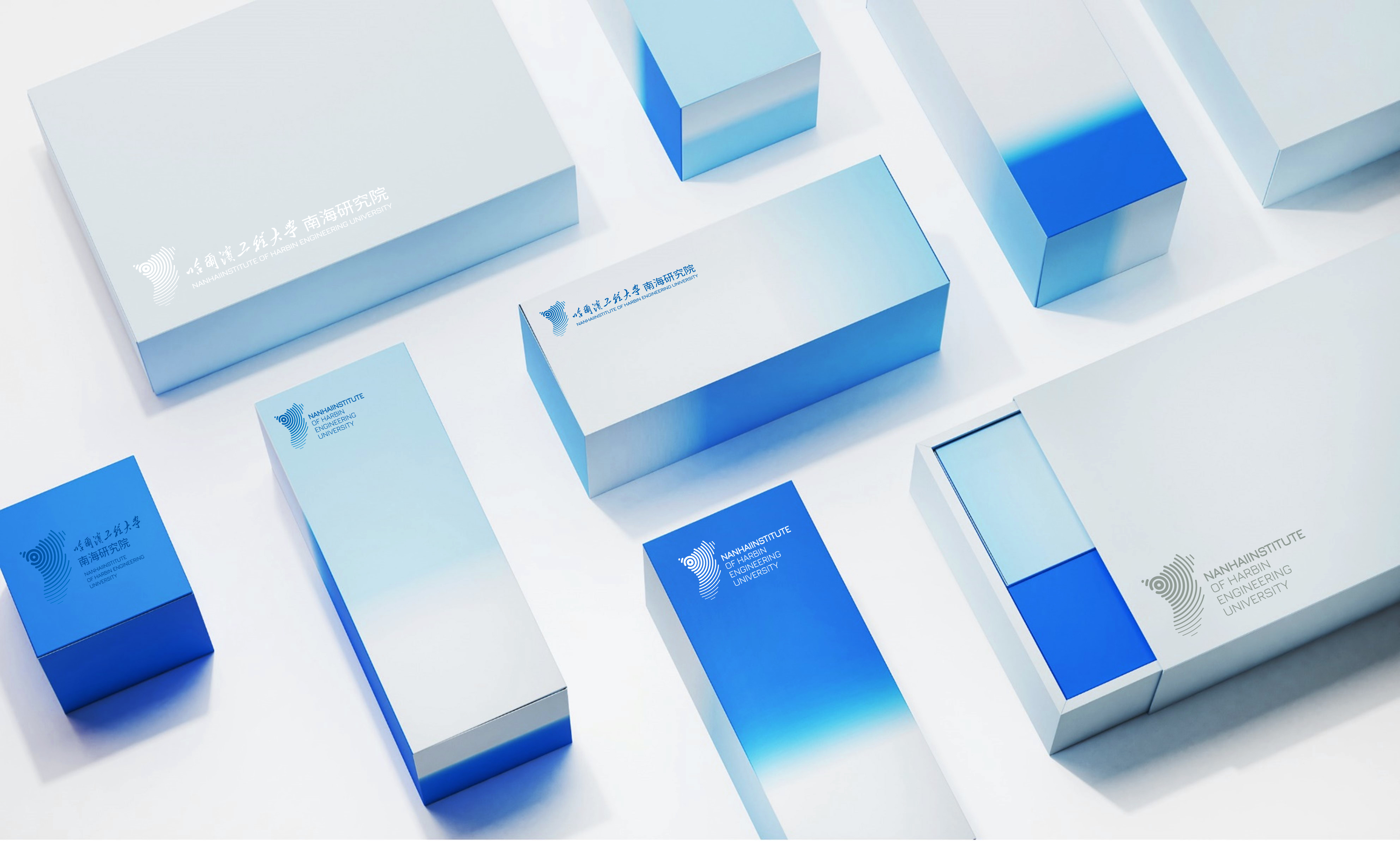
The marine-blue color palette strengthens the visual connection to the sea, while also conveying rationality, reliability, depth, and advanced technology. The same wave and radiation structures are extended into supporting graphics, creating a flexible system for exhibitions, publications, digital media, environmental graphics, and institutional communication.
The final identity transforms the institute’s location, mission, and research vision into a clear, memorable, and expandable visual language.
Featured Media
Credits

Entrant
Nanjing Manyin Musical Instrument Co., Ltd.
Category
Product Design - Music, Audio & Sound

Entrant
SHANG YUE INTERIOR DESIGN CO. LTD.
Category
Interior Design - Residential
